Preview image. Unlock full-res
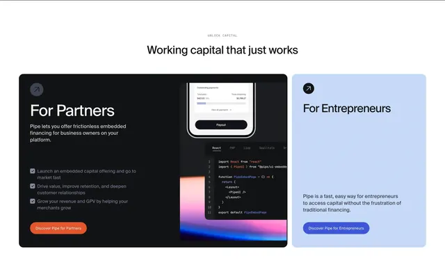
Centered headline above an asymmetric two-card gateway with a dark partners panel showing embed UI and a lighter entrepreneurs panel with a blue CTA.
Summary
Centered headline above an asymmetric two-card gateway with a dark partners panel showing embed UI and a lighter entrepreneurs panel with a blue CTA.
Visual description
White page with centered grey uppercase eyebrow "UNLOCK CAPITAL" and black headline "Working capital that just works". Two rounded cards sit below in a roughly two-thirds / one-third split. The larger left card is charcoal black with a corner arrow icon, white "For Partners" title, short embed-finance description, three grey checkmark bullet lines about launch speed, retention, and revenue growth, and an orange "Discover Pipe for Partners" button; its right edge shows a mobile payout UI, code editor with React tabs, and a blue-pink-orange gradient backdrop. The smaller right card is pale blue with matching arrow icon, black "For Entrepreneurs" title, brief capital-access copy, and a blue "Discover Pipe for Entrepreneurs" button.
Key takeaway
Weighting the partners path with a wider dark card, checklist proof, and live embed visuals while keeping the entrepreneur path as a simple light counterweight. Orange versus blue CTAs make the two journeys instantly distinguishable.
Reuse notes
Ideal home-page gateway for platform-plus-direct fintech brands. The partners side needs credible code and product screenshots; on narrow viewports the asymmetric ratio will need a deliberate stack order.
More cta sections
See all











More like this





Keep what you find
A free account saves references to boards and can send you a weekly email of picks based on what you save.
To see every result, go Pro.