Preview image. Unlock full-res
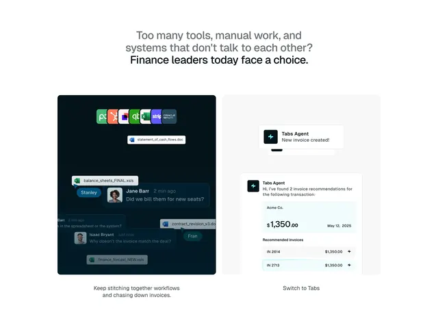
Before-and-after split comparing a dark cluttered multi-tool workflow with chat and file tags against a light Tabs Agent invoice interface.
Summary
Before-and-after split comparing a dark cluttered multi-tool workflow with chat and file tags against a light Tabs Agent invoice interface.
Visual description
Centered headline about too many tools. Left dark panel: HubSpot, Slack, QuickBooks, Excel, Stripe, NetSuite icons, floating file pills, overlapping chat bubbles with billing questions, caption about stitching workflows. Right light panel: Tabs Agent notification and invoice recommendation card with teal accents, Switch to Tabs caption.
Key takeaway
Realistic file names and chat snippets make abstract integration pain tangible. Dark-vs-light split reads as problem-to-solution instantly.
Reuse notes
Consolidation or automation pitches where the enemy is tool sprawl. Keep left side deliberately messy, right side sparse.
More comparison sections
See all











More like this




Keep what you find
A free account saves references to boards and can send you a weekly email of picks based on what you save.
To see every result, go Pro.