Preview image. Unlock full-res
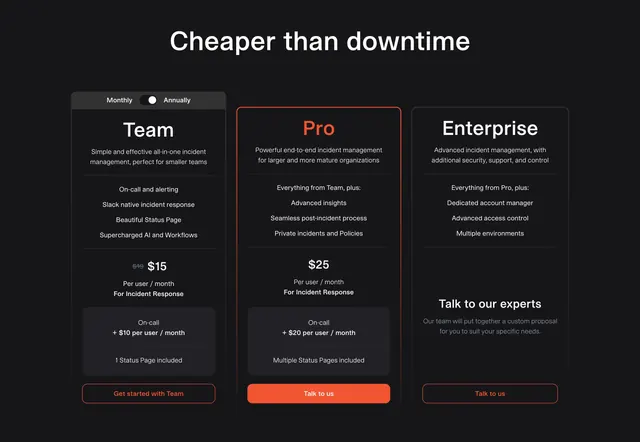
Dark three-tier pricing with the billing toggle docked into the first card, struck-through original price, and a red-outlined Pro plan with a filled red CTA.
Summary
A dark three-column pricing block with a single oversized headline, where the Monthly/Annually toggle is tucked into the header of the first card and the middle Pro plan is lifted with a red outline, red plan name, and the only filled red button.
Visual description
On a near-black background, an oversized white headline "Cheaper than downtime" centers the top. Three bordered dark cards sit in a row: Team, Pro, Enterprise. The Team card's top strip holds a Monthly/Annually pill toggle. Each card stacks a large plan name, a two-line description, a thin divider, a centered feature list, then pricing: Team shows a struck-through "$19" beside "$15" with "Per user / month", Pro shows "$25", and Enterprise swaps price for a "Talk to our experts" block. Team and Pro include an inset darker add-on box noting on-call per-user pricing and status pages. Pro is emphasized with a red border and red plan name and a filled red "Talk to us" button; Team and Enterprise use red-outline ghost buttons.
Key takeaway
Docking the billing toggle into the corner of the first pricing card instead of floating it above the grid, which saves vertical space and keeps the control attached to the prices. The nested darker add-on box cleanly separates a base price from optional add-ons inside one card.
Reuse notes
Use for a dark-themed product with three tiers and per-seat add-ons that need their own line. The struck-through anchor price reads as a discount, so only use it when an annual or promo saving is real. Works only on dark; the single red plan plus red button is enough emphasis without a separate badge.