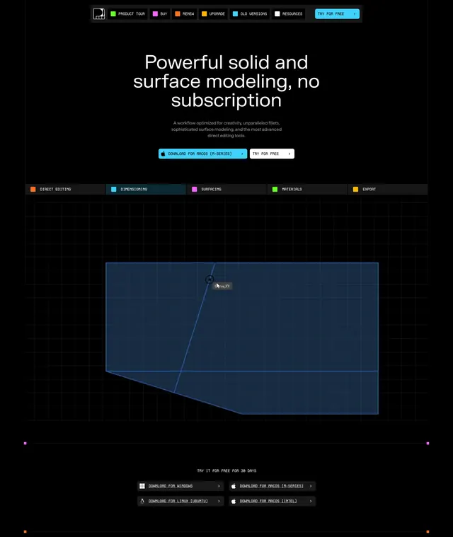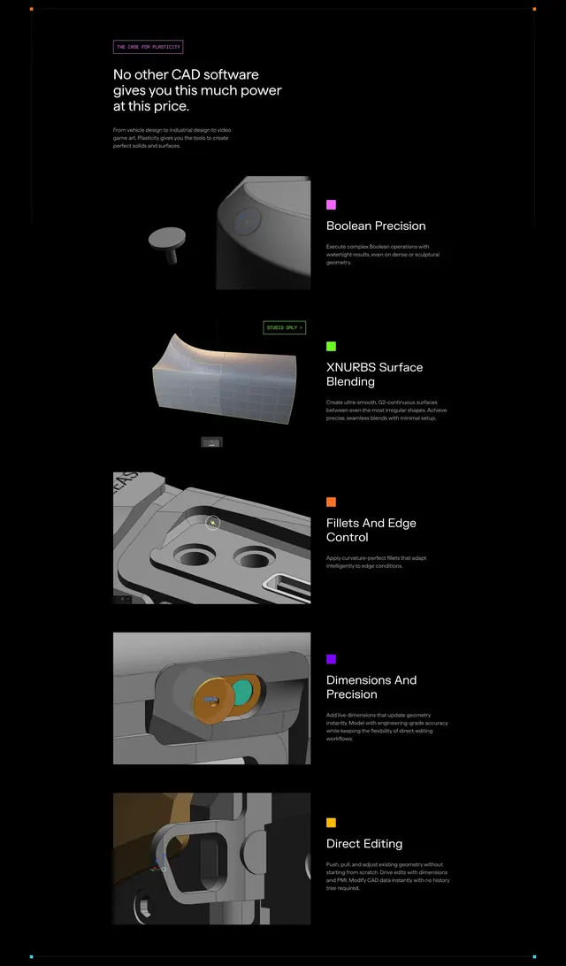
Preview image. Unlock full-res
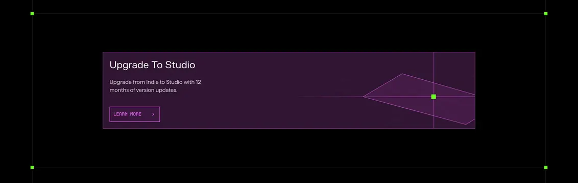
Compact dark purple CTA banner promoting Indie-to-Studio upgrade with wireframe perspective graphic.
Summary
A short Plasticity upgrade strip with purple panel, white headline about Studio tier, ghost learn button, and neon wireframe crosshair art.
Visual description
Black field with thin gray frame and green corner squares like a selected viewport. Inside, wide dark plum banner. Left: white "Upgrade To Studio" heading, gray subcopy on 12 months of version updates from Indie, and purple-outlined "LEARN MORE >" ghost button. Right third: wireframe perspective plane with radiating lines and bright green square at the intersection crosshair, evoking CAD construction geometry.
Key takeaway
Full-width color band on black makes a tier upsell feel intentional, not like a random ad. Wireframe art fills space without photography. Viewport corner markers extend the product UI language into marketing components.
Reuse notes
Best as an inline upsell between feature sections on pricing or account pages. Low height suits mid-page insertion. Purple palette is brand-specific; swap hue but keep high contrast on black.