Preview image. Unlock full-res
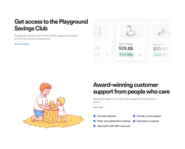
Two stacked split feature rows promoting Savings Club product cards and award-winning support with checklist and sandbox illustration.
Summary
Back-to-back horizontal feature bands alternate copy and visuals � savings product cards on top, warm support illustration below � each with headline, body, and text link CTA.
Visual description
White background, two full-width rows. Top row: left copy "Get access to the Playground Savings Club" with 10�40% off explanation and blue "See how it works" link; right, three product cards in a row showing illustrated Paper Towels ($29.25, Save 38%) and Baby Wipes ($23.30, Save 15%) with plus buttons. Bottom row reverses: left warm line-art illustration of adult and child building a sandcastle; right "Award-winning customer support from people who care" with subcopy, "Learn more" link, and two-column checklist with blue check circles (free migration, roadmap, help center, human support, Disponible en espa�ol).
Key takeaway
Alternating split directions in stacked bands keep a long features page rhythmic without new components. Pairing a commerce teaser with a human support story covers rational and emotional proof in one section.
Reuse notes
Good mid-page pattern for platforms with ancillary perks plus services. Illustration and product cards should share warm palette so the two rows feel related.