Preview image. Unlock full-res
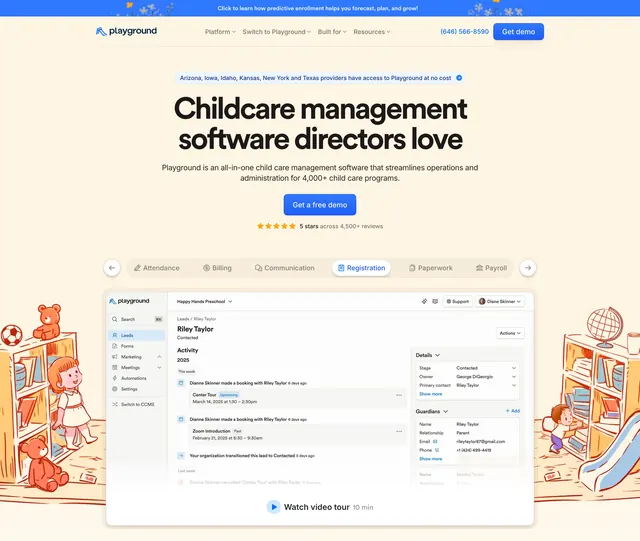
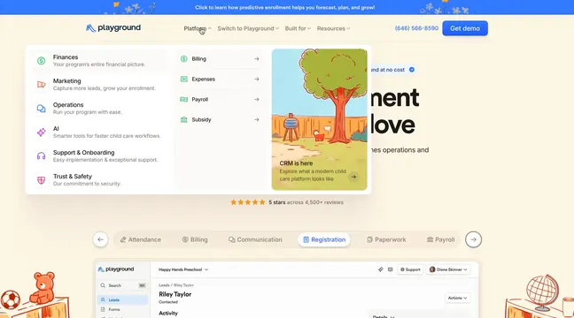
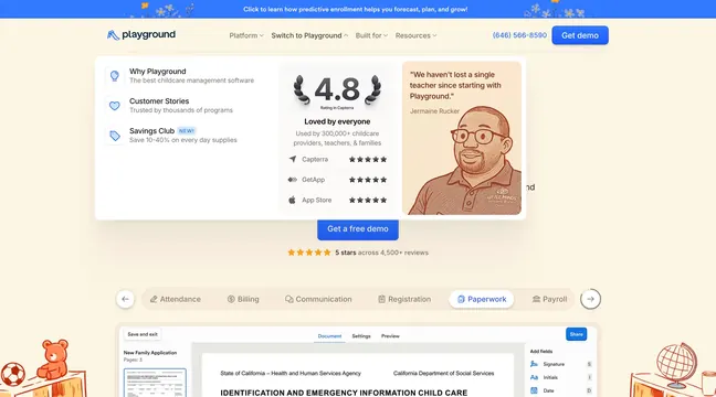
Switch-to-Playground mega menu combining nav links, Capterra rating block, testimonial card, and tabbed paperwork UI preview below.
Summary
An open "Switch to Playground" mega menu that mixes conversion links, aggregate review stats, a customer quote, and a hero demo CTA above tabbed product previews.
Visual description
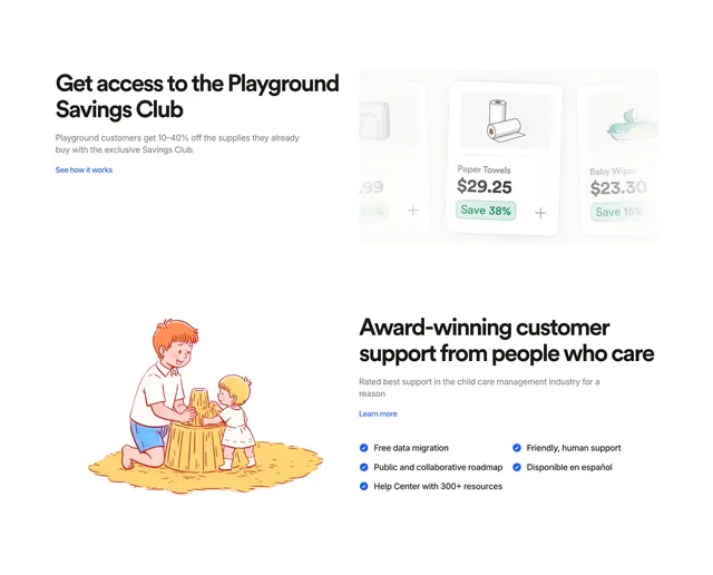
Cream page, blue top banner, standard nav with Switch to Playground active. White rounded mega panel in three zones: left links � Why Playground, Customer Stories, Savings Club NEW with icons and subtext; center social proof � large 4.8 Capterra laurel rating, 300,000+ users line, five-star rows for Capterra, GetApp, App Store; right peach testimonial card with quote from Jermaine Rucker and line-art portrait. Below menu, centered blue "Get a free demo" and orange five-star 4,500+ reviews. Scrollable feature tab bar (Paperwork active) over document editor UI showing California childcare identification form with signature fields panel. Toy sketch vignettes in bottom corners.
Key takeaway
Embedding review aggregation inside the nav dropdown answers "why switch" before the user scrolls. Testimonial tile with portrait makes the mega menu feel editorial, not administrative.
Reuse notes
Strong for competitive switch pages surfaced from nav. Keep third-column quote short; wide menus collapse badly on smaller breakpoints.