Preview image. Unlock full-res
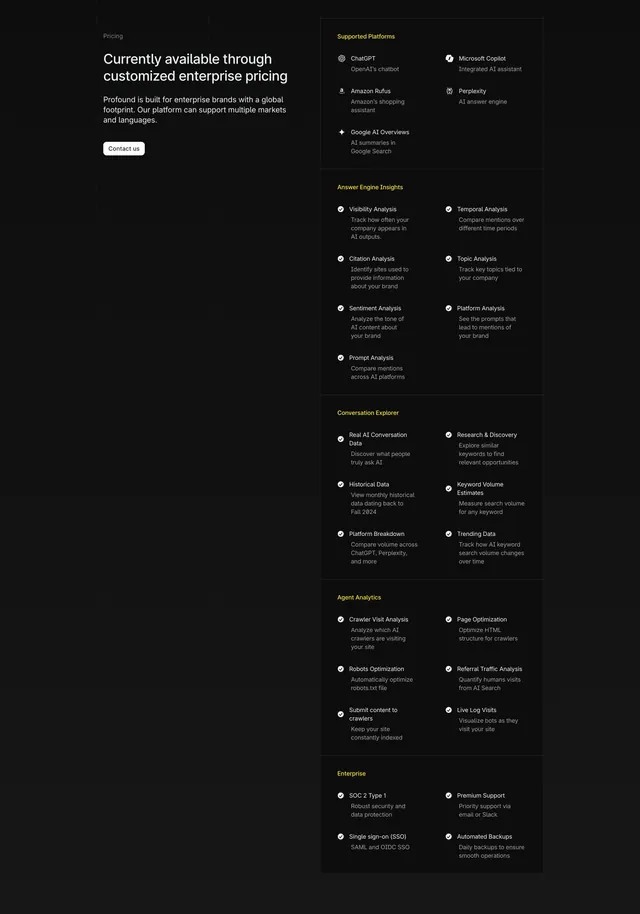
A dark two-column pricing section pairing a short enterprise-pricing pitch on the left with a long checkmarked feature matrix grouped into categories on the right.
Summary
A dark, enterprise-only pricing layout that skips tier cards entirely: a short left-column pitch and Contact button sit beside a long right-column feature matrix grouped under yellow category headings with checkmarked items in two sub-columns. The exhaustive capability list, not a price, is the selling device.
Visual description
On a near-black field, the left column shows a small gray "Pricing" label, a two-line heading "Currently available through customized enterprise pricing," a short muted paragraph about global enterprise support, and a small outlined "Contact us" button. The right column is a tall feature matrix split into two sub-columns and sectioned by yellow category headers: Supported Platforms, Answer Engine Insights, Conversation Explorer, Agent Analytics, and Enterprise. Each entry pairs a small white circular check icon with a bold feature name (for example ChatGPT, Visibility Analysis, Citation Analysis, Crawler Visit Analysis, SOC 2 Type 1, Single sign-on) and a line of gray descriptive copy. Thin rules separate the category blocks down the column.
Key takeaway
For a single enterprise plan, replacing pricing tiers with a comprehensive categorized feature matrix communicates depth and justifies "contact us" pricing. Yellow category headers are an effective accent for chunking a long checkmark list into scannable groups.
Reuse notes
Best when there is one enterprise offering and the value lives in breadth of features rather than price points. The matrix is content-heavy and only impresses if the capabilities are genuinely extensive. The single accent color keeps the long dark list legible; avoid adding more hues. Dark mode only as shown.