Preview image. Unlock full-res
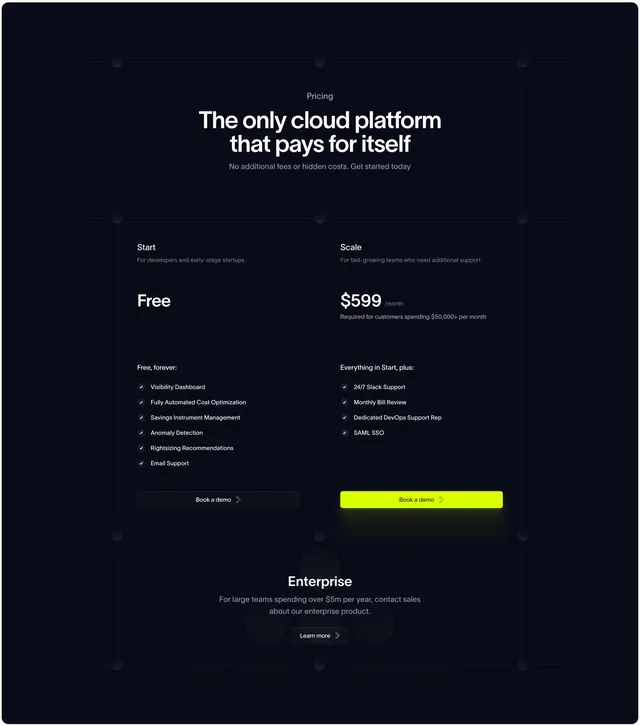
Dark centered pricing section with two side-by-side plans split by a divider, a lime-highlighted CTA on the paid tier, and a separate enterprise band below.
Summary
A near-black pricing section with a centered oversized headline over two open plan columns (Free and a $599 Scale tier) divided by a vertical rule, the paid tier marked by a glowing lime CTA, with an Enterprise call-out banded across the bottom.
Visual description
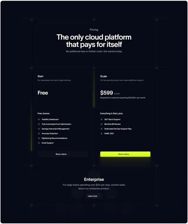
A small "Pricing" eyebrow tops a centred white two-line headline and a short grey subhead. The body is a two-column comparison with no card borders, just a faint vertical divider: each column has a plan name, a one-line audience note, a large price ("Free" and "$599 /month"), a fine-print qualifier, and a checklist of features with small check icons. The left Start column lists basic features under "Free, forever:"; the right Scale column lists "Everything in Start, plus:" extras. Each column ends in a full-width "Book a demo" button, the right one filled bright lime with a soft glow, the left one dark and outlined. A faint blueprint grid with corner nodes underlies the whole area. Below a divider, a centred Enterprise block names a higher tier with a small "Learn more" button.
Key takeaway
The borderless two-column layout that lets a faint background grid and a single divider do the structuring, keeping the dark pricing minimal. Highlighting only the paid tier's CTA with a glowing lime fill steers choice without a loud "most popular" badge. The separate enterprise band cleanly handles the third, custom tier.
Reuse notes
Good for a dark, technical product with a simple two-plan structure plus enterprise. The glow effect depends on a dark background to register. Keep feature checklists short and parallel so the open columns stay aligned; without card borders, uneven lists will look ragged.
More pricing sections
See all











More like this



Keep what you find
A free account saves references to boards and can send you a weekly email of picks based on what you save.
To see every result, go Pro.