Preview image. Unlock full-res
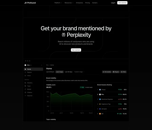
A dark centered hero name-checking Perplexity over faint grid lines, anchored by a large analytics dashboard showing AI brand-visibility scores and rankings.
Summary
A dark, technical hero leading with an oversized white headline that pairs a Perplexity glyph with the brand name, backed by faint rounded grid lines, then anchored by a large product dashboard preview. The dashboard's brand-visibility chart and ranking table do the proof-of-value work.
Visual description
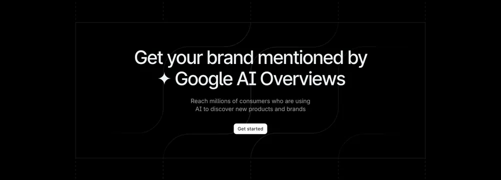
A black top nav shows the Profound logo at left, Platform / Resources / Enterprise / Pricing / Careers links centered, and Log in plus a white "Get started" button at right. Centered white type reads "Get your brand mentioned by [Perplexity glyph] Perplexity," over faint rounded grid lines, with a gray two-line sub-paragraph and a white "Get started" pill. Below sits a large dark dashboard with carousel dots above it: a left sidebar (Rho workspace, Home, Search, Inbox, and Metrics items), a main "Brand visibility" panel with an 89.8% visibility score and a green area chart over dated axes, and a right "Brand Industry Ranking" list crediting Chase, Rho, American Express, Capital on Tap, US bank, and Bill with percentages and up/down deltas.
Key takeaway
Embedding the swapped-in AI-platform glyph directly into the headline keeps messaging and category instantly clear. The realistic, data-dense dashboard with a real chart and ranking table sells the product's value far better than a generic UI mockup.
Reuse notes
Strong default for an AI-visibility or analytics SaaS that needs to show actual numbers above the fold. It depends on a convincing, populated dashboard, so the screenshot must look like real data. The carousel dots imply the dashboard can be swapped; only treat that as motion if a slider is actually present. Dark mode only.