Preview image. Unlock full-res
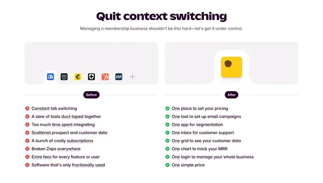
Light two-column comparison contrasting a scattered tool stack against one consolidated tool, using red-cross and green-check lists under labeled panels.
Summary
A light, two-column "before vs after" comparison that pits a cluttered row of third-party app icons against a single Outseta icon, then lists the pains versus the wins beneath each. The defining move is the visual icon contrast: many tools on the left, one on the right.
Visual description
A centered rounded-display headline "Quit context switching" in deep aubergine sits above one line of muted subcopy. Two light gray rounded panels span the width: the left panel shows a strip of six colorful third-party app icons plus a faint "+", the right panel shows a single yellow Outseta icon raised on a white tile. Below each panel a thin divider carries a small dark pill label, "Before" on the left and "After" on the right. Under "Before" is an eight-item list with red circular X icons and partially underlined phrases (constant tab switching, duct-taped tools, scattered data, broken Zaps, extra fees). Under "After" is a matching list with green circular check icons (one place to set pricing, one inbox, one chart to track MRR, one simple price), each beginning with an emphasized "One".
Key takeaway
Encoding the entire value proposition in the icon row alone, a crowded toolbar versus a single app, so the point lands before any copy is read. Anchoring every "after" line with the repeated word "One" turns the benefit list into a rhythmic, memorable refrain.
Reuse notes
Ideal for all-in-one or consolidation plays that replace a stack of point tools. The left icon strip works best with recognizable real logos; check trademark comfort before shipping. The rounded display headline sets a friendly tone; pairs well with a light, approachable brand.