Preview image. Unlock full-res
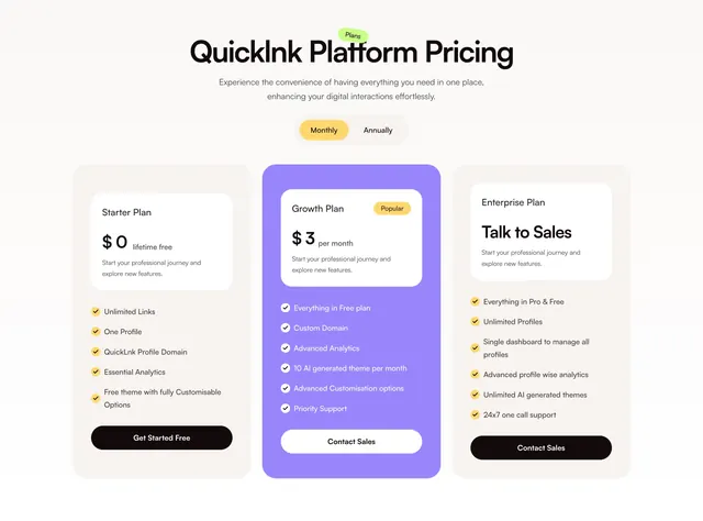
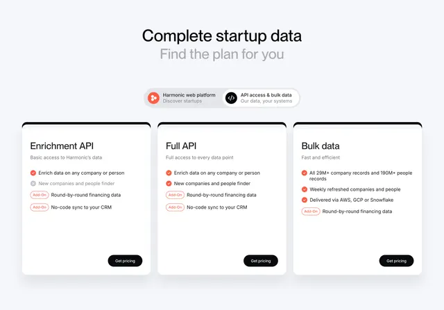
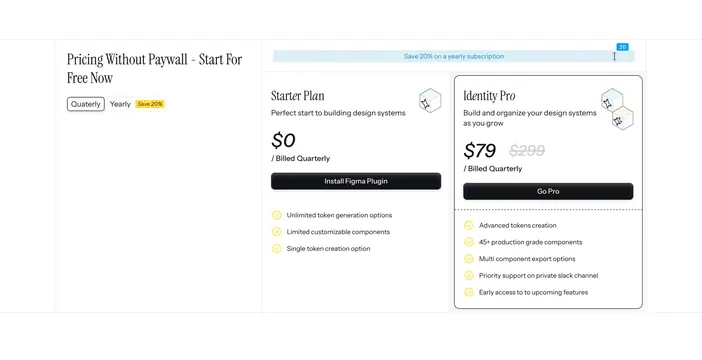
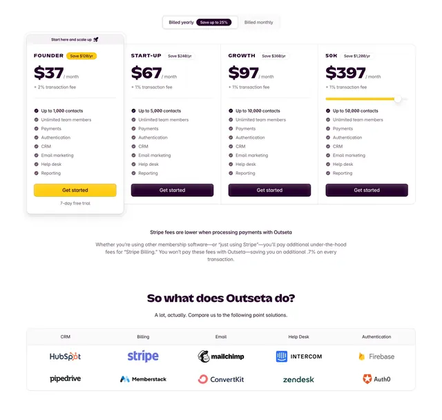
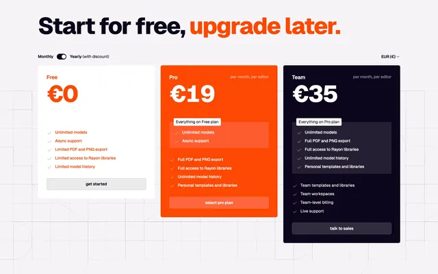
Light three-column pricing with a highlighted orange middle tier, a billing toggle, and checklisted features over a faint blueprint grid.
Summary
A light three-tier pricing block where the middle Pro plan is filled solid orange to pull the eye, framed by a Monthly/Yearly toggle and a currency selector. The bold black-and-orange headline and the color-blocked center card define it.
Visual description
A large two-tone headline "Start for free, upgrade later." (the second half in orange) sits above a control row: a Monthly/Yearly switch on the left and a "EUR" currency dropdown on the right. Three cards follow: Free is white on the page with a black price and a grey "get started" button; Pro is a solid orange card, white price, with a darker nested "Everything on Free plan" sub-box and a pale "select pro plan" button; Team is near-black, white price, with its own nested "Everything on Pro plan" box and a dark "talk to sales" button. Each plan lists check-marked features, and the whole section sits on a faint blueprint grid that fades in from the right.
Key takeaway
Coloring the recommended tier with a full solid fill (not just a border or badge) makes the upsell unmistakable. The nested "Everything on the previous plan" sub-box inside each card visually communicates the stacking value without re-listing every feature. Pairing the toggle and currency selector on one control line keeps the header tidy.
Reuse notes
A clean default for a three-plan SaaS with a clear flagship tier. The solid-color center card needs a brand accent strong enough to carry white text; muted palettes will look weak. Works on light; the blueprint grid is optional flavor that suits technical brands.