Preview image. Unlock full-res
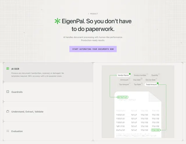
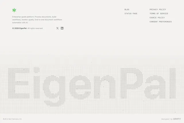
Centered light-gray product CTA with dot-grid texture, EigenPal headline, and a single lavender primary button.
Summary
Centered light-gray product CTA with dot-grid texture, EigenPal headline, and a single lavender primary button.
Visual description
Off-white field with a fine square dot grid and scattered darker pixels. A small gray / PRODUCT label sits above a centered lockup: green four-point star logo beside a bold dark headline ending in a period. Two lines of muted sub-copy about AI document processing follow, then one wide lavender rectangle button with dark uppercase label. All elements are center-aligned with generous vertical padding.
Key takeaway
The dot-grid background adds technical credibility without imagery. Pairing logo, oversized product name, and one flat lavender button keeps the conversion path obvious while the grid texture carries the enterprise feel.
Reuse notes
Works as a mid-page or pre-footer product CTA for document or workflow SaaS on light backgrounds. Needs a strong product name lockup and one clear action; the grid pattern requires enough vertical space to read.