Preview image. Unlock full-res
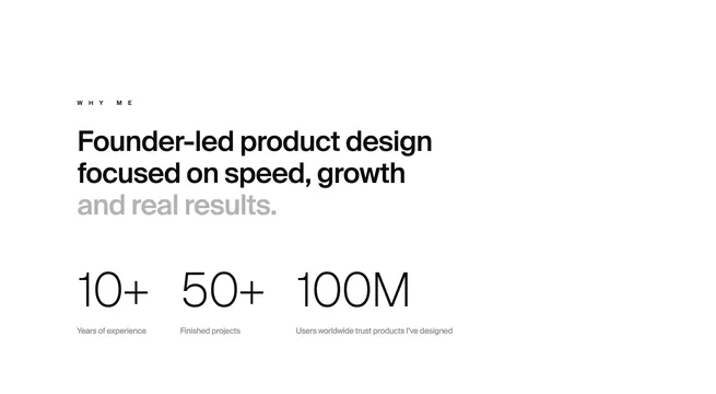
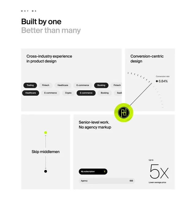
Light 2x2 bento grid selling solo-designer value with industry pills, conversion gauge, direct-line diagram, and subscription-vs-agency price comparison.
Summary
Light 2x2 bento grid selling solo-designer value with industry pills, conversion gauge, direct-line diagram, and subscription-vs-agency price comparison.
Visual description
Off-white canvas with WHY ME label and a split-weight headline Built by one Better than many. Four rounded white tiles form a 2x2 grid around a centered lime circle RH monogram. Top-left tile stacks black and gray industry pills (Trading, Fintech, Healthcare, E-commerce, Booking, Crypto, SaaS). Top-right shows a minimal gauge pointing to Conversion rate 6.84% with a green up arrow. Bottom-left uses a dotted vertical line between green and black dots for Skip middlemen. Bottom-right contrasts a black My subscription $ pill against a gray Agency $$$ bar beside Up to 5x Lower average price in thin display type.
Key takeaway
Use a bento grid so each freelancer advantage gets its own micro-visual instead of a bullet list. Lime accent on a monochrome base makes the personal mark and metrics pop. Price comparison pills communicate agency markup faster than prose.
Reuse notes
Independent designer or small studio positioning pages. Works when you have concrete metrics and industry breadth to show. Lime accent needs restraint; tiles require real data points to avoid feeling generic.