Preview image. Unlock full-res
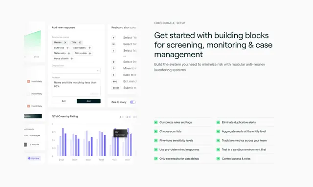
Light split feature section pairing layered product UI mocks on the left with a headline and two-column green checklist on the right.
Summary
A split feature section showing a collage of layered product screens on the left against a headline plus a dense two-column green checklist on the right. The defining move is the overlapping UI fragments that imply a deep, configurable tool without one full screenshot.
Visual description
White background. The left half is a loose collage of cropped light-gray interface pieces: an "Add new response" panel with tag chips and a reason field, a "Keyboard shortcuts" list, a small area chart, review checkboxes, and a "QC'd Cases by Rating" bar chart in purple with a hover tooltip. The right half opens with a monospace "CONFIGURABLE SETUP" eyebrow, a three-line dark sans-serif headline "Get started with building blocks for screening, monitoring & case management", and a muted subhead. Below sit two columns of feature bullets, each with a small green check (Customize rules and tags, Choose your lists, Fine-tune sensitivity levels, Eliminate duplicative alerts, Track key metrics, Control access & roles, and more).
Key takeaway
The overlapping screen fragments suggest breadth and configurability more convincingly than a single tidy screenshot. A monospace eyebrow signals a technical, developer-adjacent product before the headline is even read. The two-column green checklist packs many capabilities into a compact, scannable block.
Reuse notes
Well suited to data-dense or compliance tooling (here anti-money-laundering and case management) where the value is in many configurable controls. The mock collage needs real, legible UI pieces to feel credible rather than decorative. Keep checklist items short so both columns stay aligned.