Preview image. Unlock full-res
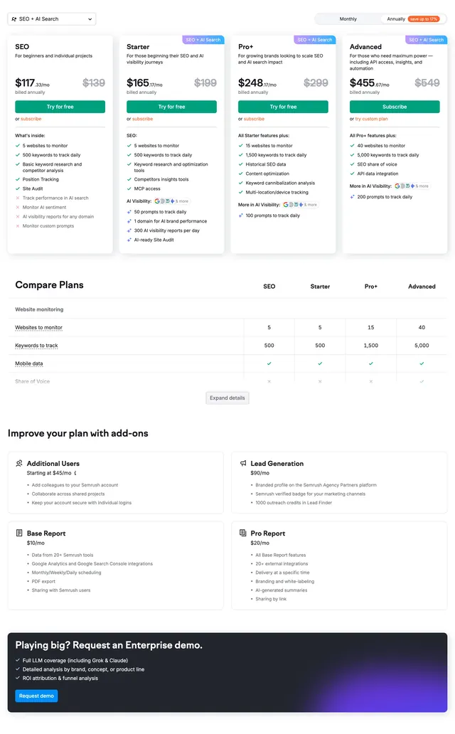
Light pricing page with monthly/annual toggle, four plan cards, a feature comparison table, add-on grid, and a dark enterprise demo banner.
Summary
Light pricing page with monthly/annual toggle, four plan cards, a feature comparison table, add-on grid, and a dark enterprise demo banner.
Visual description
White page opens with a Monthly/Annually toggle at top right and an orange save-up-to-17% badge on the annual side. Four equal pricing cards span SEO, Starter, Pro+, and Advanced with struck-through list prices, bold monthly rates, green check and red x feature rows, and mostly green Try for free buttons except Advanced which uses a dark Subscribe button; light blue SEO + AI Search badges sit on some tiers. Below, a Compare plans table rows websites, keywords, mobile data, and share of voice across the four columns with check/x icons and an Expand details control centered underneath. A four-card add-ons grid follows for Additional Users, Lead Generation, Base Report, and Pro Report, each with a small icon, price, bullets, and Learn more link. The section closes on a full-width dark navy banner with purple-blue glow, enterprise headline, three bullet points, and a bright blue Request demo button.
Key takeaway
Stacking cards, comparison table, and add-ons in one scroll gives buyers every decision layer without leaving the page. The annual toggle with a visible savings badge nudges commitment without hiding monthly. Keeping trial CTAs green and enterprise Subscribe dark separates self-serve from sales-led paths.
Reuse notes
Strong reference for complex SaaS pricing with multiple tiers and upsells. Needs real feature matrices and consistent check/x iconography. The enterprise gradient banner works as a final escalation for high-touch plans; lighter brands may want softer color on the dark band.