Preview image. Unlock full-res
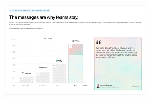
A light, data-led comparison that benchmarks the brand against named competitors in a bar chart, with a gradient testimonial card validating the headline number.
Summary
A comparison built on an actual chart: a reply-rate bar graph ranks the brand well above named competitors, sitting beside a single gradient-bordered testimonial that backs up the claim.
Visual description
White background patterned with faint dots. A highlighted monospace eyebrow states a metric ("15-45% reply rates vs 2% industry average") above a bold sans headline ("The messages are why teams stay.") and two lines of body copy. Lower left is a labelled bar chart with x and y axes: four bars rising from Cold Email (2%) to HeyReach (8%) to Clay (15%) to a tallest, gradient-filled Valley bar (30%), each topped with the competitor's small logo. Lower right is a tall testimonial card with a soft rainbow-gradient border holding a multi-line quote, an avatar, a name and title, and a company logo.
Key takeaway
Making the comparison literally a chart so the gap is felt, not just claimed, then placing one testimonial right beside it so proof and praise read together. The monospace eyebrow and axis labels lend a credible, analytical tone.
Reuse notes
Use when you have a defensible quantitative edge and are willing to name competitors. Bars topped with real competitor logos raise the stakes, so be sure the numbers are sourced. The gradient card adds warmth to an otherwise clinical layout; keep it to one quote so it does not compete with the chart.
More comparison sections
See all











More like this


Keep what you find
A free account saves references to boards and can send you a weekly email of picks based on what you save.
To see every result, go Pro.