Preview image. Unlock full-res
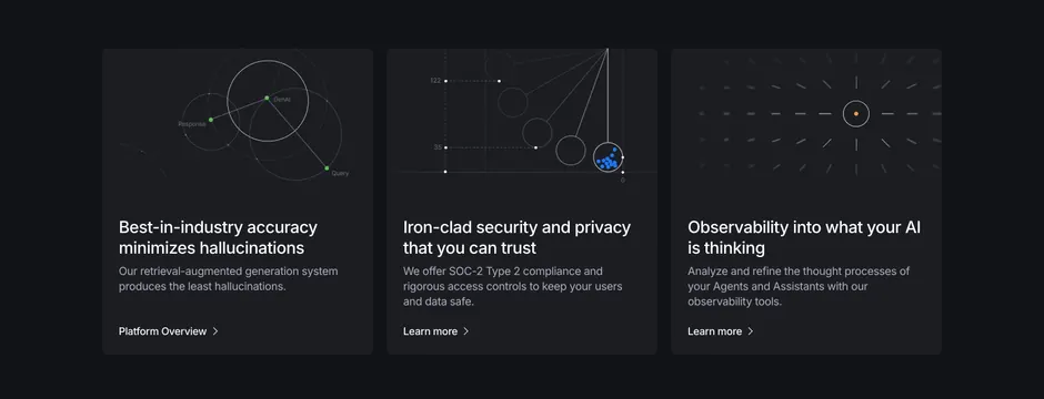
Dark three-column feature row where each card pairs an abstract technical data visualization with a headline, blurb and inline link.
Summary
A dark three-up feature row where each rounded card is led by a different abstract technical graphic (node graph, scatter plot, radial vector field) above a headline, short blurb and a chevron link.
Visual description
Three equal dark cards sit on a near-black background, each slightly lighter than the page. The top half of each card holds a fine-lined data visualization: card one shows a connected node graph labeling Response, GenAI and Query with green dots and concentric circles; card two shows a scatter plot with axis numbers (122, 35, 0), grey circles and a cluster of blue dots; card three shows a radial field of short grey dashes around a single orange dot inside a ring. Below each graphic is a two-line white headline ("Best-in-industry accuracy minimizes hallucinations", "Iron-clad security and privacy that you can trust", "Observability into what your AI is thinking"), a muted grey description, and a small "Platform Overview" or "Learn more" chevron link.
Key takeaway
The custom thin-line data visualizations make abstract AI capabilities (accuracy, security, observability) feel concrete and engineered rather than generic. Keeping the three graphics in a shared monoline style on matching dark cards makes the row read as one coherent system.
Reuse notes
Best for technical AI or data infrastructure products where bespoke diagrams can stand in for screenshots. The graphics carry the section, so they need to be genuinely custom and consistent. Works only on dark; the fine lines would lose contrast on a light background.