Preview image. Unlock full-res
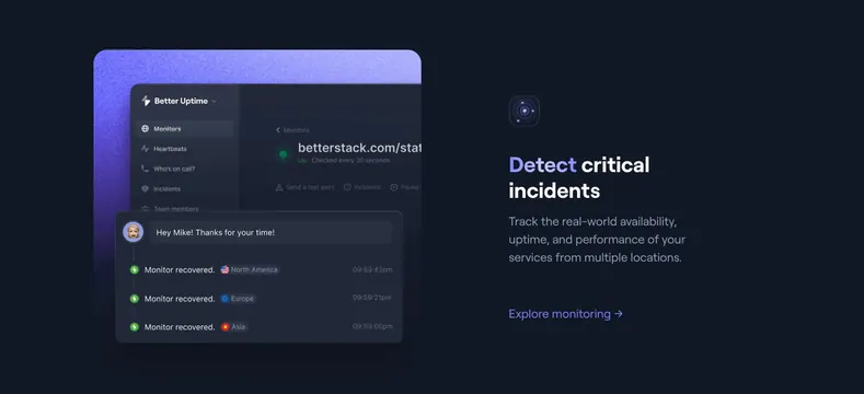
Dark split feature with layered Uptime dashboard and multi-region recovery timeline opposite Detect critical incidents copy.
Summary
Left product montage of Better Uptime monitor status and a floating recovery timeline card; right column headline Detect critical incidents with Explore monitoring link.
Visual description
Dark background with purple gradient glow left. Layered UI: background Better Uptime dashboard with Monitors sidebar, green Up status for betterstack.com/stat, 30-second check label. Foreground dark card shows avatar message and vertical timeline of Monitor recovered events with US, EU, and Asia flags and timestamps. Right: small radar icon, white headline, gray copy on multi-location uptime tracking, lavender Explore monitoring link.
Key takeaway
Timeline overlay on the dashboard tells an incident story, not just static metrics. Regional flags make multi-location monitoring tangible. Split with visual left / copy right alternates rhythm from logging section on the same page.
Reuse notes
Use for uptime or monitoring product bands on observability homepages. Needs credible UI and realistic timeline data. Works best when paired with opposite-split logging section.
More feature detail sections
See all

More like this
Keep what you find
A free account saves references to boards and can send you a weekly email of picks based on what you save.
To see every result, go Pro.