Preview image. Unlock full-res
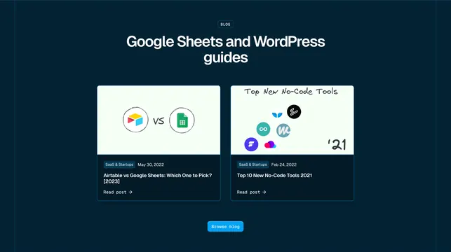
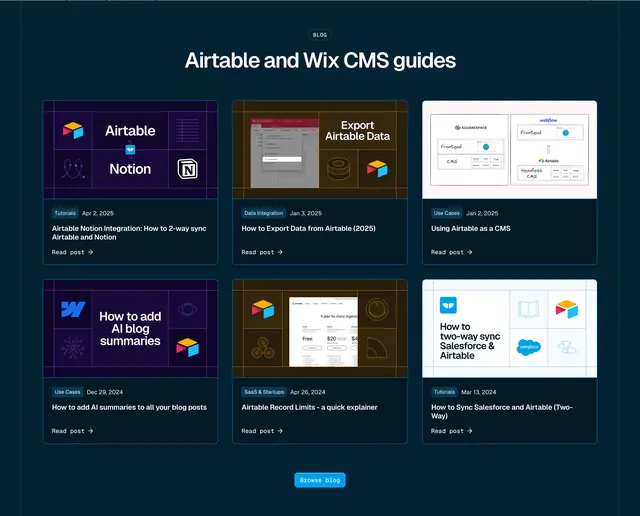
Dark blog section with a 3x2 card grid, colorful illustrated thumbnails, category tags, and a Browse blog CTA.
Summary
A dark navy blog section titled "Airtable and Wix CMS guides" displays six posts in a 3x2 grid with illustrated thumbnails, blue category pills, dates, and Read post links.
Visual description
Deep navy background. Centered BLOG pill badge and large white headline. Six uniform cards in a 3x2 grid, each split into a colorful illustrated thumbnail (grid-style graphics with app logos on purple, orange, or white backgrounds) and a dark content area with a solid blue category tag (Tutorials, Data Integration, Use Cases, SaaS & Startups), date, bold white title, and Read post arrow link. Centered bright blue Browse blog button at bottom.
Key takeaway
Illustrated thumbnails with consistent grid grammar make a technical blog feel branded rather than stock. Category pill plus date on one line creates scannable metadata. Six-card grid density works for SEO landing pages targeting specific tool pairs.
Reuse notes
Strong for developer or integration SaaS content hubs. Illustrated thumbnails require design production per post or a template system. Dark cards need sufficient thumbnail contrast.