Preview image. Unlock full-res
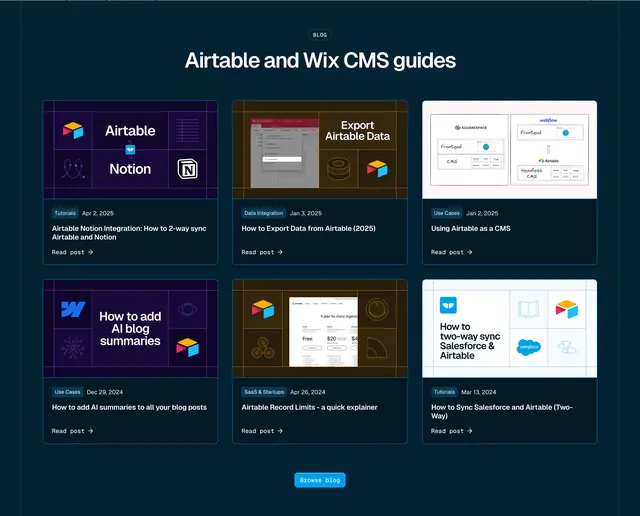
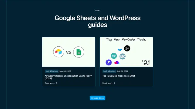
Dark blog preview with two large side-by-side cards featuring hand-drawn thumbnails and a Browse blog button.
Summary
A compact dark blog section highlights two featured posts with sketchy hand-drawn thumbnails, category tags, and a centered Browse blog CTA.
Visual description
Deep navy background. Centered BLOG outline pill and headline "Google Sheets and WordPress guides" with a subtle dot grid behind "guides." Two equal cards side by side, each with a light mint thumbnail (hand-drawn circles around app logos, handwritten vs text, or lo-fi tool logo clusters), dark lower half with blue SaaS & Startups tag, grey date, bold white title, and Read post link. Bright cyan Browse blog button centered below.
Key takeaway
Hand-drawn thumbnail style humanizes a technical brand without abandoning the dark SaaS shell. Two-up layout gives each post room when you only need a teaser, not a full grid. Dot-grid accent behind one headline word adds texture without imagery.
Reuse notes
Good for blog teasers on integration or tool-comparison landing pages. Lo-fi illustration style must stay consistent across posts. Less suitable when you need to show many articles at once.