Preview image. Unlock full-res
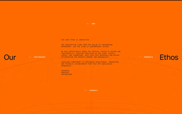
Full-bleed orange ethos section with oversized flanking headlines and centered monospace manifesto.
Summary
An orange full-bleed brand philosophy block with "Our" and "Ethos" as oversized edge anchors and a centered technical manifesto.
Visual description
Vibrant orange background with subtle curved wireframe grid lines. Large black sans-serif "Our" left and "Ethos" right sit on the horizontal midline. Center holds a block of black monospace all-caps copy about innovation, engineering, motorsport, and horological boundaries. Four compass-point labels with small crosshair icons: WRK top, WATCHMAKING left, KINEMATICS right, RESEARCH bottom.
Key takeaway
Flanking oversized words frame a dense center manifesto without a traditional headline hierarchy. Monospace all-caps body on a saturated field reads as engineering spec sheet, not marketing fluff.
Reuse notes
Strong for brand ethos or mission pages where copy is the hero. The compass labels need short, punchy category words. Orange field limits palette flexibility elsewhere on the page.