Preview image. Unlock full-res
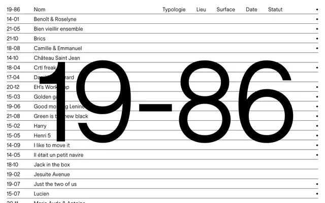
Architectural blueprint on white marble. The system is built on a high-contrast, minimalist palette of black and white, reminiscent of technical drawings.
Color palette
Primary text, headings, table lines, accent dots — provides stark contrast on white, suggesting permanence and clarity.
Page backgrounds, surface elements — establishes a clean, expansive canvas.
Link text in inactive state — offers a subtle desaturation from primary black, indicating interactive but not primary status.
Typography
- Weights
- 400
- Sizes
- 24px, 490px
- Line height
- 1, 1.2
- Letter spacing
- -0.0200em
- Fallback
- Montserrat
All textual content, from body copy to oversized display numbers. The single light weight (400) even at large sizes is the signature, providing an authoritative yet non-aggressive presence due to its subtlety.
Spacing & shape
Components
A single line item in a list with `paddingTop: 5px`, `paddingBottom: 8px`, and a `border-bottom` of 1px solid `Obsidian Black` (#000000). Text is `Obsidian Black` (#000000) using `store_norske_ja_light`.
Headers for tabular data, with `paddingBottom: 12px` and a `border-bottom` of 1px solid `Obsidian Black` (#000000). Text is `Obsidian Black` (#000000) using `store_norske_ja_light`.
Simple text link, using `Ash Gray` (#8C8C8C) for text when not primary, and `Obsidian Black` (#000000) or inferred accent colors for active states. Uses `store_norske_ja_light` font family.
Guidelines
- Prioritize `Obsidian Black` (#000000) text on `Pure White` (#FFFFFF) backgrounds for all content.
- Utilize `store_norske_ja_light` (or Montserrat) at weight 400 for all typography, maintaining a consistent light aesthetic.
- Implement -0.0200em letter spacing for all text elements to maintain typographic precision.
- Structure content primarily in tabular or list formats with clear 1px solid `Obsidian Black` (#000000) dividers for organization.
- Use subtle spacing increments like `5px` and `8px` for internal element padding, creating a comfortable yet contained feel.
- Leverage the large `490px` `store_norske_ja_light` weight 400 for dominant display elements to infuse monumental scale without visual heaviness.
- Avoid shadows or complex gradients; rely on pure black and white for depth and visual interest.
- Do not introduce additional font families or arbitrary weights; maintain the singular light aesthetic of `store_norske_ja_light`.
- Do not use saturated or vivid chromatic colors; the system relies on a strictly achromatic palette with a single muted accent (Ash Gray) for links.
- Avoid highly rounded corners or soft shapes; prioritize crisp lines and rectangular forms.
- Do not vary line heights excessively; stick to the defined `1.00` and `1.20` ratios for consistency and readability.
- Do not use a `pageMaxWidth`; allow content to span the full width where appropriate, but maintain internal content alignment.
About this system
ShowHide
This design system evokes the precision and meticulousness of architectural blueprints, presented with stark clarity. The visual field is dominated by pure black text and lines against an unblemished white background, creating an impression of objective documentation. The singular `store_norske_ja_light` font, with its consistent weight and precise letter-spacing, grounds the aesthetic in technical rigor while allowing large display elements like "19-86" to feel monumental yet understated due to their light weight.
The page exhibits a full-bleed, uncontained model, but with strong internal alignment and a structured tabular presentation that implies a grid. The hero section is characterized by the monumental '19-86' central to the screen, serving as both branding and a strong visual anchor. Content below flows in a list-like fashion with alternating text and subtle horizontal dividers creating a rhythm. The overall density is comfortable, with ample vertical spacing between content blocks, contrasting with the precise, tight typography.
The visual language is characterized by an absence of traditional imagery like photography or illustrations. Instead, the design foregrounds text as the primary visual element. The large-scale number '19-86' functions as a graphical focal point, treated with the same typographic precision as smaller text, yet gaining monumental presence through its size. Simple, singular black dots serve as purely functional icons, mirroring the minimalist and high-contrast approach.
Reminiscent of AIGA Journal, Grilli Type, Norm Architects, Office of Paul Sahre.
# 19–86 — Style Reference
> Architectural blueprint on white marble. The system is built on a high-contrast, minimalist palette of black and white, reminiscent of technical drawings.

**Theme:** light

**Site:** https://19-86.fr

This design system evokes the precision and meticulousness of architectural blueprints, presented with stark clarity. The visual field is dominated by pure black text and lines against an unblemished white background, creating an impression of objective documentation. The singular `store_norske_ja_light` font, with its consistent weight and precise letter-spacing, grounds the aesthetic in technical rigor while allowing large display elements like "19-86" to feel monumental yet understated due to their light weight.

## Tokens — Colors

| Name | Value | Token | Role |
|------|------|------|------|
| Obsidian Black | `#000000` | `--color-obsidian-black` | Primary text, headings, table lines, accent dots — provides stark contrast on white, suggesting permanence and clarity. |
| Pure White | `#FFFFFF` | `--color-pure-white` | Page backgrounds, surface elements — establishes a clean, expansive canvas. |
| Ash Gray | `#8C8C8C` | `--color-ash-gray` | Link text in inactive state — offers a subtle desaturation from primary black, indicating interactive but not primary status. |

## Tokens — Typography

### store_norske_ja_light
- **Substitute:** Montserrat
- **Weights:** 400
- **Sizes:** 24px, 490px
- **Line height:** 1, 1.2
- **Letter spacing:** -0.0200em
- **Role:** All textual content, from body copy to oversized display numbers. The single light weight (400) even at large sizes is the signature, providing an authoritative yet non-aggressive presence due to its subtlety.

## Tokens — Type Scale

| Role | Size | Line height | Letter spacing |
|------|------|------|------|
| body | 24px | 1.2 | -0.02em |
| display | 490px | 1 | -0.02em |

## Tokens — Spacing

- **Card padding:** 24px
- **Element gap:** 5px

## Tokens — Radius

- **none:** 0px

## Layout

The page exhibits a full-bleed, uncontained model, but with strong internal alignment and a structured tabular presentation that implies a grid. The hero section is characterized by the monumental '19-86' central to the screen, serving as both branding and a strong visual anchor. Content below flows in a list-like fashion with alternating text and subtle horizontal dividers creating a rhythm. The overall density is comfortable, with ample vertical spacing between content blocks, contrasting with the precise, tight typography.

## Imagery

The visual language is characterized by an absence of traditional imagery like photography or illustrations. Instead, the design foregrounds text as the primary visual element. The large-scale number '19-86' functions as a graphical focal point, treated with the same typographic precision as smaller text, yet gaining monumental presence through its size. Simple, singular black dots serve as purely functional icons, mirroring the minimalist and high-contrast approach.

## Components

### Project Table with Header

### Display Monogram

### Link Button Group

### Table Row
*Data display*

A single line item in a list with `paddingTop: 5px`, `paddingBottom: 8px`, and a `border-bottom` of 1px solid `Obsidian Black` (#000000). Text is `Obsidian Black` (#000000) using `store_norske_ja_light`.

### Table Header Cell
*Table column title*

Headers for tabular data, with `paddingBottom: 12px` and a `border-bottom` of 1px solid `Obsidian Black` (#000000). Text is `Obsidian Black` (#000000) using `store_norske_ja_light`.

### Link Button
*Interactive navigation*

Simple text link, using `Ash Gray` (#8C8C8C) for text when not primary, and `Obsidian Black` (#000000) or inferred accent colors for active states. Uses `store_norske_ja_light` font family.

## Guidelines

### Do

- Prioritize `Obsidian Black` (#000000) text on `Pure White` (#FFFFFF) backgrounds for all content.
- Utilize `store_norske_ja_light` (or Montserrat) at weight 400 for all typography, maintaining a consistent light aesthetic.
- Implement -0.0200em letter spacing for all text elements to maintain typographic precision.
- Structure content primarily in tabular or list formats with clear 1px solid `Obsidian Black` (#000000) dividers for organization.
- Use subtle spacing increments like `5px` and `8px` for internal element padding, creating a comfortable yet contained feel.
- Leverage the large `490px` `store_norske_ja_light` weight 400 for dominant display elements to infuse monumental scale without visual heaviness.

### Don't

- Avoid shadows or complex gradients; rely on pure black and white for depth and visual interest.
- Do not introduce additional font families or arbitrary weights; maintain the singular light aesthetic of `store_norske_ja_light`.
- Do not use saturated or vivid chromatic colors; the system relies on a strictly achromatic palette with a single muted accent (Ash Gray) for links.
- Avoid highly rounded corners or soft shapes; prioritize crisp lines and rectangular forms.
- Do not vary line heights excessively; stick to the defined `1.00` and `1.20` ratios for consistency and readability.
- Do not use a `pageMaxWidth`; allow content to span the full width where appropriate, but maintain internal content alignment.

## Agent Prompt Guide

### Quick Color Reference
- Text: `Obsidian Black` (#000000)
- Background: `Pure White` (#FFFFFF)
- Link (inactive): `Ash Gray` (#8C8C8C)
- Border: `Obsidian Black` (#000000)

### 3-5 Example Component Prompts
1. Create a header section with '19-86' as a large display element: use `Pure White` background. Text '19-86' should be `Obsidian Black` (#000000), `store_norske_ja_light` font at 490px size, weight 400, line-height 1.0, letter-spacing -0.02em.
2. Generate a tabular content list: `Pure White` background. Each row should have `Obsidian Black` (#000000) text (e.g., 'Benoît & Roselyne'), `store_norske_ja_light` font at 24px size, weight 400, line-height 1.2, letter-spacing -0.02em. Apply 5px padding-top, 8px padding-bottom, and a 1px solid `Obsidian Black` (#000000) bottom border to each row.
3. Design a sub-header for a table: use `Obsidian Black` (#000000) text (e.g., 'Typologie'), `store_norske_ja_light` font at 24px size, weight 400, line-height 1.2, letter-spacing -0.02em. Apply 12px padding-bottom and a 1px solid `Obsidian Black` (#000000) bottom border.
4. Create an interactive text link: use `Ash Gray` (#8C8C8C) text, `store_norske_ja_light` font at 24px size, weight 400, letter-spacing -0.02em.
More like this









Keep what you find
A free account saves references to boards and can send you a weekly email of picks based on what you save.
To see every result, go Pro.