Preview image. Unlock full-res
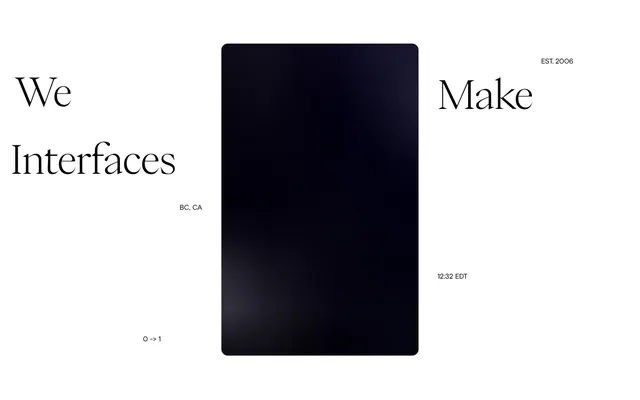
monochrome canvas, serif headlines as art
Color palette
Page backgrounds, prominent text, selected borders.
Primary text, core UI elements, contrasting backgrounds.
Secondary surface background, providing subtle depth against Void Black.
Button backgrounds for an interactive, muted effect.
Typography
- Weights
- 240
- Sizes
- 88px
- Line height
- 0.8
- Letter spacing
- -1.76
- Fallback
- Playfair Display
Display headings. It defines the brand's unique voice by using an extremely light weight and tight letter spacing at large sizes, creating a delicate yet commanding presence.
- Weights
- 350, 400
- Sizes
- 12px, 16px
- Line height
- 1, 1.2, 1.4, 1.76, 2
- Letter spacing
- -0.16
- Fallback
- Inter
Body text, navigation, and utility elements. Its slight letter-spacing creates a refined, spacious feel even at smaller sizes.
Spacing & shape
Components
Transparent background, white 1px border, white text. No padding, relying on surrounding layout for spacing. Used for prominent actions like 'Get in Touch'.
Background color rgba(186, 186, 186, 0.2) with white text. Pill-shaped with 50px border-radius. Padding 0px top/bottom, 16px left/right. Used to list client names in a subtle, contained manner.
Guidelines
- Prioritize PP Eiko (240 weight, 88px, -1.76px letter-spacing) for all main headings to maintain dramatic visual impact.
- Use Basis Grotesque Pro (350/400 weight, 12px/16px) for all functional text with -0.16px letter-spacing for consistent readability.
- Apply Canvas White (#ffffff) as the dominant background color for most sections to create a bright, expansive canvas.
- Use Void Black (#000000) for primary text on Canvas White backgrounds, ensuring AAA contrast.
- Employ 50px border-radius for all interactive elements and contained content blocks to maintain a soft yet defined shape.
- Maintain generous padding; apply 0px top/bottom, 16px left/right for client tag buttons and other container specific components.
- Utilize rgba(186, 186, 186, 0.2) background for subtly interactive elements on dark backgrounds, providing visual feedback without strong color.
- Avoid using highly saturated or chromatic colors; adhere strictly to the monochrome palette with subtle gray variations.
- Do not deviate from the specified font families; PP Eiko and Basis Grotesque Pro are core to the brand's typographic identity.
- Avoid box shadows or strong elevation effects, as the system relies on color contrast and negative space for hierarchy.
- Do not use letter-spacing values other than -1.76px for display text and -0.16px for body text.
- Avoid tightly packed sections; ensure `sectionGap` of 900px vertical spacing between major content blocks.
- Do not introduce square or sharp-cornered elements; 50px is the minimum radius for rounded forms including buttons.
About this system
ShowHide
This design system conjures a mood of restrained sophistication and intellectual calm. Large, dramatic serif typography acts as art against a stark black and white canvas, establishing an immediate sense of gravity and refined taste. The composition prioritizes ample negative space, allowing elements to breathe and create an atmosphere of quiet authority, where every visual decision feels deliberate and impactful.
The layout follows a full-bleed model with content centered within implied vertical segments, rather than a fixed maximum width. The hero section features a dramatic, highly asymmetric composition of large serif headings framing a central, dark, rounded rectangle. Sections below adopt a similar asymmetrical arrangement, with large dark blocks often balanced by sparse text or logos. There's a strong visual rhythm established by large, consistent vertical section gaps (900px), creating a spacious, almost architectural feel. Content is arranged in alternating visual weights rather than strict grids. Navigation is minimal, likely restricted to an off-screen menu. The overall density is very spacious, emphasizing individual elements and generous negative space.
The site's visual language is dominated by UI-like simulations or abstract dark rectangles that suggest screens or digital interfaces. There are no traditional photographs or illustrations. The treatment is full-bleed, occupying significant visual real estate, with softly rounded corners (implied by the 50px radius). These elements serve a decorative, atmospheric role, enhancing the 'interfaces' theme rather than explaining content or showcasing products directly. The density is medium, with these large visual elements balanced by extensive negative space and purposeful typography.
Reminiscent of Huge Inc., Anton & Irene, Basic (Agency).
# Metalab — Style Reference
> monochrome canvas, serif headlines as art

**Theme:** light

**Site:** https://metalab.com

This design system conjures a mood of restrained sophistication and intellectual calm. Large, dramatic serif typography acts as art against a stark black and white canvas, establishing an immediate sense of gravity and refined taste. The composition prioritizes ample negative space, allowing elements to breathe and create an atmosphere of quiet authority, where every visual decision feels deliberate and impactful.

## Tokens — Colors

| Name | Value | Token | Role |
|------|------|------|------|
| Canvas White | `#ffffff` | `--color-canvas-white` | Page backgrounds, prominent text, selected borders. |
| Void Black | `#000000` | `--color-void-black` | Primary text, core UI elements, contrasting backgrounds. |
| Ash Surface | `#252525` | `--color-ash-surface` | Secondary surface background, providing subtle depth against Void Black. |
| Elevated Grey | `#bababa` | `--color-elevated-grey` | Button backgrounds for an interactive, muted effect. |

## Tokens — Typography

### PP Eiko
- **Substitute:** Playfair Display
- **Weights:** 240
- **Sizes:** 88px
- **Line height:** 0.8
- **Letter spacing:** -1.76
- **Role:** Display headings. It defines the brand's unique voice by using an extremely light weight and tight letter spacing at large sizes, creating a delicate yet commanding presence.

### Basis Grotesque Pro
- **Substitute:** Inter
- **Weights:** 350, 400
- **Sizes:** 12px, 16px
- **Line height:** 1, 1.2, 1.4, 1.76, 2
- **Letter spacing:** -0.16
- **Role:** Body text, navigation, and utility elements. Its slight letter-spacing creates a refined, spacious feel even at smaller sizes.

## Tokens — Type Scale

| Role | Size | Line height | Letter spacing |
|------|------|------|------|
| caption | 12px | 1.76 | -0.16px |
| body | 16px | 1.2 | -0.16px |
| display | 88px | 0.8 | -1.76px |

## Tokens — Spacing

- **Card padding:** 24px
- **Element gap:** 8px

## Tokens — Radius

- **General:** 50px
- **Buttons:** 50px
- **forms:** 50px

## Layout

The layout follows a full-bleed model with content centered within implied vertical segments, rather than a fixed maximum width. The hero section features a dramatic, highly asymmetric composition of large serif headings framing a central, dark, rounded rectangle. Sections below adopt a similar asymmetrical arrangement, with large dark blocks often balanced by sparse text or logos. There's a strong visual rhythm established by large, consistent vertical section gaps (900px), creating a spacious, almost architectural feel. Content is arranged in alternating visual weights rather than strict grids. Navigation is minimal, likely restricted to an off-screen menu. The overall density is very spacious, emphasizing individual elements and generous negative space.

## Imagery

The site's visual language is dominated by UI-like simulations or abstract dark rectangles that suggest screens or digital interfaces. There are no traditional photographs or illustrations. The treatment is full-bleed, occupying significant visual real estate, with softly rounded corners (implied by the 50px radius). These elements serve a decorative, atmospheric role, enhancing the 'interfaces' theme rather than explaining content or showcasing products directly. The density is medium, with these large visual elements balanced by extensive negative space and purposeful typography.

## Components

### Ghost Button

### Client Tag Buttons

### Stat / Identity Block

### Ghost Button
*Primary Call to Action*

Transparent background, white 1px border, white text. No padding, relying on surrounding layout for spacing. Used for prominent actions like 'Get in Touch'.

### Client Tag Button
*Client Logo/Identifier*

Background color rgba(186, 186, 186, 0.2) with white text. Pill-shaped with 50px border-radius. Padding 0px top/bottom, 16px left/right. Used to list client names in a subtle, contained manner.

## Guidelines

### Do

- Prioritize PP Eiko (240 weight, 88px, -1.76px letter-spacing) for all main headings to maintain dramatic visual impact.
- Use Basis Grotesque Pro (350/400 weight, 12px/16px) for all functional text with -0.16px letter-spacing for consistent readability.
- Apply Canvas White (#ffffff) as the dominant background color for most sections to create a bright, expansive canvas.
- Use Void Black (#000000) for primary text on Canvas White backgrounds, ensuring AAA contrast.
- Employ 50px border-radius for all interactive elements and contained content blocks to maintain a soft yet defined shape.
- Maintain generous padding; apply 0px top/bottom, 16px left/right for client tag buttons and other container specific components.
- Utilize rgba(186, 186, 186, 0.2) background for subtly interactive elements on dark backgrounds, providing visual feedback without strong color.

### Don't

- Avoid using highly saturated or chromatic colors; adhere strictly to the monochrome palette with subtle gray variations.
- Do not deviate from the specified font families; PP Eiko and Basis Grotesque Pro are core to the brand's typographic identity.
- Avoid box shadows or strong elevation effects, as the system relies on color contrast and negative space for hierarchy.
- Do not use letter-spacing values other than -1.76px for display text and -0.16px for body text.
- Avoid tightly packed sections; ensure `sectionGap` of 900px vertical spacing between major content blocks.
- Do not introduce square or sharp-cornered elements; 50px is the minimum radius for rounded forms including buttons.

## Agent Prompt Guide

Quick Color Reference:
- Text (primary): #000000
- Background (primary): #ffffff
- Button Background (active): #bababa
- Button Background (client tag): rgba(186, 186, 186, 0.2)
- Accent Border: #ffffff

Example Component Prompts:
1. Create a display hero section: background #ffffff. Headline 'We' using PP Eiko 240 weight, 88px size, #000000, letter-spacing -1.76px. Place a central placeholder element with background #252525 and 50px radius, approximately 400px wide by 600px high.
2. Generate a client spotlight section: background #ffffff. Client name 'Robinhood' using Basis Grotesque Pro 400 weight, 16px size, #000000, letter-spacing -0.16px. Accompany with a 'Client Tag Button' below it: background rgba(186, 186, 186, 0.2), text #ffffff, 50px radius, 0px vertical padding, 16px horizontal padding.
3. Design a navigation link: text 'Get in Touch' using Basis Grotesque Pro 400 weight, 16px size, #000000, letter-spacing -0.16px. Apply a 1px #ffffff bottom border on hover, with 0px padding in all directions.
More like this








Keep what you find
A free account saves references to boards and can send you a weekly email of picks based on what you save.
To see every result, go Pro.