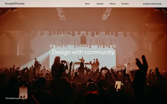
Preview image. Unlock full-res
Gallery Canvas, Subtle Presence
Color palette
Primary text, major borders, subtle ghost button borders, essential iconography
Muted text, secondary borders, background for inactive badge states
Background for filled buttons and interactive elements, providing a subtle lift from the canvas
Primary page background, elevated surface backgrounds in light theme
Secondary page and card backgrounds, serving as a subtly warmer alternative to pure white
Hairline borders for badges and small UI elements, providing structure with minimal visual weight
Text within specific input fields, slightly softer than Midnight Ink
Typography
- Weights
- 400
- Sizes
- 8px, 10px, 14px, 17px, 20px, 24px, 34px, 50px, 72px
- Line height
- 1, 1.28, 1.29, 1.33, 1.4, 1.41, 1.43, 1.6, 1.71
- Letter spacing
- -0.01em
- Fallback
- Inter
Primary typeface for all UI elements, body text, headings, and interactive components. Its consistent weight and precise tracking maintain a readable, contemporary feel across all sizes.
- Weights
- 400
- Sizes
- 34px
- Line height
- 1
- Letter spacing
- normal
- Fallback
- PT Serif
Decorative typeface used for specific display text or artistic branding elements, providing a distinct, bespoke character at larger sizes.
Spacing & shape
Components
Background: Cloud Cover (#ecebe7), Text: Midnight Ink (#000000), Border: 1px solid Midnight Ink (#000000), Radius: 20px. Padding variable but a common instance is 12px vertical, 33px horizontal. Font: Messina Sans 400.
Background: transparent, Text: Midnight Ink (#000000), Border: 1px solid Midnight Ink (#000000). No border-radius. Padding of 15px vertical, 0px horizontal. Font: Messina Sans 400.
Background: rgba(0, 0, 0, 0.05) (a very light black tint), Text: Midnight Ink (#000000), Border: 1px solid Midnight Ink (#000000), Radius: 100px 0px 0px 100px (curved left side). Padding 8px vertical, 18-20px horizontal. Font: Messina Sans 400.
Background: transparent, no explicit border or shadow, Radius: 8px. Internally, content may use 12px or 15px padding. Image blocks are sharp-edged, but the containing card defines 8px rounded corners.
Background: transparent, Text: Midnight Ink (#000000), Border: 1px solid Steel Gaze (#a2a1a1), Radius: 3.4px. No padding at the badge level, internal element spacing (4px) may apply.
Background: Fog (#8c8c8c), Text: Midnight Ink (#000000), no explicit border. No border-radius. No padding at the badge level.
Background: rgba(0, 0, 0, 0.05), Placeholder Text: Carbon Text (#333333), Border: 1px solid Midnight Ink (#000000), Radius: 100px 0px 0px 100px (curved left side). Padding 8px vertical, 20px left. Font: Messina Sans 400.
Background: transparent, Text: Midnight Ink (#000000), no explicit border or radius. Padding is around 15px vertical, 0px horizontal for alignment within list items. Font: Messina Sans 400.
Guidelines
- Use Fog (#8c8c8c) for all muted text, secondary icon outlines, and inactive UI elements.
- Apply a 20px border-radius to all primary action buttons, using Cloud Cover (#ecebe7) for the background and Midnight Ink (#000000) for text and border.
- Maintain -0.01em letter-spacing for all Messina Sans text elements to preserve typographic precision.
- Organize content into clean card structures with an 8px border-radius, remaining transparent and shadowless.
- Utilize Warm Linen (#f9f7f3) or Canvas White (#ffffff) as primary neutral surface backgrounds, alternating for visual segmentation.
- Implement the 3.4px border-radius for badges to create subtle corner rounding distinct from larger components.
- Ensure a minimum elementGap of 8px between discrete UI elements, especially within containers like badges or form fields.
- Do not introduce strong accent colors; confine the palette to the established neutrals for content segmentation and interaction.
- Avoid heavy drop shadows or significant elevation; the design relies on subtle background shifts and borders for separation.
- Do not use generic button styles; prefer the pre-defined Filled, Ghost, or Pill variants with their specific radii and visual properties.
- Refrain from using varied letter-spacings beyond the Messina Sans default; maintain consistent tracking.
- Do not use highly saturated imagery; imagery should be high-contrast or desaturated to complement the neutral palette.
- Avoid decorative gradients; the system prefers flat colors and subtle textural shifts.
- Do not vary line heights significantly; adhere to the Messina Sans predefined line-height scale for all text roles.
About this system
ShowHide
Accept&Proceed presents a subtly textured, spacious environment that feels like a quiet gallery space. Neutral tones dominate, allowing content and subtle interaction cues to stand out. Typography is precise and understated, maintaining a sense of refined professionalism. Interactions are minimal and direct, avoiding heavy graphics or loud effects, reinforcing an atmosphere of focused artistic curation.
The site uses a max-width contained layout with centered content blocks, punctuated by occasional full-bleed hero sections. The header is sticky and minimal. Sections are vertically stacked with consistent spacing (48px sectionGap), creating a rhythmic flow. Content often alternates between left-aligned text and right-aligned visuals or vice-versa within a two-column grid. Project listings often utilize a multi-column card grid pattern. Density is comfortable, with ample whitespace providing breathable separation between elements and sections.
Imagery primarily features product shots, abstract digital renderings (like the globe), and high-contrast event photography. Photography leans towards moody or impactful scenes with desaturated or monochrome treatments, emphasizing shape and form over vibrant color. Illustrations are digital, often abstract and volumetric like the blue globe effect, serving an explanatory or atmospheric role rather than literal representation. Icons are minimal, outlined, thin, and monochrome (Midnight Ink) for functionality. Imagery is often contained within card structures or hero sections, acting as key content rather than decorative filler, and sometimes full-bleed in hero sections.
Reminiscent of Kontrapunkt, B-Reel, North Kingdom, Basic/Dept.
# Acceptandproceed — Style Reference
> Gallery Canvas, Subtle Presence

**Theme:** light

**Site:** https://www.acceptandproceed.com

Accept&Proceed presents a subtly textured, spacious environment that feels like a quiet gallery space. Neutral tones dominate, allowing content and subtle interaction cues to stand out. Typography is precise and understated, maintaining a sense of refined professionalism. Interactions are minimal and direct, avoiding heavy graphics or loud effects, reinforcing an atmosphere of focused artistic curation.

## Tokens — Colors

| Name | Value | Token | Role |
|------|------|------|------|
| Midnight Ink | `#000000` | `--color-midnight-ink` | Primary text, major borders, subtle ghost button borders, essential iconography |
| Fog | `#8c8c8c` | `--color-fog` | Muted text, secondary borders, background for inactive badge states |
| Cloud Cover | `#ecebe7` | `--color-cloud-cover` | Background for filled buttons and interactive elements, providing a subtle lift from the canvas |
| Canvas White | `#ffffff` | `--color-canvas-white` | Primary page background, elevated surface backgrounds in light theme |
| Warm Linen | `#f9f7f3` | `--color-warm-linen` | Secondary page and card backgrounds, serving as a subtly warmer alternative to pure white |
| Steel Gaze | `#a2a1a1` | `--color-steel-gaze` | Hairline borders for badges and small UI elements, providing structure with minimal visual weight |
| Carbon Text | `#333333` | `--color-carbon-text` | Text within specific input fields, slightly softer than Midnight Ink |

## Tokens — Typography

### Messina Sans
- **Substitute:** Inter
- **Weights:** 400
- **Sizes:** 8px, 10px, 14px, 17px, 20px, 24px, 34px, 50px, 72px
- **Line height:** 1, 1.28, 1.29, 1.33, 1.4, 1.41, 1.43, 1.6, 1.71
- **Letter spacing:** -0.01em
- **Role:** Primary typeface for all UI elements, body text, headings, and interactive components. Its consistent weight and precise tracking maintain a readable, contemporary feel across all sizes.

### Letterformvariations 04 Dmgx
- **Substitute:** PT Serif
- **Weights:** 400
- **Sizes:** 34px
- **Line height:** 1
- **Letter spacing:** normal
- **Role:** Decorative typeface used for specific display text or artistic branding elements, providing a distinct, bespoke character at larger sizes.

## Tokens — Type Scale

Perfect Fourth (1.333) from 14px base.

| Role | Size | Line height | Letter spacing |
|------|------|------|------|
| body | 14px | 1.43 | -0.01em |
| button | 17px | 1.41 | -0.01em |
| subheading | 20px | 1.4 | -0.01em |
| heading-sm | 24px | 1.29 | -0.01em |
| heading | 34px | 1.33 | -0.01em |
| heading-lg | 50px | 1.6 | -0.01em |
| display | 72px | 1.71 | -0.01em |

## Tokens — Spacing

- **Section gap:** 48px
- **Card padding:** 12px
- **Element gap:** 8px

## Tokens — Radius

- **Buttons:** 20px
- **Inputs:** 100px
- **Cards:** 8px
- **badges:** 3.4px

## Layout

The site uses a max-width contained layout with centered content blocks, punctuated by occasional full-bleed hero sections. The header is sticky and minimal. Sections are vertically stacked with consistent spacing (48px sectionGap), creating a rhythmic flow. Content often alternates between left-aligned text and right-aligned visuals or vice-versa within a two-column grid. Project listings often utilize a multi-column card grid pattern. Density is comfortable, with ample whitespace providing breathable separation between elements and sections.

## Imagery

Imagery primarily features product shots, abstract digital renderings (like the globe), and high-contrast event photography. Photography leans towards moody or impactful scenes with desaturated or monochrome treatments, emphasizing shape and form over vibrant color. Illustrations are digital, often abstract and volumetric like the blue globe effect, serving an explanatory or atmospheric role rather than literal representation. Icons are minimal, outlined, thin, and monochrome (Midnight Ink) for functionality. Imagery is often contained within card structures or hero sections, acting as key content rather than decorative filler, and sometimes full-bleed in hero sections.

## Components

### Filled Button: Read Story Large
*Primary interactive button for calls to action.*

Background: Cloud Cover (#ecebe7), Text: Midnight Ink (#000000), Border: 1px solid Midnight Ink (#000000), Radius: 20px. Padding variable but a common instance is 12px vertical, 33px horizontal. Font: Messina Sans 400.

### Ghost Button: Navigation Link
*Subtle navigation or secondary action within content. Inherits text color from parent context.*

Background: transparent, Text: Midnight Ink (#000000), Border: 1px solid Midnight Ink (#000000). No border-radius. Padding of 15px vertical, 0px horizontal. Font: Messina Sans 400.

### Pill Button: Curved Left
*Unique interactive element, often for specialized actions or tags, with an asymmetric pill shape.*

Background: rgba(0, 0, 0, 0.05) (a very light black tint), Text: Midnight Ink (#000000), Border: 1px solid Midnight Ink (#000000), Radius: 100px 0px 0px 100px (curved left side). Padding 8px vertical, 18-20px horizontal. Font: Messina Sans 400.

### Project Card: Image Top
*Container for project previews, featuring an imagery block and descriptive text.*

Background: transparent, no explicit border or shadow, Radius: 8px. Internally, content may use 12px or 15px padding. Image blocks are sharp-edged, but the containing card defines 8px rounded corners.

### Soft Badge: Outlined Text
*Categorization or tagging element, visually lightweight.*

Background: transparent, Text: Midnight Ink (#000000), Border: 1px solid Steel Gaze (#a2a1a1), Radius: 3.4px. No padding at the badge level, internal element spacing (4px) may apply.

### Muted Badge: Grey Background
*Secondary categorization, distinct from active or primary tags.*

Background: Fog (#8c8c8c), Text: Midnight Ink (#000000), no explicit border. No border-radius. No padding at the badge level.

### Rounded Input Field: Curved Left
*Input element with a distinct rounded style for forms.*

Background: rgba(0, 0, 0, 0.05), Placeholder Text: Carbon Text (#333333), Border: 1px solid Midnight Ink (#000000), Radius: 100px 0px 0px 100px (curved left side). Padding 8px vertical, 20px left. Font: Messina Sans 400.

### Listen Button: Minimal
*Interactive element for audio content, integrated subtly into lists.*

Background: transparent, Text: Midnight Ink (#000000), no explicit border or radius. Padding is around 15px vertical, 0px horizontal for alignment within list items. Font: Messina Sans 400.

## Guidelines

### Do

- Use Fog (#8c8c8c) for all muted text, secondary icon outlines, and inactive UI elements.
- Apply a 20px border-radius to all primary action buttons, using Cloud Cover (#ecebe7) for the background and Midnight Ink (#000000) for text and border.
- Maintain -0.01em letter-spacing for all Messina Sans text elements to preserve typographic precision.
- Organize content into clean card structures with an 8px border-radius, remaining transparent and shadowless.
- Utilize Warm Linen (#f9f7f3) or Canvas White (#ffffff) as primary neutral surface backgrounds, alternating for visual segmentation.
- Implement the 3.4px border-radius for badges to create subtle corner rounding distinct from larger components.
- Ensure a minimum elementGap of 8px between discrete UI elements, especially within containers like badges or form fields.

### Don't

- Do not introduce strong accent colors; confine the palette to the established neutrals for content segmentation and interaction.
- Avoid heavy drop shadows or significant elevation; the design relies on subtle background shifts and borders for separation.
- Do not use generic button styles; prefer the pre-defined Filled, Ghost, or Pill variants with their specific radii and visual properties.
- Refrain from using varied letter-spacings beyond the Messina Sans default; maintain consistent tracking.
- Do not use highly saturated imagery; imagery should be high-contrast or desaturated to complement the neutral palette.
- Avoid decorative gradients; the system prefers flat colors and subtle textural shifts.
- Do not vary line heights significantly; adhere to the Messina Sans predefined line-height scale for all text roles.

## Agent Prompt Guide

Quick Color Reference:
text: #000000
background: #ffffff
border: #000000
accent: no distinct accent color
primary action: no distinct CTA color

Example Component Prompts:
No distinct primary action color was observed; use the extracted neutral button treatments instead of inventing a filled CTA color.
2. Design a transparent project card: background transparent, no border or shadow, 8px border-radius. Inside place an image full width and a heading 'Featured Project' in Messina Sans 400, 24px, -0.01em letter-spacing, color Midnight Ink (#000000).
3. Generate a soft badge: background transparent, text Midnight Ink (#000000), 1px solid Steel Gaze (#a2a1a1) border, 3.4px border-radius. Text 'Technology' in Messina Sans 400, 8px, -0.01em letter-spacing. Use 4px elementGap around its content.
More like this









Keep what you find
A free account saves references to boards and can send you a weekly email of picks based on what you save.
To see every result, go Pro.