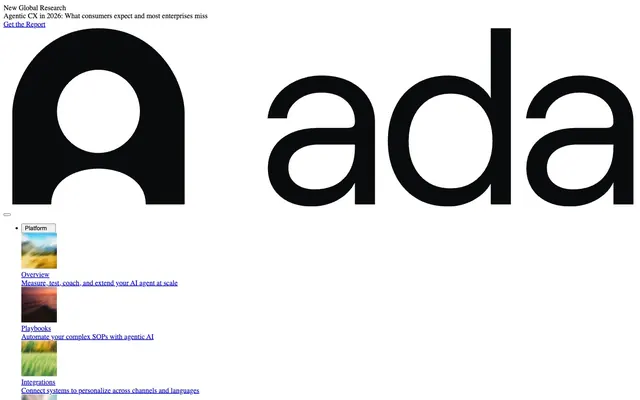
Preview image. Unlock full-res
Color palette
Dark borders and separators for elevated surfaces and inverted UI. Do not promote it to the primary CTA color
Page background, surface background for all content blocks. The primary color base for the entire system providing a clean, bright foundation
Background for secondary or ghost buttons, indicating an interactive but low-emphasis element
Default browser link color, appears as informative text links
Typography
- Weights
- 400, 700
- Sizes
- 16px, 19px, 24px, 32px
- Line height
- 1.2
- Letter spacing
- normal
- Fallback
- serif
Core content font for headings, body text, links, and navigation. Its serifs lend a classic, authoritative feel, reinforcing the informative and research-heavy nature of the content. Headlines often use bolder weights to establish hierarchy, while body text maintains readability with the 400 weight. Used for most of the prominent text, including the brand name.
- Weights
- 400
- Sizes
- 13px
- Line height
- 1.2
- Letter spacing
- normal
- Fallback
- sans-serif
Supportive text for buttons, navigation sub-items, and small informational text. Its sans-serif nature provides a utilitarian contrast to the Times serif font, used for functional elements where clarity and conciseness are prioritized.
Spacing & shape
Components
Background: Fog Button (#efefef), Text: Ghost Ink (#000000), Border: 1px Ghost Ink (#000000) on all sides, Padding: 1px top/bottom, 6px left/right. Radius: 0px.
Text: Ghost Ink (#000000), Font: Times 16px, Line Height: 1.20. No padding or background by default, relies on text contrast. Links are underlined by default (browser behavior), this is not a custom style.
Background: Transparent (rgba(0, 0, 0, 0)), Border: None, Box Shadow: None, Padding: 0px, Radius: 0px. Acts as a simple wrapper for content without imposing visual style.
Guidelines
- Prioritize Times (serif) for all headings and primary body text to establish an authoritative tone.
- Use Arial (sans-serif) only for functional elements like buttons or small navigational text, ensuring clear distinction from content.
- Maintain high contrast throughout the interface, primarily using Ghost Ink (#000000) on Canvas White (#FFFFFF) backgrounds.
- Apply Fog Button (#efefef) as the background for any button intended to be visually subtle but interactive.
- Ensure all interactive elements, where visible borders are present, such as ghost buttons, use a 1px Ghost Ink (#000000) border.
- Adhere to 0px border-radius for all component corners, reinforcing a sharp, precise aesthetic.
- Utilize 16px as the standard vertical element separation, with larger 40px gaps for section breaks.
- Avoid using any colors other than Ghost Ink (#000000), Canvas White (#FFFFFF), Fog Button (#efefef), and the browser default blue link color in the UI.
- Do not introduce rounded corners or box shadows, as the system relies on flat surfaces and sharp edges.
- Do not deviate from the specified font families or their assigned roles; Times is for content, Arial for controls.
- Avoid decorative gradients or background images that detract from the content-first focus.
- Do not use padding on cards; they should act as invisible containers using the default 0px padding.
- Do not apply custom styling to links; allow the browser default underlined blue to indicate interactivity.
- Never use less than 16px vertical element spacing, except for specific button padding.
About this system
ShowHide
The Ada design system establishes a stark, information-first aesthetic built on high contrast and minimal ornamentation. Typography anchors the visual hierarchy, with a clear distinction between prominent headings and concise body text. Surfaces are flat and monochromatic, emphasizing content over decorative elements. Interaction is signaled through bold black borders and subtle background shifts, ensuring focus remains on actionable items.
The page exhibits a full-bleed layout, maximizing screen width for content delivery. The hero section features a prominent, centered headline over a dark background. Content sections follow in a vertical stack, utilizing consistent vertical spacing. While the layout often features a single column for primary content, some areas suggest implicit two-column arrangements for text and visual pairings. Navigation primarily appears as a static top bar with interactive dropdowns, and occasional nested lists for sub-navigation. The overall density is comfortable, with ample breathing room between content blocks, but the information itself is presented concisely.
The site predominantly uses abstract, textural imagery with a muted, often blurred aesthetic, serving as atmospheric backdrops rather than explicit content. Product screenshots are minimal. Icons are monochrome, often using Ghost Ink outlines, maintaining the stark, high-contrast feel. Imagery density is low, with visuals primarily serving as decorative accents or visual breaks rather than key information carriers.
Reminiscent of OpenAI, Notion, Substack, Linear.
# Ada — Style Reference
> Contrast-driven document

**Theme:** light

**Site:** https://www.ada.cx

The Ada design system establishes a stark, information-first aesthetic built on high contrast and minimal ornamentation. Typography anchors the visual hierarchy, with a clear distinction between prominent headings and concise body text. Surfaces are flat and monochromatic, emphasizing content over decorative elements. Interaction is signaled through bold black borders and subtle background shifts, ensuring focus remains on actionable items.

## Tokens — Colors

| Name | Value | Token | Role |
|------|------|------|------|
| Ghost Ink | `#000000` | `--color-ghost-ink` | Dark borders and separators for elevated surfaces and inverted UI. Do not promote it to the primary CTA color |
| Canvas White | `#FFFFFF` | `--color-canvas-white` | Page background, surface background for all content blocks. The primary color base for the entire system providing a clean, bright foundation |
| Fog Button | `#efefef` | `--color-fog-button` | Background for secondary or ghost buttons, indicating an interactive but low-emphasis element |
| Subtle Link Blue | `#0000ee` | `--color-subtle-link-blue` | Default browser link color, appears as informative text links |

## Tokens — Typography

### Times
- **Substitute:** serif
- **Weights:** 400, 700
- **Sizes:** 16px, 19px, 24px, 32px
- **Line height:** 1.2
- **Letter spacing:** normal
- **Role:** Core content font for headings, body text, links, and navigation. Its serifs lend a classic, authoritative feel, reinforcing the informative and research-heavy nature of the content. Headlines often use bolder weights to establish hierarchy, while body text maintains readability with the 400 weight. Used for most of the prominent text, including the brand name.

### Arial
- **Substitute:** sans-serif
- **Weights:** 400
- **Sizes:** 13px
- **Line height:** 1.2
- **Letter spacing:** normal
- **Role:** Supportive text for buttons, navigation sub-items, and small informational text. Its sans-serif nature provides a utilitarian contrast to the Times serif font, used for functional elements where clarity and conciseness are prioritized.

## Tokens — Type Scale

Major Third (1.25) from 16px base.

| Role | Size | Line height | Letter spacing |
|------|------|------|------|
| body | 16px | 1.2 | — |
| subheading | 19px | 1.2 | — |
| heading | 24px | 1.2 | — |
| display | 32px | 1.2 | — |

## Tokens — Spacing

- **Section gap:** 40px
- **Card padding:** 0px
- **Element gap:** 16px

## Tokens — Radius

- **none:** 0px

## Layout

The page exhibits a full-bleed layout, maximizing screen width for content delivery. The hero section features a prominent, centered headline over a dark background. Content sections follow in a vertical stack, utilizing consistent vertical spacing. While the layout often features a single column for primary content, some areas suggest implicit two-column arrangements for text and visual pairings. Navigation primarily appears as a static top bar with interactive dropdowns, and occasional nested lists for sub-navigation. The overall density is comfortable, with ample breathing room between content blocks, but the information itself is presented concisely.

## Imagery

The site predominantly uses abstract, textural imagery with a muted, often blurred aesthetic, serving as atmospheric backdrops rather than explicit content. Product screenshots are minimal. Icons are monochrome, often using Ghost Ink outlines, maintaining the stark, high-contrast feel. Imagery density is low, with visuals primarily serving as decorative accents or visual breaks rather than key information carriers.

## Components

### Ghost Button
*Interactive element for secondary actions.*

Background: Fog Button (#efefef), Text: Ghost Ink (#000000), Border: 1px Ghost Ink (#000000) on all sides, Padding: 1px top/bottom, 6px left/right. Radius: 0px.

### Navigation Link
*Primary navigation items.*

Text: Ghost Ink (#000000), Font: Times 16px, Line Height: 1.20. No padding or background by default, relies on text contrast. Links are underlined by default (browser behavior), this is not a custom style.

### Information Card (Unstyled)
*General content container for text and images.*

Background: Transparent (rgba(0, 0, 0, 0)), Border: None, Box Shadow: None, Padding: 0px, Radius: 0px. Acts as a simple wrapper for content without imposing visual style.

## Guidelines

### Do

- Prioritize Times (serif) for all headings and primary body text to establish an authoritative tone.
- Use Arial (sans-serif) only for functional elements like buttons or small navigational text, ensuring clear distinction from content.
- Maintain high contrast throughout the interface, primarily using Ghost Ink (#000000) on Canvas White (#FFFFFF) backgrounds.
- Apply Fog Button (#efefef) as the background for any button intended to be visually subtle but interactive.
- Ensure all interactive elements, where visible borders are present, such as ghost buttons, use a 1px Ghost Ink (#000000) border.
- Adhere to 0px border-radius for all component corners, reinforcing a sharp, precise aesthetic.
- Utilize 16px as the standard vertical element separation, with larger 40px gaps for section breaks.

### Don't

- Avoid using any colors other than Ghost Ink (#000000), Canvas White (#FFFFFF), Fog Button (#efefef), and the browser default blue link color in the UI.
- Do not introduce rounded corners or box shadows, as the system relies on flat surfaces and sharp edges.
- Do not deviate from the specified font families or their assigned roles; Times is for content, Arial for controls.
- Avoid decorative gradients or background images that detract from the content-first focus.
- Do not use padding on cards; they should act as invisible containers using the default 0px padding.
- Do not apply custom styling to links; allow the browser default underlined blue to indicate interactivity.
- Never use less than 16px vertical element spacing, except for specific button padding.

## Agent Prompt Guide

Quick Color Reference:
text: #000000
background: #FFFFFF
border: #000000
accent: no distinct accent color
primary action: no distinct CTA color

Example Component Prompts:
1. Create a ghost button: background #efefef, text Ghost Ink (#000000), 1px Ghost Ink (#000000) border, 0px radius, 1px vertical padding, 6px horizontal padding, using Arial 13px.
2. Design a primary content section: Canvas White (#FFFFFF) background, with a main heading using Times 32px Ghost Ink (#000000) and body text using Times 16px Ghost Ink (#000000), with 40px vertical spacing between sections.
3. Create a navigation link: Text Ghost Ink (#000000), Font Times 16px, Line Height 1.20, no background or border, using 16px element gaps for spacing.
More like this







Keep what you find
A free account saves references to boards and can send you a weekly email of picks based on what you save.
To see every result, go Pro.