Preview image. Unlock full-res
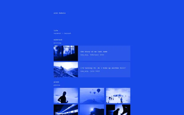
Midnight Digital Blueprint — a deeply saturated cobalt canvas meticulously laid out with crisp white and subtle gray text.
Color palette
Page background, primary canvas, background for interactive elements
Primary text on dark backgrounds, active states
Dark borders and separators for elevated surfaces and inverted UI. Do not promote it to the primary CTA color
Outlined interactive element borders, muted text
Typography
- Weights
- 400
- Sizes
- 16px
- Line height
- 1.2
- Fallback
- system-ui, sans-serif
Primary text across all body and interactive elements due to the limited typographic scale. Its neutrality lets the bold color palette speak louder than extensive font variations. Size 16px is used widely.
Spacing & shape
Components
A rectangle with a Midnight Cobalt background (#194ae9), a Dark Void border (#000000), and Ghost White text (#ffffff). The body text is styled with Subtle Violet (#bfccf9).
A block with a Midnight Cobalt background (#194ae9) and a Subtle Violet border (#bfccf9). Text is Ghost White (#ffffff), and supplementary text is Subtle Violet (#bfccf9). These blocks appear to respond to hover states with background fills.
Ghost White text (#ffffff) on the Midnight Cobalt background, using ui-sans-serif, weight 400, 16px size, with 1.2 lh. No underline, relying on color contrast for prominence.
Images contained within a Dark Void border (#000000) against the Midnight Cobalt page background.
Guidelines
- Use Midnight Cobalt (#194ae9) as the dominant background color for all primary canvas areas.
- Employ Ghost White (#ffffff) for all main textual content and active link states.
- Define interactive component borders using Dark Void (#000000) or Subtle Violet (#bfccf9) to create subtle divisions.
- Maintain a tight typographic scale using ui-sans-serif at 16px, weight 400 for all textual elements, overriding browser defaults.
- Structure content within a max-width of 600px, centered on the page for a focused reading experience.
- Separate sections with a vertical gap of 24px and use 8px for internal element spacing within components.
- Utilize Ghost White (#ffffff) for hover states on interactive links against the Midnight Cobalt background.
- Avoid introducing additional saturated colors; maintain the strictly monochrome + cobalt palette.
- Do not use different font families or weights beyond ui-sans-serif 400.
- Refrain from using drop shadows or complex graphical elements; rely on color and spacing for visual hierarchy.
- Do not vary font sizes significantly; keep the visual density consistent.
- Avoid using outlines or borders on elements that are not interactive or structural.
- Do not use gradients; the system relies on solid color blocks.
- Never justify text alignment; keep all text left-aligned.
About this system
ShowHide
Alec Babala's design language is a 'Midnight Digital Blueprint', characterized by a singular, intense cobalt blue dominating the canvas. Text and interactive elements are rendered in stark white or subtly muted gray, creating high contrast and immediate focus. The system embraces a minimalist, high-density layout where content takes precedence, organized with subtle visual cues rather than heavy ornamentation. This creates a functional, almost stark, digital workspace feel.
The page adheres to a centered, max-width 600px layout, appearing as a content column on the wide cobalt blue canvas. The hero section is minimal, simply displaying the brand name. Content is arranged in compact, text-dominant blocks, occasionally interspersed with 2-column grids of monochrome images. Vertical spacing is consistent between sections (24px) but tighter within content groups (8px), creating a focused, high-information density. Navigation is implied through textual links rather than a distinct header bar, with a persistent 'Alec Babala' brand identity at the top.
This design system is image-heavy, utilizing square or rectangular photographic cells treated with a strong blue monochrome filter. The images are contained within subtle borders, not overlapping, and appear as embedded content rather than decorative backgrounds. They function as visual anchors and content previews, contributing to the high-density information display. The icon style is minimal and text-based, blending seamlessly with the typographic focus rather than standing out as distinct graphical elements.
Reminiscent of Figma, Stripe, Linear.
# Alec Babala — Style Reference
> Midnight Digital Blueprint — a deeply saturated cobalt canvas meticulously laid out with crisp white and subtle gray text.

**Theme:** dark

**Site:** https://www.alecbabala.com

Alec Babala's design language is a 'Midnight Digital Blueprint', characterized by a singular, intense cobalt blue dominating the canvas. Text and interactive elements are rendered in stark white or subtly muted gray, creating high contrast and immediate focus. The system embraces a minimalist, high-density layout where content takes precedence, organized with subtle visual cues rather than heavy ornamentation. This creates a functional, almost stark, digital workspace feel.

## Tokens — Colors

| Name | Value | Token | Role |
|------|------|------|------|
| Midnight Cobalt | `#194ae9` | `--color-midnight-cobalt` | Page background, primary canvas, background for interactive elements |
| Ghost White | `#ffffff` | `--color-ghost-white` | Primary text on dark backgrounds, active states |
| Dark Void | `#000000` | `--color-dark-void` | Dark borders and separators for elevated surfaces and inverted UI. Do not promote it to the primary CTA color |
| Subtle Violet | `#bfccf9` | `--color-subtle-violet` | Outlined interactive element borders, muted text |

## Tokens — Typography

### ui-sans-serif
- **Substitute:** system-ui, sans-serif
- **Weights:** 400
- **Sizes:** 16px
- **Line height:** 1.2
- **Role:** Primary text across all body and interactive elements due to the limited typographic scale. Its neutrality lets the bold color palette speak louder than extensive font variations. Size 16px is used widely.

## Tokens — Spacing

- **Max width:** 600px
- **Section gap:** 24px
- **Card padding:** 8px
- **Element gap:** 8px

## Tokens — Radius

- **none:** 0px

## Layout

The page adheres to a centered, max-width 600px layout, appearing as a content column on the wide cobalt blue canvas. The hero section is minimal, simply displaying the brand name. Content is arranged in compact, text-dominant blocks, occasionally interspersed with 2-column grids of monochrome images. Vertical spacing is consistent between sections (24px) but tighter within content groups (8px), creating a focused, high-information density. Navigation is implied through textual links rather than a distinct header bar, with a persistent 'Alec Babala' brand identity at the top.

## Imagery

This design system is image-heavy, utilizing square or rectangular photographic cells treated with a strong blue monochrome filter. The images are contained within subtle borders, not overlapping, and appear as embedded content rather than decorative backgrounds. They function as visual anchors and content previews, contributing to the high-density information display. The icon style is minimal and text-based, blending seamlessly with the typographic focus rather than standing out as distinct graphical elements.

## Components

### Interactive Card
*Informational cards that link to content, acting as secondary navigation.*

A rectangle with a Midnight Cobalt background (#194ae9), a Dark Void border (#000000), and Ghost White text (#ffffff). The body text is styled with Subtle Violet (#bfccf9).

### Outlined Link Block
*Content previews for articles or projects, featuring an image and text.*

A block with a Midnight Cobalt background (#194ae9) and a Subtle Violet border (#bfccf9). Text is Ghost White (#ffffff), and supplementary text is Subtle Violet (#bfccf9). These blocks appear to respond to hover states with background fills.

### Primary Navigation Text Link
*Top-level textual links for site navigation.*

Ghost White text (#ffffff) on the Midnight Cobalt background, using ui-sans-serif, weight 400, 16px size, with 1.2 lh. No underline, relying on color contrast for prominence.

### Image Grid Item
*Visual content showcase within grid layouts.*

Images contained within a Dark Void border (#000000) against the Midnight Cobalt page background.

## Guidelines

### Do

- Use Midnight Cobalt (#194ae9) as the dominant background color for all primary canvas areas.
- Employ Ghost White (#ffffff) for all main textual content and active link states.
- Define interactive component borders using Dark Void (#000000) or Subtle Violet (#bfccf9) to create subtle divisions.
- Maintain a tight typographic scale using ui-sans-serif at 16px, weight 400 for all textual elements, overriding browser defaults.
- Structure content within a max-width of 600px, centered on the page for a focused reading experience.
- Separate sections with a vertical gap of 24px and use 8px for internal element spacing within components.
- Utilize Ghost White (#ffffff) for hover states on interactive links against the Midnight Cobalt background.

### Don't

- Avoid introducing additional saturated colors; maintain the strictly monochrome + cobalt palette.
- Do not use different font families or weights beyond ui-sans-serif 400.
- Refrain from using drop shadows or complex graphical elements; rely on color and spacing for visual hierarchy.
- Do not vary font sizes significantly; keep the visual density consistent.
- Avoid using outlines or borders on elements that are not interactive or structural.
- Do not use gradients; the system relies on solid color blocks.
- Never justify text alignment; keep all text left-aligned.

## Agent Prompt Guide

Quick Color Reference:
text: #ffffff
background: #194ae9
border: #000000
accent: #bfccf9
primary action: #bfccf9 (outlined action border)

Example Component Prompts:
Create an 'Interactive Card' with 'The story of my last name' as the title and 'new_wip, February 2026' as the subtitle. It should have a Midnight Cobalt background (#194ae9), a Dark Void border (#000000), Ghost White text for the title, and Subtle Violet text (#bfccf9) for the subtitle. Use ui-sans-serif, 16px, 400 weight.
Create an 'Outlined Link Block' with a square image on the left and text content 'i’m turning 34. do i bike up another hill? new_wip, July 2025' on the right. The block should have a Midnight Cobalt background (#194ae9), a Subtle Violet border (#bfccf9), and use Ghost White text (#ffffff) for the main title and Subtle Violet (#bfccf9) for the descriptive text. The image should be borderless against the background with no radius.
Create an Outlined Primary Action: Transparent background, #bfccf9 border and text, 9999px radius, compact pill padding. Use it for the main CTA instead of a filled button.
More like this





Keep what you find
A free account saves references to boards and can send you a weekly email of picks based on what you save.
To see every result, go Pro.