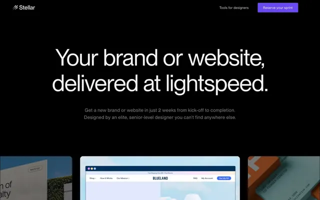
Preview image. Unlock full-res
Midnight canvas, violet beacon.
Color palette
Primary action buttons, interactive highlights, navigational accents on dark backgrounds — creates a vivid point of focus; Decorative background accent, adding depth and visual interest behind specific sections or elements
Page background, primary surface for elevated cards, base for borders
Secondary surface, subtle background for cards, slight distinction from page background
Interface element backgrounds (e.g., input fields), ghost button backgrounds, subtle borders
Dominant text color for primary headings and body copy on dark backgrounds
Muted secondary text, placeholder text, subtle decorative elements, default icon fills. Provides contrast without stealing focus
Hairline borders, dividers, input outlines, and card edges on light surfaces. Do not promote it to the primary CTA color
Less prominent text, default link color, lighter highlights
Subtle borders, inactive navigation items, lighter UI details
Low-contrast decorative details, muted icon elements
Typography
- Weights
- 400, 500
- Sizes
- 14px, 15px, 16px, 18px, 19px, 21px, 22px, 40px, 70px, 72px, 104px
- Line height
- 1, 1.1, 1.2, 1.43, 1.5, 1.55
- Letter spacing
- -0.0200em at 104px, -0.0100em at 70-72px, 0.0080em at 21-22px, 0.0150em at 19px, 0.0200em at 18px, 0.0210em at 16px, 0.0230em at 15px, 0.0250em at 14px, 0.0300em, 0.0350em, 0.0400em
- Fallback
- Inter
Primary typeface for all UI text, headings, and body copy. Its precise tracking, especially at larger sizes, enhances legibility and contributes to the crisp, modern feel of the dark UI.
Spacing & shape
Components
Filled button with Ultraviolet background (#6a48f2), Lunar White text (#ffffff), and a 50px border-radius, giving it a pill shape. Padding of 10px vertical and 24px horizontal. Text uses Neue Montreal, weight 400.
Ghost button with Storm Gray background (#2c2c2e), Cloudburst text (#888888), and a 100% border-radius for a circular shape (though no padding is applied directly to the button container based on data; assumed for internal icon/text). Text is often uncolored or small, representing an icon or minimal label.
Rectangular button with Storm Gray background (#2c2c2e), Glimmer White text (#e9e9e9), and a 6px border-radius. Padding of 16px vertical and 20px horizontal. Uses Neue Montreal, weight 400.
Flat card with Stellar Black background (#171718), 6px border-radius, and 20px padding on all sides. Content inside uses Spectral White for headings and Cloudburst for body text. No box shadow.
Flat card with Stellar Black background (#171718), 10px border-radius, and no padding defined at the card level. Content elements inside typically have their own padding. No box shadow.
Transparent background with 0px radius. Primarily used as a container to visually group elements without adding a distinct background surface or padding. Often relies on inner elements for visual boundaries and structure.
Input field with Storm Gray background (#2c2c2e), Spectral White text (#f3f3f3), 6px border-radius, and 12px horizontal padding. No vertical padding defined, assuming internal text alignment. Uses Neue Montreal, weight 400.
A ghost card with transparent background, 10px border-radius. Contains a designer's image and text typically formatted with Spectral White for names and Cloudburst for roles, using Neue Montreal.
Guidelines
- Prioritize Absolute Zero (#000000) as the primary page background for all sections to maintain a consistent dark theme.
- Use Ultraviolet (#6a48f2) exclusively for primary calls to action, interactive highlights, and brand elements requiring high visual impact.
- Apply a 6px border-radius to inputs, most cards, and some buttons for a consistent soft-edged feel.
- Ensure all primary headings use Spectral White (#f3f3f3) with Neue Montreal, weight 400-500, and precise letter-spacing from the type scale to stand out against the dark backgrounds.
- Maintain high contrast text with a minimum ratio of 17:1 for Spectral White / Lunar White text on Absolute Zero or Stellar Black backgrounds.
- Confine visual flair to the single Ultraviolet accent color; avoid introducing additional chromatic colors for UI elements.
- Utilize 'Element gap: 20px' to consistently separate major UI components horizontally and vertically, including cards and buttons.
- Avoid using multiple vibrant accent colors; the brand relies on a single defined Ultraviolet (#6a48f2) as its color statement.
- Refrain from using strong box shadows on general UI elements; surfaces are largely flat with minimal elevation.
- Do not deviate from the pill-shaped 50px border-radius for primary action buttons.
- Do not use generic system fonts; always specify 'Neue Montreal' or its substitute 'Inter' for all text elements.
- Avoid decorative gradients on standard UI components; save the gradient for specific atmospheric or background sections.
- Do not reduce the letter-spacing for body text (14-16px) as it requires positive tracking for readability on dark backgrounds.
- Never use dark text colors on Stellar Black (#171718) or Absolute Zero (#000000) backgrounds; rely on white and light gray tones for legibility.
About this system
ShowHide
Stellar uses a high-contrast dark mode design with near-black backgrounds serving as a deep canvas for bright white typography. A single, vivid violet acts as a primary brand accent, used sparingly to highlight interactive elements and create a sense of direct action. Surfaces are typically flat and minimal, avoiding heavy shadows or decorative elements to maintain a streamlined, focused experience. Typography is utilitarian yet impactful, employing precise letter-spacing and varying weights to establish clear hierarchy against the dark backdrop.
The page primarily uses a full-bleed dark background with content centered within an implicit `pageMaxWidth`. The hero section is full-bleed, featuring a large, centered headline and subtext. Sections generally follow a consistent vertical rhythm with minimal visual dividers, flowing seamlessly. Content is arranged in alternating patterns, such as a large centered headline and subtext followed by a responsive grid of cards for team members or project showcases. Card grids are prominent for presenting work and people. The navigation is a minimalist top bar, fixed to the top, with basic links and a primary action button.
This site utilizes a mix of product screenshots, often contained within cards, and portraits for designer profiles. Photography is high-key and direct, typically showing tight crops of UI or individual faces with minimal background context. Imagery is generally contained within defined card shapes, maintaining clear boundaries and not overlapping. Iconography (where visible) appears to be simple, outlined, and monochromatic, typically in Cloudburst (#888888) against dark backgrounds. Imagery serves to showcase product work or individual talent, acting as explanatory content rather than purely decorative atmosphere.
Reminiscent of Figma, Linear, Supabase.
# Stellar — Style Reference
> Midnight canvas, violet beacon.

**Theme:** dark

**Site:** https://www.stellar.work

Stellar uses a high-contrast dark mode design with near-black backgrounds serving as a deep canvas for bright white typography. A single, vivid violet acts as a primary brand accent, used sparingly to highlight interactive elements and create a sense of direct action. Surfaces are typically flat and minimal, avoiding heavy shadows or decorative elements to maintain a streamlined, focused experience. Typography is utilitarian yet impactful, employing precise letter-spacing and varying weights to establish clear hierarchy against the dark backdrop.

## Tokens — Colors

| Name | Value | Token | Role |
|------|------|------|------|
| Ultraviolet | `#6a48f2` | `--color-ultraviolet` | Primary action buttons, interactive highlights, navigational accents on dark backgrounds — creates a vivid point of focus; Decorative background accent, adding depth and visual interest behind specific sections or elements |
| Absolute Zero | `#000000` | `--color-absolute-zero` | Page background, primary surface for elevated cards, base for borders |
| Stellar Black | `#171718` | `--color-stellar-black` | Secondary surface, subtle background for cards, slight distinction from page background |
| Storm Gray | `#2c2c2e` | `--color-storm-gray` | Interface element backgrounds (e.g., input fields), ghost button backgrounds, subtle borders |
| Spectral White | `#f3f3f3` | `--color-spectral-white` | Dominant text color for primary headings and body copy on dark backgrounds |
| Cloudburst | `#888888` | `--color-cloudburst` | Muted secondary text, placeholder text, subtle decorative elements, default icon fills. Provides contrast without stealing focus |
| Lunar White | `#ffffff` | `--color-lunar-white` | Hairline borders, dividers, input outlines, and card edges on light surfaces. Do not promote it to the primary CTA color |
| Glimmer White | `#e9e9e9` | `--color-glimmer-white` | Less prominent text, default link color, lighter highlights |
| Dusty Gray | `#dddddd` | `--color-dusty-gray` | Subtle borders, inactive navigation items, lighter UI details |
| Cosmic Dust | `#333333` | `--color-cosmic-dust` | Low-contrast decorative details, muted icon elements |

## Tokens — Typography

### Neue Montreal
- **Substitute:** Inter
- **Weights:** 400, 500
- **Sizes:** 14px, 15px, 16px, 18px, 19px, 21px, 22px, 40px, 70px, 72px, 104px
- **Line height:** 1, 1.1, 1.2, 1.43, 1.5, 1.55
- **Letter spacing:** -0.0200em at 104px, -0.0100em at 70-72px, 0.0080em at 21-22px, 0.0150em at 19px, 0.0200em at 18px, 0.0210em at 16px, 0.0230em at 15px, 0.0250em at 14px, 0.0300em, 0.0350em, 0.0400em
- **Role:** Primary typeface for all UI text, headings, and body copy. Its precise tracking, especially at larger sizes, enhances legibility and contributes to the crisp, modern feel of the dark UI.

## Tokens — Type Scale

Augmented Fourth (1.414) from 16px base.

| Role | Size | Line height | Letter spacing |
|------|------|------|------|
| caption | 14px | 1.5 | 0.35px |
| body | 16px | 1.5 | 0.336px |
| subheading | 18px | 1.5 | 0.36px |
| heading | 21px | 1.2 | 0.168px |
| heading-lg | 40px | 1.2 | -0.4px |
| display | 72px | 1.1 | -0.72px |

## Tokens — Spacing

- **Section gap:** 50px
- **Card padding:** 20px
- **Element gap:** 20px

## Tokens — Radius

- **Default:** 6px
- **Buttons:** 50px
- **Cards:** 6px
- **circular:** 100%
- **roundCards:** 10px

## Layout

The page primarily uses a full-bleed dark background with content centered within an implicit `pageMaxWidth`. The hero section is full-bleed, featuring a large, centered headline and subtext. Sections generally follow a consistent vertical rhythm with minimal visual dividers, flowing seamlessly. Content is arranged in alternating patterns, such as a large centered headline and subtext followed by a responsive grid of cards for team members or project showcases. Card grids are prominent for presenting work and people. The navigation is a minimalist top bar, fixed to the top, with basic links and a primary action button.

## Imagery

This site utilizes a mix of product screenshots, often contained within cards, and portraits for designer profiles. Photography is high-key and direct, typically showing tight crops of UI or individual faces with minimal background context. Imagery is generally contained within defined card shapes, maintaining clear boundaries and not overlapping. Iconography (where visible) appears to be simple, outlined, and monochromatic, typically in Cloudburst (#888888) against dark backgrounds. Imagery serves to showcase product work or individual talent, acting as explanatory content rather than purely decorative atmosphere.

## Components

### Primary Action Button
*Calls to action, e.g., 'Reserve your sprint'.*

Filled button with Ultraviolet background (#6a48f2), Lunar White text (#ffffff), and a 50px border-radius, giving it a pill shape. Padding of 10px vertical and 24px horizontal. Text uses Neue Montreal, weight 400.

### Ghost Card Button
*Secondary action within card interfaces.*

Ghost button with Storm Gray background (#2c2c2e), Cloudburst text (#888888), and a 100% border-radius for a circular shape (though no padding is applied directly to the button container based on data; assumed for internal icon/text). Text is often uncolored or small, representing an icon or minimal label.

### Informational Button
*Callouts or navigation within sections, e.g., 'Learn More'.*

Rectangular button with Storm Gray background (#2c2c2e), Glimmer White text (#e9e9e9), and a 6px border-radius. Padding of 16px vertical and 20px horizontal. Uses Neue Montreal, weight 400.

### Content Card - Neutral
*Container for showcasing projects, designers, or information.*

Flat card with Stellar Black background (#171718), 6px border-radius, and 20px padding on all sides. Content inside uses Spectral White for headings and Cloudburst for body text. No box shadow.

### Content Card - Rounded
*Container for showcasing work examples.*

Flat card with Stellar Black background (#171718), 10px border-radius, and no padding defined at the card level. Content elements inside typically have their own padding. No box shadow.

### Ghost Card
*Containers for imagery or specific, unpadded graphic elements.*

Transparent background with 0px radius. Primarily used as a container to visually group elements without adding a distinct background surface or padding. Often relies on inner elements for visual boundaries and structure.

### Text Input
*Standard user input fields.*

Input field with Storm Gray background (#2c2c2e), Spectral White text (#f3f3f3), 6px border-radius, and 12px horizontal padding. No vertical padding defined, assuming internal text alignment. Uses Neue Montreal, weight 400.

### Designer Avatar Card
*Individual profile cards for designers.*

A ghost card with transparent background, 10px border-radius. Contains a designer's image and text typically formatted with Spectral White for names and Cloudburst for roles, using Neue Montreal.

## Guidelines

### Do

- Prioritize Absolute Zero (#000000) as the primary page background for all sections to maintain a consistent dark theme.
- Use Ultraviolet (#6a48f2) exclusively for primary calls to action, interactive highlights, and brand elements requiring high visual impact.
- Apply a 6px border-radius to inputs, most cards, and some buttons for a consistent soft-edged feel.
- Ensure all primary headings use Spectral White (#f3f3f3) with Neue Montreal, weight 400-500, and precise letter-spacing from the type scale to stand out against the dark backgrounds.
- Maintain high contrast text with a minimum ratio of 17:1 for Spectral White / Lunar White text on Absolute Zero or Stellar Black backgrounds.
- Confine visual flair to the single Ultraviolet accent color; avoid introducing additional chromatic colors for UI elements.
- Utilize 'Element gap: 20px' to consistently separate major UI components horizontally and vertically, including cards and buttons.

### Don't

- Avoid using multiple vibrant accent colors; the brand relies on a single defined Ultraviolet (#6a48f2) as its color statement.
- Refrain from using strong box shadows on general UI elements; surfaces are largely flat with minimal elevation.
- Do not deviate from the pill-shaped 50px border-radius for primary action buttons.
- Do not use generic system fonts; always specify 'Neue Montreal' or its substitute 'Inter' for all text elements.
- Avoid decorative gradients on standard UI components; save the gradient for specific atmospheric or background sections.
- Do not reduce the letter-spacing for body text (14-16px) as it requires positive tracking for readability on dark backgrounds.
- Never use dark text colors on Stellar Black (#171718) or Absolute Zero (#000000) backgrounds; rely on white and light gray tones for legibility.

## Agent Prompt Guide

Quick Color Reference:
text: #f3f3f3
background: #000000
border: #888888
accent: #6a48f2
primary action: #6a48f2 (filled action)

Example Component Prompts:
1. Create a Hero Section: Absolute Zero (#000000) background. Headline 'Your brand or website, delivered at lightspeed.' using Neue Montreal, 72px size, 1.1 line-height, -0.72px letter-spacing, Spectral White (#f3f3f3). Subtext 'Get a new brand or website in just 2 weeks.' using Neue Montreal, 18px size, 1.5 line-height, 0.36px letter-spacing, Cloudburst (#888888).
2. Create a Primary Action Button: 'Reserve your sprint' with Ultraviolet (#6a48f2) background, Lunar White (#ffffff) text using Neue Montreal 16px weight 400, 50px border-radius, and 10px vertical, 24px horizontal padding.
3. Create a Designer Profile Card: Stellar Black (#171718) background, 10px border-radius. Inside, display an image (avatar). Below the image, 'Joonas' using Neue Montreal 18px weight 500, Spectral White (#f3f3f3). Below the name, 'Brand Designer' using Neue Montreal 15px weight 400, Cloudburst (#888888).
More like this





Keep what you find
A free account saves references to boards and can send you a weekly email of picks based on what you save.
To see every result, go Pro.