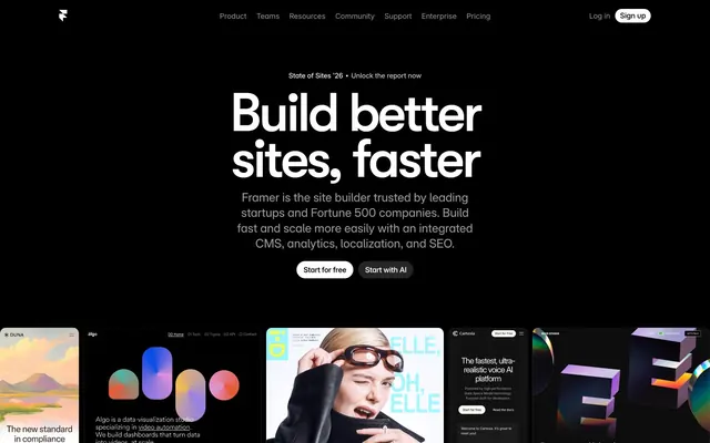
Preview image. Unlock full-res
Deep Space Command
Color palette
Observed in other backgroundColor, body borderColor, other stroke. Extracted usage does not support a distinct primary control color.
Secondary brand accent, used for gradients and fills in illustrations. Provides a slightly deeper, more saturated blue.
Dark blue tint used in shadows, adding a subtle chromatic depth to elevated elements.
Primary page background, text (on light elements), borders, illustration backgrounds. The foundational dark color that defines the theme.
Card backgrounds, elevated container surfaces. Provides subtle separation from the primary canvas.
Secondary elevated surfaces, slightly darker than Deep Graphite for further distinction.
Primary text, core interactive element backgrounds (buttons), accents on dark backgrounds. High contrast against dark surfaces.
Secondary text, muted links, subtle borders. A desaturated tone for less prominent information.
Tertiary text, subtle separators, link borders. Provides a lower contrast alternative to Mercury Gray.
Supporting palette color with insufficient usage evidence for a stronger role. Extracted usage does not support a distinct primary control color.
Typography
- Weights
- 400
- Sizes
- 12px
- Line height
- 1.2
sans-serif — detected in extracted data but not described by AI
- Weights
- 400
- Sizes
- 8px, 12px, 13px, 14px, 15px, 18px, 24px
- Line height
- 0.8, 1, 1.07, 1.2, 1.3, 1.4
- Letter spacing
- -0.02em, -0.018em, -0.01em, -0.001em, 0.03em
- Fallback
- Inter
Primary UI text for body, captions, and some headings. Its variable nature allows for precise tailoring to content needs.
- Weights
- 400, 500, 600, 700
- Sizes
- 10px, 12px, 13px, 14px, 20px, 22px
- Line height
- 0.83, 1, 1.1, 1.15, 1.2, 1.3, 1.4, 1.6
- Letter spacing
- -0.053em, -0.05em, -0.04em, -0.036em, -0.03em, -0.02em, -0.01em, 0.02em
- Fallback
- Inter
Supportive body text and information hierarchy secondary to Inter Variable. Used for links and smaller headings. The range of weights provides granular control.
- Weights
- 500
- Sizes
- 12px, 13px, 17px, 18px, 62px
- Line height
- 1, 1.2, 1.3, 1.7, 2.28
- Letter spacing
- -0.05em, -0.046em
- Fallback
- Inter
Distincitve display headings and prominent sub-headings. Its unique character contributes to brand personality in key areas.
- Weights
- 500
- Sizes
- 32px, 62px, 85px
- Line height
- 0.95, 1, 1.13
- Letter spacing
- -0.05em, -0.031em
- Fallback
- Montserrat
Bold, impactful display text for hero sections and major headers. Its strong presence defines primary messaging.
- Weights
- 500
- Sizes
- 110px
- Line height
- 0.85
- Letter spacing
- -0.05em
- Fallback
- Montserrat
Largest, most authoritative display text, used sparingly for maximum impact in hero sections. Establishes the brand's confident tone.
- Weights
- 600
- Sizes
- 9px
- Line height
- 1.11
- Fallback
- Roboto Condensed
Specialized, highly condensed text for labels or metadata where space is limited and distinctiveness is desired.
Spacing & shape
Elevation
Components
Ghost button with no background and transparent border, typically used for secondary actions or links. Text color can vary but is often an interactive blue or white. Padding 10px vertical, 14px horizontal for smaller instances.
Filled button with a Cloud White (#FFFFFF) background and #0000EE text. Features a 100px border-radius, giving it a pill shape. Padding: 10px vertical, 14px horizontal.
Ghost button with a semi-transparent white background rgba(255, 255, 255, 0.15) and a 100px border-radius. Text is typically #0000EE. Padding: 10px vertical, 14px horizontal.
Minimal button with rgba(255, 255, 255, 0.1) background and 40px border-radius, often used for subtle navigation within a dark context. Has #000000 text and 0px padding. Sometimes text only if backgroundColor is rgba(0,0,0,0).
Standard card with Midnight Ink (#000000) background, 10px border-radius, no box shadow initially. Padding is often 0px, designed for content to define its own internal spacing.
Card with Deep Graphite (#080808) background and a large 30px border-radius. No box shadow, relying on background contrast for elevation.
Card with a very subtle background tint of rgba(0, 0, 0, 0.03), 20px border-radius and 40px internal padding. Used for lighter sections or within other components. Note: This color indicates usage on a light canvas, which is not the dominant theme here.
Card with a rgba(255, 255, 255, 0.1) background and 30px border-radius. Features 1px padding, which likely acts as an internal border or separator.
Guidelines
- Use Midnight Ink (#000000) for primary page backgrounds to maintain the immersive dark theme.
- Employ Cloud White (#FFFFFF) for all primary text and critical interactive button fills to ensure high contrast and readability.
- Apply Electric Blue (#0099FF) sparingly as an accent for interactive elements, borders, and hover states to guide user attention.
- Ensure all buttons feature a 100px border-radius to consistently achieve a 'pill' shape.
- Utilize GT Walsheim Medium and GT Walsheim Framer Medium for impactful headlines, prioritizing their distinctive weight 500.
- Maintain a compact density for element spacing, with a default elementGap of 10px, allowing visual elements to feel close-knit.
- Implement the subtle #021f33 blue tint in shadows for any elevated elements to keep depth cohesive with the brand palette.
- Avoid using bright or overly saturated colors outside of the defined Electric Blue and Velocity Blue accents.
- Do not introduce square or sharp corners on buttons; they must always use the 100px pill radius.
- Do not use generic gray shadows; all shadows should leverage the blue-tinted #021f33 to maintain brand consistency.
- Avoid excessive spacing between elements; the design emphasizes a compact and dense information presentation.
- Do not use transparent backgrounds without a clear visual purpose; surfaces are typically solid or subtly layered near-blacks.
- Do not deviate from the specified font families for headings (GT Walsheim, Mona Sans), as they are key to brand typography.
- Avoid using light backgrounds exclusively, as the design system is fundamentally built upon a dark theme.
About this system
ShowHide
Framer's aesthetic is a high-contrast digital canvas, emphasizing bold typography and a deep, immersive dark mode. The dominant #000000 background provides a stark stage for crisp #FFFFFF text, interrupted by precise, high-chroma electric blues (#0099FF, #0055FF) that pulse like indicator lights on active elements. Subtle surface variations in near-black (#080808, #171717) create depth within the dark theme without relying on heavy shadows, giving the interface a layered, architectural feel. The interplay of razor-sharp edges and large, soft radii (100px pill buttons) generates an engaging tension, balancing technical precision with approachable interactivity.
The page primarily uses a max-width contained layout section-by-section, though the hero element achieves a full-bleed effect by filling the entire viewport with the dark background. The hero features a large, centered headline and subtext with two signature pill-shaped buttons below. Sections often follow an alternating pattern of background colors (Midnight Ink, Deep Graphite) and content arrangements, though most appear on pure black. Content frequently uses a centered stack or a split-panel approach with text on one side and an image/product screenshot on the other. A prominent feature is a dense, responsive grid for case studies or product examples, showcasing a variety of brand aesthetics within the Framer ecosystem. Navigation is a sticky top bar, providing persistent access.
The visual language is a blend of product screenshots, abstract generative graphics, and minimalist iconography. Product screenshots are meticulously cropped, often presented within mock devices or with soft, gradient-tinted backdrops, showcasing the UI without much surrounding context. Abstract graphics are geometric, sometimes fluid, and use the brand's vivid blues and a broader rainbow of saturated colors against the dark background, serving decorative and atmospheric roles. Icons are typically monochrome (white on black or vice-versa), conveying information with clear, functional outlines. Imagery is used to either highlight product capabilities or create a dramatic, future-forward mood, often occupying significant visual space. The density is high, with images working alongside text rather than merely supporting it, creating an image-dominant experience in many sections.
Reminiscent of Vercel, Linear, Supabase, Ray.so, PlanetScale.
# Framer — Style Reference
> Deep Space Command

**Theme:** dark

**Site:** https://www.framer.com

Framer's aesthetic is a high-contrast digital canvas, emphasizing bold typography and a deep, immersive dark mode. The dominant #000000 background provides a stark stage for crisp #FFFFFF text, interrupted by precise, high-chroma electric blues (#0099FF, #0055FF) that pulse like indicator lights on active elements. Subtle surface variations in near-black (#080808, #171717) create depth within the dark theme without relying on heavy shadows, giving the interface a layered, architectural feel. The interplay of razor-sharp edges and large, soft radii (100px pill buttons) generates an engaging tension, balancing technical precision with approachable interactivity.

## Tokens — Colors

| Name | Value | Token | Role |
|------|------|------|------|
| Electric Blue | `#0099FF` | `--color-electric-blue` | Observed in other backgroundColor, body borderColor, other stroke. Extracted usage does not support a distinct primary control color. |
| Velocity Blue | `#0055FF` | `--color-velocity-blue` | Secondary brand accent, used for gradients and fills in illustrations. Provides a slightly deeper, more saturated blue. |
| Shadow Tint | `#021f33` | `--color-shadow-tint` | Dark blue tint used in shadows, adding a subtle chromatic depth to elevated elements. |
| Midnight Ink | `#000000` | `--color-midnight-ink` | Primary page background, text (on light elements), borders, illustration backgrounds. The foundational dark color that defines the theme. |
| Deep Graphite | `#080808` | `--color-deep-graphite` | Card backgrounds, elevated container surfaces. Provides subtle separation from the primary canvas. |
| Rich Coal | `#171717` | `--color-rich-coal` | Secondary elevated surfaces, slightly darker than Deep Graphite for further distinction. |
| Cloud White | `#FFFFFF` | `--color-cloud-white` | Primary text, core interactive element backgrounds (buttons), accents on dark backgrounds. High contrast against dark surfaces. |
| Mercury Gray | `#999999` | `--color-mercury-gray` | Secondary text, muted links, subtle borders. A desaturated tone for less prominent information. |
| Steel Gray | `#666666` | `--color-steel-gray` | Tertiary text, subtle separators, link borders. Provides a lower contrast alternative to Mercury Gray. |
| Interactive Blue Tint | `#0000ee` | `--color-interactive-blue-tint` | Supporting palette color with insufficient usage evidence for a stronger role. Extracted usage does not support a distinct primary control color. |

## Tokens — Typography

### sans-serif
- **Weights:** 400
- **Sizes:** 12px
- **Line height:** 1.2
- **Role:** sans-serif — detected in extracted data but not described by AI

### Inter Variable
- **Substitute:** Inter
- **Weights:** 400
- **Sizes:** 8px, 12px, 13px, 14px, 15px, 18px, 24px
- **Line height:** 0.8, 1, 1.07, 1.2, 1.3, 1.4
- **Letter spacing:** -0.02em, -0.018em, -0.01em, -0.001em, 0.03em
- **Role:** Primary UI text for body, captions, and some headings. Its variable nature allows for precise tailoring to content needs.

### Inter
- **Substitute:** Inter
- **Weights:** 400, 500, 600, 700
- **Sizes:** 10px, 12px, 13px, 14px, 20px, 22px
- **Line height:** 0.83, 1, 1.1, 1.15, 1.2, 1.3, 1.4, 1.6
- **Letter spacing:** -0.053em, -0.05em, -0.04em, -0.036em, -0.03em, -0.02em, -0.01em, 0.02em
- **Role:** Supportive body text and information hierarchy secondary to Inter Variable. Used for links and smaller headings. The range of weights provides granular control.

### Mona Sans
- **Substitute:** Inter
- **Weights:** 500
- **Sizes:** 12px, 13px, 17px, 18px, 62px
- **Line height:** 1, 1.2, 1.3, 1.7, 2.28
- **Letter spacing:** -0.05em, -0.046em
- **Role:** Distincitve display headings and prominent sub-headings. Its unique character contributes to brand personality in key areas.

### GT Walsheim Medium
- **Substitute:** Montserrat
- **Weights:** 500
- **Sizes:** 32px, 62px, 85px
- **Line height:** 0.95, 1, 1.13
- **Letter spacing:** -0.05em, -0.031em
- **Role:** Bold, impactful display text for hero sections and major headers. Its strong presence defines primary messaging.

### GT Walsheim Framer Medium
- **Substitute:** Montserrat
- **Weights:** 500
- **Sizes:** 110px
- **Line height:** 0.85
- **Letter spacing:** -0.05em
- **Role:** Largest, most authoritative display text, used sparingly for maximum impact in hero sections. Establishes the brand's confident tone.

### Open Runde
- **Substitute:** Roboto Condensed
- **Weights:** 600
- **Sizes:** 9px
- **Line height:** 1.11
- **Role:** Specialized, highly condensed text for labels or metadata where space is limited and distinctiveness is desired.

## Tokens — Type Scale

Augmented Fourth (1.414) from 13px base.

| Role | Size | Line height | Letter spacing |
|------|------|------|------|
| nav-link | 13px | 1.07 | -0.13px |
| heading-sm | 20px | 1.1 | -0.6px |
| heading | 24px | 1.4 | -0.24px |
| heading-lg | 32px | 0.95 | -1.6px |
| display-sm | 62px | 1 | -3.1px |
| display-md | 85px | 1.13 | -4.25px |
| display | 110px | 0.85 | -5.5px |

## Tokens — Spacing

- **Section gap:** 60px
- **Card padding:** 40px
- **Element gap:** 10px

## Tokens — Radius

- **Default:** 8px
- **Buttons:** 100px
- **Cards:** 10px
- **decorative:** 15px
- **extra-large:** 40px
- **large-cards:** 30px
- **minimal:** 1px

## Tokens — Elevation

- **Card / Elevated elements:** `rgba(0, 0, 0, 0.25) 0px 1px 2px 0px`
- **Card / Stronger Elevation:** `rgba(255, 255, 255, 0.1) 0px 0.5px 0px 0.5px, rgba(0, 0, 0, 0.25) 0px 10px 30px 0px`
- **Card / Subtle Elevation:** `rgb(9, 9, 9) 0px 0px 0px 2px`
- **Card / Deeper Visual Impact:** `rgba(0, 0, 0, 0.6) -10px 10px 20px 10px`

## Layout

The page primarily uses a max-width contained layout section-by-section, though the hero element achieves a full-bleed effect by filling the entire viewport with the dark background. The hero features a large, centered headline and subtext with two signature pill-shaped buttons below. Sections often follow an alternating pattern of background colors (Midnight Ink, Deep Graphite) and content arrangements, though most appear on pure black. Content frequently uses a centered stack or a split-panel approach with text on one side and an image/product screenshot on the other. A prominent feature is a dense, responsive grid for case studies or product examples, showcasing a variety of brand aesthetics within the Framer ecosystem. Navigation is a sticky top bar, providing persistent access.

## Imagery

The visual language is a blend of product screenshots, abstract generative graphics, and minimalist iconography. Product screenshots are meticulously cropped, often presented within mock devices or with soft, gradient-tinted backdrops, showcasing the UI without much surrounding context. Abstract graphics are geometric, sometimes fluid, and use the brand's vivid blues and a broader rainbow of saturated colors against the dark background, serving decorative and atmospheric roles. Icons are typically monochrome (white on black or vice-versa), conveying information with clear, functional outlines. Imagery is used to either highlight product capabilities or create a dramatic, future-forward mood, often occupying significant visual space. The density is high, with images working alongside text rather than merely supporting it, creating an image-dominant experience in many sections.

## Components

### Primary Ghost Button
*Action button*

Ghost button with no background and transparent border, typically used for secondary actions or links. Text color can vary but is often an interactive blue or white. Padding 10px vertical, 14px horizontal for smaller instances.

### Secondary Button (White)
*Call to action*

Filled button with a Cloud White (#FFFFFF) background and #0000EE text. Features a 100px border-radius, giving it a pill shape. Padding: 10px vertical, 14px horizontal.

### Tertiary Button (Ghost Frosted)
*Secondary action button*

Ghost button with a semi-transparent white background rgba(255, 255, 255, 0.15) and a 100px border-radius. Text is typically #0000EE. Padding: 10px vertical, 14px horizontal.

### Text Button / Link
*Navigation or in-line action*

Minimal button with rgba(255, 255, 255, 0.1) background and 40px border-radius, often used for subtle navigation within a dark context. Has #000000 text and 0px padding. Sometimes text only if backgroundColor is rgba(0,0,0,0).

### Default Card
*Content container*

Standard card with Midnight Ink (#000000) background, 10px border-radius, no box shadow initially. Padding is often 0px, designed for content to define its own internal spacing.

### Elevated Card
*Highlighted content container*

Card with Deep Graphite (#080808) background and a large 30px border-radius. No box shadow, relying on background contrast for elevation.

### Subtle Card
*Informational or less prominent content*

Card with a very subtle background tint of rgba(0, 0, 0, 0.03), 20px border-radius and 40px internal padding. Used for lighter sections or within other components. Note: This color indicates usage on a light canvas, which is not the dominant theme here.

### Bordered White Card
*Featured content container with subtle visual appeal*

Card with a rgba(255, 255, 255, 0.1) background and 30px border-radius. Features 1px padding, which likely acts as an internal border or separator.

## Guidelines

### Do

- Use Midnight Ink (#000000) for primary page backgrounds to maintain the immersive dark theme.
- Employ Cloud White (#FFFFFF) for all primary text and critical interactive button fills to ensure high contrast and readability.
- Apply Electric Blue (#0099FF) sparingly as an accent for interactive elements, borders, and hover states to guide user attention.
- Ensure all buttons feature a 100px border-radius to consistently achieve a 'pill' shape.
- Utilize GT Walsheim Medium and GT Walsheim Framer Medium for impactful headlines, prioritizing their distinctive weight 500.
- Maintain a compact density for element spacing, with a default elementGap of 10px, allowing visual elements to feel close-knit.
- Implement the subtle #021f33 blue tint in shadows for any elevated elements to keep depth cohesive with the brand palette.

### Don't

- Avoid using bright or overly saturated colors outside of the defined Electric Blue and Velocity Blue accents.
- Do not introduce square or sharp corners on buttons; they must always use the 100px pill radius.
- Do not use generic gray shadows; all shadows should leverage the blue-tinted #021f33 to maintain brand consistency.
- Avoid excessive spacing between elements; the design emphasizes a compact and dense information presentation.
- Do not use transparent backgrounds without a clear visual purpose; surfaces are typically solid or subtly layered near-blacks.
- Do not deviate from the specified font families for headings (GT Walsheim, Mona Sans), as they are key to brand typography.
- Avoid using light backgrounds exclusively, as the design system is fundamentally built upon a dark theme.

## Agent Prompt Guide

Quick Color Reference:
text: #FFFFFF
background: #000000
border: #000000
accent: #0099FF
primary action: #ffffff (filled action)

3-5 Example Component Prompts:
Create a hero section: Midnight Ink (#000000) background. Headline at 110px GT Walsheim Framer Medium, #FFFFFF, letter-spacing -0.05em, line-height 0.85. Subtext at 24px Inter Variable, #FFFFFF, letter-spacing -0.01em, line-height 1.40. Two buttons below, left: Secondary Button (White) with text 'Start for free', right: Tertiary Button (Ghost Frosted) with text 'Start with AI'.
Create an elevated card: Deep Graphite (#080808) background, 30px border-radius. Inside, use Mona Sans 62px #FFFFFF for a main title and Inter Variable 18px #999999 for body text. Add Subtle Card (rgba(0,0,0,0.03)) nested inside, 20px radius, 40px padding.
Create a navigation item: Inter Variable 14px #999999 text for general links. For active items, use Electric Blue (#0099FF) text.
Create a content section with three Default Cards in a row: Midnight Ink (#000000) background, 10px border-radius, no padding. Each card contains a Mona Sans 32px #FFFFFF subheading and Inter 14px #999999 body text. Gap between cards should be 10px.
More like this






Keep what you find
A free account saves references to boards and can send you a weekly email of picks based on what you save.
To see every result, go Pro.