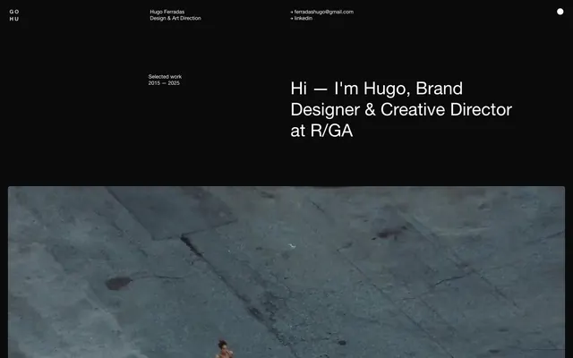
Preview image. Unlock full-res
Black canvas, white inscription.
Color palette
Page background, card backgrounds, primary surface
Primary text, interactive elements (links, hover states), hairline borders, general interface text
Typography
- Weights
- 400, 500
- Sizes
- 13px, 24px, 44px
- Line height
- 1.2, 1.21, 1.23
- Fallback
- system-ui, sans-serif
All textual content: headings, body text, links, and minor interface elements. Its neutrality and system presence ensure direct communication without distraction.
Spacing & shape
Components
Body text styled as a link, using Ghost White for foreground color and an implicit 1px Ghost White bottom border for hover states (though not always visible). No explicit background or padding.
Completely transparent background, 0px border radius, no box shadow, 0px padding. This makes the primary page background the effective card background, creating a seamless visual flow for nested content.
Guidelines
- Maintain a stark, high-contrast palette using Midnight (#000000) for backgrounds and Ghost White (#ffffff) for all text and interactive elements.
- Utilize Helvetica Neue across all typography roles, favoring weights 400 and 500 for clear communication.
- Apply a default border-radius of 5px to any element requiring slight softening, such as image containers.
- Implement the 20px element gap for consistent spacing between vertical design elements.
- Use 1px Ghost White (#ffffff) for all outline borders and interactive underlines to maintain visual economy and highlight interaction.
- Ensure large vertical separations between main sections, with a minimum of 115px section gap.
- Prioritize a transparent background and no explicit styling for content cards (e.g., project preview cards) to allow the primary background to show through, emphasizing content over container.
- Avoid using any colors other than Midnight and Ghost White for primary UI elements; color is reserved for content or specific branding within projects.
- Do not introduce heavy shadows or complex gradients; rely on contrast and spacing for visual hierarchy.
- Refrain from using varied typography families or weights outside of Helvetica Neue 400/500; consistency is key to the system's directness.
- Do not add extra padding or explicit backgrounds to cards; they should maintain a frictionless presentation against the main canvas.
- Avoid decorative imagery in the UI itself; the focus is on project work and minimalist interactive elements.
About this system
ShowHide
Hugo Ferradas' design system establishes a stark, high-contrast dark canvas for showcasing work with direct, minimalist typography. Functionality is expressed through subtle interactions rather than heavy-handed styling. The visual experience is anchored by pure black surfaces and crisp white text, providing a focused, gallery-like setting where content takes precedence over decorative elements.
The page implements a full-bleed layout, primarily dark-mode, with content sections centered. The hero section features a large, centered headline over a dark background. Subsequent sections maintain consistent vertical spacing, often with text-dominant blocks. The structure suggests a clear hierarchy designed to guide the eye through portfolio pieces, alternating between large visual content and concise textual descriptions. Navigation is minimal, presenting as plain text links in the header and footer.
This system primarily features large, full-bleed product imagery and photography as the core content. Images appear contained at 5px border-radius, often spanning the full content width. The treatment implies a gallery-like showcase, allowing project visuals to dominate the layout. Icons, when present, are minimalist, outlined, and inherit the Ghost White color, serving purely functional roles.
# Hugo Ferradas — Style Reference
> Black canvas, white inscription.

**Theme:** dark

**Site:** https://hugoferradas.com

Hugo Ferradas' design system establishes a stark, high-contrast dark canvas for showcasing work with direct, minimalist typography. Functionality is expressed through subtle interactions rather than heavy-handed styling. The visual experience is anchored by pure black surfaces and crisp white text, providing a focused, gallery-like setting where content takes precedence over decorative elements.

## Tokens — Colors

| Name | Value | Token | Role |
|------|------|------|------|
| Midnight | `#000000` | `--color-midnight` | Page background, card backgrounds, primary surface |
| Ghost White | `#ffffff` | `--color-ghost-white` | Primary text, interactive elements (links, hover states), hairline borders, general interface text |

## Tokens — Typography

### Helvetica Neue
- **Substitute:** system-ui, sans-serif
- **Weights:** 400, 500
- **Sizes:** 13px, 24px, 44px
- **Line height:** 1.2, 1.21, 1.23
- **Role:** All textual content: headings, body text, links, and minor interface elements. Its neutrality and system presence ensure direct communication without distraction.

## Tokens — Type Scale

| Role | Size | Line height | Letter spacing |
|------|------|------|------|
| caption | 13px | 1.21 | — |
| body-sm | 24px | 1.21 | — |
| body | 44px | 1.21 | — |

## Tokens — Spacing

- **Section gap:** 115px
- **Card padding:** 20px
- **Element gap:** 20px

## Tokens — Radius

- **Default:** 5px

## Layout

The page implements a full-bleed layout, primarily dark-mode, with content sections centered. The hero section features a large, centered headline over a dark background. Subsequent sections maintain consistent vertical spacing, often with text-dominant blocks. The structure suggests a clear hierarchy designed to guide the eye through portfolio pieces, alternating between large visual content and concise textual descriptions. Navigation is minimal, presenting as plain text links in the header and footer.

## Imagery

This system primarily features large, full-bleed product imagery and photography as the core content. Images appear contained at 5px border-radius, often spanning the full content width. The treatment implies a gallery-like showcase, allowing project visuals to dominate the layout. Icons, when present, are minimalist, outlined, and inherit the Ghost White color, serving purely functional roles.

## Components

### Text Link
*Interactive text element*

Body text styled as a link, using Ghost White for foreground color and an implicit 1px Ghost White bottom border for hover states (though not always visible). No explicit background or padding.

### Plain Content Card
*Content container for project listings*

Completely transparent background, 0px border radius, no box shadow, 0px padding. This makes the primary page background the effective card background, creating a seamless visual flow for nested content.

## Guidelines

### Do

- Maintain a stark, high-contrast palette using Midnight (#000000) for backgrounds and Ghost White (#ffffff) for all text and interactive elements.
- Utilize Helvetica Neue across all typography roles, favoring weights 400 and 500 for clear communication.
- Apply a default border-radius of 5px to any element requiring slight softening, such as image containers.
- Implement the 20px element gap for consistent spacing between vertical design elements.
- Use 1px Ghost White (#ffffff) for all outline borders and interactive underlines to maintain visual economy and highlight interaction.
- Ensure large vertical separations between main sections, with a minimum of 115px section gap.
- Prioritize a transparent background and no explicit styling for content cards (e.g., project preview cards) to allow the primary background to show through, emphasizing content over container.

### Don't

- Avoid using any colors other than Midnight and Ghost White for primary UI elements; color is reserved for content or specific branding within projects.
- Do not introduce heavy shadows or complex gradients; rely on contrast and spacing for visual hierarchy.
- Refrain from using varied typography families or weights outside of Helvetica Neue 400/500; consistency is key to the system's directness.
- Do not add extra padding or explicit backgrounds to cards; they should maintain a frictionless presentation against the main canvas.
- Avoid decorative imagery in the UI itself; the focus is on project work and minimalist interactive elements.

## Agent Prompt Guide

primary action: no distinct CTA color
More like this





Keep what you find
A free account saves references to boards and can send you a weekly email of picks based on what you save.
To see every result, go Pro.