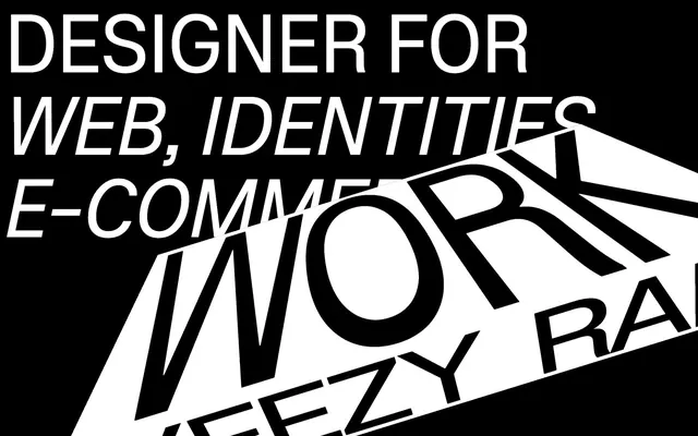
Preview image. Unlock full-res
Black canvas, typographic drama
Color palette
Background for specific sections, providing a strong tonal shift against the primary black
Page backgrounds, card surfaces, primary text for reversed content
Hairline borders, dividers, input outlines, and card edges on light surfaces. Do not promote it to the primary CTA color
Typography
- Weights
- 300
- Sizes
- 22px, 54px, 60px, 170px
- Line height
- 1, 1.06, 1.5
- Letter spacing
- -0.0300em at 170px, -0.0200em at 60px, -0.0100em at 54px
- Fallback
- Open Sans
Dominant headlines, hero text, and significant calls to action. The extremely light weight (300) for such large sizes is anti-conventional, creating an effect of authority through restraint rather than loudness. Consistent tight letter-spacing also contributes to its graphic impact.
- Weights
- 500
- Sizes
- 28px
- Line height
- 1.5, 2.29
- Letter spacing
- normal
- Fallback
- Helvetica Neue
Secondary headings, body text, and general interface labels. This font offers high readability and a clean counterpoint to the more expressive Plaid font, maintaining an overall sharp typographic presence.
Spacing & shape
Components
Completely transparent background, Spectral White (#ffffff) text and a 0px border. Padding is implicitly handled by content itself, giving a tight, text-focused interactive area. All corners are sharp (0px radius).
Guidelines
- Prioritize text as the primary visual element; use typography to create hierarchy and visual interest.
- Maintain high contrast by pairing Spectral White (#ffffff) text with Absolute Zero (#000000) backgrounds.
- Use Plaid font for all prominent headlines and expressive text, with a fontWeight of 300.
- Apply negative letter-spacing for Plaid headlines as detected: -0.0300em at 170px, -0.0200em at 60px, -0.0100em at 54px.
- Utilize Midnight Indigo (#4200ff) sparingly as a background for sections requiring a distinct thematic shift.
- Ensure interactive elements like links and ghost buttons use Spectral White (#ffffff) text and borders on dark backgrounds.
- Use a default border-radius of 4px for any subtle container elements, but 0px for text links and buttons.
- Avoid decorative imagery; if imagery is necessary, prioritize clean, functional representations or abstract graphics.
- Do not use complex shadow systems; elevation should be achieved through color shifts or typographic hierarchy.
- Refrain from using strong, saturated colors beyond Midnight Indigo; the palette is intentionally limited.
- Do not introduce rounded corners on primary interactive elements or text links; keep them sharp.
- Avoid dense, feature-heavy layouts; prioritize spaciousness and clear information architecture.
- Do not use default browser link styles; all links should adhere to Spectral White (#ffffff) text on dark backgrounds.
- Do not apply padding to ghost buttons; let the text content dictate sizing.
About this system
ShowHide
Michael Speichert's design system presents a stark, high-contrast experience, primarily leveraging monochromatic tones with an occasional deep indigo accent. Typography is central, using large, bold typefaces and precise letter-spacing to create focal points. The visual language emphasizes graphic impact over detailed imagery, with minimal adornment or complex components, focusing instead on strong textual communication.
The page primarily uses a full-bleed layout without a maximum content width, allowing textual elements to span the viewport or be intentionally constrained for visual impact. The hero section leverages large, rotated text directly on a black canvas to establish high-impact typographic drama. Sections typically follow a consistent vertical rhythm, with ample spacing (50-60px section gap) between blocks. Content arrangement is primarily stacked or uses a loose grid for client logos, centered or left-aligned. Navigation is minimal, implied through discrete text links.
The visual system relies heavily on typography as imagery. The few graphical elements are stark, high-contrast compositions of text on solid backgrounds. There are no photographs, illustrations, or product shots. Icons are not a prominent feature, and the overall density is text-dominant, with graphical elements (text itself) used for decorative atmosphere and branding.
Reminiscent of A24, Karlssonwilker inc., Build in Amsterdam, Instrument.
# Michael Speichert — Style Reference
> Black canvas, typographic drama

**Theme:** dark

**Site:** https://www.michaelspeichert.com

Michael Speichert's design system presents a stark, high-contrast experience, primarily leveraging monochromatic tones with an occasional deep indigo accent. Typography is central, using large, bold typefaces and precise letter-spacing to create focal points. The visual language emphasizes graphic impact over detailed imagery, with minimal adornment or complex components, focusing instead on strong textual communication.

## Tokens — Colors

| Name | Value | Token | Role |
|------|------|------|------|
| Midnight Indigo | `#4200ff` | `--color-midnight-indigo` | Background for specific sections, providing a strong tonal shift against the primary black |
| Absolute Zero | `#000000` | `--color-absolute-zero` | Page backgrounds, card surfaces, primary text for reversed content |
| Spectral White | `#ffffff` | `--color-spectral-white` | Hairline borders, dividers, input outlines, and card edges on light surfaces. Do not promote it to the primary CTA color |

## Tokens — Typography

### Plaid
- **Substitute:** Open Sans
- **Weights:** 300
- **Sizes:** 22px, 54px, 60px, 170px
- **Line height:** 1, 1.06, 1.5
- **Letter spacing:** -0.0300em at 170px, -0.0200em at 60px, -0.0100em at 54px
- **Role:** Dominant headlines, hero text, and significant calls to action. The extremely light weight (300) for such large sizes is anti-conventional, creating an effect of authority through restraint rather than loudness. Consistent tight letter-spacing also contributes to its graphic impact.

### system-ui
- **Substitute:** Helvetica Neue
- **Weights:** 500
- **Sizes:** 28px
- **Line height:** 1.5, 2.29
- **Letter spacing:** normal
- **Role:** Secondary headings, body text, and general interface labels. This font offers high readability and a clean counterpoint to the more expressive Plaid font, maintaining an overall sharp typographic presence.

## Tokens — Type Scale

| Role | Size | Line height | Letter spacing |
|------|------|------|------|
| body | 28px | 1.5 | — |
| heading-sm | 54px | 1.06 | -0.02em |
| heading | 60px | 1.06 | -0.02em |
| display | 170px | 1 | -0.03em |

## Tokens — Spacing

- **Section gap:** 50-60px
- **Card padding:** 10px
- **Element gap:** 8px

## Tokens — Radius

- **Default:** 4px
- **links:** 0px

## Layout

The page primarily uses a full-bleed layout without a maximum content width, allowing textual elements to span the viewport or be intentionally constrained for visual impact. The hero section leverages large, rotated text directly on a black canvas to establish high-impact typographic drama. Sections typically follow a consistent vertical rhythm, with ample spacing (50-60px section gap) between blocks. Content arrangement is primarily stacked or uses a loose grid for client logos, centered or left-aligned. Navigation is minimal, implied through discrete text links.

## Imagery

The visual system relies heavily on typography as imagery. The few graphical elements are stark, high-contrast compositions of text on solid backgrounds. There are no photographs, illustrations, or product shots. Icons are not a prominent feature, and the overall density is text-dominant, with graphical elements (text itself) used for decorative atmosphere and branding.

## Components

### Ghost Button
*Interactive elements for navigation or secondary actions.*

Completely transparent background, Spectral White (#ffffff) text and a 0px border. Padding is implicitly handled by content itself, giving a tight, text-focused interactive area. All corners are sharp (0px radius).

## Guidelines

### Do

- Prioritize text as the primary visual element; use typography to create hierarchy and visual interest.
- Maintain high contrast by pairing Spectral White (#ffffff) text with Absolute Zero (#000000) backgrounds.
- Use Plaid font for all prominent headlines and expressive text, with a fontWeight of 300.
- Apply negative letter-spacing for Plaid headlines as detected: -0.0300em at 170px, -0.0200em at 60px, -0.0100em at 54px.
- Utilize Midnight Indigo (#4200ff) sparingly as a background for sections requiring a distinct thematic shift.
- Ensure interactive elements like links and ghost buttons use Spectral White (#ffffff) text and borders on dark backgrounds.
- Use a default border-radius of 4px for any subtle container elements, but 0px for text links and buttons.

### Don't

- Avoid decorative imagery; if imagery is necessary, prioritize clean, functional representations or abstract graphics.
- Do not use complex shadow systems; elevation should be achieved through color shifts or typographic hierarchy.
- Refrain from using strong, saturated colors beyond Midnight Indigo; the palette is intentionally limited.
- Do not introduce rounded corners on primary interactive elements or text links; keep them sharp.
- Avoid dense, feature-heavy layouts; prioritize spaciousness and clear information architecture.
- Do not use default browser link styles; all links should adhere to Spectral White (#ffffff) text on dark backgrounds.
- Do not apply padding to ghost buttons; let the text content dictate sizing.

## Agent Prompt Guide

Quick Color Reference:
text: #ffffff
background: #000000
border: #ffffff
accent: #4200ff
primary action: no distinct CTA color

Example Component Prompts:
1. Create a hero section with a centered headline: Background Absolute Zero (#000000). Headline 'DESIGNER' using Plaid, 170px, weight 300, Spectral White (#ffffff), letter-spacing -0.0300em. Subtitle 'for web, identities & e-commerce' using system-ui, 28px, weight 500, Spectral White (#ffffff).
2. Create a client logo section: Background Absolute Zero (#000000). Section heading 'Client experience:' using system-ui, 28px, weight 500, Spectral White (#ffffff). Follow with a ghost button 'A24': text Spectral White (#ffffff), 0px radius, no background, 0px border. Layout these elements with an 8px elementGap between logos and a 50px sectionGap below the heading.
3. Create a descriptive text block within a Midnight Indigo (#4200ff) section: Text 'Amsterdam based senior experience designer & art director...' using system-ui, 28px, weight 500, Spectral White (#ffffff), lineHeight 1.5. Include a link 'Karlssonwilker inc.' using system-ui, 28px, weight 500, Spectral White (#ffffff), with a 0px border.
More like this





Keep what you find
A free account saves references to boards and can send you a weekly email of picks based on what you save.
To see every result, go Pro.