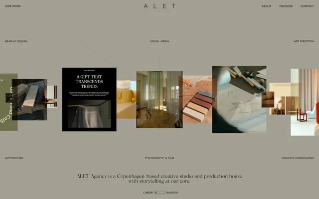
Preview image. Unlock full-res
Warm clay gallery
Color palette
Muted UI surface for disabled controls, low-emphasis panels, and placeholder blocks. Do not promote it to the primary CTA color
Primary text across all elements, icon color, strong borders for embedded content
Navigation text, subheadings, and soft borders
Decorative strokes and subtle visual accents. Almost indistinguishable from primary text but used for lighter effect
Secondary text for categories and descriptive labels
Subtle background for UI elements, very light borders, used sparingly
Typography
- Weights
- 400
- Sizes
- 11px, 12px, 13px
- Line height
- 1, 1.1, 1.5
- Fallback
- system-ui
Navigation, body text, image labels, and all functional interface elements. Its neutrality allows the serif to stand out.
- Weights
- 400
- Sizes
- 23px
- Line height
- 0.94
- Fallback
- serif
Primary headings and large display text. The delicate light weight creates a sense of gravitas and refined presence.
Spacing & shape
Components
Work Sans, Weight 400, size 13px, 'Charcoal Grey' #252525. Active/hover states subtle, often indicated by an 'Inkwell' #000000 border.
Work Sans, Weight 400, size 13px, 'Ash Secondary' #101010, positioned below headings.
Silk Serif, Weight 400, size 23px, Line Height 0.94, 'Inkwell' #000000. Features a tight letter-spacing that is inherent to the font choice.
Background is often the base 'Canvas Clay' #ada59b. Contains an 'Inkwell' #000000 border or text, varying content. Corner radius 10.8px.
Small pill-shaped container with Work Sans 400, 11px text. Border of 1px 'Inkwell' #000000, 9999px radius. Background is transparent or 'Canvas Clay' #ada59b.
Guidelines
- Use 'Canvas Clay' #ada59b as the primary background for all page sections and major UI elements.
- Apply 'Inkwell' #000000 for all primary text, ensuring a high contrast against the background.
- Employ Silk Serif Light 400 at 23px with 0.94 line height for all prominent headings to maintain a refined tone.
- Utilize Work Sans 400 at sizes 11px, 12px, or 13px with their respective line heights for all body text, navigation, and functional labels.
- Apply a 10.8px border-radius to all card-like containers, establishing a soft corner aesthetic.
- Use a minimum of 101px vertical spacing between major page sections to ensure a comfortable density.
- Outline interactive elements like buttons and toggles with a 1px 'Inkwell' #000000 border and a 9999px radius for a subtle, rounded pill shape.
- Avoid introducing vibrant colors; all UI elements must adhere to the defined monochrome palette of warm grays and off-whites.
- Do not use heavy shadows or gradients; flat surfaces and subtle borders define the visual hierarchy.
- Refrain from using bold or heavy weights for any typeface; lightness and delicate forms are key to the brand's aesthetic.
- Do not deviate from the specified typefaces; custom Work Sans and Silk Serif are integral to the brand identity.
- Avoid dense, overcrowded layouts; prioritize ample whitespace and comfortable spacing values like sectionGap 101px and elementGap 5px.
- Do not use generic system fonts; 'Work Sans' and 'Silk Serif' are deliberate choices.
- Introduce no rounded corners sharper than 10.8px for cards, nor less than 9999px for buttons, to maintain consistency.
About this system
ShowHide
ALET utilizes a muted, gallery-like aesthetic, offering an understated backdrop for its creative work. The design minimizes visual distractions, employing a monochrome palette dominated by dark text on a warm, desaturated canvas. Typography carries the primary visual weight, with elegant serifs for headlines and crisp sans-serifs for functional text, achieving a sophisticated yet grounded presentation. Interactive elements are subtle, blending into the background until hovered, emphasizing content over chrome.
The page structure is full-bleed, with content dynamically displayed across the viewport without a fixed max-width container, creating an immersive experience. The hero area is atypical, consisting of horizontally scrolling image cards and text, inviting exploration. Sections flow seamlessly with consistent vertical spacing, leveraging a natural, relaxed rhythm. Text and content blocks lean towards centered compositions or appear within the flow of the image carousel. Navigation is a minimalist top bar, almost blending into the background, providing essential links without drawing undue attention.
This design system uses a combination of curated, high-quality photography and minimalist graphical elements. Photography is central, featuring interiors, product shots, and abstract compositions, often with muted color palettes that blend with the site's overall tone. Images frequently appear as contained blocks within the layout, sometimes overlapping or featuring a slight rotation. Iconography is minimal, primarily text-based or simple, fine-line outlined styles, complementing the lightweight typography. Imagery serves both decorative atmosphere and to showcase content, and the density is balanced, allowing text to breathe alongside visuals.
Reminiscent of B&B Italia, Frama, Aesop.
# alet — Style Reference
> Warm clay gallery

**Theme:** light

**Site:** https://aletagency.com

ALET utilizes a muted, gallery-like aesthetic, offering an understated backdrop for its creative work. The design minimizes visual distractions, employing a monochrome palette dominated by dark text on a warm, desaturated canvas. Typography carries the primary visual weight, with elegant serifs for headlines and crisp sans-serifs for functional text, achieving a sophisticated yet grounded presentation. Interactive elements are subtle, blending into the background until hovered, emphasizing content over chrome.

## Tokens — Colors

| Name | Value | Token | Role |
|------|------|------|------|
| Canvas Clay | `#ada59b` | `--color-canvas-clay` | Muted UI surface for disabled controls, low-emphasis panels, and placeholder blocks. Do not promote it to the primary CTA color |
| Inkwell | `#000000` | `--color-inkwell` | Primary text across all elements, icon color, strong borders for embedded content |
| Charcoal Grey | `#252525` | `--color-charcoal-grey` | Navigation text, subheadings, and soft borders |
| Deep Shadow | `#060506` | `--color-deep-shadow` | Decorative strokes and subtle visual accents. Almost indistinguishable from primary text but used for lighter effect |
| Ash Secondary | `#101010` | `--color-ash-secondary` | Secondary text for categories and descriptive labels |
| Muted Stone | `#454545` | `--color-muted-stone` | Subtle background for UI elements, very light borders, used sparingly |

## Tokens — Typography

### Work Sans
- **Substitute:** system-ui
- **Weights:** 400
- **Sizes:** 11px, 12px, 13px
- **Line height:** 1, 1.1, 1.5
- **Role:** Navigation, body text, image labels, and all functional interface elements. Its neutrality allows the serif to stand out.

### Silk Serif
- **Substitute:** serif
- **Weights:** 400
- **Sizes:** 23px
- **Line height:** 0.94
- **Role:** Primary headings and large display text. The delicate light weight creates a sense of gravitas and refined presence.

## Tokens — Type Scale

Minor Second (1.067) from 13px base.

| Role | Size | Line height | Letter spacing |
|------|------|------|------|
| caption | 11px | 1.1 | — |
| body-sm | 12px | 1.1 | — |
| body | 13px | 1.1 | — |

## Tokens — Spacing

- **Section gap:** 101px
- **Card padding:** 22px
- **Element gap:** 5px

## Tokens — Radius

- **Buttons:** 9999px
- **Cards:** 10.8px

## Layout

The page structure is full-bleed, with content dynamically displayed across the viewport without a fixed max-width container, creating an immersive experience. The hero area is atypical, consisting of horizontally scrolling image cards and text, inviting exploration. Sections flow seamlessly with consistent vertical spacing, leveraging a natural, relaxed rhythm. Text and content blocks lean towards centered compositions or appear within the flow of the image carousel. Navigation is a minimalist top bar, almost blending into the background, providing essential links without drawing undue attention.

## Imagery

This design system uses a combination of curated, high-quality photography and minimalist graphical elements. Photography is central, featuring interiors, product shots, and abstract compositions, often with muted color palettes that blend with the site's overall tone. Images frequently appear as contained blocks within the layout, sometimes overlapping or featuring a slight rotation. Iconography is minimal, primarily text-based or simple, fine-line outlined styles, complementing the lightweight typography. Imagery serves both decorative atmosphere and to showcase content, and the density is balanced, allowing text to breathe alongside visuals.

## Components

### Navigation Link
*Interactive text link in the header and footer.*

Work Sans, Weight 400, size 13px, 'Charcoal Grey' #252525. Active/hover states subtle, often indicated by an 'Inkwell' #000000 border.

### Category Label
*Descriptive text for content categories.*

Work Sans, Weight 400, size 13px, 'Ash Secondary' #101010, positioned below headings.

### Main Heading
*Large, eye-catching title for sections or hero content.*

Silk Serif, Weight 400, size 23px, Line Height 0.94, 'Inkwell' #000000. Features a tight letter-spacing that is inherent to the font choice.

### Gallery Item Card
*Display unit for portfolio pieces.*

Background is often the base 'Canvas Clay' #ada59b. Contains an 'Inkwell' #000000 border or text, varying content. Corner radius 10.8px.

### Linear/Random Toggle
*Interactive element for content sorting.*

Small pill-shaped container with Work Sans 400, 11px text. Border of 1px 'Inkwell' #000000, 9999px radius. Background is transparent or 'Canvas Clay' #ada59b.

## Guidelines

### Do

- Use 'Canvas Clay' #ada59b as the primary background for all page sections and major UI elements.
- Apply 'Inkwell' #000000 for all primary text, ensuring a high contrast against the background.
- Employ Silk Serif Light 400 at 23px with 0.94 line height for all prominent headings to maintain a refined tone.
- Utilize Work Sans 400 at sizes 11px, 12px, or 13px with their respective line heights for all body text, navigation, and functional labels.
- Apply a 10.8px border-radius to all card-like containers, establishing a soft corner aesthetic.
- Use a minimum of 101px vertical spacing between major page sections to ensure a comfortable density.
- Outline interactive elements like buttons and toggles with a 1px 'Inkwell' #000000 border and a 9999px radius for a subtle, rounded pill shape.

### Don't

- Avoid introducing vibrant colors; all UI elements must adhere to the defined monochrome palette of warm grays and off-whites.
- Do not use heavy shadows or gradients; flat surfaces and subtle borders define the visual hierarchy.
- Refrain from using bold or heavy weights for any typeface; lightness and delicate forms are key to the brand's aesthetic.
- Do not deviate from the specified typefaces; custom Work Sans and Silk Serif are integral to the brand identity.
- Avoid dense, overcrowded layouts; prioritize ample whitespace and comfortable spacing values like sectionGap 101px and elementGap 5px.
- Do not use generic system fonts; 'Work Sans' and 'Silk Serif' are deliberate choices.
- Introduce no rounded corners sharper than 10.8px for cards, nor less than 9999px for buttons, to maintain consistency.

## Agent Prompt Guide

Quick Color Reference:
text: #000000
background: #ada59b
border: #000000
accent: none observed
primary action: no distinct CTA color

Example Component Prompts:
1. Create a header navigation link: 'Work Sans' 400, 13px, Charcoal Grey #252525. On hover, apply a 1px bottom border in Inkwell #000000.
2. Design a section headline: 'Silk Serif' 400, 23px, line height 0.94, Inkwell #000000, centered on the page with a 101px top margin.
3. Build a gallery item card for a project: Background Canvas Clay #ada59b, 10.8px border-radius, with an Inkwell #000000 text label ('Work Sans' 400, 12px) and a main 'Inkwell' #000000 title ('Silk Serif' 400, 18px).
4. Create a toggle button: Text 'Work Sans' 400, 11px, Inkwell #000000. The button should have a 1px Inkwell #000000 border and a 9999px border-radius, with 5px padding on top/bottom and 11px padding on left/right.
More like this









Keep what you find
A free account saves references to boards and can send you a weekly email of picks based on what you save.
To see every result, go Pro.