Preview image. Unlock full-res
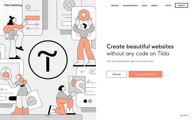
Architectural blueprint on white marble. Clean lines and a single warm accent define a space where work feels like play.
Color palette
Call-to-action buttons, active links, and prominent interactive elements; adding a vivid, approachable energy.
Supportive accent, often used in illustrations or as a secondary highlight to Warm Peach.
Page backgrounds, card surfaces, primary content backgrounds.
Primary text, critical headings, borders, and UI accents.
Secondary backgrounds, subtle fills, hover states, and lighter text nuances.
Darker backgrounds, deep button fills without being pure black.
Border colors, subtle dividers, inactive elements.
Typography
- Weights
- 100, 300, 400, 500, 600, 700
- Sizes
- All headline and most body text sizes. Its range of weights from 100 to 700 allows for distinct typographic hierarchy.
- Line height
- 1.13
- Letter spacing
- -0.038em at 78px down to 0.179em at 13px creates precise visual tension and breathability; tighter at larger sizes for impact, looser at smaller for readability.
- Fallback
- Inter
The primary typeface for all content. The light and thin weights (100, 300) are signature for large headings, creating an understated elegance that relies on kerning and generous line height rather than bolding for prominence. Higher weights used for body and interactive elements maintain clarity.
- Weights
- 100, 300, 400, 500
- Sizes
- 11px, 13px, 14px
- Line height
- 1.2
- Fallback
- Roboto
Secondary and utility text, often in smaller contexts like labels or footnotes, providing high readability at small sizes where TildaSans might be too stylized.
- Weights
- 400
- Sizes
- 16px
- Line height
- 1.2
- Fallback
- Merriweather
Used sparingly for specific content or within embedded components as a fallback, providing a classic contrast to the modern sans-serifs.
Spacing & shape
Components
backgroundColor= #fa8669 (Warm Peach), color=#ffffff (Arctic White), borderRadius=60px. Padding is implied by larger button sizes typically ~19px vertical and ~60px horizontal for full rectangular buttons.
backgroundColor=transparent, color=#000000 (Ink Black), border=1px solid #000000 (Ink Black), borderRadius=60px. Text is TildaSans, typically 400 weight.
backgroundColor=transparent, color=#000000 (Ink Black), border=none. Text is TildaSans, varying weights and sizes, often underlined on hover, and typically sharing the same color as body text.
backgroundColor=rgba(0,0,0,0), color=#000000 (Ink Black), border=none, hover/active background is #efefef (Cloud Gray) with text #000000. Often appears in navigation or as subtle interactive elements.
backgroundColor=#222222 (Graphite) or #000000 (Ink Black), color=#efefef (Cloud Gray) or #ffffff (Arctic White), borderRadius=0px. Padding around 19px vertical, 60px horizontal. Used for 'Log in' or similar.
backgroundColor=#cccccc (Pebble), color=#000000 (Ink Black), borderRadius=100px. Minimal padding around text. Text often TildaSans, 400 weight.
backgroundColor=rgba(0,0,0,0), borderRadius=0px, boxShadow=none. Acts as a transparent wrapper, often inheriting the page background. Internal padding varies wildly for content flow.
backgroundColor=rgba(0,0,0,0), color=#000000 (Ink Black), borderRadius=0px (though overall it appears rounded due to text padding and surrounding context), padding 0px vertical, 5px horizontal. The underlying pill-shaped interactive elements are likely built from `Pill Button (Neutral)`.
Guidelines
- Always use TildaSans as the primary typeface, leveraging light weights (100-300) for large headings and 400-500 for body text to maintain the sophisticated, understated tone.
- Utilize #fa8669 (Warm Peach) exclusively for primary calls-to-action and key interactive elements to draw attention and convey action.
- Maintain high contrast with #000000 (Ink Black) text on #ffffff (Arctic White) backgrounds for maximum readability and visual impact.
- Apply a 60px or 100px border-radius for all primary buttons and interactive pill-shaped elements to soften sharp lines.
- Ensure generous line-heights for all text, especially headings, to provide ample breathing room and enhance the sophisticated aesthetic.
- When introducing secondary backgrounds, use #efefef (Cloud Gray) to create subtle distinction without heavy shadows or borders.
- Employ consistent element gaps using the 8px, 10px, or 12px tokens for internal spacing, creating a precise and ordered layout.
- Avoid using multiple accent colors; #fa8669 (Warm Peach) and #ffa282 (Soft Peach) are the only acceptable chromatic accents.
- Do not use box shadows for general elevation of cards or sections; rely on background color changes or thick borders for hierarchy.
- Do not vary font families beyond TildaSans for primary content; Arial and Times are reserved for fallback or specific utility contexts.
- Never use small, tight line-heights that crowd text; maintain the spacious typographic style.
- Do not use heavy, bold weights for display headings; the aesthetic prioritizes thin, elegant typography even at large sizes.
- Avoid decorative borders or aggressive gradients that would detract from the clean, architectural feel.
- Do not introduce rounded corners on general information cards or section containers; maintain a sharp, logical structure for these elements.
About this system
ShowHide
Tilda's aesthetic is an 'architectural blueprint on white marble', conveying a sense of playful professionalism through precise lines and a singular warm accent against a stark, high-contrast monochrome palette. The design marries the structured with the whimsical, using clean typography and minimalist UI elements to frame dynamic, illustrative hero sections. A consistent application of a soft, peachy-orange for interactive elements injects warmth and approachability without compromising the overall sense of meticulous design.
The page primarily uses a full-bleed model, with the main content often centered within an implied maximum width but frequently extending to the viewport edges for background colors or illustrations. The hero section is characterized by a large, illustrative graphic occupying the left side, balancing a prominent, light-weighted headline and call-to-actions on the right. Section rhythm is generally consistent, with ample vertical spacing (multiples of ~60px to ~120px) between distinct content blocks, often separated by a hard white background. Content arrangement alternates between centered text stacks and left-aligned text with visual elements, creating a balanced, scannable flow. Minimalist navigation with centered links and distinct 'Log in'/'Sign up' buttons is present at the top right, staying sticky on scroll. There are no obvious multi-column card grids in the provided sections, favoring larger, distinct content blocks.
The site uses a distinct style of abstract, illustrative imagery, primarily seen in hero sections. These are line-art illustrations with occasional solid fills of #fa8669 (Warm Peach) and #000000 (Ink Black), featuring human figures interacting with UI elements in a whimsical, almost playful manner. The illustrations are contained within larger white or transparent sections, often overlapping simple geometric shapes or dotted patterns for added visual interest. They serve a decorative and atmospheric role, conveying the brand's creative and user-friendly approach without being literal product screenshots. The density is moderate to high in hero sections, then transitions to text-dominant content with occasional small, functional icons. Iconography is primarily outlined, matching the line-art illustration style.
Reminiscent of Figma, Notion, Webflow, Mailchimp.
# Tilda — Style Reference
> Architectural blueprint on white marble. Clean lines and a single warm accent define a space where work feels like play.

**Theme:** light

**Site:** https://tilda.cc

Tilda's aesthetic is an 'architectural blueprint on white marble', conveying a sense of playful professionalism through precise lines and a singular warm accent against a stark, high-contrast monochrome palette. The design marries the structured with the whimsical, using clean typography and minimalist UI elements to frame dynamic, illustrative hero sections. A consistent application of a soft, peachy-orange for interactive elements injects warmth and approachability without compromising the overall sense of meticulous design.

## Tokens — Colors

| Name | Value | Token | Role |
|------|------|------|------|
| Warm Peach | `#fa8669` | `--color-warm-peach` | Call-to-action buttons, active links, and prominent interactive elements; adding a vivid, approachable energy. |
| Soft Peach | `#ffa282` | `--color-soft-peach` | Supportive accent, often used in illustrations or as a secondary highlight to Warm Peach. |
| Arctic White | `#ffffff` | `--color-arctic-white` | Page backgrounds, card surfaces, primary content backgrounds. |
| Ink Black | `#000000` | `--color-ink-black` | Primary text, critical headings, borders, and UI accents. |
| Cloud Gray | `#efefef` | `--color-cloud-gray` | Secondary backgrounds, subtle fills, hover states, and lighter text nuances. |
| Graphite | `#222222` | `--color-graphite` | Darker backgrounds, deep button fills without being pure black. |
| Pebble | `#cccccc` | `--color-pebble` | Border colors, subtle dividers, inactive elements. |

## Tokens — Typography

### TildaSans
- **Substitute:** Inter
- **Weights:** 100, 300, 400, 500, 600, 700
- **Sizes:** All headline and most body text sizes. Its range of weights from 100 to 700 allows for distinct typographic hierarchy.
- **Line height:** 1.13
- **Letter spacing:** -0.038em at 78px down to 0.179em at 13px creates precise visual tension and breathability; tighter at larger sizes for impact, looser at smaller for readability.
- **Role:** The primary typeface for all content. The light and thin weights (100, 300) are signature for large headings, creating an understated elegance that relies on kerning and generous line height rather than bolding for prominence. Higher weights used for body and interactive elements maintain clarity.

### Arial
- **Substitute:** Roboto
- **Weights:** 100, 300, 400, 500
- **Sizes:** 11px, 13px, 14px
- **Line height:** 1.2
- **Role:** Secondary and utility text, often in smaller contexts like labels or footnotes, providing high readability at small sizes where TildaSans might be too stylized.

### Times
- **Substitute:** Merriweather
- **Weights:** 400
- **Sizes:** 16px
- **Line height:** 1.2
- **Role:** Used sparingly for specific content or within embedded components as a fallback, providing a classic contrast to the modern sans-serifs.

## Tokens — Type Scale

Golden Ratio (1.618) from 11px base.

| Role | Size | Line height | Letter spacing |
|------|------|------|------|
| caption | 11px | 1.2 | — |
| heading-sm | 22px | 1.57 | — |
| heading | 34px | 1.4 | — |
| heading-lg | 48px | 1.17 | — |
| display | 78px | 1.13 | 0.038em |

## Tokens — Radius

- **Buttons:** 100px for pill shapes, or 60px for softer rounded rectangles.
- **Cards:** 0px, maintaining a sharp, structured aesthetic.
- **other:** Occasional 6px or 30px for specific UI elements, breaking the sharpness for specific interactive elements.

## Layout

The page primarily uses a full-bleed model, with the main content often centered within an implied maximum width but frequently extending to the viewport edges for background colors or illustrations. The hero section is characterized by a large, illustrative graphic occupying the left side, balancing a prominent, light-weighted headline and call-to-actions on the right. Section rhythm is generally consistent, with ample vertical spacing (multiples of ~60px to ~120px) between distinct content blocks, often separated by a hard white background. Content arrangement alternates between centered text stacks and left-aligned text with visual elements, creating a balanced, scannable flow. Minimalist navigation with centered links and distinct 'Log in'/'Sign up' buttons is present at the top right, staying sticky on scroll. There are no obvious multi-column card grids in the provided sections, favoring larger, distinct content blocks.

## Imagery

The site uses a distinct style of abstract, illustrative imagery, primarily seen in hero sections. These are line-art illustrations with occasional solid fills of #fa8669 (Warm Peach) and #000000 (Ink Black), featuring human figures interacting with UI elements in a whimsical, almost playful manner. The illustrations are contained within larger white or transparent sections, often overlapping simple geometric shapes or dotted patterns for added visual interest. They serve a decorative and atmospheric role, conveying the brand's creative and user-friendly approach without being literal product screenshots. The density is moderate to high in hero sections, then transitions to text-dominant content with occasional small, functional icons. Iconography is primarily outlined, matching the line-art illustration style.

## Components

### CTA Button Group

### Pricing Plan Cards

### Feature Stat Block

### Primary Filled Button
*Call-to-action button for core actions like 'Sign up' or 'Create a website'.*

backgroundColor= #fa8669 (Warm Peach), color=#ffffff (Arctic White), borderRadius=60px. Padding is implied by larger button sizes typically ~19px vertical and ~60px horizontal for full rectangular buttons.

### Ghost Button (Primary)
*Secondary call-to-action or navigational element.*

backgroundColor=transparent, color=#000000 (Ink Black), border=1px solid #000000 (Ink Black), borderRadius=60px. Text is TildaSans, typically 400 weight.

### Text Link Button
*Inline actions or less prominent calls to action.*

backgroundColor=transparent, color=#000000 (Ink Black), border=none. Text is TildaSans, varying weights and sizes, often underlined on hover, and typically sharing the same color as body text.

### Ghost Button (Secondary Gray)
*Low-prominence or disabled actions.*

backgroundColor=rgba(0,0,0,0), color=#000000 (Ink Black), border=none, hover/active background is #efefef (Cloud Gray) with text #000000. Often appears in navigation or as subtle interactive elements.

### Dark Filled Button
*Specialized CTA for dark themes or specific sections.*

backgroundColor=#222222 (Graphite) or #000000 (Ink Black), color=#efefef (Cloud Gray) or #ffffff (Arctic White), borderRadius=0px. Padding around 19px vertical, 60px horizontal. Used for 'Log in' or similar.

### Pill Button (Neutral)
*Small interactive elements, categories, or tags.*

backgroundColor=#cccccc (Pebble), color=#000000 (Ink Black), borderRadius=100px. Minimal padding around text. Text often TildaSans, 400 weight.

### Empty Card
*Container for content without visual elevation, acting as a structured content block.*

backgroundColor=rgba(0,0,0,0), borderRadius=0px, boxShadow=none. Acts as a transparent wrapper, often inheriting the page background. Internal padding varies wildly for content flow.

### Pill Badge
*Small content labels, often used for categorization or status.*

backgroundColor=rgba(0,0,0,0), color=#000000 (Ink Black), borderRadius=0px (though overall it appears rounded due to text padding and surrounding context), padding 0px vertical, 5px horizontal. The underlying pill-shaped interactive elements are likely built from `Pill Button (Neutral)`.

## Guidelines

### Do

- Always use TildaSans as the primary typeface, leveraging light weights (100-300) for large headings and 400-500 for body text to maintain the sophisticated, understated tone.
- Utilize #fa8669 (Warm Peach) exclusively for primary calls-to-action and key interactive elements to draw attention and convey action.
- Maintain high contrast with #000000 (Ink Black) text on #ffffff (Arctic White) backgrounds for maximum readability and visual impact.
- Apply a 60px or 100px border-radius for all primary buttons and interactive pill-shaped elements to soften sharp lines.
- Ensure generous line-heights for all text, especially headings, to provide ample breathing room and enhance the sophisticated aesthetic.
- When introducing secondary backgrounds, use #efefef (Cloud Gray) to create subtle distinction without heavy shadows or borders.
- Employ consistent element gaps using the 8px, 10px, or 12px tokens for internal spacing, creating a precise and ordered layout.

### Don't

- Avoid using multiple accent colors; #fa8669 (Warm Peach) and #ffa282 (Soft Peach) are the only acceptable chromatic accents.
- Do not use box shadows for general elevation of cards or sections; rely on background color changes or thick borders for hierarchy.
- Do not vary font families beyond TildaSans for primary content; Arial and Times are reserved for fallback or specific utility contexts.
- Never use small, tight line-heights that crowd text; maintain the spacious typographic style.
- Do not use heavy, bold weights for display headings; the aesthetic prioritizes thin, elegant typography even at large sizes.
- Avoid decorative borders or aggressive gradients that would detract from the clean, architectural feel.
- Do not introduce rounded corners on general information cards or section containers; maintain a sharp, logical structure for these elements.

## Agent Prompt Guide

### Quick Color Reference
- **Text (Ink Black):** #000000
- **Background (Arctic White):** #ffffff
- **CTA (Warm Peach):** #fa8669
- **Border (Pebble):** #cccccc
- **Accent (Soft Peach):** #ffa282

### Example Component Prompts
1. **Create a hero section:** Arctic White (#ffffff) background. Headline 'Create beautiful websites' using TildaSans, 78px, weight 300, #000000, letter-spacing 0.038em. Subtext 'without any code on Tilda', TildaSans, 22px, weight 400, #000000, line-height 1.57. Primary button 'Create a website for free' is Warm Peach (#fa8669) background, Arctic White (#ffffff) text, 60px border-radius, font TildaSans 16px weight 500.
2. **Generate a Ghost Navigation Button:** 'Log In', background transparent, text Ink Black (#000000), TildaSans 16px weight 400. No border. On hover, background Cloud Gray (#efefef).
3. **Design a content block with a subtle background:** Cloud Gray (#efefef) background. Heading 'Share your passion with the world' using TildaSans, 48px, weight 300, #000000. Body text 'Now everyone can be a designer...' using TildaSans, 18px, weight 400, #000000, line-height 1.55. Internal padding 60px top and bottom.
More like this







Keep what you find
A free account saves references to boards and can send you a weekly email of picks based on what you save.
To see every result, go Pro.