Preview image. Unlock full-res
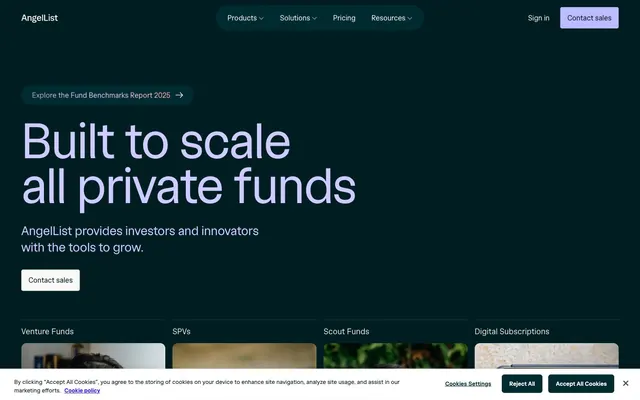
Midnight Ledger, luminous script.
Color palette
Gray text accent for links, tags, and emphasized short phrases
Navigation text, icons, and subtle headings. A muted green for clear yet unobtrusive signaling
Decorative fills and accent text for a soft, modern touch. Provides a gentle contrast to dark backgrounds
Accent for interactive elements, such as button backgrounds. A soft, approachable violet
Interactive link colors and borders. A vivid, almost electric violet for clickable elements
Decorative background for brand sections, creating flow and depth. Incorporates multiple brand hues
Specific background sections to convey richness or importance. A warm, earthy tone
Subtle border accents for cards or specific data displays. A desaturated, metallic hue
Alternative muted text or border color. A deeper, more earthy gray with a hint of warmth
Primary surface background, dark text on lighter surfaces. Conveys a deep, foundational tone
Lightest surface background, reverse text on dark surfaces, border accents. Creates high contrast and visual breaks
Secondary text variant, subtle separators and disabled states. Offers a softer contrast
Muted body text, helper text, and subtle icon strokes. For less prominent information
Subtle background for UI elements like navigation or ghost buttons. Softens primary dark backgrounds
Card backgrounds, primary button fills, interactive element borders. A slightly lighter shade of Midnight Ink
Hairline borders, subtle dividers, and inactive states. Provides internal structure without stark lines
Typography
- Weights
- 400, 500, 600, 700
- Sizes
- 11px, 12px, 13px, 14px, 16px, 18px, 90px, 216px
- Line height
- 0.9, 1.1, 1.2, 1.4, 1.45, 1.5, 1.6, 2.64
- Letter spacing
- -0.0500em at 216px, -0.0050em at 90px, normal at 11-18px
- Fallback
- Inter, Arial, sans-serif
Primary typeface for body text, interface elements, and smaller headings. Features stylistic alternates and tabular figures for precise data display, embodying a structured yet clean feel.
- Weights
- 400
- Sizes
- 28px, 38px, 60px, 90px, 112px, 216px
- Line height
- 0.9, 1.1, 1.15, 1.25, 1.3
- Letter spacing
- -0.0400em at 216px, -0.0150em at 90px
- Fallback
- Inter, Arial, sans-serif
Used exclusively for large, impactful display headings. Its slightly tighter tracking at larger sizes maintains legibility and prominence without feeling bloated.
Spacing & shape
Components
Text in Mint Glaze (#e0fee6) over a transparent background, transitioning to Verdant Mist (#cdeed3) on hover, with a 9999px border radius for a pill shape.
Background Charcoal Tint (rgba(0, 29, 33, 0.15)), text Verdant Mist (#cdeed3), with border radius 9999px. Padding typically 0px.
Background Charcoal Tint (#002b31), text Canvas White (#ffffff), with border radius 6px and 1px border in Charcoal Tint (#002b31). Padding 12px vertical, 16px horizontal.
Background Royal Violet (#bdbbff), text Canvas White (#ffffff), with border radius 9999px. Padding 10px vertical, 24px horizontal.
Background Charcoal Tint (#002b31), border radius 12px, no shadow. Padding is typically 0, content within provides structure.
Transparent background, no border radius, no shadow. Bottom padding 16px.
Background rgb(243, 244, 242) (near Canvas White), border radius 3px, no shadow. Padding 2px vertical, 4px horizontal.
Guidelines
- Use Midnight Ink (#001d21) as the default page background for most sections, establishing a dark, serious foundation.
- Employ angellistDisplay font at weight 400 with a negative letter-spacing between -0.015em and -0.04em for all large headings (90px and above) to maintain a compact, impactful look.
- Prioritize Canvas White (#ffffff) text on all Midnight Ink (#001d21) and Charcoal Tint (#002b31) backgrounds for maximum legibility.
- Apply a 9999px border-radius to all primary action buttons and navigation pills to create a distinct, approachable, 'soft' interactive element.
- Use Silver Thread (#ccd5d6) for hairline borders and subtle dividers, ensuring visual separation without heavy lines.
- Introduce Mint Glaze (#e0fee6) or Verdant Mist (#cdeed3) sparingly as accent colors for active states, small highlights, or positive indicators.
- Avoid using multiple chromatic colors in close proximity; maintain a largely monochromatic palette with selective accents.
- Do not use default system fonts; always utilize angellist or angellistDisplay variants for brand consistency.
- Do not introduce heavy shadows; the system favors subtle elevation through background color shifts and light borders.
- Avoid tight vertical spacing in content sections; ensure generous vertical buffer with a section gap of at least 48px.
- Do not place large blocks of text in accent colors; reserve them for highlights, interactive elements, or very short headings.
About this system
ShowHide
AngelList employs a sophisticated, dark-mode financial intelligence aesthetic. Deep, almost-black surfaces create a sense of gravitas, punctuated by crisp, light typography that stands out with authoritative clarity. Subtle green and muted violet accents are sparingly used for functional elements, guiding the eye without overwhelming the serious tone. Components feature soft, rounded edges and light borders, maintaining a sense of approachability within the otherwise robust system.
The page primarily uses a full-bleed dark background for impact, with content sections constrained to a central max-width (likely 1200px based on component widths) that is not fixed, but implied. The hero section is full-bleed, featuring a large, centered headline on a dark canvas. Content flows in distinct blocks, often alternating background colors or using large, dark cards (#002b31) to break up sections. There's a common pattern of 4-column card grids for features. The rhythm is comfortable, with generous vertical spacing between sections. Navigation is handled by a fixed top bar on a dark background, with main links and a primary button.
The site uses a mix of tightly cropped, process-oriented photography showing people interacting with technology or collaborating, and abstract product screenshots. Photography includes candid, mid-tone, slightly desaturated images of people in professional settings, often with hands-on focus, serving to ground the abstract financial concepts in human activity. Product screenshots are clean, showcasing UI against dark backgrounds. Visuals are contained within cards, often with soft transitions or subtle overlays, without raw edges or heavy masking. Icons are generally outlined with a medium stroke weight, in monochromatic or brand accent colors, providing functional clarity.
Reminiscent of Linear, Rippling, Brex, Vercel.
# AngelList — Style Reference
> Midnight Ledger, luminous script.

**Theme:** dark

**Site:** https://www.angellist.com

AngelList employs a sophisticated, dark-mode financial intelligence aesthetic. Deep, almost-black surfaces create a sense of gravitas, punctuated by crisp, light typography that stands out with authoritative clarity. Subtle green and muted violet accents are sparingly used for functional elements, guiding the eye without overwhelming the serious tone. Components feature soft, rounded edges and light borders, maintaining a sense of approachability within the otherwise robust system.

## Tokens — Colors

| Name | Value | Token | Role |
|------|------|------|------|
| Mint Glaze | `#e0fee6` | `--color-mint-glaze` | Gray text accent for links, tags, and emphasized short phrases |
| Verdant Mist | `#cdeed3` | `--color-verdant-mist` | Navigation text, icons, and subtle headings. A muted green for clear yet unobtrusive signaling |
| Lavender Haze | `#cdcbff` | `--color-lavender-haze` | Decorative fills and accent text for a soft, modern touch. Provides a gentle contrast to dark backgrounds |
| Royal Violet | `#bdbbff` | `--color-royal-violet` | Accent for interactive elements, such as button backgrounds. A soft, approachable violet |
| Deep Plum | `#3a25f5` | `--color-deep-plum` | Interactive link colors and borders. A vivid, almost electric violet for clickable elements |
| Cosmic Gradient | `#6258ff` | `--color-cosmic-gradient` | Decorative background for brand sections, creating flow and depth. Incorporates multiple brand hues |
| Harvest Gold | `#6e5c3b` | `--color-harvest-gold` | Specific background sections to convey richness or importance. A warm, earthy tone |
| Patina | `#5d5337` | `--color-patina` | Subtle border accents for cards or specific data displays. A desaturated, metallic hue |
| Bronze Slate | `#544a2e` | `--color-bronze-slate` | Alternative muted text or border color. A deeper, more earthy gray with a hint of warmth |
| Midnight Ink | `#001d21` | `--color-midnight-ink` | Primary surface background, dark text on lighter surfaces. Conveys a deep, foundational tone |
| Canvas White | `#ffffff` | `--color-canvas-white` | Lightest surface background, reverse text on dark surfaces, border accents. Creates high contrast and visual breaks |
| Ash Cloud | `#e1e3e3` | `--color-ash-cloud` | Secondary text variant, subtle separators and disabled states. Offers a softer contrast |
| Smoke Gray | `#68706f` | `--color-smoke-gray` | Muted body text, helper text, and subtle icon strokes. For less prominent information |
| Pale Stone | `#f1f3f2` | `--color-pale-stone` | Subtle background for UI elements like navigation or ghost buttons. Softens primary dark backgrounds |
| Charcoal Tint | `#002b31` | `--color-charcoal-tint` | Card backgrounds, primary button fills, interactive element borders. A slightly lighter shade of Midnight Ink |
| Silver Thread | `#ccd5d6` | `--color-silver-thread` | Hairline borders, subtle dividers, and inactive states. Provides internal structure without stark lines |

## Tokens — Typography

### angellist
- **Substitute:** Inter, Arial, sans-serif
- **Weights:** 400, 500, 600, 700
- **Sizes:** 11px, 12px, 13px, 14px, 16px, 18px, 90px, 216px
- **Line height:** 0.9, 1.1, 1.2, 1.4, 1.45, 1.5, 1.6, 2.64
- **Letter spacing:** -0.0500em at 216px, -0.0050em at 90px, normal at 11-18px
- **Role:** Primary typeface for body text, interface elements, and smaller headings. Features stylistic alternates and tabular figures for precise data display, embodying a structured yet clean feel.

### angellistDisplay
- **Substitute:** Inter, Arial, sans-serif
- **Weights:** 400
- **Sizes:** 28px, 38px, 60px, 90px, 112px, 216px
- **Line height:** 0.9, 1.1, 1.15, 1.25, 1.3
- **Letter spacing:** -0.0400em at 216px, -0.0150em at 90px
- **Role:** Used exclusively for large, impactful display headings. Its slightly tighter tracking at larger sizes maintains legibility and prominence without feeling bloated.

## Tokens — Type Scale

| Role | Size | Line height | Letter spacing |
|------|------|------|------|
| caption | 11px | 1.4 | — |
| body | 14px | 1.5 | — |
| subheading | 18px | 1.2 | -0.09em |
| heading | 38px | 1.15 | -0.57px |
| heading-lg | 90px | 1.1 | -1.35px |
| display | 216px | 0.9 | -8.64px |

## Tokens — Spacing

- **Section gap:** 48px
- **Card padding:** 16px
- **Element gap:** 4px

## Tokens — Radius

- **Default:** 4px
- **Buttons:** 9999px
- **Cards:** 12px

## Layout

The page primarily uses a full-bleed dark background for impact, with content sections constrained to a central max-width (likely 1200px based on component widths) that is not fixed, but implied. The hero section is full-bleed, featuring a large, centered headline on a dark canvas. Content flows in distinct blocks, often alternating background colors or using large, dark cards (#002b31) to break up sections. There's a common pattern of 4-column card grids for features. The rhythm is comfortable, with generous vertical spacing between sections. Navigation is handled by a fixed top bar on a dark background, with main links and a primary button.

## Imagery

The site uses a mix of tightly cropped, process-oriented photography showing people interacting with technology or collaborating, and abstract product screenshots. Photography includes candid, mid-tone, slightly desaturated images of people in professional settings, often with hands-on focus, serving to ground the abstract financial concepts in human activity. Product screenshots are clean, showcasing UI against dark backgrounds. Visuals are contained within cards, often with soft transitions or subtle overlays, without raw edges or heavy masking. Icons are generally outlined with a medium stroke weight, in monochromatic or brand accent colors, providing functional clarity.

## Components

### Navigation Link (Active/Hover)
*Top navigation item, highlighted state*

Text in Mint Glaze (#e0fee6) over a transparent background, transitioning to Verdant Mist (#cdeed3) on hover, with a 9999px border radius for a pill shape.

### Primary Ghost Button
*Call to action, less prominent*

Background Charcoal Tint (rgba(0, 29, 33, 0.15)), text Verdant Mist (#cdeed3), with border radius 9999px. Padding typically 0px.

### Outlined Button
*Secondary action, distinctive outline*

Background Charcoal Tint (#002b31), text Canvas White (#ffffff), with border radius 6px and 1px border in Charcoal Tint (#002b31). Padding 12px vertical, 16px horizontal.

### Primary Filled Button
*Primary call to action (e.g. 'Contact sales')*

Background Royal Violet (#bdbbff), text Canvas White (#ffffff), with border radius 9999px. Padding 10px vertical, 24px horizontal.

### Card - Dark Surface
*Content container with elevated dark surface*

Background Charcoal Tint (#002b31), border radius 12px, no shadow. Padding is typically 0, content within provides structure.

### Card - Transparent
*Content container for featured sections*

Transparent background, no border radius, no shadow. Bottom padding 16px.

### Card - Light Accent
*Small informational card, e.g. cookie settings*

Background rgb(243, 244, 242) (near Canvas White), border radius 3px, no shadow. Padding 2px vertical, 4px horizontal.

## Guidelines

### Do

- Use Midnight Ink (#001d21) as the default page background for most sections, establishing a dark, serious foundation.
- Employ angellistDisplay font at weight 400 with a negative letter-spacing between -0.015em and -0.04em for all large headings (90px and above) to maintain a compact, impactful look.
- Prioritize Canvas White (#ffffff) text on all Midnight Ink (#001d21) and Charcoal Tint (#002b31) backgrounds for maximum legibility.
- Apply a 9999px border-radius to all primary action buttons and navigation pills to create a distinct, approachable, 'soft' interactive element.
- Use Silver Thread (#ccd5d6) for hairline borders and subtle dividers, ensuring visual separation without heavy lines.
- Introduce Mint Glaze (#e0fee6) or Verdant Mist (#cdeed3) sparingly as accent colors for active states, small highlights, or positive indicators.

### Don't

- Avoid using multiple chromatic colors in close proximity; maintain a largely monochromatic palette with selective accents.
- Do not use default system fonts; always utilize angellist or angellistDisplay variants for brand consistency.
- Do not introduce heavy shadows; the system favors subtle elevation through background color shifts and light borders.
- Avoid tight vertical spacing in content sections; ensure generous vertical buffer with a section gap of at least 48px.
- Do not place large blocks of text in accent colors; reserve them for highlights, interactive elements, or very short headings.

## Agent Prompt Guide

Quick Color Reference:
text: #ffffff
background: #001d21
border: #ccd5d6
accent: #e0fee6
primary action: #002b31 (filled action)

Example Component Prompts:
1. Create a Primary Action Button: #002b31 background, #ffffff text, 9999px radius, compact pill padding. Use this filled treatment for the main CTA.
2. Create a feature card: Charcoal Tint (#002b31) background, 12px radius, 16px padding. Heading at 18px angellist weight 700, Canvas White (#ffffff). Body text at 14px angellist weight 400, Smoke Gray (#68706f). Include a ghost button with background rgba(0, 29, 33, 0.15), Verdant Mist (#cdeed3) text, 9999px radius.
3. Create a navigation item: Verdant Mist (#cdeed3) text at 16px angellist weight 500. On hover, change text to Mint Glaze (#e0fee6) and apply a transparent background.
More like this






Keep what you find
A free account saves references to boards and can send you a weekly email of picks based on what you save.
To see every result, go Pro.