Preview image. Unlock full-res
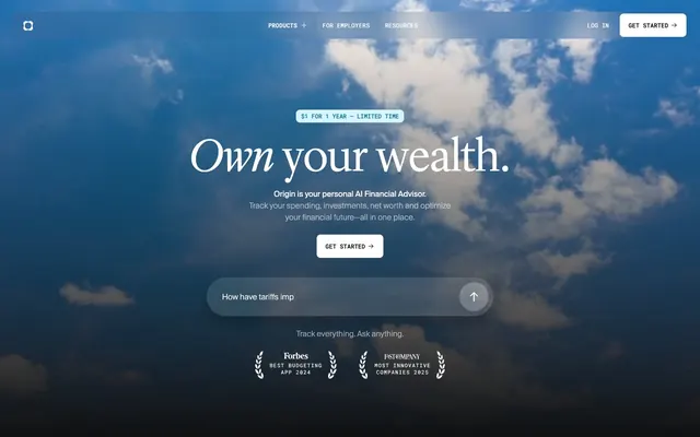
Midnight Command Center – screens glowing with data against a dark, seamless backdrop.
Color palette
Decorative card backgrounds, accent in data visualizations
Decorative card backgrounds, accent in data visualizations, icon fills
Muted decorative card backgrounds, secondary accent
Decorative card backgrounds, accent for specific data points
Stronger decorative card backgrounds, prominent accent
Light decorative card backgrounds, tertiary accent
Subtle blue tint for borders and muted text, often in navigation
Primary page and large section background; Complex background gradient for hero sections, adding atmospheric depth
Card backgrounds, secondary container surfaces
Neutral form states, badge text, and quiet UI feedback where color should stay understated. Do not promote it to the primary CTA color
Primary text, button text on dark backgrounds, active states, borders
Secondary text for headlines, subtle borders
Tertiary text, divider lines, muted elements
Placeholder text, minor descriptive text, inactive button borders
Background gradient for hero sections, conveying depth and atmosphere
Typography
- Weights
- 300, 400
- Sizes
- 38px, 80px, 96px
- Line height
- 0.9, 1
- Fallback
- Playfair Display, Lora
Display headlines and hero titles. The 300 weight is used for large, elegant branding, conveying authority through visual lightness instead of heavy impact.
- Weights
- 400
- Sizes
- 11px, 14px, 16px
- Line height
- 1, 1.5, 1.67, 2.18
- Letter spacing
- 0.182em
- Fallback
- Montserrat, Lato
Navigation, interactive elements, and certain card labels. Its slightly wider tracking gives it an airy, modern feel, especially at smaller sizes.
- Weights
- 300, 400
- Sizes
- 12px, 14px, 16px, 18px
- Line height
- 1, 1.41, 1.43, 1.5, 2
- Letter spacing
- normal
- Fallback
- Inter, Roboto
Body text, subheadings, and general UI text. Its normal letter spacing ensures readability for longer blocks of text.
- Weights
- 400, 500
- Sizes
- 10px, 11px, 12px, 16px
- Line height
- 1.35, 1.4, 1.5, 2
- Letter spacing
- 0.016em, 0.021em, 0.182em
- Fallback
- Space Mono, Fira Code
Used for code snippets, financial figures, and technical data where fixed-width alignment and precise character distinction are important.
Spacing & shape
Components
Ghost White text on a transparent background with an 8px radius. Text is 16px Suisseintltrial weight 400. Hover state shows a subtle white background fill. Padding: 12px vertical, 18px horizontal.
Slate Canvas text on a Ghost White background with an 8px radius. Text is 16px Suisseintltrial weight 400. Padding: 12px vertical, 18px horizontal.
Ghost White text on a transparent background with a 100% border radius (effectively circular). Background is rgba(255, 255, 255, 0.2). Padding: 1px vertical, 6px horizontal.
Slate Canvas background with a 1440px border-radius (pill shape). Ghost White text color at 16px Suisseintl weight 400. Left padding 32px, right padding 10px. Subtle border rgba(255, 255, 255, 0.15).
Features a large 16px border-radius. Background colors vary, often utilizing Ocean Glimmer, Violet Haze, or Soft Rose. No box shadow, relying instead on distinct background color for separation. Padding: 90px.
No border radius, no box shadow, transparent background. Typically used for internal content organization or when imagery fills the card area.
Elevated Charcoal background with a 30px border radius. Padding: 32px. No box shadow, distinct color defines elevation.
Guidelines
- Always use Midnight Ink (#0f1011) as the primary page background to maintain the dark theme.
- Utilize Lyondisplay App weight 300 for prominent headlines, letting its lightness convey subtle authority.
- Apply a generous 16px border-radius to static cards and 8px to interactive components like buttons and inputs.
- Structure primary buttons as Ghost White text on a transparent background, accented with a light border, to maintain visual lightness.
- Incorporate accent colors like Ocean Glimmer (#00b3dd) or Violet Haze (#847dff) primarily within card backgrounds or data visualizations, as functional highlights.
- Maintain comfortable element spacing with 12px as a common `elementGap` between related items.
- Ensure all body text uses Suisseintl weight 400 for optimal readability on dark backgrounds.
- Avoid using harsh, saturated primary colors for large background areas; reserve vivid hues for contained accents.
- Do not introduce strong drop shadows; the system relies on distinct background colors and subtle borders for elevation.
- Do not deviate from the specified font families or their intended weights and letter spacing, as these are critical for brand identity.
- Never use Ghost White (#ffffff) text directly on Slate Canvas (#000000) for large text blocks; primary text should sit against Midnight Ink or Elevated Charcoal for optimal contrast.
- Avoid using generic button styles; always apply the specific radius (8px or 1440px) as defined for primary actions.
- Do not create dense layouts; maintain a comfortable density with ample padding and vertical spacing.
- Don't use more than a single accent color in any given visual area to avoid visual clutter and maintain focus.
About this system
ShowHide
Origin Financial employs a 'Dark Canvas, Subtle Glow' visual system. It uses a deep, rich dark grey as its primary background, accented by layers of lighter, desaturated greys for elevated surfaces and text. Typography is elegant, with a focus on restrained display fonts and highly legible body text. While largely monochromatic, the system introduces a spectrum of soft, vivid colors within functional cards, creating a sense of dynamic data visualization and subtle branding rather than overt color blocking.
The page uses a max-width 1200px centered layout for content sections. The hero section is full-bleed, featuring atmospheric photography or gradient backgrounds with a large, centered headline and a centered call-to-action block. Subsequent sections maintain consistent vertical spacing, creating a comfortable, unhurried rhythm. Content is often presented in centered stacks or a 3-column card grid, with cards dynamically themed. Navigation is a sticky top bar, minimal and semi-transparent, supporting a secondary Log In button and a prominent 'Get Started' ghost button. The layout feels spacious and deliberate, with breathing room between major content blocks.
The site primarily uses dark, atmospheric photography as background elements in hero sections, often with cloud formations, setting a reflective and expansive mood. Product screenshots are contained within device mockups (like iPhones), showcasing the UI in a dark mode context, implying functionality and data visualization. Illustrations are absent. Icons are minimal, monochromatic, and outlined, reinforcing the clean, data-focused UI. Imagery serves as decorative atmosphere or explanatory product showcase, not content-heavy. The overall density is text-dominant.
Reminiscent of Wealthfront, Supabase, Fathom Analytics, Revolut.
# Origin Financial — Style Reference
> Midnight Command Center – screens glowing with data against a dark, seamless backdrop.

**Theme:** dark

**Site:** https://www.useorigin.com

Origin Financial employs a 'Dark Canvas, Subtle Glow' visual system. It uses a deep, rich dark grey as its primary background, accented by layers of lighter, desaturated greys for elevated surfaces and text. Typography is elegant, with a focus on restrained display fonts and highly legible body text. While largely monochromatic, the system introduces a spectrum of soft, vivid colors within functional cards, creating a sense of dynamic data visualization and subtle branding rather than overt color blocking.

## Tokens — Colors

| Name | Value | Token | Role |
|------|------|------|------|
| Ocean Glimmer | `#00b3dd` | `--color-ocean-glimmer` | Decorative card backgrounds, accent in data visualizations |
| Violet Haze | `#847dff` | `--color-violet-haze` | Decorative card backgrounds, accent in data visualizations, icon fills |
| Lavender Mist | `#d1c9ff` | `--color-lavender-mist` | Muted decorative card backgrounds, secondary accent |
| Soft Rose | `#dd90d8` | `--color-soft-rose` | Decorative card backgrounds, accent for specific data points |
| Deep Indigo | `#4b49aa` | `--color-deep-indigo` | Stronger decorative card backgrounds, prominent accent |
| Sky Tint | `#90b8f0` | `--color-sky-tint` | Light decorative card backgrounds, tertiary accent |
| Deep Sea | `#195f97` | `--color-deep-sea` | Subtle blue tint for borders and muted text, often in navigation |
| Midnight Ink | `#0f1011` | `--color-midnight-ink` | Primary page and large section background; Complex background gradient for hero sections, adding atmospheric depth |
| Elevated Charcoal | `#2e2e2e` | `--color-elevated-charcoal` | Card backgrounds, secondary container surfaces |
| Slate Canvas | `#000000` | `--color-slate-canvas` | Neutral form states, badge text, and quiet UI feedback where color should stay understated. Do not promote it to the primary CTA color |
| Ghost White | `#ffffff` | `--color-ghost-white` | Primary text, button text on dark backgrounds, active states, borders |
| Faded Mist | `#f5f5f7` | `--color-faded-mist` | Secondary text for headlines, subtle borders |
| Subtle Ash | `#cacaca` | `--color-subtle-ash` | Tertiary text, divider lines, muted elements |
| Whisper Blue | `#6a6b6b` | `--color-whisper-blue` | Placeholder text, minor descriptive text, inactive button borders |
| Dark Sky Gradient | `#2b2b2c` | `--color-dark-sky-gradient` | Background gradient for hero sections, conveying depth and atmosphere |

## Tokens — Typography

### Lyondisplay App
- **Substitute:** Playfair Display, Lora
- **Weights:** 300, 400
- **Sizes:** 38px, 80px, 96px
- **Line height:** 0.9, 1
- **Role:** Display headlines and hero titles. The 300 weight is used for large, elegant branding, conveying authority through visual lightness instead of heavy impact.

### Suisseintltrial
- **Substitute:** Montserrat, Lato
- **Weights:** 400
- **Sizes:** 11px, 14px, 16px
- **Line height:** 1, 1.5, 1.67, 2.18
- **Letter spacing:** 0.182em
- **Role:** Navigation, interactive elements, and certain card labels. Its slightly wider tracking gives it an airy, modern feel, especially at smaller sizes.

### Suisseintl
- **Substitute:** Inter, Roboto
- **Weights:** 300, 400
- **Sizes:** 12px, 14px, 16px, 18px
- **Line height:** 1, 1.41, 1.43, 1.5, 2
- **Letter spacing:** normal
- **Role:** Body text, subheadings, and general UI text. Its normal letter spacing ensures readability for longer blocks of text.

### Roboto Mono
- **Substitute:** Space Mono, Fira Code
- **Weights:** 400, 500
- **Sizes:** 10px, 11px, 12px, 16px
- **Line height:** 1.35, 1.4, 1.5, 2
- **Letter spacing:** 0.016em, 0.021em, 0.182em
- **Role:** Used for code snippets, financial figures, and technical data where fixed-width alignment and precise character distinction are important.

## Tokens — Type Scale

| Role | Size | Line height | Letter spacing |
|------|------|------|------|
| caption | 11px | 1.5 | 0.182px |
| body | 14px | 1.5 | — |
| heading | 38px | 1 | — |
| heading-lg | 80px | 0.9 | — |
| display | 96px | 0.9 | — |

## Tokens — Spacing

- **Max width:** 1200px
- **Section gap:** 64px
- **Card padding:** 32px
- **Element gap:** 12px

## Tokens — Radius

- **Buttons:** 8px
- **Cards:** 16px
- **circularElements:** 14385.6px
- **largeCards:** 30px
- **pillButtons:** 1440px

## Layout

The page uses a max-width 1200px centered layout for content sections. The hero section is full-bleed, featuring atmospheric photography or gradient backgrounds with a large, centered headline and a centered call-to-action block. Subsequent sections maintain consistent vertical spacing, creating a comfortable, unhurried rhythm. Content is often presented in centered stacks or a 3-column card grid, with cards dynamically themed. Navigation is a sticky top bar, minimal and semi-transparent, supporting a secondary Log In button and a prominent 'Get Started' ghost button. The layout feels spacious and deliberate, with breathing room between major content blocks.

## Imagery

The site primarily uses dark, atmospheric photography as background elements in hero sections, often with cloud formations, setting a reflective and expansive mood. Product screenshots are contained within device mockups (like iPhones), showcasing the UI in a dark mode context, implying functionality and data visualization. Illustrations are absent. Icons are minimal, monochromatic, and outlined, reinforcing the clean, data-focused UI. Imagery serves as decorative atmosphere or explanatory product showcase, not content-heavy. The overall density is text-dominant.

## Components

### Primary Ghost Button
*Main call to action on dark backgrounds.*

Ghost White text on a transparent background with an 8px radius. Text is 16px Suisseintltrial weight 400. Hover state shows a subtle white background fill. Padding: 12px vertical, 18px horizontal.

### Light Filled Button
*Call to action on dark backgrounds where immediate strong contrast is needed.*

Slate Canvas text on a Ghost White background with an 8px radius. Text is 16px Suisseintltrial weight 400. Padding: 12px vertical, 18px horizontal.

### Circular Micro Button
*Small, interactive buttons for secondary actions or toggles.*

Ghost White text on a transparent background with a 100% border radius (effectively circular). Background is rgba(255, 255, 255, 0.2). Padding: 1px vertical, 6px horizontal.

### Pill Input Field
*Search bars or prominent single-line text inputs.*

Slate Canvas background with a 1440px border-radius (pill shape). Ghost White text color at 16px Suisseintl weight 400. Left padding 32px, right padding 10px. Subtle border rgba(255, 255, 255, 0.15).

### Themed Content Card
*Displaying data or information with a unique thematic background color.*

Features a large 16px border-radius. Background colors vary, often utilizing Ocean Glimmer, Violet Haze, or Soft Rose. No box shadow, relying instead on distinct background color for separation. Padding: 90px.

### Seamless Card
*Cards seamlessly integrated into the background with no discernible borders or shadows.*

No border radius, no box shadow, transparent background. Typically used for internal content organization or when imagery fills the card area.

### Floating Data Card
*Elevated card for statistical data or features, used against a dark background.*

Elevated Charcoal background with a 30px border radius. Padding: 32px. No box shadow, distinct color defines elevation.

## Guidelines

### Do

- Always use Midnight Ink (#0f1011) as the primary page background to maintain the dark theme.
- Utilize Lyondisplay App weight 300 for prominent headlines, letting its lightness convey subtle authority.
- Apply a generous 16px border-radius to static cards and 8px to interactive components like buttons and inputs.
- Structure primary buttons as Ghost White text on a transparent background, accented with a light border, to maintain visual lightness.
- Incorporate accent colors like Ocean Glimmer (#00b3dd) or Violet Haze (#847dff) primarily within card backgrounds or data visualizations, as functional highlights.
- Maintain comfortable element spacing with 12px as a common `elementGap` between related items.
- Ensure all body text uses Suisseintl weight 400 for optimal readability on dark backgrounds.

### Don't

- Avoid using harsh, saturated primary colors for large background areas; reserve vivid hues for contained accents.
- Do not introduce strong drop shadows; the system relies on distinct background colors and subtle borders for elevation.
- Do not deviate from the specified font families or their intended weights and letter spacing, as these are critical for brand identity.
- Never use Ghost White (#ffffff) text directly on Slate Canvas (#000000) for large text blocks; primary text should sit against Midnight Ink or Elevated Charcoal for optimal contrast.
- Avoid using generic button styles; always apply the specific radius (8px or 1440px) as defined for primary actions.
- Do not create dense layouts; maintain a comfortable density with ample padding and vertical spacing.
- Don't use more than a single accent color in any given visual area to avoid visual clutter and maintain focus.

## Agent Prompt Guide

Quick Color Reference:
text: #ffffff
background: #0f1011
border: #ffffff
accent: #847dff
primary action: #ffffff (filled action)

Example Component Prompts:

1. Create a Primary Action Button: #ffffff background, #000000 text, 9999px radius, compact pill padding. Use this filled treatment for the main CTA.

2. Create a Themed Content Card: Use 'Ocean Glimmer' (#00b3dd) for the background with 16px border-radius. Inside, place a title 'Spending Overview' using Suisseintl weight 400, 18px, Ghost White text, and body text 'View your monthly budget' using Suisseintl weight 400, 14px, Ghost White text.

3. Create a Pill Input Field: Use Slate Canvas (#000000) background with 1440px border-radius. Placeholder text 'How have tariffs imp' in Whisper Blue (#6a6b6b) with Suisseintl weight 400, 16px. Left padding 32px, right padding 10px. Include a small circular submit button on the right with Ghost White icon, rgba(255, 255, 255, 0.2) background, 100% radius, 1px vertical 6px horizontal padding.
More like this





Keep what you find
A free account saves references to boards and can send you a weekly email of picks based on what you save.
To see every result, go Pro.