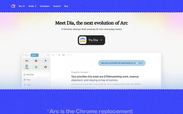
Preview image. Unlock full-res
Playful gradient on clean slate
Color palette
Primary brand color, used for prominent links, icons, and hero elements, representing the core identity.
A darker shade of violet for interactive states, buttons, and focused elements to provide visual feedback.
Accent color used sparingly, primarily for icons in the navigation, adding a touch of dynamism.
Accent color for icons in the navigation, contributing to a diverse, playful palette for small elements.
Accent color for icons in the navigation, adding warmth and variety.
Accent color for icons in the navigation, providing depth.
Accent color for icons in the navigation, a rich, dark hue.
Accent color for icons in the navigation.
Primary page background and pristine surfaces.
Subtle secondary background for content sections and slight surface elevation.
Even lighter background used for specific content blocks in the hero section, creating a soft visual lift.
Primary text color for headlines and body copy, providing high contrast against light backgrounds.
Secondary text used for body paragraphs and descriptive content.
Tertiary text for less prominent information or subtle details.
The base color for button shadows, providing a soft, almost imperceptible lift.
Background for the hero section, fading from light yellow to blue, defining the site's playful energy.
Typography
- Weights
- 500, 700
- Sizes
- 14px, 16px, 28px, 40px, 46px
- Line height
- 0.93, 0.98, 1.07, 1.1, 1.2
- Letter spacing
- -0.02em, -0.02em, -0.04em, -0.04em, -0.05em
- Fallback
- Montserrat
Used for navigation items and significant headings, characterized by its rounded, inviting forms, and tight letter spacing at larger sizes, giving it a modern, almost-compressed feel without sacrificing legibility.
- Weights
- 400, 700, 800
- Sizes
- 16px, 46px
- Line height
- 0.93, 1.2
- Letter spacing
- -0.04em, -0.04em
- Fallback
- Montserrat
The core typeface for body text and prominent display headlines. Its clear, geometric structure provides a high degree of readability even with very tight letter spacing, acting as a workhorse for informational content and key statements.
- Weights
- 500, 600, 700
- Sizes
- 12px, 17px
- Line height
- 1.2, 1.5
- Letter spacing
- 0.033em, 0.033em
- Fallback
- Inter
A highly versatile sans-serif for interactive elements, smaller text, and functional copy. Its variable nature allows for precise control, making it suitable for compact UI elements where legibility at small sizes is crucial. The slightly positive letter spacing helps differentiate it from the tightly tracked headlines.
- Weights
- 400, 700
- Sizes
- 12px
- Line height
- 1.2
- Letter spacing
- 0.033em
- Fallback
- Space Mono
A monospaced font used for code snippets, technical details, or unique UI elements that require a distinct, more structured feel, emphasizing precision and technicality. The varied letter spacing implies careful typographic treatment for specific data display.
- Weights
- 600
- Sizes
- 14px
- Line height
- 2.07
- Letter spacing
- -0.01em
- Fallback
- system-ui
Fallback system font for buttons, ensuring native OS readability and baseline consistency. The slightly negative letter spacing gives it a clean, modern appearance within button contexts.
- Weights
- 400
- Sizes
- 20px, 24px
- Line height
- 1.2
- Letter spacing
- normal, normal
- Fallback
- IBM Plex Sans
A more traditional, open sans-serif, acting as a counterpoint to the tightly tracked headlines. Used for body text at larger sizes and subheadings, providing a sense of space and approachability with normal letter spacing.
- Weights
- 700
- Sizes
- 36px
- Line height
- 1
- Letter spacing
- -0.02em
- Fallback
- Oswald
A bold, impactful font reserved for singular, high-impact statements. Its condensed nature and tight letter spacing ensure it stands out and conveys authority in key messaging areas.
Spacing & shape
Elevation
Components
A ghost button for primary actions, featuring an Arc Violet (#3139fb) text color, a 10px corner radius, and 8px vertical padding. The border color matches the text, giving it a minimalist yet prominent appearance.
Similar to the Primary Ghost Button, but with a white background and Action Violet (#2702c2) text and border, offering a slightly more subdued interaction while retaining brand color.
Prominent pill-shaped button for downloads, with a semi-transparent dark background (rgba(0, 0, 0, 0.85)), white text, and a substantial 22px border-radius. It includes 8px padding-top, 22px padding-right, 8px padding-bottom, and 8px padding-left, creating an oval shape. A light shadow (rgba(0, 0, 0, 0.1) 0px 5px 5px 0px) provides subtle depth.
Compact navigation links using Marlin Soft SQ, 14px, typically with a 3px vertical padding. Text color is Charcoal Text (#000000) or Arc Violet (#3139fb) for active states.
Content containers with default 8px border-radius, often featuring a 1px solid border and 24px internal padding. They utilize Canvas (#ffffff) or Wash (#fffcec) as backgrounds, appearing as distinct blocks.
Elements within the browser interface mockups, characterized by clean white backgrounds and subtle shadows (rgba(0, 0, 0, 0.25) 0px 2px 8px 0px) for elevated components. They incorporate small 4px or 8px radii where appropriate to mimic system UI.
Links formatted with 4px border-radius, using lighter body text colors like Muted Text (#595853) with an underscore or an Action Violet (#2702c2) for interactive quotes.
Guidelines
- Prioritize Marlin Soft SQ for all headlines and navigation, applying tight letter spacing values like -0.05em at 46px to maintain the crisp, modern feel.
- Use Arc Violet (#3139fb) as the dominant accent for all interactive elements, ensuring visual consistency for brand actions.
- Apply the Pill Download Button's 22px border-radius and rgba(0, 0, 0, 0.85) background to all primary call-to-action buttons for consistency.
- Employ the Canvas (#ffffff) and Wash (#fffcec) backgrounds in an alternating fashion for major page sections to create a subtle shift in depth.
- Use a base vertical padding of 8px and horizontal padding of 22px for buttons to preserve the brand's unique button proportions.
- For any UI elements requiring a subtle lift, incorporate a soft shadow: rgba(0, 0, 0, 0.1) 0px 5px 5px 0px.
- Maintain a clear hierarchy of text colors: use Charcoal Text (#000000) for headlines, Body Text (#696969) for main paragraphs, and Muted Text (#595853) for secondary information.
- Avoid using harsh or opaque shadows; stick to the light, transparent shadow styles provided.
- Do not introduce new color hues for interactive elements; confine brand interactions to Arc Violet (#3139fb) and Action Violet (#2702c2).
- Avoid generic button shapes; adhere to either the 10px radius for ghost buttons or the 22px pill shape for primary CTAs.
- Do not let headlines breathe with positive letter spacing; maintain the characteristic negative tracking for impact.
- Avoid using stock photography; instead, focus on clean product screenshots within browser frames.
- Do not deviate from the established spacing hierarchy; all elements should align with the 4px base unit, with element gaps at 24px and section gaps at 48px.
- Don't use gradients for subtle UI elements; confine them to large, thematic areas like hero sections or structural backgrounds.
About this system
ShowHide
Arc's design feels like an iridescent canvas beneath structured content. A clean, spacious base of near-white `#fffcec` and `#ffffff` is contrasted by vibrant, gradient-heavy headers and footers that burst with energetic blues and purples. Typography utilizes tight letter-spacing for headlines, lending a crisp, almost digital precision, while interactive elements are defined by a singular, deep violet `#3139fb` and a distinct pill-shaped button style.
The page primarily uses a max-width contained layout for core content after the hero. The hero section is characterized by a full-bleed gradient background with a centered headline and CTA. Content sections generally use consistent vertical spacing of 48px. Within sections, content is arranged in centered stacks or alternating text+image compositions, as seen with the browser mockups. Density is comfortable, with generous white space around elements.
The site uses product screenshots embedded within highly stylized browser frames as its primary visual content, showcasing the Arc browser's UI. These are typically contained and serve an explanatory role. Icons are outlined, mono-color (either black or a brand accent like Arc Violet). There is a complete absence of conventional photography or illustrations, putting the focus entirely on the product UI and its innovative design.
Reminiscent of Framer, Linear, Raycast, Notion.
# Arc — Style Reference
> Playful gradient on clean slate

**Theme:** light

**Site:** https://arc.net

Arc's design feels like an iridescent canvas beneath structured content. A clean, spacious base of near-white `#fffcec` and `#ffffff` is contrasted by vibrant, gradient-heavy headers and footers that burst with energetic blues and purples. Typography utilizes tight letter-spacing for headlines, lending a crisp, almost digital precision, while interactive elements are defined by a singular, deep violet `#3139fb` and a distinct pill-shaped button style.

## Tokens — Colors

| Name | Value | Token | Role |
|------|------|------|------|
| Arc Violet | `#3139fb` | `--color-arc-violet` | Primary brand color, used for prominent links, icons, and hero elements, representing the core identity. |
| Action Violet | `#2702c2` | `--color-action-violet` | A darker shade of violet for interactive states, buttons, and focused elements to provide visual feedback. |
| Red Accent | `#ff5060` | `--color-red-accent` | Accent color used sparingly, primarily for icons in the navigation, adding a touch of dynamism. |
| Cerulean Accent | `#0034fe` | `--color-cerulean-accent` | Accent color for icons in the navigation, contributing to a diverse, playful palette for small elements. |
| Coral Accent | `#ff9999` | `--color-coral-accent` | Accent color for icons in the navigation, adding warmth and variety. |
| Indigo Accent | `#26069c` | `--color-indigo-accent` | Accent color for icons in the navigation, providing depth. |
| Deep Violet Accent | `#210784` | `--color-deep-violet-accent` | Accent color for icons in the navigation, a rich, dark hue. |
| Royal Blue Accent | `#2404aa` | `--color-royal-blue-accent` | Accent color for icons in the navigation. |
| Canvas | `#ffffff` | `--color-canvas` | Primary page background and pristine surfaces. |
| Wash | `#fffcec` | `--color-wash` | Subtle secondary background for content sections and slight surface elevation. |
| Highlight | `#fffadd` | `--color-highlight` | Even lighter background used for specific content blocks in the hero section, creating a soft visual lift. |
| Charcoal Text | `#000000` | `--color-charcoal-text` | Primary text color for headlines and body copy, providing high contrast against light backgrounds. |
| Body Text | `#696969` | `--color-body-text` | Secondary text used for body paragraphs and descriptive content. |
| Muted Text | `#595853` | `--color-muted-text` | Tertiary text for less prominent information or subtle details. |
| Shadow Tint | `#bfbdb1` | `--color-shadow-tint` | The base color for button shadows, providing a soft, almost imperceptible lift. |
| Hero Gradient Background | `#fffcec` | `--color-hero-gradient-background` | Background for the hero section, fading from light yellow to blue, defining the site's playful energy. |

## Tokens — Typography

### Marlin Soft SQ
- **Substitute:** Montserrat
- **Weights:** 500, 700
- **Sizes:** 14px, 16px, 28px, 40px, 46px
- **Line height:** 0.93, 0.98, 1.07, 1.1, 1.2
- **Letter spacing:** -0.02em, -0.02em, -0.04em, -0.04em, -0.05em
- **Role:** Used for navigation items and significant headings, characterized by its rounded, inviting forms, and tight letter spacing at larger sizes, giving it a modern, almost-compressed feel without sacrificing legibility.

### Marlin
- **Substitute:** Montserrat
- **Weights:** 400, 700, 800
- **Sizes:** 16px, 46px
- **Line height:** 0.93, 1.2
- **Letter spacing:** -0.04em, -0.04em
- **Role:** The core typeface for body text and prominent display headlines. Its clear, geometric structure provides a high degree of readability even with very tight letter spacing, acting as a workhorse for informational content and key statements.

### InterVariable
- **Substitute:** Inter
- **Weights:** 500, 600, 700
- **Sizes:** 12px, 17px
- **Line height:** 1.2, 1.5
- **Letter spacing:** 0.033em, 0.033em
- **Role:** A highly versatile sans-serif for interactive elements, smaller text, and functional copy. Its variable nature allows for precise control, making it suitable for compact UI elements where legibility at small sizes is crucial. The slightly positive letter spacing helps differentiate it from the tightly tracked headlines.

### ABC Favorit Mono
- **Substitute:** Space Mono
- **Weights:** 400, 700
- **Sizes:** 12px
- **Line height:** 1.2
- **Letter spacing:** 0.033em
- **Role:** A monospaced font used for code snippets, technical details, or unique UI elements that require a distinct, more structured feel, emphasizing precision and technicality. The varied letter spacing implies careful typographic treatment for specific data display.

### -apple-system
- **Substitute:** system-ui
- **Weights:** 600
- **Sizes:** 14px
- **Line height:** 2.07
- **Letter spacing:** -0.01em
- **Role:** Fallback system font for buttons, ensuring native OS readability and baseline consistency. The slightly negative letter spacing gives it a clean, modern appearance within button contexts.

### ABC Oracle
- **Substitute:** IBM Plex Sans
- **Weights:** 400
- **Sizes:** 20px, 24px
- **Line height:** 1.2
- **Letter spacing:** normal, normal
- **Role:** A more traditional, open sans-serif, acting as a counterpoint to the tightly tracked headlines. Used for body text at larger sizes and subheadings, providing a sense of space and approachability with normal letter spacing.

### Exposure VAR
- **Substitute:** Oswald
- **Weights:** 700
- **Sizes:** 36px
- **Line height:** 1
- **Letter spacing:** -0.02em
- **Role:** A bold, impactful font reserved for singular, high-impact statements. Its condensed nature and tight letter spacing ensure it stands out and conveys authority in key messaging areas.

## Tokens — Type Scale

Minor Third (1.2) from 12px base.

| Role | Size | Line height | Letter spacing |
|------|------|------|------|
| caption | 12px | 1.2 | 0.033em |
| nav | 14px | 1.2 | -0.02em |
| body-sm | 17px | 1.5 | 0.033em |
| body-lg | 20px | 1.2 | — |
| subheading | 24px | 1.2 | — |
| heading-sm | 28px | 1.1 | -0.04em |
| statement | 36px | 1 | -0.02em |
| heading | 40px | 0.98 | -0.04em |
| heading-lg | 46px | 0.93 | -0.05em |

## Tokens — Spacing

- **Section gap:** 48px
- **Card padding:** 24px
- **Element gap:** 24px

## Tokens — Radius

- **Default:** 8px
- **buttons-pill:** 22px
- **links:** 4px

## Tokens — Elevation

- **Button:** `rgba(0, 0, 0, 0.1) 0px 5px 5px 0px`
- **Elevated UI Component:** `rgba(0, 0, 0, 0.25) 0px 2px 8px 0px`

## Layout

The page primarily uses a max-width contained layout for core content after the hero. The hero section is characterized by a full-bleed gradient background with a centered headline and CTA. Content sections generally use consistent vertical spacing of 48px. Within sections, content is arranged in centered stacks or alternating text+image compositions, as seen with the browser mockups. Density is comfortable, with generous white space around elements.

## Imagery

The site uses product screenshots embedded within highly stylized browser frames as its primary visual content, showcasing the Arc browser's UI. These are typically contained and serve an explanatory role. Icons are outlined, mono-color (either black or a brand accent like Arc Violet). There is a complete absence of conventional photography or illustrations, putting the focus entirely on the product UI and its innovative design.

## Components

### Primary Ghost Button
*Primary Call to Action*

A ghost button for primary actions, featuring an Arc Violet (#3139fb) text color, a 10px corner radius, and 8px vertical padding. The border color matches the text, giving it a minimalist yet prominent appearance.

### Secondary Ghost Button
*Secondary Call to Action*

Similar to the Primary Ghost Button, but with a white background and Action Violet (#2702c2) text and border, offering a slightly more subdued interaction while retaining brand color.

### Pill Download Button
*Download / Key Action*

Prominent pill-shaped button for downloads, with a semi-transparent dark background (rgba(0, 0, 0, 0.85)), white text, and a substantial 22px border-radius. It includes 8px padding-top, 22px padding-right, 8px padding-bottom, and 8px padding-left, creating an oval shape. A light shadow (rgba(0, 0, 0, 0.1) 0px 5px 5px 0px) provides subtle depth.

### Navigation Link
*Primary Navigation*

Compact navigation links using Marlin Soft SQ, 14px, typically with a 3px vertical padding. Text color is Charcoal Text (#000000) or Arc Violet (#3139fb) for active states.

### Feature Card
*Informational Display*

Content containers with default 8px border-radius, often featuring a 1px solid border and 24px internal padding. They utilize Canvas (#ffffff) or Wash (#fffcec) as backgrounds, appearing as distinct blocks.

### Browser UI Element
*Product Mockup Display*

Elements within the browser interface mockups, characterized by clean white backgrounds and subtle shadows (rgba(0, 0, 0, 0.25) 0px 2px 8px 0px) for elevated components. They incorporate small 4px or 8px radii where appropriate to mimic system UI.

### Quote Citation
*Testimonial or Endorsement*

Links formatted with 4px border-radius, using lighter body text colors like Muted Text (#595853) with an underscore or an Action Violet (#2702c2) for interactive quotes.

## Guidelines

### Do

- Prioritize Marlin Soft SQ for all headlines and navigation, applying tight letter spacing values like -0.05em at 46px to maintain the crisp, modern feel.
- Use Arc Violet (#3139fb) as the dominant accent for all interactive elements, ensuring visual consistency for brand actions.
- Apply the Pill Download Button's 22px border-radius and rgba(0, 0, 0, 0.85) background to all primary call-to-action buttons for consistency.
- Employ the Canvas (#ffffff) and Wash (#fffcec) backgrounds in an alternating fashion for major page sections to create a subtle shift in depth.
- Use a base vertical padding of 8px and horizontal padding of 22px for buttons to preserve the brand's unique button proportions.
- For any UI elements requiring a subtle lift, incorporate a soft shadow: rgba(0, 0, 0, 0.1) 0px 5px 5px 0px.
- Maintain a clear hierarchy of text colors: use Charcoal Text (#000000) for headlines, Body Text (#696969) for main paragraphs, and Muted Text (#595853) for secondary information.

### Don't

- Avoid using harsh or opaque shadows; stick to the light, transparent shadow styles provided.
- Do not introduce new color hues for interactive elements; confine brand interactions to Arc Violet (#3139fb) and Action Violet (#2702c2).
- Avoid generic button shapes; adhere to either the 10px radius for ghost buttons or the 22px pill shape for primary CTAs.
- Do not let headlines breathe with positive letter spacing; maintain the characteristic negative tracking for impact.
- Avoid using stock photography; instead, focus on clean product screenshots within browser frames.
- Do not deviate from the established spacing hierarchy; all elements should align with the 4px base unit, with element gaps at 24px and section gaps at 48px.
- Don't use gradients for subtle UI elements; confine them to large, thematic areas like hero sections or structural backgrounds.

## Agent Prompt Guide

Quick Color Reference:
- Primary Text: #000000
- Background: #ffffff
- CTA Button: rgba(0, 0, 0, 0.85)
- Primary Accent: #3139fb
- Secondary Surface: #fffcec

Example Component Prompts:
1. Create a hero section: Full-width linear-gradient(to right, #fffcec, #fffadd) background. Headline 'Meet Dia, the next evolution of Arc' using Marlin Soft SQ 46px, weight 700, #000000, letter-spacing -0.05em. Subheading 'A familiar design that weaves AI into everyday tasks' Marlin 16px, weight 400, #696969. Center a 'Pill Download Button' below with an icon.
2. Create a 'Feature Card': Background #ffffff, border-radius 8px, 1px solid #e0e0e0 (placeholder, derive a neutral from the data, if none is present). Padding 24px. Headline 'Your perfect setup.' Marlin Soft SQ 28px, weight 700, #000000. Body text 'Customize your browser to match your unique workflow.' InterVariable 17px, weight 500, #696969.
3. Create a 'Pill Download Button': Background rgba(0, 0, 0, 0.85), text #ffffff. Border-radius 22px. Padding 8px 22px 8px 8px. Text 'Try Dia' with -apple-system 14px, weight 600, letter-spacing -0.01em. Add an icon to the left inside the padding space.
More like this







Keep what you find
A free account saves references to boards and can send you a weekly email of picks based on what you save.
To see every result, go Pro.