Preview image. Unlock full-res
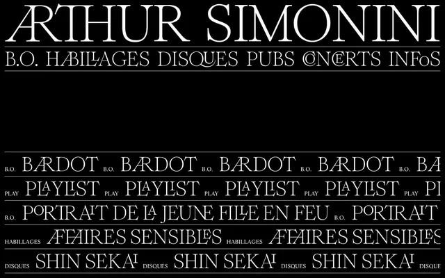
Dramatic typographic stage
Color palette
Page backgrounds, section separators, modal overlays — creates a deep, infinite backdrop
Hairline borders, dividers, input outlines, and card edges on light surfaces. Do not promote it to the primary CTA color
Typography
- Weights
- 400
- Sizes
- 18px
- Line height
- 1, 1.2
- Letter spacing
- normal
- Fallback
- serif
Body text, navigation items, secondary headings — provides a classic, readable foundation. Its single weight keeps the tone consistent and understated.
- Weights
- 400
- Sizes
- 18px, 65px, 167px
- Line height
- 0.73, 0.9, 1.2
- Letter spacing
- normal
- Fallback
- serif
Large headings and callouts — its ornate ligatures and dramatic scale imbue sections with a distinct, artistic flair. The 'dlig' feature is crucial for its distinctive character.
Spacing & shape
Components
Ghost White (#ffffff) text using LifeLTStd-Roman, 18px size, normal letter-spacing, on a Midnight Canvas (#000000) background. Underlines appear on hover/active states for subtle interaction feedback.
Divided by a 1px solid Ghost White (#ffffff) border. Text in Ghost White (#ffffff) using LifeLTStd-Roman, 18px size, with additional decorative text in RomieLigatures-Regular. Each item has vertical padding of 5px.
Image-based card with no explicit background, padding, or border-radius (0px). The content is primarily visual, with text overlays in Ghost White (#ffffff) on some images. Cards are tightly packed without visible gaps between them, allowing the images to form a continuous visual block.
Large text in RomieLigatures-Regular, 167px, weight 400, Ghost White (#ffffff) on Midnight Canvas (#000000). Features font ligatures ('kern', 'dlig') for a unique visual signature.
Guidelines
- Prioritize extreme contrast: Ghost White (#ffffff) text and elements must always appear on Midnight Canvas (#000000) backgrounds.
- Use RomieLigatures-Regular (weight 400, 'kern', 'dlig' features enabled) for all dominant headlines and titles to maintain the signature artistic feel.
- Apply LifeLTStd-Roman (weight 400) for body copy, navigation, and secondary text, ensuring consistent classic readability.
- Maintain strict adherence to 0px border-radius across all components, conveying a sharp, uncompromising aesthetic.
- Employ 1px solid Ghost White (#ffffff) borders as subtle dividers for lists and separating textual content.
- Utilize 15px as the primary elementGap and cardPadding, creating a comfortable yet contained density.
- Embrace the absence of drop shadows or elevation; surfaces are flat against the Midnight Canvas (#000000) background.
- Do not introduce any saturated colors; the palette is strictly monochrome Ghost White (#ffffff) and Midnight Canvas (#000000).
- Avoid rounded corners or any soft shapes; all visual components should be sharp and rectilinear.
- Do not use any font weights other than 400 for both primary font families.
- Never introduce drop shadows or other forms of elevation; surfaces must remain flat against the background.
- Avoid excessive padding or large gaps between interactive elements; maintain a comfortable, not expansive, density.
About this system
ShowHide
Arthur Simonini's website embodies a stark, high-contrast dark mode aesthetic, where elegant serif typography takes center stage on a pure black canvas. The design prioritizes visual drama and readability through extreme contrast and minimal UI elements. All interactive elements are presented in white, creating a luminous, ghost-like appearance that ensures focus on content.
The page uses a full-bleed layout on Midnight Canvas, with content centered but extending edge-to-edge for media grids. The hero section features a large, centered headline in RomieLigatures-Regular. Sections are distinguished by consistent vertical spacing of 40px and sometimes by a 1px Ghost White divider. Content is arranged either as single-column text blocks or compact, tightly packed media grids. Navigation is a simple top bar with Ghost White links. The overall density is comfortable, with ample breathing room around text but dense information display in image grids.
The visual language is dominated by black-and-white photography and movie/album covers, often presented as tight crops or full-bleed. Imagery is presented with sharp, raw edges, typically contained within grid structures with no explicit spacing, creating a dense, mosaic-like appearance. Color imagery is desaturated to grayscale, maintaining the monochrome aesthetic. The role of imagery is primarily content showcase and decorative atmosphere, reflecting the artist's work.
Reminiscent of A24 (Studio), The New York Times (digital archive), Figma (dark mode), Pitchfork (Archival content).
# Arthursimonini — Style Reference
> Dramatic typographic stage

**Theme:** dark

**Site:** https://arthursimonini.com

Arthur Simonini's website embodies a stark, high-contrast dark mode aesthetic, where elegant serif typography takes center stage on a pure black canvas. The design prioritizes visual drama and readability through extreme contrast and minimal UI elements. All interactive elements are presented in white, creating a luminous, ghost-like appearance that ensures focus on content.

## Tokens — Colors

| Name | Value | Token | Role |
|------|------|------|------|
| Midnight Canvas | `#000000` | `--color-midnight-canvas` | Page backgrounds, section separators, modal overlays — creates a deep, infinite backdrop |
| Ghost White | `#ffffff` | `--color-ghost-white` | Hairline borders, dividers, input outlines, and card edges on light surfaces. Do not promote it to the primary CTA color |

## Tokens — Typography

### LifeLTStd-Roman
- **Substitute:** serif
- **Weights:** 400
- **Sizes:** 18px
- **Line height:** 1, 1.2
- **Letter spacing:** normal
- **Role:** Body text, navigation items, secondary headings — provides a classic, readable foundation. Its single weight keeps the tone consistent and understated.

### RomieLigatures-Regular
- **Substitute:** serif
- **Weights:** 400
- **Sizes:** 18px, 65px, 167px
- **Line height:** 0.73, 0.9, 1.2
- **Letter spacing:** normal
- **Role:** Large headings and callouts — its ornate ligatures and dramatic scale imbue sections with a distinct, artistic flair. The 'dlig' feature is crucial for its distinctive character.

## Tokens — Type Scale

| Role | Size | Line height | Letter spacing |
|------|------|------|------|
| body | 18px | 1.2 | — |
| subheading | 65px | 0.9 | — |
| display | 167px | 0.73 | — |

## Tokens — Spacing

- **Section gap:** 40px
- **Card padding:** 15px
- **Element gap:** 15px

## Tokens — Radius

- **Buttons:** 0px
- **Inputs:** 0px
- **Cards:** 0px
- **media:** 0px

## Layout

The page uses a full-bleed layout on Midnight Canvas, with content centered but extending edge-to-edge for media grids. The hero section features a large, centered headline in RomieLigatures-Regular. Sections are distinguished by consistent vertical spacing of 40px and sometimes by a 1px Ghost White divider. Content is arranged either as single-column text blocks or compact, tightly packed media grids. Navigation is a simple top bar with Ghost White links. The overall density is comfortable, with ample breathing room around text but dense information display in image grids.

## Imagery

The visual language is dominated by black-and-white photography and movie/album covers, often presented as tight crops or full-bleed. Imagery is presented with sharp, raw edges, typically contained within grid structures with no explicit spacing, creating a dense, mosaic-like appearance. Color imagery is desaturated to grayscale, maintaining the monochrome aesthetic. The role of imagery is primarily content showcase and decorative atmosphere, reflecting the artist's work.

## Components

### Navigation Link
*Primary site navigation*

Ghost White (#ffffff) text using LifeLTStd-Roman, 18px size, normal letter-spacing, on a Midnight Canvas (#000000) background. Underlines appear on hover/active states for subtle interaction feedback.

### Tracklist Item
*Displays music tracks with duration*

Divided by a 1px solid Ghost White (#ffffff) border. Text in Ghost White (#ffffff) using LifeLTStd-Roman, 18px size, with additional decorative text in RomieLigatures-Regular. Each item has vertical padding of 5px.

### Media Grid Card
*Displays album or movie covers in a grid layout*

Image-based card with no explicit background, padding, or border-radius (0px). The content is primarily visual, with text overlays in Ghost White (#ffffff) on some images. Cards are tightly packed without visible gaps between them, allowing the images to form a continuous visual block.

### Hero Headline
*Dominant page title*

Large text in RomieLigatures-Regular, 167px, weight 400, Ghost White (#ffffff) on Midnight Canvas (#000000). Features font ligatures ('kern', 'dlig') for a unique visual signature.

## Guidelines

### Do

- Prioritize extreme contrast: Ghost White (#ffffff) text and elements must always appear on Midnight Canvas (#000000) backgrounds.
- Use RomieLigatures-Regular (weight 400, 'kern', 'dlig' features enabled) for all dominant headlines and titles to maintain the signature artistic feel.
- Apply LifeLTStd-Roman (weight 400) for body copy, navigation, and secondary text, ensuring consistent classic readability.
- Maintain strict adherence to 0px border-radius across all components, conveying a sharp, uncompromising aesthetic.
- Employ 1px solid Ghost White (#ffffff) borders as subtle dividers for lists and separating textual content.
- Utilize 15px as the primary elementGap and cardPadding, creating a comfortable yet contained density.
- Embrace the absence of drop shadows or elevation; surfaces are flat against the Midnight Canvas (#000000) background.

### Don't

- Do not introduce any saturated colors; the palette is strictly monochrome Ghost White (#ffffff) and Midnight Canvas (#000000).
- Avoid rounded corners or any soft shapes; all visual components should be sharp and rectilinear.
- Do not use any font weights other than 400 for both primary font families.
- Never introduce drop shadows or other forms of elevation; surfaces must remain flat against the background.
- Avoid excessive padding or large gaps between interactive elements; maintain a comfortable, not expansive, density.

## Agent Prompt Guide

Quick Color Reference:
text: #ffffff
background: #000000
border: #ffffff
accent: no distinct accent color
primary action: no distinct CTA color

Example Component Prompts:
Create a primary navigation link: text 'B.O.' in Ghost White (#ffffff), 18px LifeLTStd-Roman, weight 400. Background Midnight Canvas (#000000).
Create a tracklist item: text 'PANDA (HIBOU OST)' in Ghost White (#ffffff), 18px LifeLTStd-Roman, weight 400. Below it, text 'PLAY' in Ghost White (#ffffff), 18px RomieLigatures-Regular, weight 400. Separate with a 1px solid Ghost White (#ffffff) border. No border-radius.
Create a large hero headline: text 'ARTHUR SIMONINI' in Ghost White (#ffffff), 167px RomieLigatures-Regular, weight 400, with font-feature-settings 'kern' and 'dlig'. Background Midnight Canvas (#000000).
Create a media card for an image: no background, no padding, no border, and 0px border-radius. The image itself should fill the card area entirely, with text overlays in Ghost White (#ffffff).
More like this



Keep what you find
A free account saves references to boards and can send you a weekly email of picks based on what you save.
To see every result, go Pro.