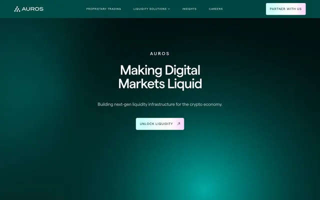
Preview image. Unlock full-res
Deep-sea radiant data
Color palette
Supporting palette color for small decorative accents when the core palette needs contrast. Do not promote it to the primary CTA color
Decorative background gradient creating a soft, shifting light effect, signifying dynamic motion or technological flow
Complex background element, giving a sense of depth and energetic movement through color transitions; Used for large, captivating hero backgrounds, emitting a soft, centered glow
Highlight elements, often hinting at digital infrastructure or data streams
Subtle background variations or overlays, providing a gentle break from solid dark tones
Background for secondary interactive elements and prominent cards, adding a subtle touch of color depth within the dark theme
Text for emphasized statistics or small, highlighted numerical data, providing a soft, almost ethereal accent
Primary page background, text on light contrasting elements, subtle borders for ghost buttons and links. It creates a deep, immersive environment
Elevated card backgrounds, providing a slightly darker surface than the main background without significant contrast
Muted body text, helper text, and inactive icon strokes, providing secondary information without competing with headings
Subtle text for quotes or less emphasized content, almost white but slightly dulled for dark contrast. Also serves as secondary border color for certain elements
Highly contrasting text and icon elements on dark backgrounds, offering maximum readability for main content
Decorative borders for ghost buttons and dividers where a darker accent is preferred, and occasionally for text on very light elements
Border color for ghost buttons, providing a subtle outline against the dark background
Background for very subtle, less prominent UI elements, providing minimal visual weight. Used for small background areas
Typography
- Weights
- 400, 500
- Sizes
- 10px, 12px, 13px, 14px, 16px, 20px, 24px, 36px, 61px, 86px, 96px, 295px
- Line height
- 1, 1.3, 1.4, 1.5
- Letter spacing
- -0.046em at 295px, -0.040em at 96px, -0.020em at 86px, -0.013em at 61px, -0.012em at 36px, normal at 24px, 0.055em at 14px, 0.080em at 12px, 0.120em at 10px, 0.150em at 20px, 0.240em at 13px
- Fallback
- Inter
Primary brand typeface. Its modern, sans-serif clarity provides a technological, forward-thinking feel. Used for all headings, body text, and UI elements. The extremely tight letter spacing at large sizes creates a sense of precise, deliberate communication, while wider spacing for smaller text ensures readability. Varied line heights and weights allow for detailed hierarchy.
- Weights
- 400
- Sizes
- 14px
- Line height
- 1.43
- Fallback
- Helvetica Neue
Fallback font for general interface elements, ensuring broad compatibility while maintaining readability across various operating systems when the Matter font is unavailable. Primarily seen in navigation and small UI text.
Spacing & shape
Components
Transparent background, 'Matter' font at 14px Weight 400, #222222 text color (for very light backgrounds, for dark backgrounds it would be a light color), 6px border radius, 0px padding. Border style would be 1px solid #222222 if on a light background, or #EDFFFE on a dark background.
Background uses 'Vivid Aqua to Gold Gradient' (linear-gradient(90deg, rgb(0, 130, 124) 0%, rgb(203, 255, 252) 100%)), text is usually a dark neutral (e.g., #222222 as seen in the prompt), 'Matter' font, 6px border radius, with generous padding (32px vertical, 22px horizontal).
Background of 'Accent Teal' (#003734), with generous padding (36px all sides) and a 16px border radius. This card uses a slightly elevated background color to differentiate from the base canvas.
Transparent background, 16px border radius, and generous padding (48px vertical, 36px horizontal).
Text in 'Arial' 14px, Weight 400, on a transparent background, typically white text on dark backgrounds. 6px border radius on hover/active states, with 0px padding.
Guidelines
- Use 'Midnight Teal' (#012624) as the default background for all main page content areas to maintain the consistent dark theme.
- Apply 'Matter' font family for all text elements, prioritizing appropriate weight and letter spacing for readability at specific sizes.
- Utilize 16px border radius for all cards and visually distinct information blocks to ensure a consistent soft-edged aesthetic.
- For primary call-to-action buttons, apply the 'Vivid Aqua to Gold Gradient' (linear-gradient(90deg, rgb(0, 130, 124) 0%, rgb(203, 255, 252) 100%)) as a background fill.
- Ensure headings use 'Near White' (#EDFFFE) for maximum contrast and prominence on dark backgrounds.
- Maintain a clear visual hierarchy by differentiating interactive cards with 'Accent Teal' (#003734) backgrounds from more subtle, transparent cards.
- Implement a generous vertical spacing of 68px between main sections to provide visual breathing room and clarity.
- Do not use highly saturated or light colors for large background areas; maintain the integrity of the dark theme.
- Avoid using low contrast text on dark backgrounds; ensure main text uses 'Near White' (#EDFFFE) or 'Soft Silver' (#bbc7c6) as appropriate.
- Do not use generic square corners for interactive elements or cards; always apply the defined border radii.
- Refrain from introducing additional font families; 'Matter' and 'Arial' are the only approved typefaces.
- Avoid excessive use of strong shadows; the design relies on color and background variations for surface differentiation rather than elevation effects.
- Do not break the established spacing rhythm; consistently apply 68px for section gaps and 20px for element gaps.
About this system
ShowHide
Auros employs a deep-sea command center aesthetic: dark, absorbing tones of teal and blue-black serve as the canvas, punctuated by a radiant, almost neon gradient of pink, purple, and green. Typography is modern and precise, with a strong emphasis on spaciousness and clarity against the dark backdrop. Components are generally dark, with subtle variations in background teal for surface hierarchy, and liberal use of large radius values for a soft-edged feel. Accents are reserved for interactive elements and highlights, creating a focused, high-tech impression.
The page employs a max-width 1440px centered layout for most content, maintaining readability and structure. The hero section, however, is full-bleed, featuring a dark background with a pronounced celestial radial gradient and large, centered typography. The section rhythm is consistent, separated by substantial vertical spacing of 68px between blocks. Content is arranged in alternating patterns, often featuring text on the left and abstract visuals or cards on the right, or vertically stacked centered content for key messages. There's a subtle 3-column card grid for features. The overall density is spacious, emphasizing individual content blocks. Navigation is a sticky top bar with clearly defined links and a prominent gradient-filled 'Partner With Us' button.
This design system uses a minimal approach to imagery, focusing primarily on abstract digital graphics and subtle animations for atmosphere rather than specific photography or product illustrations. Where present, it features scattered particle effects and molecular-like structures (e.g., the large sphere of dots and the connected 'blob' shapes), rendered in colors that subtly shift between shades of the brand's teal and soft pink. These are primarily decorative, contributing to the high-tech, liquid data feel. Icons are typically outlined and monochromatic, matching the overall sleek and understated UI. The density of imagery is low, allowing typography and spacious layouts to dominate.
Reminiscent of Stripe, Linear, Alchemy, Coinbase (Dark Mode).
# Auros — Style Reference
> Deep-sea radiant data

**Theme:** dark

**Site:** https://auros.global

Auros employs a deep-sea command center aesthetic: dark, absorbing tones of teal and blue-black serve as the canvas, punctuated by a radiant, almost neon gradient of pink, purple, and green. Typography is modern and precise, with a strong emphasis on spaciousness and clarity against the dark backdrop. Components are generally dark, with subtle variations in background teal for surface hierarchy, and liberal use of large radius values for a soft-edged feel. Accents are reserved for interactive elements and highlights, creating a focused, high-tech impression.

## Tokens — Colors

| Name | Value | Token | Role |
|------|------|------|------|
| Vivid Aqua to Gold Gradient | `#00827c` | `--color-vivid-aqua-to-gold-gradient` | Supporting palette color for small decorative accents when the core palette needs contrast. Do not promote it to the primary CTA color |
| Ethereal Spectrum | `#cbfffc` | `--color-ethereal-spectrum` | Decorative background gradient creating a soft, shifting light effect, signifying dynamic motion or technological flow |
| Dynamic Flow Gradient | `#fadde6` | `--color-dynamic-flow-gradient` | Complex background element, giving a sense of depth and energetic movement through color transitions; Used for large, captivating hero backgrounds, emitting a soft, centered glow |
| Tech Surge Gradient | `#CBE0F9` | `--color-tech-surge-gradient` | Highlight elements, often hinting at digital infrastructure or data streams |
| Soft Transition Gradient | `#edfefe` | `--color-soft-transition-gradient` | Subtle background variations or overlays, providing a gentle break from solid dark tones |
| Accent Teal | `#003734` | `--color-accent-teal` | Background for secondary interactive elements and prominent cards, adding a subtle touch of color depth within the dark theme |
| Pale Pink Glow | `#FDE9FF` | `--color-pale-pink-glow` | Text for emphasized statistics or small, highlighted numerical data, providing a soft, almost ethereal accent |
| Midnight Teal | `#012624` | `--color-midnight-teal` | Primary page background, text on light contrasting elements, subtle borders for ghost buttons and links. It creates a deep, immersive environment |
| Deep Ocean | `#011d1c` | `--color-deep-ocean` | Elevated card backgrounds, providing a slightly darker surface than the main background without significant contrast |
| Soft Silver | `#bbc7c6` | `--color-soft-silver` | Muted body text, helper text, and inactive icon strokes, providing secondary information without competing with headings |
| Frost White | `#F2F2F2` | `--color-frost-white` | Subtle text for quotes or less emphasized content, almost white but slightly dulled for dark contrast. Also serves as secondary border color for certain elements |
| Near White | `#EDFFFE` | `--color-near-white` | Highly contrasting text and icon elements on dark backgrounds, offering maximum readability for main content |
| Slate Gray | `#333333` | `--color-slate-gray` | Decorative borders for ghost buttons and dividers where a darker accent is preferred, and occasionally for text on very light elements |
| Off Black | `#222222` | `--color-off-black` | Border color for ghost buttons, providing a subtle outline against the dark background |
| Soft Gray | `#707777` | `--color-soft-gray` | Background for very subtle, less prominent UI elements, providing minimal visual weight. Used for small background areas |

## Tokens — Typography

### Matter
- **Substitute:** Inter
- **Weights:** 400, 500
- **Sizes:** 10px, 12px, 13px, 14px, 16px, 20px, 24px, 36px, 61px, 86px, 96px, 295px
- **Line height:** 1, 1.3, 1.4, 1.5
- **Letter spacing:** -0.046em at 295px, -0.040em at 96px, -0.020em at 86px, -0.013em at 61px, -0.012em at 36px, normal at 24px, 0.055em at 14px, 0.080em at 12px, 0.120em at 10px, 0.150em at 20px, 0.240em at 13px
- **Role:** Primary brand typeface. Its modern, sans-serif clarity provides a technological, forward-thinking feel. Used for all headings, body text, and UI elements. The extremely tight letter spacing at large sizes creates a sense of precise, deliberate communication, while wider spacing for smaller text ensures readability. Varied line heights and weights allow for detailed hierarchy.

### Arial
- **Substitute:** Helvetica Neue
- **Weights:** 400
- **Sizes:** 14px
- **Line height:** 1.43
- **Role:** Fallback font for general interface elements, ensuring broad compatibility while maintaining readability across various operating systems when the Matter font is unavailable. Primarily seen in navigation and small UI text.

## Tokens — Type Scale

Perfect Fourth (1.333) from 14px base.

| Role | Size | Line height | Letter spacing |
|------|------|------|------|
| caption | 10px | 1.5 | 0.12px |
| body | 14px | 1.4 | 0.055em |
| body-lg | 16px | 1.5 | — |
| subheading | 20px | 1.5 | 0.15px |
| heading-sm | 24px | 1.3 | — |
| heading | 36px | 1.3 | -0.012em |
| heading-lg | 61px | 1.3 | -0.013em |
| display | 86px | 1 | -0.02em |
| display-lg | 96px | 1 | -0.04em |

## Tokens — Spacing

- **Max width:** 1440px
- **Section gap:** 68px
- **Card padding:** 40px
- **Element gap:** 20px

## Tokens — Radius

- **Buttons:** 6px
- **Cards:** 16px
- **Images:** 6px
- **badges:** 6px
- **forms:** 6px
- **links:** 6px

## Layout

The page employs a max-width 1440px centered layout for most content, maintaining readability and structure. The hero section, however, is full-bleed, featuring a dark background with a pronounced celestial radial gradient and large, centered typography. The section rhythm is consistent, separated by substantial vertical spacing of 68px between blocks. Content is arranged in alternating patterns, often featuring text on the left and abstract visuals or cards on the right, or vertically stacked centered content for key messages. There's a subtle 3-column card grid for features. The overall density is spacious, emphasizing individual content blocks. Navigation is a sticky top bar with clearly defined links and a prominent gradient-filled 'Partner With Us' button.

## Imagery

This design system uses a minimal approach to imagery, focusing primarily on abstract digital graphics and subtle animations for atmosphere rather than specific photography or product illustrations. Where present, it features scattered particle effects and molecular-like structures (e.g., the large sphere of dots and the connected 'blob' shapes), rendered in colors that subtly shift between shades of the brand's teal and soft pink. These are primarily decorative, contributing to the high-tech, liquid data feel. Icons are typically outlined and monochromatic, matching the overall sleek and understated UI. The density of imagery is low, allowing typography and spacious layouts to dominate.

## Components

### Ghost Button - Light Text
*Secondary action button for low-priority interactions or link-like behavior.*

Transparent background, 'Matter' font at 14px Weight 400, #222222 text color (for very light backgrounds, for dark backgrounds it would be a light color), 6px border radius, 0px padding. Border style would be 1px solid #222222 if on a light background, or #EDFFFE on a dark background.

### Primary Action Button - Gradient Fill
*Prominent calls to action, drawing attention with its distinctive gradient.*

Background uses 'Vivid Aqua to Gold Gradient' (linear-gradient(90deg, rgb(0, 130, 124) 0%, rgb(203, 255, 252) 100%)), text is usually a dark neutral (e.g., #222222 as seen in the prompt), 'Matter' font, 6px border radius, with generous padding (32px vertical, 22px horizontal).

### Action Card - Accent Teal Background
*Interactive cards highlighting specific services or key information.*

Background of 'Accent Teal' (#003734), with generous padding (36px all sides) and a 16px border radius. This card uses a slightly elevated background color to differentiate from the base canvas.

### Ghost Card - Minimal
*Informational cards that blend with the background, using internal content for visual hierarchy.*

Transparent background, 16px border radius, and generous padding (48px vertical, 36px horizontal).

### Navigation Link
*Interactive navigation items in the header or footer.*

Text in 'Arial' 14px, Weight 400, on a transparent background, typically white text on dark backgrounds. 6px border radius on hover/active states, with 0px padding.

## Guidelines

### Do

- Use 'Midnight Teal' (#012624) as the default background for all main page content areas to maintain the consistent dark theme.
- Apply 'Matter' font family for all text elements, prioritizing appropriate weight and letter spacing for readability at specific sizes.
- Utilize 16px border radius for all cards and visually distinct information blocks to ensure a consistent soft-edged aesthetic.
- For primary call-to-action buttons, apply the 'Vivid Aqua to Gold Gradient' (linear-gradient(90deg, rgb(0, 130, 124) 0%, rgb(203, 255, 252) 100%)) as a background fill.
- Ensure headings use 'Near White' (#EDFFFE) for maximum contrast and prominence on dark backgrounds.
- Maintain a clear visual hierarchy by differentiating interactive cards with 'Accent Teal' (#003734) backgrounds from more subtle, transparent cards.
- Implement a generous vertical spacing of 68px between main sections to provide visual breathing room and clarity.

### Don't

- Do not use highly saturated or light colors for large background areas; maintain the integrity of the dark theme.
- Avoid using low contrast text on dark backgrounds; ensure main text uses 'Near White' (#EDFFFE) or 'Soft Silver' (#bbc7c6) as appropriate.
- Do not use generic square corners for interactive elements or cards; always apply the defined border radii.
- Refrain from introducing additional font families; 'Matter' and 'Arial' are the only approved typefaces.
- Avoid excessive use of strong shadows; the design relies on color and background variations for surface differentiation rather than elevation effects.
- Do not break the established spacing rhythm; consistently apply 68px for section gaps and 20px for element gaps.

## Agent Prompt Guide

Quick Color Reference:
text: #EDFFFE
background: #012624
border: #333333
accent: #003734
primary action: #003734 (filled action)

Example Component Prompts:
1. Create a Primary Action Button: #003734 background, #ffffff text, 9999px radius, compact pill padding. Use this filled treatment for the main CTA.
2. Create a feature card: 'Accent Teal' (#003734) background, 16px border radius, 36px padding on all sides. Heading 'Proprietary Trading' at 24px 'Matter' Weight 500, #EDFFFE. Body text 'Rooted in algorithmic precision and powered by advanced technology...' at 14px 'Matter' Weight 400, 'Soft Silver' (#BBC7C6).
3. Create a navigation button: Text 'Proprietary Trading' at 14px 'Arial' Weight 400, #EDFFFE, 6px border radius, 0px padding. On hover, apply a subtle background change to a transparent variant of 'Accent Teal' or a light border of #EDFFFE.

## Gradient System

The gradients are a crucial part of the Auros brand identity, representing fluidity, data streams, and cutting-edge technology. They are primarily linear, evolving through shades of teal, aqua, and soft pink/purple. The 'Vivid Aqua to Gold Gradient' (linear-gradient(90deg, rgb(0, 130, 124) 0%, rgb(203, 255, 252) 100%)) is reserved for primary interactive elements, while more complex, multi-stop gradients like 'Ethereal Spectrum' and 'Dynamic Flow Gradient' are utilized for large atmospheric backgrounds or decorative elements to create visual depth and a sense of movement. The 'Celestial Radial' is specifically for hero sections to emanate a focal glow. Ensure gradients are smooth and avoid harsh color blocks.
More like this





Keep what you find
A free account saves references to boards and can send you a weekly email of picks based on what you save.
To see every result, go Pro.