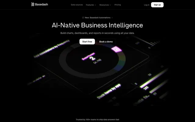
Preview image. Unlock full-res
Midnight data studio.
Color palette
Violet outline accent for tags, dividers, and focused UI edges. Do not promote it to the primary CTA color
Atmospheric background gradient for accent regions, hinting at depth and digital glow
Soft, expanding radial glow often used as subtle background illumination for product showcases
Primary page and hero backgrounds, deep surface base
Card backgrounds, secondary dark surfaces
Primary text, button backgrounds, active navigation elements
Muted text, hairline borders, secondary content
Tertiary text, inactive icons, subtle dividers
Fine borders, subtle text elements
Subtle background for specific sections, sometimes for borders
Success states, live indicators, or positive metrics within charts/badges
Typography
- Weights
- 400, 500, 600
- Sizes
- 12px, 13px, 14px, 15px, 16px, 18px, 30px, 34px, 48px
- Line height
- 1, 1.2, 1.33, 1.38, 1.43, 1.5, 1.56
- Letter spacing
- -0.0300em
- Fallback
- system-ui
Primary UI font for body text, navigation, buttons, and most informational elements. Its functional nature maintains clarity across various weights and sizes.
- Weights
- 400
- Sizes
- 48px
- Line height
- 1
- Letter spacing
- normal
Display font for prominent headlines, used sparingly to create a distinctive, digital aesthetic. Specific stylistic sets ('ss01', 'ss02') contribute to its unique character.
- Weights
- 300
- Sizes
- 24px
- Line height
- 1.25
- Letter spacing
- -0.0250em
- Fallback
- serif
Serif font for specific body or quote elements at larger sizes, providing a refined textual counterpoint to the sans-serif display type. The light weight (300) combined with slight letter-spacing creates an airy, almost whispered presence.
Spacing & shape
Components
Solid Ghost White background (#ffffff), Obsidian Canvas text (#000000). Padding is 8px vertical, 20px horizontal. Border-radius of 12px.
Transparent background with 25% opacity (oklab(0 0 0 / 0.25)), Ghost White text (#ffffff). Outline border in 10% opacity white (rgba(255, 255, 255, 0.1)). Padding is 8px vertical, 20px horizontal. Border-radius of 12px.
Transparent background, muted Ghost White text (rgba(255, 255, 255, 0.5)). No padding or border-radius; meant to be part of inline navigation.
Obsidian Canvas background (#000000), Ghost White text (#ffffff). Outline border in 10% opacity white (rgba(255, 255, 255, 0.1)). Padding 8px vertical, 12px horizontal. Border-radius of 6px.
Solid Eclipse Surface background (#050607), no box-shadow. Border-radius of 14px. Padding 14px vertical, 14px horizontal internally.
Solid Alert Green background (#3fcb7f), Ghost White text at 70% opacity (rgba(255, 255, 255, 0.7)). Very high border-radius (1.67772e+07px) creating a pill shape. No internal padding means text is flush with badge background.
Guidelines
- Use Obsidian Canvas (#000000) as the dominant background color for seamless dark mode cohesion.
- Apply Ghost White (#ffffff) for primary text and calls to action against dark backgrounds to ensure high contrast.
- Employ Vivid Violet (#9984d8) as a border accent for interactive elements or visual framing, not as a primary fill color for buttons.
- Utilize Inter font for all functional text: body, buttons, navigation, and smaller headings at its specified letter spacing -0.0300em.
- Maintain a clear visual hierarchy by limiting Alpha Lyrae to prominent headlines at 48px, with its unique font feature settings "ss01" and "ss02".
- Define card surfaces with Eclipse Surface (#050607) and a 14px border-radius, reserving elevation for occasional, subtle glows.
- Apply 6px border-radius for buttons and input fields, and 16px for cards to maintain consistent shape language.
- Use Alert Green (#3fcb7f) specifically for positive semantic indicators like 'Live' status or success messages.
- Avoid using bright, saturated colors for large background areas; stick to the neutral palette for canvas and surfaces.
- Do not introduce strong visual shadows on elements; elevation is primarily achieved through subtle background glows or no shadow at all.
- Do not use Iowan Old Style for general UI text; reserve it for specific, larger body sections or quotes requiring a refined feel.
- Refrain from drastically altering letter-spacing for Inter font; maintain -0.0300em for consistent text density.
- Do not deviate from the established padding values for buttons (8px vertical, 20px horizontal for larger, 8px vertical, 12px horizontal for small) to preserve component weight.
- Avoid adding new radii values; adhere to 6px, 14px/16px, and 999px for consistency across components.
- Do not use Vivid Violet (#9984d8) as a background for primary calls to action, as it functions as an accent border or decorative element.
About this system
ShowHide
Basedash employs a 'dark studio canvas' aesthetic, designed to showcase product functionality with stark clarity against a deep, almost black background. White typography and a single vibrant purple accent provide functional highlights and interactive cues, giving the interface a precise, analytical feel. Components are minimalist, often defined by subtle borders or ghost styles, suggesting a lightweight and highly performant system. The overall impression is one of focused utility, where UI elements serve to illuminate data rather than compete with it.
The page structure favors a full-bleed layout, particularly in the hero section, but maintains content within discernable, perhaps implied, max-width constraints in other areas. The hero features a centered headline over a dark, subtly animated product visual. Section rhythm is primarily consistent vertical spacing on a dark canvas, utilizing the Obsidian Canvas as a continuous background rather than alternating light/dark bands. Content is arranged in flexible patterns, including centered stacks for key messages and multi-column grids for integrations. Navigation is a sticky top bar, minimalist and unobtrusive.
Imagery on Basedash is primarily functional product screenshots and data visualizations, presented directly with minimal framing. These are often enveloped by subtle atmospheric gradients or glows (like the Radial Violet Glow) that hint at functionality without being distracting. The icons are mostly monochromatic (white), with some being multi-colored, and serve to represent data sources or integrations in a compact, recognizable format. There’s a balance between text dominance and visual explanation, where images clarity illustrates product features.
Reminiscent of Linear, Supabase, Vercel, Stripe.
# Basedash — Style Reference
> Midnight data studio.

**Theme:** dark

**Site:** https://www.basedash.com

Basedash employs a 'dark studio canvas' aesthetic, designed to showcase product functionality with stark clarity against a deep, almost black background. White typography and a single vibrant purple accent provide functional highlights and interactive cues, giving the interface a precise, analytical feel. Components are minimalist, often defined by subtle borders or ghost styles, suggesting a lightweight and highly performant system. The overall impression is one of focused utility, where UI elements serve to illuminate data rather than compete with it.

## Tokens — Colors

| Name | Value | Token | Role |
|------|------|------|------|
| Vivid Violet | `#9984d8` | `--color-vivid-violet` | Violet outline accent for tags, dividers, and focused UI edges. Do not promote it to the primary CTA color |
| Gradient Violet | `#6b5aa8` | `--color-gradient-violet` | Atmospheric background gradient for accent regions, hinting at depth and digital glow |
| Radial Violet Glow | `#a366ff` | `--color-radial-violet-glow` | Soft, expanding radial glow often used as subtle background illumination for product showcases |
| Obsidian Canvas | `#000000` | `--color-obsidian-canvas` | Primary page and hero backgrounds, deep surface base |
| Eclipse Surface | `#050607` | `--color-eclipse-surface` | Card backgrounds, secondary dark surfaces |
| Ghost White | `#ffffff` | `--color-ghost-white` | Primary text, button backgrounds, active navigation elements |
| Ash Gray | `#b3b3b3` | `--color-ash-gray` | Muted text, hairline borders, secondary content |
| Steel Gray | `#808080` | `--color-steel-gray` | Tertiary text, inactive icons, subtle dividers |
| Carbon Detail | `#333333` | `--color-carbon-detail` | Fine borders, subtle text elements |
| Illumination White | `#e8eaee` | `--color-illumination-white` | Subtle background for specific sections, sometimes for borders |
| Alert Green | `#3fcb7f` | `--color-alert-green` | Success states, live indicators, or positive metrics within charts/badges |

## Tokens — Typography

### Inter
- **Substitute:** system-ui
- **Weights:** 400, 500, 600
- **Sizes:** 12px, 13px, 14px, 15px, 16px, 18px, 30px, 34px, 48px
- **Line height:** 1, 1.2, 1.33, 1.38, 1.43, 1.5, 1.56
- **Letter spacing:** -0.0300em
- **Role:** Primary UI font for body text, navigation, buttons, and most informational elements. Its functional nature maintains clarity across various weights and sizes.

### Alpha Lyrae
- **Weights:** 400
- **Sizes:** 48px
- **Line height:** 1
- **Letter spacing:** normal
- **Role:** Display font for prominent headlines, used sparingly to create a distinctive, digital aesthetic. Specific stylistic sets ('ss01', 'ss02') contribute to its unique character.

### Iowan Old Style
- **Substitute:** serif
- **Weights:** 300
- **Sizes:** 24px
- **Line height:** 1.25
- **Letter spacing:** -0.0250em
- **Role:** Serif font for specific body or quote elements at larger sizes, providing a refined textual counterpoint to the sans-serif display type. The light weight (300) combined with slight letter-spacing creates an airy, almost whispered presence.

## Tokens — Type Scale

Perfect Fourth (1.333) from 12px base.

| Role | Size | Line height | Letter spacing |
|------|------|------|------|
| caption | 12px | 1.5 | -0.36px |
| heading-sm | 18px | 1.5 | -0.54px |
| heading | 24px | 1.25 | -0.6px |
| heading-lg | 30px | 1.33 | -0.9px |
| display-sm | 34px | 1.2 | -1.02px |
| display | 48px | 1 | — |

## Tokens — Spacing

- **Section gap:** 24px
- **Card padding:** 12px
- **Element gap:** 12px

## Tokens — Radius

- **Buttons:** 6px
- **Cards:** 16px
- **fields:** 6px
- **tags:** 999px

## Layout

The page structure favors a full-bleed layout, particularly in the hero section, but maintains content within discernable, perhaps implied, max-width constraints in other areas. The hero features a centered headline over a dark, subtly animated product visual. Section rhythm is primarily consistent vertical spacing on a dark canvas, utilizing the Obsidian Canvas as a continuous background rather than alternating light/dark bands. Content is arranged in flexible patterns, including centered stacks for key messages and multi-column grids for integrations. Navigation is a sticky top bar, minimalist and unobtrusive.

## Imagery

Imagery on Basedash is primarily functional product screenshots and data visualizations, presented directly with minimal framing. These are often enveloped by subtle atmospheric gradients or glows (like the Radial Violet Glow) that hint at functionality without being distracting. The icons are mostly monochromatic (white), with some being multi-colored, and serve to represent data sources or integrations in a compact, recognizable format. There’s a balance between text dominance and visual explanation, where images clarity illustrates product features.

## Components

### Primary Filled Button
*Call to action button for starting free trials or sign-ups.*

Solid Ghost White background (#ffffff), Obsidian Canvas text (#000000). Padding is 8px vertical, 20px horizontal. Border-radius of 12px.

### Ghost Accent Button
*Secondary call to action button, or action that needs subtle visual emphasis.*

Transparent background with 25% opacity (oklab(0 0 0 / 0.25)), Ghost White text (#ffffff). Outline border in 10% opacity white (rgba(255, 255, 255, 0.1)). Padding is 8px vertical, 20px horizontal. Border-radius of 12px.

### Navigation Link Button
*Links within the main navigation bar.*

Transparent background, muted Ghost White text (rgba(255, 255, 255, 0.5)). No padding or border-radius; meant to be part of inline navigation.

### Small Dark Button
*Compact utility buttons, often for logging in or secondary actions in header.*

Obsidian Canvas background (#000000), Ghost White text (#ffffff). Outline border in 10% opacity white (rgba(255, 255, 255, 0.1)). Padding 8px vertical, 12px horizontal. Border-radius of 6px.

### Content Card
*Containers for content blocks like testimonials or feature descriptions.*

Solid Eclipse Surface background (#050607), no box-shadow. Border-radius of 14px. Padding 14px vertical, 14px horizontal internally.

### Live Status Badge
*Used to denote 'Live' status or positive indicators.*

Solid Alert Green background (#3fcb7f), Ghost White text at 70% opacity (rgba(255, 255, 255, 0.7)). Very high border-radius (1.67772e+07px) creating a pill shape. No internal padding means text is flush with badge background.

## Guidelines

### Do

- Use Obsidian Canvas (#000000) as the dominant background color for seamless dark mode cohesion.
- Apply Ghost White (#ffffff) for primary text and calls to action against dark backgrounds to ensure high contrast.
- Employ Vivid Violet (#9984d8) as a border accent for interactive elements or visual framing, not as a primary fill color for buttons.
- Utilize Inter font for all functional text: body, buttons, navigation, and smaller headings at its specified letter spacing -0.0300em.
- Maintain a clear visual hierarchy by limiting Alpha Lyrae to prominent headlines at 48px, with its unique font feature settings "ss01" and "ss02".
- Define card surfaces with Eclipse Surface (#050607) and a 14px border-radius, reserving elevation for occasional, subtle glows.
- Apply 6px border-radius for buttons and input fields, and 16px for cards to maintain consistent shape language.
- Use Alert Green (#3fcb7f) specifically for positive semantic indicators like 'Live' status or success messages.

### Don't

- Avoid using bright, saturated colors for large background areas; stick to the neutral palette for canvas and surfaces.
- Do not introduce strong visual shadows on elements; elevation is primarily achieved through subtle background glows or no shadow at all.
- Do not use Iowan Old Style for general UI text; reserve it for specific, larger body sections or quotes requiring a refined feel.
- Refrain from drastically altering letter-spacing for Inter font; maintain -0.0300em for consistent text density.
- Do not deviate from the established padding values for buttons (8px vertical, 20px horizontal for larger, 8px vertical, 12px horizontal for small) to preserve component weight.
- Avoid adding new radii values; adhere to 6px, 14px/16px, and 999px for consistency across components.
- Do not use Vivid Violet (#9984d8) as a background for primary calls to action, as it functions as an accent border or decorative element.

## Agent Prompt Guide

Quick Color Reference:
text: #ffffff
background: #000000
border: #b3b3b3
accent: #9984d8
primary action: #000000 (filled action)

Example Component Prompts:
1. Create a Primary Action Button: #000000 background, #ffffff text, 9999px radius, compact pill padding. Use this filled treatment for the main CTA.
2. Design a Testimonial Card for 'Nathan Baschez Founder · Lex': Eclipse Surface background, 14px border-radius, 14px padding. Quote text in Iowan Old Style weight 300 at 24px, Ghost White text, letter-spacing -0.0250em. Below, add 'Read case study →' as an Ash Gray link.
3. Implement a 'Log in' navigation button: No background, Ghost White text at 50% opacity (rgba(255, 255, 255, 0.5)), Inter weight 400 at 16px, no padding or border-radius.
More like this







Keep what you find
A free account saves references to boards and can send you a weekly email of picks based on what you save.
To see every result, go Pro.