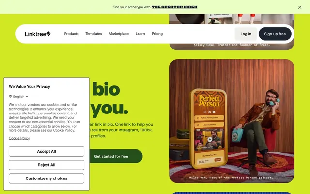
Preview image. Unlock full-res
Vibrant, playful canvases
Color palette
Primary action buttons, accented card backgrounds, vibrant section backgrounds
Violet outline accent for tags, dividers, and focused UI edges. Do not promote it to the primary CTA color
Accent cards, button backgrounds, decorative graphics
Deep blue accent for cards and specific buttons
Rich violet background for content sections
Deep red background for specific content sections and cards
Dark green accent for cards and specific text
Warm gold accent for cards
Primary text, deep neutral backgrounds for headers and footers, button text on light backgrounds
Page backgrounds, card surfaces, text on dark backgrounds
Subtle background for UI elements and sections, ghost button backgrounds
Muted text, link borders when not active, placeholder text
Darker text, button borders
Typography
- Weights
- 400
- Sizes
- 16px
- Line height
- 1.5
- Letter spacing
- normal
- Fallback
- Helvetica Neue
Standard body text and interface elements. A highly legible system font for dense content.
- Weights
- 400, 500, 700, 800
- Sizes
- 14px, 16px, 18px, 24px, 28px, 56px, 80px
- Line height
- 1, 1.06, 1.07, 1.2, 1.3, 1.5
- Letter spacing
- -0.0200em at 24-80px, -0.0100em at 18px
- Fallback
- Inter
Display and headings. The varying letter-spacing creates controlled visual impact, becoming tighter at larger sizes for density.
- Weights
- 400, 500, 700
- Sizes
- 12px, 13px, 14px, 15px, 20px, 24px, 25px, 51px
- Line height
- 1.06, 1.2, 1.31, 1.5, 2.32
- Letter spacing
- -0.0430em at 51px, -0.0240em at 24-25px, -0.0200em at 20px, -0.0130em for smaller sizes
- Fallback
- Inter
Subheadings, navigation items, and larger body text. This family maintains a consistent geometric feel with subtle variations in tracking.
- Weights
- 400
- Sizes
- 14px
- Line height
- 1.5
yerk — detected in extracted data but not described by AI
Spacing & shape
Components
A pill-shaped button with Chartreuse Kick (#d2e823) background and Ink (#1e2330) text. Uses 99px border-radius, 20px vertical padding, and 26px horizontal padding. Energetic and highly visible.
A square button with Marble Fog (#f3f3f1) background and Ink (#1e2330) text. Uses 8px border-radius, 22px vertical padding, and 26px horizontal padding.
A transparent button with Ink (#1e2330) text and no background or border. Used for discrete actions or internal navigation. No explicit padding, relies on text-based spacing.
Transparent background with Ink text. Text size 16px, Linesans Linksansvf, weight 400. No explicit padding or border radius on interaction.
Transparent background with a 32px border-radius. No box shadow. Used for showcasing images or illustrations within the hero section.
These cards use various brand colors like Hydrangea Bold (#2665d6), Lavender Pop (#e9c0e9), Iris Deep (#061492), Forest Green (#254f1a), Marigold Gold (#d6a337), or Crimson Currant (#780016) backgrounds. They feature an extreme 64px or 1000px border-radius, with no box shadow or padding.
Pure White (#ffffff) background with a 1px solid Ink (#000000) border, 8px border-radius. Placeholder text uses Ash Concrete (#757575). 8px vertical padding, 16px horizontal padding.
Guidelines
- Use Chartreuse Kick (#d2e823) for primary call-to-action buttons, ensuring a 99px border-radius and Ink (#1e2330) text.
- Apply extreme large border radii (64px, 1000px) to decorative cards and feature blocks to maintain a playful aesthetic.
- Prioritize Linksans Linksansvf or Linksans for all headings and subheadings, adjusting letter-spacing according to the specified type scale for visual cohesion.
- Maintain a clear visual hierarchy by using Pure White (#ffffff) or Marble Fog (#f3f3f1) as background for most content areas, contrasted with Ink (#1e2330) text.
- Employ the specified brand colors – Chartreuse Kick, Hydrangea Bold, Lavender Pop, Iris Deep, Dahlia Grape, Crimson Currant, Forest Green, Marigold Gold – as vibrant, full-block section backgrounds on a rotating basis.
- Use Arial for standard body text at 16px to ensure optimal readability for longer passages.
- Apply 10px as the default elementGap for consistency in vertical spacing between discrete UI elements.
- Avoid using drop shadows on cards or buttons; the design system relies on color, shape, and bold typography for visual differentiation.
- Do not introduce new color hues; strictly adhere to the defined brand and neutral palettes to maintain brand consistency.
- Do not deviate from the specified border-radii; the curved aesthetic is a core part of the brand identity making specific values critical.
- Avoid using subtle grays for interactive elements; actions should be clearly distinguished with vibrant brand colors.
- Do not use generic system fonts for display or heading text; it dilutes the distinctive typographic voice.
- Do not apply padding or margins that break the established elementGap (10px) and sectionGap (48px) rhythm.
- Do not use less than 20px vertical padding on primary buttons; the generous padding is integral to their confident presence.
About this system
ShowHide
Linktree employs a vibrant, high-contrast visual system built around playful, oversized typography and boldly colored, flat surfaces. The design makes liberal use of curved shapes, particularly extreme pill-like radii, creating a soft yet dynamic feel. Color functions primarily as an energetic accent, rotating through vivid primary and secondary hues to delineate sections and highlight interactive elements, while core content remains anchored by highly legible black text on clean white or near-white backgrounds. Components are lightweight with minimal elevation, emphasizing color and shape over heavy borders or shadows.
The page uses a maximum content width of 1504px, with content centered. The hero section is full-bleed, aggressively using a brand color as its background (e.g., Chartreuse Kick or Hydrangea Bold) with large, bold, centered typography. Subsequent sections alternate between vibrant solid color backgrounds and Pure White or Marble Fog, creating clear visual segmentation. Content arrangement frequently features large, centered headlines followed by a button, or alternating text-left / visual-right layouts. Card grids are used for features, showcasing product benefits within a collection of creatively shaped and colored containers. The layout is spacious with distinct vertical section spacing, lending an open and friendly feel. A sticky top navigation bar provides consistent access to key sections.
Linktree primarily uses product screenshots and contained lifestyle photography for branding, often with a unique treatment. Product-focused imagery is presented full-bleed or within cards, frequently tinted or placed on brand-colored backgrounds, with rounded corners of varying degrees (from 8px to extreme 1000px pills and 64px large radii). Photography is high-key, vibrant, and features people interacting with digital products or engaging in creative activities. Illustrations are simple, filled, geometric, and often utilize the brand's vibrant color palette, serving decorative and explanatory roles. Icons are filled and monochromatic, complementing the flat UI. Visual density is moderate, allowing imagery to break up text-heavy sections and act as visual anchors.
Reminiscent of Canva, Fiverr, Gumroad.
# Bento — Style Reference
> Vibrant, playful canvases

**Theme:** light

**Site:** https://www.bento.me

Linktree employs a vibrant, high-contrast visual system built around playful, oversized typography and boldly colored, flat surfaces. The design makes liberal use of curved shapes, particularly extreme pill-like radii, creating a soft yet dynamic feel. Color functions primarily as an energetic accent, rotating through vivid primary and secondary hues to delineate sections and highlight interactive elements, while core content remains anchored by highly legible black text on clean white or near-white backgrounds. Components are lightweight with minimal elevation, emphasizing color and shape over heavy borders or shadows.

## Tokens — Colors

| Name | Value | Token | Role |
|------|------|------|------|
| Chartreuse Kick | `#d2e823` | `--color-chartreuse-kick` | Primary action buttons, accented card backgrounds, vibrant section backgrounds |
| Hydrangea Bold | `#2665d6` | `--color-hydrangea-bold` | Violet outline accent for tags, dividers, and focused UI edges. Do not promote it to the primary CTA color |
| Lavender Pop | `#e9c0e9` | `--color-lavender-pop` | Accent cards, button backgrounds, decorative graphics |
| Iris Deep | `#061492` | `--color-iris-deep` | Deep blue accent for cards and specific buttons |
| Dahlia Grape | `#502274` | `--color-dahlia-grape` | Rich violet background for content sections |
| Crimson Currant | `#780016` | `--color-crimson-currant` | Deep red background for specific content sections and cards |
| Forest Green | `#254f1a` | `--color-forest-green` | Dark green accent for cards and specific text |
| Marigold Gold | `#d6a337` | `--color-marigold-gold` | Warm gold accent for cards |
| Ink | `#1e2330` | `--color-ink` | Primary text, deep neutral backgrounds for headers and footers, button text on light backgrounds |
| Pure White | `#ffffff` | `--color-pure-white` | Page backgrounds, card surfaces, text on dark backgrounds |
| Marble Fog | `#f3f3f1` | `--color-marble-fog` | Subtle background for UI elements and sections, ghost button backgrounds |
| Ash Concrete | `#676b5f` | `--color-ash-concrete` | Muted text, link borders when not active, placeholder text |
| Charcoal Grey | `#222222` | `--color-charcoal-grey` | Darker text, button borders |

## Tokens — Typography

### Arial
- **Substitute:** Helvetica Neue
- **Weights:** 400
- **Sizes:** 16px
- **Line height:** 1.5
- **Letter spacing:** normal
- **Role:** Standard body text and interface elements. A highly legible system font for dense content.

### Linksans Linksansvf
- **Substitute:** Inter
- **Weights:** 400, 500, 700, 800
- **Sizes:** 14px, 16px, 18px, 24px, 28px, 56px, 80px
- **Line height:** 1, 1.06, 1.07, 1.2, 1.3, 1.5
- **Letter spacing:** -0.0200em at 24-80px, -0.0100em at 18px
- **Role:** Display and headings. The varying letter-spacing creates controlled visual impact, becoming tighter at larger sizes for density.

### Linksans
- **Substitute:** Inter
- **Weights:** 400, 500, 700
- **Sizes:** 12px, 13px, 14px, 15px, 20px, 24px, 25px, 51px
- **Line height:** 1.06, 1.2, 1.31, 1.5, 2.32
- **Letter spacing:** -0.0430em at 51px, -0.0240em at 24-25px, -0.0200em at 20px, -0.0130em for smaller sizes
- **Role:** Subheadings, navigation items, and larger body text. This family maintains a consistent geometric feel with subtle variations in tracking.

### yerk
- **Weights:** 400
- **Sizes:** 14px
- **Line height:** 1.5
- **Role:** yerk — detected in extracted data but not described by AI

## Tokens — Type Scale

| Role | Size | Line height | Letter spacing |
|------|------|------|------|
| caption | 12px | 1.5 | — |
| body-sm | 14px | 1.5 | -0.19px |
| body | 16px | 1.5 | — |
| subheading | 24px | 1.31 | -0.58px |
| heading | 28px | 1.2 | -0.56px |
| heading-lg | 51px | 1.06 | -2.2px |
| display | 80px | 1 | -1.6px |

## Tokens — Spacing

- **Max width:** 1504px
- **Section gap:** 48px
- **Card padding:** 16px
- **Element gap:** 10px

## Tokens — Radius

- **Buttons:** 99px
- **Inputs:** 8px
- **Cards:** 32px
- **largeCards:** 64px
- **navigation:** 8px
- **pillForms:** 1000px

## Layout

The page uses a maximum content width of 1504px, with content centered. The hero section is full-bleed, aggressively using a brand color as its background (e.g., Chartreuse Kick or Hydrangea Bold) with large, bold, centered typography. Subsequent sections alternate between vibrant solid color backgrounds and Pure White or Marble Fog, creating clear visual segmentation. Content arrangement frequently features large, centered headlines followed by a button, or alternating text-left / visual-right layouts. Card grids are used for features, showcasing product benefits within a collection of creatively shaped and colored containers. The layout is spacious with distinct vertical section spacing, lending an open and friendly feel. A sticky top navigation bar provides consistent access to key sections.

## Imagery

Linktree primarily uses product screenshots and contained lifestyle photography for branding, often with a unique treatment. Product-focused imagery is presented full-bleed or within cards, frequently tinted or placed on brand-colored backgrounds, with rounded corners of varying degrees (from 8px to extreme 1000px pills and 64px large radii). Photography is high-key, vibrant, and features people interacting with digital products or engaging in creative activities. Illustrations are simple, filled, geometric, and often utilize the brand's vibrant color palette, serving decorative and explanatory roles. Icons are filled and monochromatic, complementing the flat UI. Visual density is moderate, allowing imagery to break up text-heavy sections and act as visual anchors.

## Components

### Pill Accent Button
*Primary calls to action*

A pill-shaped button with Chartreuse Kick (#d2e823) background and Ink (#1e2330) text. Uses 99px border-radius, 20px vertical padding, and 26px horizontal padding. Energetic and highly visible.

### Filled Square Button
*Secondary action buttons, form submission*

A square button with Marble Fog (#f3f3f1) background and Ink (#1e2330) text. Uses 8px border-radius, 22px vertical padding, and 26px horizontal padding.

### Ghost Text Button
*Tertiary actions, navigation links*

A transparent button with Ink (#1e2330) text and no background or border. Used for discrete actions or internal navigation. No explicit padding, relies on text-based spacing.

### Navigation Link
*Top navigation items*

Transparent background with Ink text. Text size 16px, Linesans Linksansvf, weight 400. No explicit padding or border radius on interaction.

### Hero Section Card
*Decorative content containers*

Transparent background with a 32px border-radius. No box shadow. Used for showcasing images or illustrations within the hero section.

### Colored Feature Card
*Highlighting key features or statistics*

These cards use various brand colors like Hydrangea Bold (#2665d6), Lavender Pop (#e9c0e9), Iris Deep (#061492), Forest Green (#254f1a), Marigold Gold (#d6a337), or Crimson Currant (#780016) backgrounds. They feature an extreme 64px or 1000px border-radius, with no box shadow or padding.

### Input Field
*User data entry*

Pure White (#ffffff) background with a 1px solid Ink (#000000) border, 8px border-radius. Placeholder text uses Ash Concrete (#757575). 8px vertical padding, 16px horizontal padding.

## Guidelines

### Do

- Use Chartreuse Kick (#d2e823) for primary call-to-action buttons, ensuring a 99px border-radius and Ink (#1e2330) text.
- Apply extreme large border radii (64px, 1000px) to decorative cards and feature blocks to maintain a playful aesthetic.
- Prioritize Linksans Linksansvf or Linksans for all headings and subheadings, adjusting letter-spacing according to the specified type scale for visual cohesion.
- Maintain a clear visual hierarchy by using Pure White (#ffffff) or Marble Fog (#f3f3f1) as background for most content areas, contrasted with Ink (#1e2330) text.
- Employ the specified brand colors – Chartreuse Kick, Hydrangea Bold, Lavender Pop, Iris Deep, Dahlia Grape, Crimson Currant, Forest Green, Marigold Gold – as vibrant, full-block section backgrounds on a rotating basis.
- Use Arial for standard body text at 16px to ensure optimal readability for longer passages.
- Apply 10px as the default elementGap for consistency in vertical spacing between discrete UI elements.

### Don't

- Avoid using drop shadows on cards or buttons; the design system relies on color, shape, and bold typography for visual differentiation.
- Do not introduce new color hues; strictly adhere to the defined brand and neutral palettes to maintain brand consistency.
- Do not deviate from the specified border-radii; the curved aesthetic is a core part of the brand identity making specific values critical.
- Avoid using subtle grays for interactive elements; actions should be clearly distinguished with vibrant brand colors.
- Do not use generic system fonts for display or heading text; it dilutes the distinctive typographic voice.
- Do not apply padding or margins that break the established elementGap (10px) and sectionGap (48px) rhythm.
- Do not use less than 20px vertical padding on primary buttons; the generous padding is integral to their confident presence.

## Agent Prompt Guide

Quick Color Reference:
text: #1e2330
background: #ffffff
border: #000000
accent: #2665d6
primary action: #d2e823 (filled action)

Example Component Prompts:
1. Create a Primary Action Button: #d2e823 background, #000000 text, 9999px radius, compact pill padding. Use this filled treatment for the main CTA.
2. Create a standard input field: '#ffffff' background, 1px solid '#000000' border, 8px border-radius, 8px vertical padding, 16px horizontal padding, placeholder text '#757575'.
3. Create a hero section heading: 'Linksans Linksansvf' weight 800 80px, letter-spacing -1.6px, '#1e2330' color, centered over a '#d2e823' background.
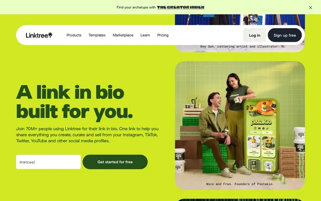
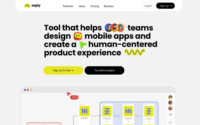
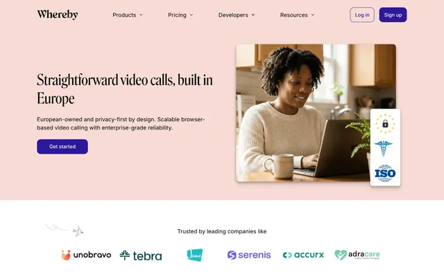
More like this







Keep what you find
A free account saves references to boards and can send you a weekly email of picks based on what you save.
To see every result, go Pro.