Preview image. Unlock full-res
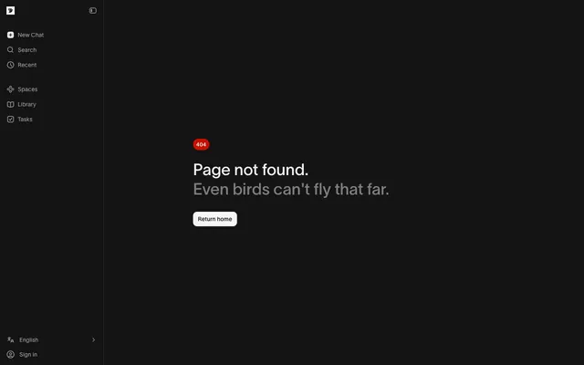
Midnight command center
Color palette
Orange wash for highlight backgrounds, decorative bands, and soft emphasis behind content. Use as a supporting accent, not as a status color
Supporting palette color for small decorative accents when the core palette needs contrast. Do not promote it to the primary CTA color
Supporting palette color for small decorative accents when the core palette needs contrast. Do not promote it to the primary CTA color
Primary background for pages and main content areas
Light text on dark surfaces, inverse labels, and high-contrast captions. Do not promote it to the primary CTA color
Secondary text, disabled states, inactive icons, and subtle dividers
Button text on light backgrounds
Tertiary text or less prominent button labels
Secondary surface background, like skeleton loading bases
Background for skeleton loading animations
Background for filled buttons, providing contrast against dark surfaces
Typography
- Weights
- 300, 450, 600
- Sizes
- 13px, 14px, 40px
- Line height
- 1.2, 1.43, 1.54
- Letter spacing
- 0.0200em, 0.0220em
- Fallback
- system-ui, sans-serif
Lausanne serves as the exclusive typeface, providing a modern, slightly geometric aesthetic. Its lighter weights (300, 450) are used for body and secondary text, creating an airy feel, while the 600 weight provides concise emphasis for headings. Consistent letter-spacing provides a subtle polish across all textual elements.
Spacing & shape
Components
Text in Muted Ash (#aaaaaa), background transparent, 8px horizontal padding, 1px top border.
Text in Ghost White (#f7f7f7), background transparent, 8px horizontal padding, 1px top border.
Text in Muted Ash (#737373), transparent background, 10px border radius, 8px vertical padding, 8px horizontal padding.
Text in Ghost White (#f7f7f7), transparent background, 8px border radius, 8px vertical padding, 8px horizontal padding.
Text in Ghost White (#f7f7f7), transparent background, 0px border radius, 0px padding.
Background in Light Button Fill (#f5f5f5), text in Deep Grey (#0d0d0d), 10px border radius, 8px vertical padding, 12px horizontal padding.
Background in Error Red (#cb0f00), white text, typically with a rounded display for emphasis.
Guidelines
- Prioritize a dark background (Pitch Black #141414) for main content areas.
- Use Ghost White (#f7f7f7) for primary text and active navigational elements to maintain high contrast.
- Apply Muted Ash (#aaaaaa) for secondary text, disabled states, and subtle UI elements like icons.
- Ensure all buttons and interactive elements use a 10px border radius for a consistent soft-cornered aesthetic.
- Maintain an 8px vertical spacing unit for consistency in padding and element gaps.
- Use Lausanne font family exclusively, with its specified weights and letter-spacing for all text.
- Employ the Light Button Fill (#f5f5f5) with Deep Grey (#0d0d0d) text for primary calls-to-action.
- Avoid introducing additional saturated colors unless explicitly assigned a functional role (e.g., error states).
- Do not vary border radii inconsistently; adhere to the 10px standard for most components.
- Refrain from using strong shadows or heavy visual elevation; subtle changes in surface color or minimal borders are preferred.
- Do not introduce new typefaces; Lausanne is the sole approved font.
- Avoid large, impactful imagery that breaks the dark, functional aesthetic.
- Do not deviate from the specified contrast ratios; legibility is paramount in the dark theme.
- Do not use generic system icon styles; all icons should align with the outlined style seen in the sidebar.
About this system
ShowHide
Bird's design system evokes a midnight command center atmosphere, characterized by a predominantly dark canvas and a restricted, achromatic color palette. High contrast between crisp white text and dark backgrounds ensures legibility, while muted grays provide subtle visual hierarchy. The system prioritizes functional, compact layouts with soft-cornered components and a clean, unobtrusive feel, reserving color for minimal functional accents.
The page adheres to a two-column layout: a fixed-width left sidebar and a flexible main content area. The overall page is full-bleed, with the dark background extending across the viewport. The hero pattern (if present) would likely feature a centered headline over the dark canvas. Vertical rhythm is established by consistent 24px section gaps with smaller 8px element gaps, creating a compact information-dense feel rather than spacious, airy sections. Navigation is presented via a fixed, always-visible left sidebar.
The visual language is UI-dominant, with minimal use of imagery. What photography exists is entirely abstract or iconographic, focusing on functional symbols rather than expressive visuals. Icons are outlined, subtle monochromes, consistent in stroke weight and color (Muted Ash #aaaaaa). No product screenshots, illustrations, or lifestyle photography are present. The density is text-dominant, with icons serving as small, functional orienting elements rather than decorative features.
Reminiscent of Linear, GitHub (Dark Mode), Raycast, Vercel (Dark Mode).
# Bird — Style Reference
> Midnight command center

**Theme:** dark

**Site:** https://bird.com/en-us

Bird's design system evokes a midnight command center atmosphere, characterized by a predominantly dark canvas and a restricted, achromatic color palette. High contrast between crisp white text and dark backgrounds ensures legibility, while muted grays provide subtle visual hierarchy. The system prioritizes functional, compact layouts with soft-cornered components and a clean, unobtrusive feel, reserving color for minimal functional accents.

## Tokens — Colors

| Name | Value | Token | Role |
|------|------|------|------|
| Error Red | `#cb0f00` | `--color-error-red` | Orange wash for highlight backgrounds, decorative bands, and soft emphasis behind content. Use as a supporting accent, not as a status color |
| Selected Blue | `#001040` | `--color-selected-blue` | Supporting palette color for small decorative accents when the core palette needs contrast. Do not promote it to the primary CTA color |
| Selected Hover Blue | `#001959` | `--color-selected-hover-blue` | Supporting palette color for small decorative accents when the core palette needs contrast. Do not promote it to the primary CTA color |
| Pitch Black | `#141414` | `--color-pitch-black` | Primary background for pages and main content areas |
| Ghost White | `#f7f7f7` | `--color-ghost-white` | Light text on dark surfaces, inverse labels, and high-contrast captions. Do not promote it to the primary CTA color |
| Muted Ash | `#aaaaaa` | `--color-muted-ash` | Secondary text, disabled states, inactive icons, and subtle dividers |
| Deep Grey | `#0d0d0d` | `--color-deep-grey` | Button text on light backgrounds |
| Soft Stone | `#737373` | `--color-soft-stone` | Tertiary text or less prominent button labels |
| Panel Background | `#212121` | `--color-panel-background` | Secondary surface background, like skeleton loading bases |
| Skeleton Glow | `#303030` | `--color-skeleton-glow` | Background for skeleton loading animations |
| Light Button Fill | `#f5f5f5` | `--color-light-button-fill` | Background for filled buttons, providing contrast against dark surfaces |

## Tokens — Typography

### Lausanne
- **Substitute:** system-ui, sans-serif
- **Weights:** 300, 450, 600
- **Sizes:** 13px, 14px, 40px
- **Line height:** 1.2, 1.43, 1.54
- **Letter spacing:** 0.0200em, 0.0220em
- **Role:** Lausanne serves as the exclusive typeface, providing a modern, slightly geometric aesthetic. Its lighter weights (300, 450) are used for body and secondary text, creating an airy feel, while the 600 weight provides concise emphasis for headings. Consistent letter-spacing provides a subtle polish across all textual elements.

## Tokens — Type Scale

| Role | Size | Line height | Letter spacing |
|------|------|------|------|
| caption | 13px | 1.43 | — |
| body-sm | 14px | 1.43 | — |
| body | 40px | 1.3 | — |

## Tokens — Spacing

- **Section gap:** 24px
- **Card padding:** 12px
- **Element gap:** 8px

## Tokens — Radius

- **Buttons:** 10px
- **Cards:** 10px
- **other:** 10px

## Layout

The page adheres to a two-column layout: a fixed-width left sidebar and a flexible main content area. The overall page is full-bleed, with the dark background extending across the viewport. The hero pattern (if present) would likely feature a centered headline over the dark canvas. Vertical rhythm is established by consistent 24px section gaps with smaller 8px element gaps, creating a compact information-dense feel rather than spacious, airy sections. Navigation is presented via a fixed, always-visible left sidebar.

## Imagery

The visual language is UI-dominant, with minimal use of imagery. What photography exists is entirely abstract or iconographic, focusing on functional symbols rather than expressive visuals. Icons are outlined, subtle monochromes, consistent in stroke weight and color (Muted Ash #aaaaaa). No product screenshots, illustrations, or lifestyle photography are present. The density is text-dominant, with icons serving as small, functional orienting elements rather than decorative features.

## Components

### Navigation Item (Inactive)
*Sidebar navigation links that are not currently active.*

Text in Muted Ash (#aaaaaa), background transparent, 8px horizontal padding, 1px top border.

### Navigation Item (Active)
*Highlighted sidebar navigation links.*

Text in Ghost White (#f7f7f7), background transparent, 8px horizontal padding, 1px top border.

### Default Button
*General purpose button with a subtle appearance.*

Text in Muted Ash (#737373), transparent background, 10px border radius, 8px vertical padding, 8px horizontal padding.

### Prominent Button
*Button with higher visual emphasis for key actions.*

Text in Ghost White (#f7f7f7), transparent background, 8px border radius, 8px vertical padding, 8px horizontal padding.

### Inline Text Button
*Button integrated directly within text, removing borders and padding.*

Text in Ghost White (#f7f7f7), transparent background, 0px border radius, 0px padding.

### Filled Button (Light)
*Primary call-to-action button, standing out against dark backgrounds.*

Background in Light Button Fill (#f5f5f5), text in Deep Grey (#0d0d0d), 10px border radius, 8px vertical padding, 12px horizontal padding.

### Error Badge
*Small informational badge, indicating an error or warning.*

Background in Error Red (#cb0f00), white text, typically with a rounded display for emphasis.

## Guidelines

### Do

- Prioritize a dark background (Pitch Black #141414) for main content areas.
- Use Ghost White (#f7f7f7) for primary text and active navigational elements to maintain high contrast.
- Apply Muted Ash (#aaaaaa) for secondary text, disabled states, and subtle UI elements like icons.
- Ensure all buttons and interactive elements use a 10px border radius for a consistent soft-cornered aesthetic.
- Maintain an 8px vertical spacing unit for consistency in padding and element gaps.
- Use Lausanne font family exclusively, with its specified weights and letter-spacing for all text.
- Employ the Light Button Fill (#f5f5f5) with Deep Grey (#0d0d0d) text for primary calls-to-action.

### Don't

- Avoid introducing additional saturated colors unless explicitly assigned a functional role (e.g., error states).
- Do not vary border radii inconsistently; adhere to the 10px standard for most components.
- Refrain from using strong shadows or heavy visual elevation; subtle changes in surface color or minimal borders are preferred.
- Do not introduce new typefaces; Lausanne is the sole approved font.
- Avoid large, impactful imagery that breaks the dark, functional aesthetic.
- Do not deviate from the specified contrast ratios; legibility is paramount in the dark theme.
- Do not use generic system icon styles; all icons should align with the outlined style seen in the sidebar.

## Agent Prompt Guide

Quick Color Reference:
text: #f7f7f7
background: #141414
border: #aaaaaa (subtle, often 1px)
accent: #001040 (subtle for selected states)
primary action: no distinct CTA color

Example Component Prompts:
Create a navigation sidebar item for 'Tasks': text 'Tasks' in Lausanne weight 450, color #aaaaaa, 8px horizontal padding, background transparent, 1px top border in #f7f7f709.
Create an active navigation sidebar item for 'New Chat': text 'New Chat' in Lausanne weight 450, color #f7f7f7, 8px horizontal padding, background transparent, 1px top border in #f7f7f709.
No distinct primary action color was observed; use the extracted neutral button treatments instead of inventing a filled CTA color.
Create a heading: text 'Page not found.' in Lausanne weight 600, color #f7f7f7, size 40px, line height 1.2, letter spacing 0.0200em, 24px bottom margin.
Create a detail message: text 'Even birds can't fly that far.' in Lausanne weight 450, color #aaaaaa, size 14px, line height 1.43, letter spacing 0.0220em, 24px top margin.
More like this







Keep what you find
A free account saves references to boards and can send you a weekly email of picks based on what you save.
To see every result, go Pro.