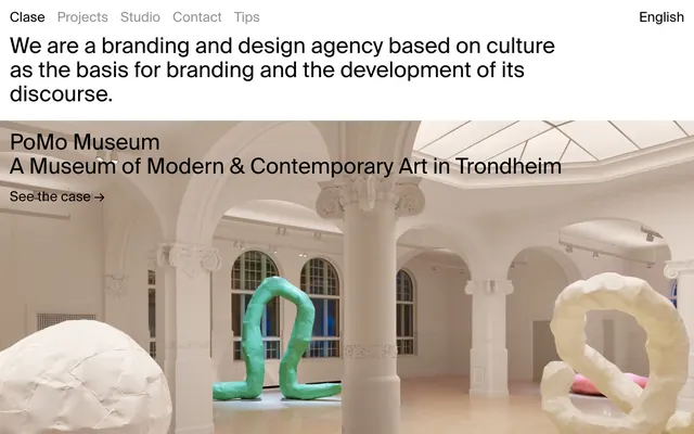
Preview image. Unlock full-res
Crisp Editorial Blocks
Color palette
Warm, earthy background for specific featured content blocks, adding a touch of personality
Vibrant, attention-grabbing background for featured content blocks, acting as a strong visual accent
Primary page background, general surface. Provides a clean, bright foundation
Dark borders and separators for elevated surfaces and inverted UI. Do not promote it to the primary CTA color
Secondary text color, slightly softer than Ink Black, used for subheadings and contextual links
Subtle background for alternate sections or cards, offering a slight visual shift from pure white
Background for specific content blocks or cards, providing a soft natural earth tone
Muted text for navigation and less prominent links, providing hierarchy through reduced contrast
Subtle link text for footer or utility navigation, further de-emphasizing non-primary information
Deep, almost pure black used for specific section backgrounds, creating strong contrast
Darkest neutral for background sections or cards, subtly distinct from Jet Black
Typography
- Weights
- 400
- Sizes
- 24px, 28px, 45px
- Line height
- 1.11, 1.17, 1.21, 1.25, 1.79, 2.01, 2.44
- Letter spacing
- normal
- Fallback
- Arial
The primary typeface for all text. Its consistent weight across various sizes gives a uniform, professional, and slightly understated feel, allowing the content itself to stand out.
Spacing & shape
Components
Text uses SuisseIntl-Regular at 400 weight. Main nav items are in `Ash Gray` while utility links are `Silver Link`. No background, no radius, minimalist. Hover states are implied by text color change or subtle underline.
Background is `Light Concrete` (#e8e8e8). No border, no shadow, 0px border-radius. Padding of 20px on all sides. Heading text uses `Ink Black` or `Deep Graphite`, body text uses SuisseIntl-Regular. 'See the case' link is `Ink Black` with an arrow decorator.
Background is `Jet Black` (#0a0000). No border, no shadow, 0px border-radius. Padding of 20px on all sides. Heading and body text uses `Canvas White`. 'See the case' link is `Canvas White` with an arrow decorator.
Background is `Blush Sand` (#efccbe). No border, no shadow, 0px border-radius. Padding of 20px on all sides. Heading and body text uses `Ink Black`. 'See the case' link is `Ink Black` with an arrow decorator.
Background is `Vivid Succulent` (#43d491). No border, no shadow, 0px border-radius. Padding of 20px on all sides. Heading and body text uses `Ink Black`. 'See the case' link is `Ink Black` with an arrow decorator.
Guidelines
- Always use 'SuisseIntl-Regular' for all text elements to maintain typographic consistency.
- Utilize 0px border-radius universally to enforce a sharp, modern aesthetic.
- Apply `Ink Black` (#000000) for primary text and `Canvas White` (#ffffff) for backgrounds to ensure high contrast.
- Use `Ash Gray` (#939393) for secondary navigation or less prominent text to create subtle hierarchy.
- Employ `Vivid Succulent` (#43d491), `Blush Sand` (#efccbe), `Jet Black` (#0a0000), or `Muted Sage` (#adada0) as solid background blocks for feature sections to create visual impact and delineate content areas. Do not use gradients.
- Maintain a comfortable rhythm with `elementGap` at 20px for internal component spacing and `sectionGap` at 100px between large content blocks.
- Ensure all interactive links, particularly 'See the case' links, are rendered in `Ink Black` or `Canvas White` depending on the background, with a distinct right arrow graphic.
- Do not use rounded corners; the system is defined by its hard edges.
- Avoid any drop shadows or elevation effects; the design relies on flat, layered blocks of color and content.
- Do not introduce new typefaces; 'SuisseIntl-Regular' is the sole typographic voice.
- Refrain from using gradients; all color applications should be flat and solid.
- Do not vary from the established spacing relationships; 20px for elements and 100px for sections are fixed.
- Avoid decorative imagery that competes with the editorial typography; visuals are primarily large, full-bleed backgrounds for project cards.
- Never use generic blue for links; links should be `Ink Black` or `Canvas White` to match the surrounding text.
About this system
ShowHide
Clase bcn employs a stark, editorial aesthetic centered on strong typography and a modular layout. It operates primarily in monochrome with occasional, deliberate use of vivid, flat color blocks as section backgrounds, creating a distinct visual break and impact. The design emphasizes clear content presentation through large, confident text and a comfortable spacing rhythm, allowing the eye to focus on the work examples the agency presents without distraction. Interactive elements are subtly integrated, maintaining the clean, minimalist feel.
The page adheres to a full-bleed layout, where content sections stretch across the entire viewport width. The hero section features a prominent headline over a large background image. Section rhythm is established through alternating background colors and large vertical `sectionGap` of 100px, creating distinct modular blocks. Content arrangement within these blocks is typically a centered stack of text and links. There are no explicit grid systems for cards, instead relying on full-width content blocks for each project. Navigation is a minimalist top bar with links on the left and a language selector on the right, which remains static at the top.
The visual language is dominated by large-format, full-bleed product or architectural photography and occasional abstract graphic elements. Photography is often presented as background fillers for case study cards, showcasing detailed work or brand aesthetics. The treatment is primarily raw edges, contained within solid color blocks, establishing a gallery-like presentation. There are no small, decorative icons; iconography is limited to simple functional arrows. Imagery serves as evocative mood-setting and product showcase rather than explanatory content, with a high density, often filling entire sections.
Reminiscent of AIGA, Pentagram, DIA, Studio Dumbar.
# Clase bcn — Style Reference
> Crisp Editorial Blocks

**Theme:** light

**Site:** https://clasebcn.com

Clase bcn employs a stark, editorial aesthetic centered on strong typography and a modular layout. It operates primarily in monochrome with occasional, deliberate use of vivid, flat color blocks as section backgrounds, creating a distinct visual break and impact. The design emphasizes clear content presentation through large, confident text and a comfortable spacing rhythm, allowing the eye to focus on the work examples the agency presents without distraction. Interactive elements are subtly integrated, maintaining the clean, minimalist feel.

## Tokens — Colors

| Name | Value | Token | Role |
|------|------|------|------|
| Blush Sand | `#efccbe` | `--color-blush-sand` | Warm, earthy background for specific featured content blocks, adding a touch of personality |
| Vivid Succulent | `#43d491` | `--color-vivid-succulent` | Vibrant, attention-grabbing background for featured content blocks, acting as a strong visual accent |
| Canvas White | `#ffffff` | `--color-canvas-white` | Primary page background, general surface. Provides a clean, bright foundation |
| Ink Black | `#000000` | `--color-ink-black` | Dark borders and separators for elevated surfaces and inverted UI. Do not promote it to the primary CTA color |
| Deep Graphite | `#0a0a0a` | `--color-deep-graphite` | Secondary text color, slightly softer than Ink Black, used for subheadings and contextual links |
| Light Concrete | `#e8e8e8` | `--color-light-concrete` | Subtle background for alternate sections or cards, offering a slight visual shift from pure white |
| Muted Sage | `#adada0` | `--color-muted-sage` | Background for specific content blocks or cards, providing a soft natural earth tone |
| Ash Gray | `#939393` | `--color-ash-gray` | Muted text for navigation and less prominent links, providing hierarchy through reduced contrast |
| Silver Link | `#aaaaaa` | `--color-silver-link` | Subtle link text for footer or utility navigation, further de-emphasizing non-primary information |
| Jet Black | `#0a0000` | `--color-jet-black` | Deep, almost pure black used for specific section backgrounds, creating strong contrast |
| Charcoal Slate | `#262a36` | `--color-charcoal-slate` | Darkest neutral for background sections or cards, subtly distinct from Jet Black |

## Tokens — Typography

### SuisseIntl-Regular
- **Substitute:** Arial
- **Weights:** 400
- **Sizes:** 24px, 28px, 45px
- **Line height:** 1.11, 1.17, 1.21, 1.25, 1.79, 2.01, 2.44
- **Letter spacing:** normal
- **Role:** The primary typeface for all text. Its consistent weight across various sizes gives a uniform, professional, and slightly understated feel, allowing the content itself to stand out.

## Tokens — Type Scale

| Role | Size | Line height | Letter spacing |
|------|------|------|------|
| body-sm | 24px | 1.79 | — |
| body | 28px | 1.25 | — |
| heading | 45px | 1.11 | — |

## Tokens — Spacing

- **Section gap:** 100px
- **Card padding:** 20px
- **Element gap:** 20px

## Tokens — Radius

- **all:** 0px

## Layout

The page adheres to a full-bleed layout, where content sections stretch across the entire viewport width. The hero section features a prominent headline over a large background image. Section rhythm is established through alternating background colors and large vertical `sectionGap` of 100px, creating distinct modular blocks. Content arrangement within these blocks is typically a centered stack of text and links. There are no explicit grid systems for cards, instead relying on full-width content blocks for each project. Navigation is a minimalist top bar with links on the left and a language selector on the right, which remains static at the top.

## Imagery

The visual language is dominated by large-format, full-bleed product or architectural photography and occasional abstract graphic elements. Photography is often presented as background fillers for case study cards, showcasing detailed work or brand aesthetics. The treatment is primarily raw edges, contained within solid color blocks, establishing a gallery-like presentation. There are no small, decorative icons; iconography is limited to simple functional arrows. Imagery serves as evocative mood-setting and product showcase rather than explanatory content, with a high density, often filling entire sections.

## Components

### Navigation Link
*Main navigation items and utility links.*

Text uses SuisseIntl-Regular at 400 weight. Main nav items are in `Ash Gray` while utility links are `Silver Link`. No background, no radius, minimalist. Hover states are implied by text color change or subtle underline.

### Project Card (Light Concrete)
*Standard project listing block.*

Background is `Light Concrete` (#e8e8e8). No border, no shadow, 0px border-radius. Padding of 20px on all sides. Heading text uses `Ink Black` or `Deep Graphite`, body text uses SuisseIntl-Regular. 'See the case' link is `Ink Black` with an arrow decorator.

### Project Card (Jet Black)
*Alternative dark project listing block.*

Background is `Jet Black` (#0a0000). No border, no shadow, 0px border-radius. Padding of 20px on all sides. Heading and body text uses `Canvas White`. 'See the case' link is `Canvas White` with an arrow decorator.

### Project Card (Blush Sand)
*Accent themed project listing block.*

Background is `Blush Sand` (#efccbe). No border, no shadow, 0px border-radius. Padding of 20px on all sides. Heading and body text uses `Ink Black`. 'See the case' link is `Ink Black` with an arrow decorator.

### Project Card (Vivid Succulent)
*Accent themed project listing block.*

Background is `Vivid Succulent` (#43d491). No border, no shadow, 0px border-radius. Padding of 20px on all sides. Heading and body text uses `Ink Black`. 'See the case' link is `Ink Black` with an arrow decorator.

## Guidelines

### Do

- Always use 'SuisseIntl-Regular' for all text elements to maintain typographic consistency.
- Utilize 0px border-radius universally to enforce a sharp, modern aesthetic.
- Apply `Ink Black` (#000000) for primary text and `Canvas White` (#ffffff) for backgrounds to ensure high contrast.
- Use `Ash Gray` (#939393) for secondary navigation or less prominent text to create subtle hierarchy.
- Employ `Vivid Succulent` (#43d491), `Blush Sand` (#efccbe), `Jet Black` (#0a0000), or `Muted Sage` (#adada0) as solid background blocks for feature sections to create visual impact and delineate content areas. Do not use gradients.
- Maintain a comfortable rhythm with `elementGap` at 20px for internal component spacing and `sectionGap` at 100px between large content blocks.
- Ensure all interactive links, particularly 'See the case' links, are rendered in `Ink Black` or `Canvas White` depending on the background, with a distinct right arrow graphic.

### Don't

- Do not use rounded corners; the system is defined by its hard edges.
- Avoid any drop shadows or elevation effects; the design relies on flat, layered blocks of color and content.
- Do not introduce new typefaces; 'SuisseIntl-Regular' is the sole typographic voice.
- Refrain from using gradients; all color applications should be flat and solid.
- Do not vary from the established spacing relationships; 20px for elements and 100px for sections are fixed.
- Avoid decorative imagery that competes with the editorial typography; visuals are primarily large, full-bleed backgrounds for project cards.
- Never use generic blue for links; links should be `Ink Black` or `Canvas White` to match the surrounding text.

## Agent Prompt Guide

### Quick Color Reference
- text: #000000
- background: #ffffff
- border: #000000 (for interactive elements)
- accent: #43d491 (for featured section backgrounds)
- primary action: no distinct CTA color

### 3-5 Example Component Prompts
- Create a static branding statement section: `Canvas White` background, 100px vertical padding. Headline using SuisseIntl-Regular, 45px, 1.11 line-height, `Ink Black` text. Body text using SuisseIntl-Regular, 28px, 1.25 line-height, `Ink Black` text.
- Create a `Project Card (Vivid Succulent)`: full-width. Background color `Vivid Succulent` (#43d491). No border, 0px border-radius, 20px padding on all sides. Heading 'PoMo Museum' in SuisseIntl-Regular, 28px, 1.25 line-height, `Ink Black`. Subheading 'A Museum of Modern & Contemporary Art in Trondheim' in SuisseIntl-Regular, 24px, 1.79 line-height, `Ink Black`. Link 'See the case →' in SuisseIntl-Regular, 24px, 1.79 line-height, `Ink Black`.
- Create a simple navigation menu item: text 'Projects' in SuisseIntl-Regular, 24px, 1.79 line-height, `Ash Gray` (#939393). No background, no border.
- Create a `Project Card (Light Concrete)` section. Use background `Light Concrete` (#e8e8e8). No border, 0px border-radius, 20px padding on all sides. Heading 'Kave Home' in SuisseIntl-Regular, 28px, 1.25 line-height, `Ink Black`. Subheading 'Expanding the Mediterranean imaginary' in SuisseIntl-Regular, 24px, 1.79 line-height, `Ink Black`. Link 'See the case →' in SuisseIntl-Regular, 24px, 1.79 line-height, `Ink Black`.
More like this









Keep what you find
A free account saves references to boards and can send you a weekly email of picks based on what you save.
To see every result, go Pro.