Preview image. Unlock full-res
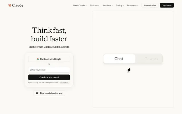
Academic Journal on Vellum — a soft, tactile precision.
Color palette
Decorative icon accents. Its vividness is contained, making it a controlled burst of warmth.
Page backgrounds, card surfaces, navigation background. Provides a warm, inviting canvas.
Primary text, main headings, button text on light backgrounds. Creates high contrast and strong legibility.
Borders, secondary text, darker accents within UI elements. Contributes to definition without harshness.
Subtle text for secondary information like navigation links and body copy. Softer than Ink Black, but still highly readable.
Tertiary text, descriptive labels, and subtle UI elements. Less prominent for supporting content.
Placeholder text, inactive states, faint iconography. Blends into the background more for assistive elements.
Subtle borders, dividers, subtle background shades. Offers a slight visual separation without drawing attention.
Input fields, selected states, and very occasional text on dark backgrounds. A brighter white for interactive elements.
Border accents, subtle highlights on interactive elements. A cool, near-gray accent that adds a touch of refinement without being overtly chromatic.
Typography
- Weights
- 330
- Sizes
- 18px, 24px, 30px, 56px
- Line height
- 1.2
- Letter spacing
- normal
- Fallback
- Lora
Primary display headings, 56px and weight 330. Its lightness commands attention through understated elegance rather than brute force, defining the site's intellectual tone.
- Weights
- 400
- Sizes
- 18px, 24px, 30px, 56px
- Line height
- 1.33
- Letter spacing
- normal
- Fallback
- Lora
Secondary headings, and large body text that needs emphasis. The refined serif forms add gravitas.
- Weights
- 400
- Sizes
- 11px, 12px, 14px, 15px, 16px, 24px
- Line height
- 1.33
- Letter spacing
- normal
- Fallback
- Inter
Body copy, button labels, navigation, captions, and all interface text. This sans-serif provides clarity and high readability across all functional elements.
- Weights
- 430
- Sizes
- 11px, 12px, 14px, 15px, 16px, 24px
- Line height
- 1.4
- Letter spacing
- normal
- Fallback
- Inter
Used for emphasized body text or secondary labels, offering a subtle lift from regular weight.
- Weights
- 500
- Sizes
- 11px, 12px, 14px, 15px, 16px, 24px
- Line height
- 1.43
- Letter spacing
- normal
- Fallback
- Inter
Typically used for call-to-action text, navigation items, or key data points where moderate emphasis is needed.
- Weights
- 600
- Sizes
- 11px, 12px, 14px, 15px, 16px, 24px
- Line height
- 1.5
- Letter spacing
- normal
- Fallback
- Inter
Used sparingly for strong emphasis, such as important labels or active navigation states.
Spacing & shape
Components
Transparent background, text color #3d3d3a. Border-radius 0px. Text is Anthropic Sans, weight 400.
Background transparent, text #141413, border rgba(31,30,29,0.3) with 9.6px border-radius. Padding 20px horizontal. Typically uses Anthropic Sans, weight 400.
Background transparent, text #ffffff, 9.6px border-radius. Padding 20px horizontal. This component seems to be nested within a different background, appearing dark on Vellum White. Text is Anthropic Sans, weight 400.
Transparent background, text #141413, border color #1f1e1d, 8px border-radius. Padding 24px horizontal. Appears in contexts requiring clear boundaries.
Background #141413, text #ffffff. Border-radius 9.6px. Padding 24px vertical, 20px horizontal. Text is Anthropic Sans, weight 500.
Background #ffffff, text #141413, border rgba(31,30,29,0.15) and 9.6px border-radius. Padding 12px horizontal. Uses Anthropic Sans, weight 400. Placeholder text in a lighter neutral.
Background #faf9f5, border is often subtle #dedcd1, with 9.6px border-radius and 24px padding within. Uses Anthropic Sans for body text, Anthropic Serif for titles.
Container has background #faf9f5 with 9.6px border-radius. Individual toggle buttons are transparent with text #3d3d3a when inactive, and a filled #faf9f5 background with text #141413 when active, maintaining the soft aesthetic.
Text color #3d3d3a, Anthropic Sans, weight 400. Underlined on hover.
Transparent background, often text #3d3d3a (e.g. 'Download desktop app'). Uses an icon with fill #141413. Similar padding and border-radius to other buttons (8px or 9.6px).
Guidelines
- Use Vellum White (#faf9f5) as the default background for all page sections and main content cards.
- Apply 9.6px border-radius to all interactive elements, including buttons, input fields, and standard cards, for a consistent soft-edged feel.
- Set primary headings (56px) with Anthropic Serif weight 330 to achieve an articulate, understated voice.
- Ensure all body text uses Anthropic Sans weight 400 to maintain high readability across the interface.
- Utilize Ink Black (#141413) for primary text and CTA button backgrounds to ensure strong contrast against Vellum White backgrounds.
- Maintain a comfortable information density using an elementGap of 8-24px between smaller components, and sectionGap of 32-40px between major sections.
- Do not use dark, harsh shadows; employ subtle borders like #dedcd1 or rgba(31,30,29,0.15) for depth and separation.
- Avoid overly vibrant or saturated color accents outside of the very specific design system-defined accents like Terra Cotta (#d97757).
- Never use bolding (weights above 500) for headlines; the system relies on lighter weights for stylistic authority.
- Refrain from using sharp, 0px border radii on buttons or cards, except for specific navigation or list item elements that require a more contained appearance.
- Do not introduce new font families; strictly adhere to Anthropic Sans and Anthropic Serif to maintain brand consistency.
About this system
ShowHide
This design system evokes the quiet confidence of a well-edited scientific journal, balancing approachability with precise execution. Creamy off-white backgrounds provide a soft canvas, while crisp dark gray text ensures legibility. The understated typography, particularly the lighter weights of Anthropic Serif for headings, communicates authority through clarity rather than shouting, reminiscent of an academic paper. Subtle accent colors appear mostly within the custom Anthropic icons, suggesting a sophisticated, self-contained aesthetic with minimal external decoration.
The layout primarily uses a max-width contained model (approximately 1200px) with content centered on the page. The hero section features a split layout: a large, centered headline on the left and an interactive UI simulation on the right. Content sections generally employ a consistent vertical spacing of 32-40px, creating a spacious feel. Feature and pricing sections often use a 3-column card grid, with content stacked vertically within each card. The navigation is a sticky top bar, with primary links left-aligned and 'Contact sales' and 'Try Claude' buttons right-aligned. The overall rhythm is clean, balanced, and information-dense without feeling cramped.
The site uses a 'no imagery, pure UI' approach for its primary content areas. Decorative visuals consist purely of custom, outlined icons with occasional accents of Terra Cotta (#d97757) within the outlines. These icons are abstract and symbolic, serving to clarify features or concepts rather than adding decorative flair. This minimalist approach places full emphasis on the elegant typography and interaction design.
Reminiscent of OpenAI, Linear, Notion, Anthropic (main website).
# Claude — Style Reference
> Academic Journal on Vellum — a soft, tactile precision.

**Theme:** light

**Site:** https://claude.ai

This design system evokes the quiet confidence of a well-edited scientific journal, balancing approachability with precise execution. Creamy off-white backgrounds provide a soft canvas, while crisp dark gray text ensures legibility. The understated typography, particularly the lighter weights of Anthropic Serif for headings, communicates authority through clarity rather than shouting, reminiscent of an academic paper. Subtle accent colors appear mostly within the custom Anthropic icons, suggesting a sophisticated, self-contained aesthetic with minimal external decoration.

## Tokens — Colors

| Name | Value | Token | Role |
|------|------|------|------|
| Terra Cotta | `#d97757` | `--color-terra-cotta` | Decorative icon accents. Its vividness is contained, making it a controlled burst of warmth. |
| Vellum White | `#faf9f5` | `--color-vellum-white` | Page backgrounds, card surfaces, navigation background. Provides a warm, inviting canvas. |
| Ink Black | `#141413` | `--color-ink-black` | Primary text, main headings, button text on light backgrounds. Creates high contrast and strong legibility. |
| Onyx | `#1f1e1d` | `--color-onyx` | Borders, secondary text, darker accents within UI elements. Contributes to definition without harshness. |
| Graphite | `#3d3d3a` | `--color-graphite` | Subtle text for secondary information like navigation links and body copy. Softer than Ink Black, but still highly readable. |
| Dusty Gray | `#73726c` | `--color-dusty-gray` | Tertiary text, descriptive labels, and subtle UI elements. Less prominent for supporting content. |
| Stone | `#9c9a92` | `--color-stone` | Placeholder text, inactive states, faint iconography. Blends into the background more for assistive elements. |
| Parchment | `#dedcd1` | `--color-parchment` | Subtle borders, dividers, subtle background shades. Offers a slight visual separation without drawing attention. |
| Snow White | `#ffffff` | `--color-snow-white` | Input fields, selected states, and very occasional text on dark backgrounds. A brighter white for interactive elements. |
| Pale Azure | `#ccdbe8` | `--color-pale-azure` | Border accents, subtle highlights on interactive elements. A cool, near-gray accent that adds a touch of refinement without being overtly chromatic. |

## Tokens — Typography

### Anthropic Serif
- **Substitute:** Lora
- **Weights:** 330
- **Sizes:** 18px, 24px, 30px, 56px
- **Line height:** 1.2
- **Letter spacing:** normal
- **Role:** Primary display headings, 56px and weight 330. Its lightness commands attention through understated elegance rather than brute force, defining the site's intellectual tone.

### Anthropic Serif
- **Substitute:** Lora
- **Weights:** 400
- **Sizes:** 18px, 24px, 30px, 56px
- **Line height:** 1.33
- **Letter spacing:** normal
- **Role:** Secondary headings, and large body text that needs emphasis. The refined serif forms add gravitas.

### Anthropic Sans
- **Substitute:** Inter
- **Weights:** 400
- **Sizes:** 11px, 12px, 14px, 15px, 16px, 24px
- **Line height:** 1.33
- **Letter spacing:** normal
- **Role:** Body copy, button labels, navigation, captions, and all interface text. This sans-serif provides clarity and high readability across all functional elements.

### Anthropic Sans
- **Substitute:** Inter
- **Weights:** 430
- **Sizes:** 11px, 12px, 14px, 15px, 16px, 24px
- **Line height:** 1.4
- **Letter spacing:** normal
- **Role:** Used for emphasized body text or secondary labels, offering a subtle lift from regular weight.

### Anthropic Sans
- **Substitute:** Inter
- **Weights:** 500
- **Sizes:** 11px, 12px, 14px, 15px, 16px, 24px
- **Line height:** 1.43
- **Letter spacing:** normal
- **Role:** Typically used for call-to-action text, navigation items, or key data points where moderate emphasis is needed.

### Anthropic Sans
- **Substitute:** Inter
- **Weights:** 600
- **Sizes:** 11px, 12px, 14px, 15px, 16px, 24px
- **Line height:** 1.5
- **Letter spacing:** normal
- **Role:** Used sparingly for strong emphasis, such as important labels or active navigation states.

## Tokens — Type Scale

| Role | Size | Line height | Letter spacing |
|------|------|------|------|
| caption | 11px | 1.33 | — |
| heading | 18px | 1.33 | — |
| heading-lg | 24px | 1.33 | — |
| display | 56px | 1.2 | — |

## Tokens — Spacing

- **Section gap:** 32-40px
- **Card padding:** 24px
- **Element gap:** 8-24px

## Tokens — Radius

- **Buttons:** 9.6px
- **Inputs:** 9.6px
- **Cards:** 9.6px
- **heroElements:** 24px
- **jumboSeparators:** 32px
- **largeContainers:** 16px

## Layout

The layout primarily uses a max-width contained model (approximately 1200px) with content centered on the page. The hero section features a split layout: a large, centered headline on the left and an interactive UI simulation on the right. Content sections generally employ a consistent vertical spacing of 32-40px, creating a spacious feel. Feature and pricing sections often use a 3-column card grid, with content stacked vertically within each card. The navigation is a sticky top bar, with primary links left-aligned and 'Contact sales' and 'Try Claude' buttons right-aligned. The overall rhythm is clean, balanced, and information-dense without feeling cramped.

## Imagery

The site uses a 'no imagery, pure UI' approach for its primary content areas. Decorative visuals consist purely of custom, outlined icons with occasional accents of Terra Cotta (#d97757) within the outlines. These icons are abstract and symbolic, serving to clarify features or concepts rather than adding decorative flair. This minimalist approach places full emphasis on the elegant typography and interaction design.

## Components

### Sign-In Form Card

### Pricing Cards

### Chat / Cowork Toggle Selector

### Primary Navigation Button
*Main navigation items in the header.*

Transparent background, text color #3d3d3a. Border-radius 0px. Text is Anthropic Sans, weight 400.

### Secondary Button
*Buttons for less prominent actions, often in a secondary role.*

Background transparent, text #141413, border rgba(31,30,29,0.3) with 9.6px border-radius. Padding 20px horizontal. Typically uses Anthropic Sans, weight 400.

### Primary CTA Button
*Key interaction buttons.*

Background transparent, text #ffffff, 9.6px border-radius. Padding 20px horizontal. This component seems to be nested within a different background, appearing dark on Vellum White. Text is Anthropic Sans, weight 400.

### Destructive / Prominent Button
*Buttons for actions demanding attention or within prominent fields.*

Transparent background, text #141413, border color #1f1e1d, 8px border-radius. Padding 24px horizontal. Appears in contexts requiring clear boundaries.

### Call to Action - Dark Filled
*Main call to action, used for sign-ups or primary workflows.*

Background #141413, text #ffffff. Border-radius 9.6px. Padding 24px vertical, 20px horizontal. Text is Anthropic Sans, weight 500.

### Form Input Field
*Standard fields for user input.*

Background #ffffff, text #141413, border rgba(31,30,29,0.15) and 9.6px border-radius. Padding 12px horizontal. Uses Anthropic Sans, weight 400. Placeholder text in a lighter neutral.

### Card - Standard
*Content containers for features, pricing tiers, or grouped information.*

Background #faf9f5, border is often subtle #dedcd1, with 9.6px border-radius and 24px padding within. Uses Anthropic Sans for body text, Anthropic Serif for titles.

### Toggle Button Group
*Used for selecting between distinct options.*

Container has background #faf9f5 with 9.6px border-radius. Individual toggle buttons are transparent with text #3d3d3a when inactive, and a filled #faf9f5 background with text #141413 when active, maintaining the soft aesthetic.

### Inline Navigation Link
*Standard text links within body content or footers.*

Text color #3d3d3a, Anthropic Sans, weight 400. Underlined on hover.

### Icon Button
*Buttons primarily identified by an icon.*

Transparent background, often text #3d3d3a (e.g. 'Download desktop app'). Uses an icon with fill #141413. Similar padding and border-radius to other buttons (8px or 9.6px).

## Guidelines

### Do

- Use Vellum White (#faf9f5) as the default background for all page sections and main content cards.
- Apply 9.6px border-radius to all interactive elements, including buttons, input fields, and standard cards, for a consistent soft-edged feel.
- Set primary headings (56px) with Anthropic Serif weight 330 to achieve an articulate, understated voice.
- Ensure all body text uses Anthropic Sans weight 400 to maintain high readability across the interface.
- Utilize Ink Black (#141413) for primary text and CTA button backgrounds to ensure strong contrast against Vellum White backgrounds.
- Maintain a comfortable information density using an elementGap of 8-24px between smaller components, and sectionGap of 32-40px between major sections.

### Don't

- Do not use dark, harsh shadows; employ subtle borders like #dedcd1 or rgba(31,30,29,0.15) for depth and separation.
- Avoid overly vibrant or saturated color accents outside of the very specific design system-defined accents like Terra Cotta (#d97757).
- Never use bolding (weights above 500) for headlines; the system relies on lighter weights for stylistic authority.
- Refrain from using sharp, 0px border radii on buttons or cards, except for specific navigation or list item elements that require a more contained appearance.
- Do not introduce new font families; strictly adhere to Anthropic Sans and Anthropic Serif to maintain brand consistency.

## Agent Prompt Guide

### Quick Color Reference
- Text (Ink Black): `#141413`
- Background (Vellum White): `#faf9f5`
- CTA Dark Fill: `#141413`
- Border (Parchment): `#dedcd1`
- Accent (Terra Cotta): `#d97757`

### 3-5 Example Component Prompts
1. **Create a pricing tier card (Standard Card)**: Background Vellum White (#faf9f5), border Parchment (#dedcd1), 9.6px border-radius, 24px padding. Headline 'Free' Anthropic Serif weight 400 at 30px, color Ink Black (#141413). Body text Anthropic Sans weight 400 at 14px, color Ink Black (#141413). Bottom button is a Dark Filled CTA: background Ink Black (#141413), text Snow White (#ffffff), 9.6px border-radius, 24px vertical, 20px horizontal padding.
2. **Generate a primary navigation bar**: Background Vellum White (#faf9f5). Left-aligned logo. Right-aligned navigation links 'Meet Claude' to 'Resources' as Primary Navigation Buttons (transparent background, text Graphite #3d3d3a, Anthropic Sans weight 400 at 15px). Followed by 'Contact sales' as a Secondary Button (transparent background, text Ink Black #141413, border rgba(31,30,29,0.3) 9.6px border-radius, 20px horizontal padding). Final button 'Try Claude' as Primary CTA (transparent background, text Snow White #ffffff, 9.6px border-radius, 20px horizontal padding, within a global Ink Black section).
3. **Design a form input field**: Background Snow White (#ffffff), border rgba(31,30,29,0.15), 9.6px border-radius. Padding 12px horizontal. Placeholder text color Stone (#9c9a92). Text input color Ink Black (#141413), Anthropic Sans weight 400 at 15px.
More like this







Keep what you find
A free account saves references to boards and can send you a weekly email of picks based on what you save.
To see every result, go Pro.