Preview image. Unlock full-res
Cognac-Stained Parchment – A sense of aged wisdom and quiet authority, inviting deep contemplation.
Color palette
Primary text color for body copy, headings, and key UI elements, offering strong contrast against the warm backgrounds.
Interactive elements like primary buttons and emphasized text, acting as a warm, grounded accent.
Used sparingly for dynamic highlights or notification states, providing a vibrant pop.
Occasional accent for specific headline emphasis, drawing attention without being overwhelming.
Primary page and card backgrounds, lending a warm, analog feel to the digital interface.
Secondary text, subtle borders, and placeholder text, providing visual hierarchy without harshness.
Tertiary text and subtle accents, deepening the warm neutral palette.
Subtle borders and muted instructional text.
Hover states and secondary button backgrounds, a slightly darker shade of the primary background for subtle interaction feedback.
Text on dark backgrounds, or pure white elements for contrast against Parchment White.
Deep, almost black text for strong contrast where needed.
Typography
- Weights
- 300, 400, 700
- Sizes
- 10px, 12px, 14px, 15px, 20px, 24px, 40px, 56px, 64px
- Line height
- 1, 1.2, 1.22, 1.32, 1.34
- Letter spacing
- -0.03em at 64px, -0.022em at 56px, -0.02em at 40px, -0.013em at 24px, -0.012em at 20px, normal at 15px and below
- Fallback
- Source Serif Pro
Primary display and headline font for all large text, creating an inviting, antique, and intellectual tone. The liberal use of negative letter-spacing for large sizes is a signature choice, drawing characters closer for a cohesive, refined look.
- Weights
- 400, 500
- Sizes
- 10px, 13px, 14px, 15px, 17px
- Line height
- 1, 1.2, 1.4
- Letter spacing
- -0.01em
- Fallback
- Inter
Dominant sans-serif for body text, navigation items, and descriptions, providing contemporary readability against the more expressive display font.
- Weights
- 400
- Sizes
- 12px
- Line height
- 1.2
- Letter spacing
- normal
- Fallback
- Arial
Fallback and utilitarian text where robust readability is paramount, such as system messages or very small captions.
- Weights
- 400
- Sizes
- 13px
- Line height
- 1.4
- Letter spacing
- normal
- Fallback
- Roboto Mono
Monospaced font used for data, code snippets, or any content requiring exact character alignment.
Spacing & shape
Components
Background: Burnt Umber (#3e2407), Text: White (#ffffff), Radius: 12px, Padding: 12px 16px. Font: Inter 500, 15px. This is the main interactive element, signifying a primary action.
Background: Parchment White (#fdf6ee), Text: Deep Cognac (#2b180a), Border: 1px Muted Stone (#94877c), Radius: 12px, Padding: 12px 16px. Font: Inter 400, 15px. Provides a less emphasized action, often paired with the primary button.
Background: Cloud Fog (#f0e6dc), Text: Deep Cognac (#2b180a), Radius: 12px, Padding: 12px 16px. Font: Inter 400, 15px. Features a slightly darker background than the page for minimal differentiation.
Background: White (#ffffff), Text: Deep Cognac (#2b180a), Radius: 12px, Padding: 12px 16px. Font: Inter 400, 15px. Used specifically for authentication flows, standing out against the header background.
Background: Parchment White (#fdf6ee), Text: Deep Cognac (#2b180a), Radius: 16px-20px (dynamic, with an inner radius for the avatar at 70px), Padding: 20px. Features a soft shadow implying elevation.
Background: Parchment White (#fdf6ee), Border: 1px Muted Stone (#94877c), Radius: 12px, Padding: 12px 16px. Placeholder text in Muted Stone, font Inter 400, 15px. Focus ring uses a subtle outline.
Text: Muted Stone (#94877c) for inactive, Deep Cognac (#2b180a) for active/hover. Font: Inter 400, 15px. Padding: 12px. No explicit background, integrates with header.
Background: Parchment White (#fdf6ee), Radius: 16px, Padding: 20px. Headline and body text use Deep Cognac and Muted Stone. Features an almost invisible shadow for subtle depth.
Guidelines
- Use Martina Plantijn Light at weight 300 for all content headings larger than 24px, applying appropriate negative letter-spacing.
- Maintain #fdf6ee as the primary background color for all main page content and interactive cards.
- Apply a default border-radius of 12px to all interactive elements and contained content blocks like cards.
- Employ the Deep Cognac (#2b180a) as the default text color for primary content and navigation.
- Utilize Inter at 15px with line height 1.4 for most body copy, ensuring an open and readable text block.
- Emphasize primary calls-to-action using a filled button with Burnt Umber (#3e2407) background and white text.
- Ensure consistent spacing elements are multiples of 4px, especially for padding within components and between text blocks.
- Do not use highly saturated colors for backgrounds or large text areas; reserve them for small, impactful accents like #f65726 or #ff5c00.
- Avoid harsh shadows; prefer subtle, barely-there elevations to maintain the soft, warm aesthetic.
- Do not use pure black (#000000) for text on #fdf6ee backgrounds unless for specific, high-contrast, legal text. Prefer Deep Cognac (#2b180a) or Dark Charcoal (#21201c).
- Do not break the established type scale; Martina Plantijn Light scales with specific letter-spacing adjustments at larger sizes.
- Do not introduce strong, geometric shapes where rounded corners (12px or 70px) are the established pattern.
- Avoid busy or distracting imagery; prefer tightly cropped portraits or clean UI mockups.
- Do not use `sans-serif` (system font) for any primary content; it is reserved for inaccessible or fallback instances.
About this system
ShowHide
This design system evokes a sense of thoughtful, quiet expertise, like a leather-bound journal filled with well-considered thoughts. The dominant use of an off-white, almost beige background (#fdf6ee) coupled with a nuanced palette of warm grays and subtle browns creates an inviting, scholarly atmosphere. The signature element is the `Martina Plantijn Light` typeface at whisper-weights, which gives a sophisticated, almost intimate feel, contrasting with the geometric precision of accompanying sans-serifs.
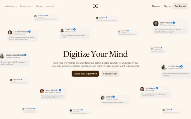
The page primarily employs a max-width contained model (around 1200px) centered on a 'Parchment White' background, creating a spacious and breathable feel. The hero section features a centered, inviting headline ('Digitize Your Mind') above a descriptive subtext and two call-to-action buttons, framed by dynamically floating, blurred testimonial-like cards, creating a sense of activity and social proof. Sections below alternate between a slightly darker off-white background (#f0e6dc) and the primary #fdf6ee, establishing a subtle rhythm. Content arrangement frequently uses two-column layouts, often pairing text with supporting UI snippets or further testimonial cards. There are instances of tightly clustered card grids for features, maintaining generous padding. The navigation is a classic sticky top bar, providing persistent access to key sections. The overall density is balanced, allowing ample whitespace to highlight cognitive ease.
The visual language is characterized by minimal photography, primarily featuring tightly cropped, professional headshots of individuals within testimonial-like thought bubbles. These headshots are typically well-lit, direct, and slightly desaturated, presenting a human but professional face to the AI's 'mind'. The images are often contained within rounded rectangular cards, sometimes layered or scattered, suggesting a constellation of expert voices. Product UI screenshots are presented cleanly within simulated device frames or as isolated, focused elements, detailing functionality without overwhelming the layout. There's an absence of abstract graphics, 3D renders, or decorative illustrations, reinforcing a serious, content-focused approach. The overall density is text-dominant, with imagery serving as supportive, grounded evidence.
Reminiscent of Typeform, Readwise Reader, Notion, Substack.
# Delphi — Style Reference
> Cognac-Stained Parchment – A sense of aged wisdom and quiet authority, inviting deep contemplation.

**Theme:** light

**Site:** https://delphi.ai

This design system evokes a sense of thoughtful, quiet expertise, like a leather-bound journal filled with well-considered thoughts. The dominant use of an off-white, almost beige background (#fdf6ee) coupled with a nuanced palette of warm grays and subtle browns creates an inviting, scholarly atmosphere. The signature element is the `Martina Plantijn Light` typeface at whisper-weights, which gives a sophisticated, almost intimate feel, contrasting with the geometric precision of accompanying sans-serifs.

## Tokens — Colors

| Name | Value | Token | Role |
|------|------|------|------|
| Deep Cognac | `#2b180a` | `--color-deep-cognac` | Primary text color for body copy, headings, and key UI elements, offering strong contrast against the warm backgrounds. |
| Burnt Umber | `#3e2407` | `--color-burnt-umber` | Interactive elements like primary buttons and emphasized text, acting as a warm, grounded accent. |
| Fire Opal | `#f65726` | `--color-fire-opal` | Used sparingly for dynamic highlights or notification states, providing a vibrant pop. |
| Sunset Orange | `#ff5c00` | `--color-sunset-orange` | Occasional accent for specific headline emphasis, drawing attention without being overwhelming. |
| Parchment White | `#fdf6ee` | `--color-parchment-white` | Primary page and card backgrounds, lending a warm, analog feel to the digital interface. |
| Muted Stone | `#94877c` | `--color-muted-stone` | Secondary text, subtle borders, and placeholder text, providing visual hierarchy without harshness. |
| Pressed Cacao | `#7f6e60` | `--color-pressed-cacao` | Tertiary text and subtle accents, deepening the warm neutral palette. |
| Warm Ash | `#a99d93` | `--color-warm-ash` | Subtle borders and muted instructional text. |
| Cloud Fog | `#f0e6dc` | `--color-cloud-fog` | Hover states and secondary button backgrounds, a slightly darker shade of the primary background for subtle interaction feedback. |
| White | `#ffffff` | `--color-white` | Text on dark backgrounds, or pure white elements for contrast against Parchment White. |
| Dark Charcoal | `#21201c` | `--color-dark-charcoal` | Deep, almost black text for strong contrast where needed. |

## Tokens — Typography

### Martina Plantijn Light
- **Substitute:** Source Serif Pro
- **Weights:** 300, 400, 700
- **Sizes:** 10px, 12px, 14px, 15px, 20px, 24px, 40px, 56px, 64px
- **Line height:** 1, 1.2, 1.22, 1.32, 1.34
- **Letter spacing:** -0.03em at 64px, -0.022em at 56px, -0.02em at 40px, -0.013em at 24px, -0.012em at 20px, normal at 15px and below
- **Role:** Primary display and headline font for all large text, creating an inviting, antique, and intellectual tone. The liberal use of negative letter-spacing for large sizes is a signature choice, drawing characters closer for a cohesive, refined look.

### Inter
- **Substitute:** Inter
- **Weights:** 400, 500
- **Sizes:** 10px, 13px, 14px, 15px, 17px
- **Line height:** 1, 1.2, 1.4
- **Letter spacing:** -0.01em
- **Role:** Dominant sans-serif for body text, navigation items, and descriptions, providing contemporary readability against the more expressive display font.

### sans-serif
- **Substitute:** Arial
- **Weights:** 400
- **Sizes:** 12px
- **Line height:** 1.2
- **Letter spacing:** normal
- **Role:** Fallback and utilitarian text where robust readability is paramount, such as system messages or very small captions.

### Roboto Mono
- **Substitute:** Roboto Mono
- **Weights:** 400
- **Sizes:** 13px
- **Line height:** 1.4
- **Letter spacing:** normal
- **Role:** Monospaced font used for data, code snippets, or any content requiring exact character alignment.

## Tokens — Type Scale

Perfect Fourth (1.333) from 15px base.

| Role | Size | Line height | Letter spacing |
|------|------|------|------|
| caption | 10px | 1 | -0.01em |
| body | 15px | 1.4 | -0.01em |
| subheading | 20px | 1.2 | -0.48px |
| heading-sm | 24px | 1.22 | -0.48px |
| heading | 40px | 1.22 | -0.8px |
| heading-lg | 56px | 1.2 | -1.23px |
| display | 64px | 1.34 | -1.92px |

## Tokens — Spacing

- **Section gap:** 75px
- **Card padding:** 20px
- **Element gap:** 8px

## Tokens — Radius

- **Default:** 12px
- **Buttons:** 12px
- **small:** 4px
- **testimonials:** 70px

## Layout

The page primarily employs a max-width contained model (around 1200px) centered on a 'Parchment White' background, creating a spacious and breathable feel. The hero section features a centered, inviting headline ('Digitize Your Mind') above a descriptive subtext and two call-to-action buttons, framed by dynamically floating, blurred testimonial-like cards, creating a sense of activity and social proof. Sections below alternate between a slightly darker off-white background (#f0e6dc) and the primary #fdf6ee, establishing a subtle rhythm. Content arrangement frequently uses two-column layouts, often pairing text with supporting UI snippets or further testimonial cards. There are instances of tightly clustered card grids for features, maintaining generous padding. The navigation is a classic sticky top bar, providing persistent access to key sections. The overall density is balanced, allowing ample whitespace to highlight cognitive ease.

## Imagery

The visual language is characterized by minimal photography, primarily featuring tightly cropped, professional headshots of individuals within testimonial-like thought bubbles. These headshots are typically well-lit, direct, and slightly desaturated, presenting a human but professional face to the AI's 'mind'. The images are often contained within rounded rectangular cards, sometimes layered or scattered, suggesting a constellation of expert voices. Product UI screenshots are presented cleanly within simulated device frames or as isolated, focused elements, detailing functionality without overwhelming the layout. There's an absence of abstract graphics, 3D renders, or decorative illustrations, reinforcing a serious, content-focused approach. The overall density is text-dominant, with imagery serving as supportive, grounded evidence.

## Components

### CTA Button Group

### Feature Cards — Why Delphi

### Trust Feature Cards Grid

### Primary Button (Filled)
*Call to action.*

Background: Burnt Umber (#3e2407), Text: White (#ffffff), Radius: 12px, Padding: 12px 16px. Font: Inter 500, 15px. This is the main interactive element, signifying a primary action.

### Secondary Button (Outlined)
*Secondary action or ghost button.*

Background: Parchment White (#fdf6ee), Text: Deep Cognac (#2b180a), Border: 1px Muted Stone (#94877c), Radius: 12px, Padding: 12px 16px. Font: Inter 400, 15px. Provides a less emphasized action, often paired with the primary button.

### Tertiary Button
*Subtle, less emphasized actions, often within navigation.*

Background: Cloud Fog (#f0e6dc), Text: Deep Cognac (#2b180a), Radius: 12px, Padding: 12px 16px. Font: Inter 400, 15px. Features a slightly darker background than the page for minimal differentiation.

### Auth Button
*Sign-in or Get-started actions in the header.*

Background: White (#ffffff), Text: Deep Cognac (#2b180a), Radius: 12px, Padding: 12px 16px. Font: Inter 400, 15px. Used specifically for authentication flows, standing out against the header background.

### Testimonial Card
*Displaying expert quotes or profiles.*

Background: Parchment White (#fdf6ee), Text: Deep Cognac (#2b180a), Radius: 16px-20px (dynamic, with an inner radius for the avatar at 70px), Padding: 20px. Features a soft shadow implying elevation.

### Input Field
*User data entry.*

Background: Parchment White (#fdf6ee), Border: 1px Muted Stone (#94877c), Radius: 12px, Padding: 12px 16px. Placeholder text in Muted Stone, font Inter 400, 15px. Focus ring uses a subtle outline.

### Header Navigation Item
*Primary site navigation.*

Text: Muted Stone (#94877c) for inactive, Deep Cognac (#2b180a) for active/hover. Font: Inter 400, 15px. Padding: 12px. No explicit background, integrates with header.

### Feature Card
*Highlighting product features or benefits.*

Background: Parchment White (#fdf6ee), Radius: 16px, Padding: 20px. Headline and body text use Deep Cognac and Muted Stone. Features an almost invisible shadow for subtle depth.

## Guidelines

### Do

- Use Martina Plantijn Light at weight 300 for all content headings larger than 24px, applying appropriate negative letter-spacing.
- Maintain #fdf6ee as the primary background color for all main page content and interactive cards.
- Apply a default border-radius of 12px to all interactive elements and contained content blocks like cards.
- Employ the Deep Cognac (#2b180a) as the default text color for primary content and navigation.
- Utilize Inter at 15px with line height 1.4 for most body copy, ensuring an open and readable text block.
- Emphasize primary calls-to-action using a filled button with Burnt Umber (#3e2407) background and white text.
- Ensure consistent spacing elements are multiples of 4px, especially for padding within components and between text blocks.

### Don't

- Do not use highly saturated colors for backgrounds or large text areas; reserve them for small, impactful accents like #f65726 or #ff5c00.
- Avoid harsh shadows; prefer subtle, barely-there elevations to maintain the soft, warm aesthetic.
- Do not use pure black (#000000) for text on #fdf6ee backgrounds unless for specific, high-contrast, legal text. Prefer Deep Cognac (#2b180a) or Dark Charcoal (#21201c).
- Do not break the established type scale; Martina Plantijn Light scales with specific letter-spacing adjustments at larger sizes.
- Do not introduce strong, geometric shapes where rounded corners (12px or 70px) are the established pattern.
- Avoid busy or distracting imagery; prefer tightly cropped portraits or clean UI mockups.
- Do not use `sans-serif` (system font) for any primary content; it is reserved for inaccessible or fallback instances.

## Agent Prompt Guide

### Quick Color Reference
- Text: #2b180a
- Background: #fdf6ee
- Primary CTA: #3e2407
- Secondary CTA: #f0e6dc
- Subtle Border: #94877c

### 3-5 Example Component Prompts
1. Create a hero section: background #fdf6ee. Centered Headline 'Digitize Your Mind' in Martina Plantijn Light 64px weight 300, #2b180a, letter-spacing -1.92px. Subtext 'Turn your knowledge into an interactive profile...' in Inter 17px weight 400, #94877c. Primary button 'Create Your Digital Mind' with background #3e2407, white text, 12px radius, 12px 16px padding. Secondary button 'See it in action' with background #f0e6dc, #2b180a text, 12px radius, 12px 16px padding.
2. Design a feature card: background #fdf6ee, radius 16px, 20px padding. Headline 'Never Repeat Yourself Again' in Martina Plantijn Light 24px weight 400, #2b180a, letter-spacing -0.48px. Body text 'You have expertise people want...' in Inter 15px weight 400, #2b180a.
3. Implement a header navigation bar: background #fdf6ee. Left-aligned logo. Navigation items 'Industries', 'Resources' at Inter 15px weight 400, #94877c, 12px padding. Right-aligned button 'Get Started' with background #ffffff, #2b180a text, 12px radius, 12px 16px padding.
More like this








Keep what you find
A free account saves references to boards and can send you a weekly email of picks based on what you save.
To see every result, go Pro.