Preview image. Unlock full-res
Architectural parchment and chiseled stone
Color palette
Primary text, headings, button backgrounds for filled buttons, primary borders. This near-black provides a stark, authoritative contrast
Page backgrounds, large inactive panels, secondary button text
Button backgrounds for ghost buttons, borders, and some text elements
Subtle borders, inactive text, subtle background fills
Muted text, secondary headings, soft borders
Muted text, accent borders with slightly more depth than Pewter
Typography
- Weights
- 500
- Sizes
- 16px, 19px
- Line height
- 1.2
- Letter spacing
- normal
- Fallback
- serif
Primary headings and select stylized text. The classic serif conveys heritage and gravitas, used for visual impact.
- Weights
- 400
- Sizes
- 11px, 12px, 14px, 16px, 18px, 28px
- Line height
- 1, 1.05, 1.2, 1.3
- Letter spacing
- -0.53px at 11px, -0.47px at 12px, -0.36px at 14px, -0.26px at 16px, -0.28px at 18px, -0.45px at 28px
- Fallback
- system-ui
Body text, navigation, and button labels - provides modern legibility with tight tracking for a contemporary feel.
- Weights
- 400
- Sizes
- 36px, 72px
- Line height
- 1, 1.05
- Letter spacing
- -0.72px at 36px, -1.44px at 72px
- Fallback
- serif
Display headings and prominent statements. The narrow tracking and sophisticated serif create a refined, impactful presence.
- Weights
- 400
- Sizes
- 13px, 16px
- Line height
- 1.2
- Letter spacing
- normal
- Fallback
- sans-serif
Subtler button text, navigation sub-items, and some body copy, offering a highly readable, unpretentious voice.
Spacing & shape
Components
Background: Deep Onyx (#140700), Text: Canvas Parchment (#f8f8f7), Radius: 96px, Padding: 0px vertical, 24px horizontal. Text uses Graphik 400.
Background: Absolute White (rgba(0, 0, 0, 0) in component data suggests transparency against Absolute White), Border: 1px Deep Onyx (#140700), Text: Deep Onyx (#140700), Radius: 0px, Padding: 1px vertical, 6px horizontal. Text uses Arial 400.
Background: transparent (rgba(0,0,0,0)), Border: 1px Absolute White (#ffffff), Text: Absolute White (#ffffff), Radius: 0px, Padding: 1px vertical, 6px horizontal. Text uses Arial 400.
Background: transparent, Border: none, Radius: 0px, Padding: 0px.
Background: transparent, Border: none, Radius: 16px, Padding: 0px.
Background: transparent, Text: Pewter Accent (#cccccc), Border: 1px bottom border in Pewter Accent (#cccccc), Radius: 0px, Padding: 0px. Text uses Graphik.
Guidelines
- Prioritize Deep Onyx (#140700) for all primary text and calls to action against Canvas Parchment (#f8f8f7) backgrounds to ensure high contrast and brand coherence.
- Use Portrait Text 400 at 72px for hero headings to establish a commanding, yet refined textual presence with -1.44px letter spacing.
- Maintain a highly achromatic palette, reserving the subtle brown tint of Deep Onyx (#140700) as the most saturated element.
- Employ Graphik 400 with its characteristic tight letter spacing for body text and interactive elements to convey modern precision.
- Utilize 96px border-radius consistently for primary filled buttons and 0px for ghost/outlined buttons to define interaction types.
- Apply 16px border-radius to card-like elements or content containers where a softer edge is desired, contrasting with the generally sharp aesthetic.
- Ensure all interactive text elements use either Deep Onyx (#140700) for active states or Absolute White (#ffffff) in dark contexts, maintaining strong readability.
- Avoid introducing additional chromatic colors; the visual system is built on a precise neutral and near-black palette.
- Do not use generic sans-serif fonts for headings; Portrait Text and Times are critical for the brand's sophisticated voice.
- Steer clear of heavy drop shadows or strong gradients; the system relies on flat surfaces and high-contrast typography for visual depth.
- Do not deviate from the established tight letter spacing for Graphik and Portrait Text; it's a signature characteristic of the typography.
- Avoid overly generous padding or wide element gaps that would disrupt the comfortable but precise density of the layout.
- Do not round corners on elements intended to be sharp and austere, such as the ghost buttons and form inputs with zero radius.
- Never use light text on light backgrounds or dark text on dark backgrounds without ensuring WCAG AAA contrast levels, particularly with the subtle off-white tones.
About this system
ShowHide
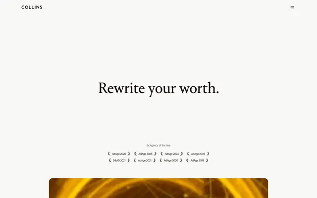
COLLINS employs a minimalist, sophisticated aesthetic, utilizing a pale canvas and precise typography to convey authority and restraint. The visual identity emphasizes clarity with high-contrast text and a deliberate absence of busy elements. Subtle interaction cues and carefully defined spacing create a sense of calm composure, allowing content to take precedence. The system avoids vibrant colors, relying instead on a refined neutral palette for impact.
The page primarily uses a max-width contained layout, centering content within a generous whitespace on a Canvas Parchment background. The hero section features a centered, impactful headline against the same background, followed by a full-width visual banner or video with a 16px border-radius, acting as a visual break. Content sections maintain consistent vertical spacing (64px section gap) and often feature simple stacked content, or alternating horizontal arrangements of text and implied visual content (like program listings). Navigation is a sticky top bar with minimal branding and interactive elements. The site favors large, isolated blocks of content over dense grids.
The imagery is sparse and impactful. Photography, when used, tends to be full-bleed, conceptual, and often dark and moody with a clear focal point, appearing within masked, rounded containers that soften the otherwise sharp UI. There are no illustrations. Icons are minimal, typically monochrome and filled, serving as subtle navigational or decorative elements (e.g., hamburger menu, arrows). The overall density is text-dominant, allowing the few high-impact visual elements to stand out, primarily for atmospheric or product showcase purposes without literal depiction.
Reminiscent of AIGA Design, Pentagram, Meta Design, Chermayeff & Geismar & Haviv.
# COLLINS — Style Reference
> Architectural parchment and chiseled stone

**Theme:** light

**Site:** https://wearecollins.com

COLLINS employs a minimalist, sophisticated aesthetic, utilizing a pale canvas and precise typography to convey authority and restraint. The visual identity emphasizes clarity with high-contrast text and a deliberate absence of busy elements. Subtle interaction cues and carefully defined spacing create a sense of calm composure, allowing content to take precedence. The system avoids vibrant colors, relying instead on a refined neutral palette for impact.

## Tokens — Colors

| Name | Value | Token | Role |
|------|------|------|------|
| Deep Onyx | `#140700` | `--color-deep-onyx` | Primary text, headings, button backgrounds for filled buttons, primary borders. This near-black provides a stark, authoritative contrast |
| Canvas Parchment | `#f8f8f7` | `--color-canvas-parchment` | Page backgrounds, large inactive panels, secondary button text |
| Absolute White | `#ffffff` | `--color-absolute-white` | Button backgrounds for ghost buttons, borders, and some text elements |
| Pewter Accent | `#cccccc` | `--color-pewter-accent` | Subtle borders, inactive text, subtle background fills |
| Slate Echo | `#5e5855` | `--color-slate-echo` | Muted text, secondary headings, soft borders |
| Shadowed Steel | `#514c49` | `--color-shadowed-steel` | Muted text, accent borders with slightly more depth than Pewter |

## Tokens — Typography

### Times
- **Substitute:** serif
- **Weights:** 500
- **Sizes:** 16px, 19px
- **Line height:** 1.2
- **Letter spacing:** normal
- **Role:** Primary headings and select stylized text. The classic serif conveys heritage and gravitas, used for visual impact.

### Graphik
- **Substitute:** system-ui
- **Weights:** 400
- **Sizes:** 11px, 12px, 14px, 16px, 18px, 28px
- **Line height:** 1, 1.05, 1.2, 1.3
- **Letter spacing:** -0.53px at 11px, -0.47px at 12px, -0.36px at 14px, -0.26px at 16px, -0.28px at 18px, -0.45px at 28px
- **Role:** Body text, navigation, and button labels - provides modern legibility with tight tracking for a contemporary feel.

### Portrait Text
- **Substitute:** serif
- **Weights:** 400
- **Sizes:** 36px, 72px
- **Line height:** 1, 1.05
- **Letter spacing:** -0.72px at 36px, -1.44px at 72px
- **Role:** Display headings and prominent statements. The narrow tracking and sophisticated serif create a refined, impactful presence.

### Arial
- **Substitute:** sans-serif
- **Weights:** 400
- **Sizes:** 13px, 16px
- **Line height:** 1.2
- **Letter spacing:** normal
- **Role:** Subtler button text, navigation sub-items, and some body copy, offering a highly readable, unpretentious voice.

## Tokens — Type Scale

| Role | Size | Line height | Letter spacing |
|------|------|------|------|
| caption | 11px | 1 | -0.58px |
| body | 14px | 1.2 | -0.21px |
| body-lg | 16px | 1.2 | -0.16px |
| subheading | 18px | 1.05 | -0.18px |
| heading | 28px | 1.05 | -0.28px |
| heading-lg | 36px | 1.05 | -0.72px |
| display | 72px | 1.05 | -1.44px |

## Tokens — Spacing

- **Section gap:** 64px
- **Card padding:** 24px
- **Element gap:** 16px

## Tokens — Radius

- **General:** 4px
- **Buttons:** 96px
- **Cards:** 16px

## Layout

The page primarily uses a max-width contained layout, centering content within a generous whitespace on a Canvas Parchment background. The hero section features a centered, impactful headline against the same background, followed by a full-width visual banner or video with a 16px border-radius, acting as a visual break. Content sections maintain consistent vertical spacing (64px section gap) and often feature simple stacked content, or alternating horizontal arrangements of text and implied visual content (like program listings). Navigation is a sticky top bar with minimal branding and interactive elements. The site favors large, isolated blocks of content over dense grids.

## Imagery

The imagery is sparse and impactful. Photography, when used, tends to be full-bleed, conceptual, and often dark and moody with a clear focal point, appearing within masked, rounded containers that soften the otherwise sharp UI. There are no illustrations. Icons are minimal, typically monochrome and filled, serving as subtle navigational or decorative elements (e.g., hamburger menu, arrows). The overall density is text-dominant, allowing the few high-impact visual elements to stand out, primarily for atmospheric or product showcase purposes without literal depiction.

## Components

### Primary Filled Button
*Call to action for key interactions.*

Background: Deep Onyx (#140700), Text: Canvas Parchment (#f8f8f7), Radius: 96px, Padding: 0px vertical, 24px horizontal. Text uses Graphik 400.

### Ghost Border Button
*Secondary call to action, navigation items.*

Background: Absolute White (rgba(0, 0, 0, 0) in component data suggests transparency against Absolute White), Border: 1px Deep Onyx (#140700),  Text: Deep Onyx (#140700), Radius: 0px, Padding: 1px vertical, 6px horizontal. Text uses Arial 400.

### Hero Ghost Button
*Calls to action within prominent dark sections.*

Background: transparent (rgba(0,0,0,0)), Border: 1px Absolute White (#ffffff), Text: Absolute White (#ffffff), Radius: 0px, Padding: 1px vertical, 6px horizontal. Text uses Arial 400.

### Programs Card (Plain)
*Structural container for program listings or similar content.*

Background: transparent, Border: none, Radius: 0px, Padding: 0px.

### Programs Card (Rounded)
*Structural container with soft corners for related content blocks.*

Background: transparent, Border: none, Radius: 16px, Padding: 0px.

### Text Input
*Single-line text entry fields.*

Background: transparent, Text: Pewter Accent (#cccccc), Border: 1px bottom border in Pewter Accent (#cccccc), Radius: 0px, Padding: 0px. Text uses Graphik.

## Guidelines

### Do

- Prioritize Deep Onyx (#140700) for all primary text and calls to action against Canvas Parchment (#f8f8f7) backgrounds to ensure high contrast and brand coherence.
- Use Portrait Text 400 at 72px for hero headings to establish a commanding, yet refined textual presence with -1.44px letter spacing.
- Maintain a highly achromatic palette, reserving the subtle brown tint of Deep Onyx (#140700) as the most saturated element.
- Employ Graphik 400 with its characteristic tight letter spacing for body text and interactive elements to convey modern precision.
- Utilize 96px border-radius consistently for primary filled buttons and 0px for ghost/outlined buttons to define interaction types.
- Apply 16px border-radius to card-like elements or content containers where a softer edge is desired, contrasting with the generally sharp aesthetic.
- Ensure all interactive text elements use either Deep Onyx (#140700) for active states or Absolute White (#ffffff) in dark contexts, maintaining strong readability.

### Don't

- Avoid introducing additional chromatic colors; the visual system is built on a precise neutral and near-black palette.
- Do not use generic sans-serif fonts for headings; Portrait Text and Times are critical for the brand's sophisticated voice.
- Steer clear of heavy drop shadows or strong gradients; the system relies on flat surfaces and high-contrast typography for visual depth.
- Do not deviate from the established tight letter spacing for Graphik and Portrait Text; it's a signature characteristic of the typography.
- Avoid overly generous padding or wide element gaps that would disrupt the comfortable but precise density of the layout.
- Do not round corners on elements intended to be sharp and austere, such as the ghost buttons and form inputs with zero radius.
- Never use light text on light backgrounds or dark text on dark backgrounds without ensuring WCAG AAA contrast levels, particularly with the subtle off-white tones.

## Agent Prompt Guide

Quick Color Reference:
text: #140700
background: #f8f8f7
border: #140700
accent: none observed
primary action: #140700 (filled action)

Example Component Prompts:
1. Create a Primary Action Button: #140700 background, #ffffff text, 9999px radius, compact pill padding. Use this filled treatment for the main CTA.
2. Design a Hero Heading: 'Rewrite your worth.' using Portrait Text 400 at 72px, Deep Onyx (#140700) color, with -1.44px letter spacing, centered on Canvas Parchment (#f8f8f7) background.
3. Construct a Program List Item: 'Brand Refresh' in Deep Onyx (#140700) Graphik 400 at 28px, followed by 'Stay Relevant. Stay Valuable.' in Slate Echo (#5e5855) Graphik 400 at 14px, separated by a 1px Pewter Accent (#cccccc) horizontal rule, all within a 0px radius Program Card (Plain).
4. Build a Ghost Border Button: background transparent, 1px Deep Onyx (#140700) border, text Deep Onyx (#140700) using Arial 400, 0px radius, 1px vertical and 6px horizontal padding.
5. Implement a Text Input: background transparent, text Pewter Accent (#cccccc) using Graphik 400, with a 1px bottom border in Pewter Accent (#cccccc), 0px radius and 0px padding.
More like this









Keep what you find
A free account saves references to boards and can send you a weekly email of picks based on what you save.
To see every result, go Pro.