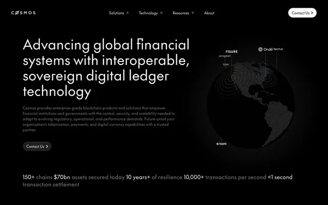
Preview image. Unlock full-res
Midnight Ledger, sharp and precise
Color palette
Green wash for highlight backgrounds, decorative bands, and soft emphasis behind content. Do not promote it to the primary CTA color
Page backgrounds, significant surface areas like navigation. Serves as the primary dark foundation
Neutral form states, badge text, and quiet UI feedback where color should stay understated. Do not promote it to the primary CTA color
Subtle borders and dividers, background for select text fields
Muted secondary text, placeholder text, and decorative borders. Adds visual depth without distracting from primary content
Background for secondary content cards, slightly lighter than the page background to denote a surface level
Subtle background for specific sections or elements, offering a brief respite from the dominant dark mode
Typography
- Weights
- 400
- Sizes
- 12px, 14px, 16px, 24px, 32px, 36px, 60px
- Line height
- 1.13, 1.25, 1.33, 1.43, 1.5, 1.6, 1.63
- Letter spacing
- Normal text tracking at 16px to tight tracking at 60px.
- Fallback
- Inter, Open Sans
Primary typeface for all textual content, from body to large headings. Its custom font features ('ss02', 'ss09') imply highly specific character forms, contributing to its distinct, precise, and engineered feel.
Spacing & shape
Components
Ghost White text on Midnight Abyss background, no padding, no explicit border radius, effectively 0px. Text color #ffffff. Interactive elements in navigation use the accent green for status indicators or subtle background highlights.
Transparent background, Ghost White text (#ffffff), and a sharp, 0px border radius. This minimizes visual weight, maintaining a clean, text-driven interface.
Background is Card Dark (#1e1f20), with a 20px border radius and 20px padding on all sides. No box shadow, relying on subtle background difference for visual separation.
Background is Card Dark (#1e1f20), with a distinctive 32px border radius. Generous internal padding of 88px top/bottom and 153.6px left/right for ample content breathing room.
Transparent background, Ghost White text (#ffffff), and a 0px border radius. The default state is a ghost text input without visible borders, integrating seamlessly with the dark background.
Guidelines
- Prioritize Midnight Abyss (#000000) for all significant background areas to maintain the system's dark theme.
- Use Ghost White (#ffffff) for all primary text and critical UI elements to ensure high contrast and readability.
- Apply the `The Future` typeface with its specific font feature settings ('ss02', 'ss09') for all text elements to preserve brand identity.
- Segment content using subtle shifts in background color like Card Dark (#1e1f20) for cards, rather than relying on shadows or heavy borders.
- Maintain sharp edges for primary interactive elements, using a 0px border radius for ghost buttons and navigation links.
- Use Interface Green (#22e2a8) sparingly, only for small interactive indicators, active states, or subtle accent details.
- Apply a 20px border radius consistently to feature cards to soften their appearance while maintaining structural clarity.
- Avoid using saturated background colors or multiple vivid accents; the system prioritizes a monochrome, high-contrast palette.
- Do not introduce drop shadows for elevation; rely on background color changes for surface differentiation.
- Do not use generic system fonts; `The Future` with its specific settings is critical for typographic identity.
- Avoid overly complex layouts or decorative gradients; emphasize clean, structured content presentation.
- Do not use heavily padded or filled buttons as primary calls to action; prefer ghost or text-based interactions.
- Do not use large, rounded corners on primary interactive elements; keep them sharp with 0px radius.
- Avoid mixing light and dark themes unless explicitly for a specific component variation.
About this system
ShowHide
Cosmos Network embodies a 'sophisticated darkness' aesthetic, utilizing a deep black canvas with stark white typography and subtle, near-gray surface treatments for content segmentation. The visual system projects authority and precision through a constrained color palette and compact, feature-rich typography. This creates a high-contrast, information-dense environment where text and data take precedence, punctuated by minimal UI elements that maintain a serious, technology-forward presence. Interactive elements are sparse, emphasizing clarity over visual flair.
The page maintains a max-width contained layout rather than full-bleed, with primary content centered. The hero section is a full-width dark background with a large, centered headline and a supporting text block, accompanied by an abstract, data-visualization graphic. Section rhythm is primarily consistent vertical spacing on a continuous dark background, with content blocks appearing as distinct cards or text-heavy paragraphs. Content arrangement often features a single column of text or a split layout with text on the left and imagery/cards on the right, or a grid of 3-4 feature cards. There is a prominent sticky top navigation with subtle links.
The visual language for imagery is primarily functional and understated. Product-focused graphics, often represented as abstract, glowing spherical elements or simplified interface diagrams, convey complex technology concepts rather than aspirational lifestyle photography. These are typically contained within sections, not full-bleed, and utilize the system's core dark and accent colors. Icons are minimalist, outlined rather than filled, with a light stroke weight, primarily in Ghost White or subtle gray tones, and occasionally accented with Interface Green. Overall density is moderate, with imagery serving explanatory or illustrative roles complementing dense blocks of text.
Reminiscent of Solana, Ethereum, Chainlink, Algorand.
# Cosmos Network — Style Reference
> Midnight Ledger, sharp and precise

**Theme:** dark

**Site:** https://cosmos.network

Cosmos Network embodies a 'sophisticated darkness' aesthetic, utilizing a deep black canvas with stark white typography and subtle, near-gray surface treatments for content segmentation. The visual system projects authority and precision through a constrained color palette and compact, feature-rich typography. This creates a high-contrast, information-dense environment where text and data take precedence, punctuated by minimal UI elements that maintain a serious, technology-forward presence. Interactive elements are sparse, emphasizing clarity over visual flair.

## Tokens — Colors

| Name | Value | Token | Role |
|------|------|------|------|
| Interface Green | `#22e2a8` | `--color-interface-green` | Green wash for highlight backgrounds, decorative bands, and soft emphasis behind content. Do not promote it to the primary CTA color |
| Midnight Abyss | `#000000` | `--color-midnight-abyss` | Page backgrounds, significant surface areas like navigation. Serves as the primary dark foundation |
| Ghost White | `#ffffff` | `--color-ghost-white` | Neutral form states, badge text, and quiet UI feedback where color should stay understated. Do not promote it to the primary CTA color |
| Iron Slate | `#333333` | `--color-iron-slate` | Subtle borders and dividers, background for select text fields |
| Faded Steel | `#807f7f` | `--color-faded-steel` | Muted secondary text, placeholder text, and decorative borders. Adds visual depth without distracting from primary content |
| Card Dark | `#1e1f20` | `--color-card-dark` | Background for secondary content cards, slightly lighter than the page background to denote a surface level |
| Frost | `#f1f4f4` | `--color-frost` | Subtle background for specific sections or elements, offering a brief respite from the dominant dark mode |

## Tokens — Typography

### The Future
- **Substitute:** Inter, Open Sans
- **Weights:** 400
- **Sizes:** 12px, 14px, 16px, 24px, 32px, 36px, 60px
- **Line height:** 1.13, 1.25, 1.33, 1.43, 1.5, 1.6, 1.63
- **Letter spacing:** Normal text tracking at 16px to tight tracking at 60px.
- **Role:** Primary typeface for all textual content, from body to large headings. Its custom font features ('ss02', 'ss09') imply highly specific character forms, contributing to its distinct, precise, and engineered feel.

## Tokens — Type Scale

Perfect Fourth (1.333) from 16px base.

| Role | Size | Line height | Letter spacing |
|------|------|------|------|
| caption | 12px | 1.63 | 0.24px |
| body-sm | 14px | 1.6 | 0.35px |
| body | 16px | 1.5 | 0.32px |
| subheading | 24px | 1.43 | 0.48px |
| heading | 32px | 1.33 | 0.64px |
| heading-lg | 36px | 1.25 | 0.72px |
| display | 60px | 1.13 | 1.5px |

## Tokens — Spacing

- **Section gap:** 30px
- **Card padding:** 20px
- **Element gap:** 16px

## Tokens — Radius

- **Buttons:** 0px
- **Cards:** 20px
- **Images:** 10px
- **sections:** 16px

## Layout

The page maintains a max-width contained layout rather than full-bleed, with primary content centered. The hero section is a full-width dark background with a large, centered headline and a supporting text block, accompanied by an abstract, data-visualization graphic. Section rhythm is primarily consistent vertical spacing on a continuous dark background, with content blocks appearing as distinct cards or text-heavy paragraphs. Content arrangement often features a single column of text or a split layout with text on the left and imagery/cards on the right, or a grid of 3-4 feature cards. There is a prominent sticky top navigation with subtle links.

## Imagery

The visual language for imagery is primarily functional and understated. Product-focused graphics, often represented as abstract, glowing spherical elements or simplified interface diagrams, convey complex technology concepts rather than aspirational lifestyle photography. These are typically contained within sections, not full-bleed, and utilize the system's core dark and accent colors. Icons are minimalist, outlined rather than filled, with a light stroke weight, primarily in Ghost White or subtle gray tones, and occasionally accented with Interface Green. Overall density is moderate, with imagery serving explanatory or illustrative roles complementing dense blocks of text.

## Components

### Navigation Link
*Primary navigation item*

Ghost White text on Midnight Abyss background, no padding, no explicit border radius, effectively 0px. Text color #ffffff. Interactive elements in navigation use the accent green for status indicators or subtle background highlights.

### Ghost Button
*Secondary action or link*

Transparent background, Ghost White text (#ffffff), and a sharp, 0px border radius. This minimizes visual weight, maintaining a clean, text-driven interface.

### Feature Card (Dark)
*Container for secondary content like customer showcases.*

Background is Card Dark (#1e1f20), with a 20px border radius and 20px padding on all sides. No box shadow, relying on subtle background difference for visual separation.

### Header Card (Dark, Large)
*Prominent content container for key sections.*

Background is Card Dark (#1e1f20), with a distinctive 32px border radius. Generous internal padding of 88px top/bottom and 153.6px left/right for ample content breathing room.

### Default Input Field
*Standard input for user data.*

Transparent background, Ghost White text (#ffffff), and a 0px border radius. The default state is a ghost text input without visible borders, integrating seamlessly with the dark background.

## Guidelines

### Do

- Prioritize Midnight Abyss (#000000) for all significant background areas to maintain the system's dark theme.
- Use Ghost White (#ffffff) for all primary text and critical UI elements to ensure high contrast and readability.
- Apply the `The Future` typeface with its specific font feature settings ('ss02', 'ss09') for all text elements to preserve brand identity.
- Segment content using subtle shifts in background color like Card Dark (#1e1f20) for cards, rather than relying on shadows or heavy borders.
- Maintain sharp edges for primary interactive elements, using a 0px border radius for ghost buttons and navigation links.
- Use Interface Green (#22e2a8) sparingly, only for small interactive indicators, active states, or subtle accent details.
- Apply a 20px border radius consistently to feature cards to soften their appearance while maintaining structural clarity.

### Don't

- Avoid using saturated background colors or multiple vivid accents; the system prioritizes a monochrome, high-contrast palette.
- Do not introduce drop shadows for elevation; rely on background color changes for surface differentiation.
- Do not use generic system fonts; `The Future` with its specific settings is critical for typographic identity.
- Avoid overly complex layouts or decorative gradients; emphasize clean, structured content presentation.
- Do not use heavily padded or filled buttons as primary calls to action; prefer ghost or text-based interactions.
- Do not use large, rounded corners on primary interactive elements; keep them sharp with 0px radius.
- Avoid mixing light and dark themes unless explicitly for a specific component variation.

## Agent Prompt Guide

Quick Color Reference:
text: #ffffff
background: #000000
border: #333333
accent: #22e2a8
primary action: no distinct CTA color

Example Component Prompts:
Create a navigation bar: Midnight Abyss background (#000000), with Ghost White text (#ffffff) for links. Add a small Interface Green (#22e2a8) accent circle next to an active link. Use `The Future` font at 16px, weight 400.
Create a dark feature card: Card Dark background (#1e1f20), 20px border radius, 20px padding. Inside, use a Ghost White heading (#ffffff) at 24px and Faded Steel body text (#807f7f) at 14px, both using `The Future` font.
Create a hero section headline: 'Financial players use Cosmos tech...' in Ghost White (#ffffff), size 60px, `The Future` font weight 400, line-height 1.13. No specific background or padding, assumes page default.
More like this





Keep what you find
A free account saves references to boards and can send you a weekly email of picks based on what you save.
To see every result, go Pro.