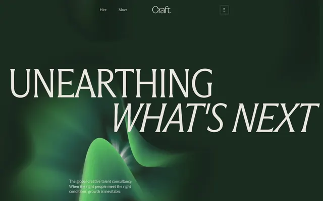
Preview image. Unlock full-res
Botanical elegance on linen
Color palette
Primary action button backgrounds, vivid highlights for interactive elements, accent for navigation hovers and titles within specific data blocks
Accent text for financial figures or key statistics, decorative borders in specific content areas
Primary text, strong headings, button outlines on light backgrounds, dark accent borders that define content blocks
Dark borders and separators for elevated surfaces and inverted UI. Do not promote it to the primary CTA color
Subtle background for UI elements, borders for ghost buttons, secondary text in specific contexts
Dominant page background, card surfaces, pristine nav backgrounds
Muted headings, specific border colors for content separation
Lightest separator lines, soft borders for structural elements
Body text for secondary content, subtle borders in various components
Typography
- Weights
- 350, 400
- Sizes
- 12px, 13px, 15px, 16px, 18px, 32px
- Line height
- 1.08, 1.18, 1.25, 1.5
- Letter spacing
- -0.03em, -0.02em, -0.01em
- Fallback
- Playfair Display
Primary body text, navigation items, secondary headings, and general interface text. The subtle variations in weight and letter spacing create a refined and legible reading experience without being overly decorative.
- Weights
- 300, 400
- Sizes
- 20px, 26px, 48px, 104px, 180px
- Line height
- 0.85, 0.95, 1.18
- Letter spacing
- -0.03em, -0.025em, -0.02em
- Fallback
- Playfair Display Condensed
Prominent headings and display text. The condensed form with specific letter spacing and light weights (especially 300) creates a distinctive, airy yet impactful typographic statement, signaling authority through restraint, not volume.
Spacing & shape
Components
Completely transparent background, text color `Ink Bark` (#2a1a1d), no border, `ABC Arizona Flare Variable` font. Padding is 0px on all sides, ensuring a minimal footprint.
Background `Garden Sprout` (#26d862), text color `Night Forest` (#1d3023), `ABC Arizona Flare Variable` font, with a `8px` border radius. 0px vertical padding, 24px horizontal padding.
Transparent background, text `Linen Mist` (#eae6df), `4px` border radius, `1px` border in `Linen Mist`. 8px padding on all sides. This button suggests interactivity without strong visual weight.
Transparent background, `0px` border radius, no shadow. Bottom padding of `32px` for consistent vertical rhythm.
Transparent background with a `8px` border radius. Features `16px` padding on all sides, visually containing information without heavy segmentation.
Background `Night Forest` (#1d3023), `8px` border radius, and `0px` padding, designed to have visual content bleed to its edges.
Guidelines
- Use `Parchment White` (#f7f5f2) as the default page background for clarity and spaciousness.
- Apply `Ink Bark` (#2a1a1d) for primary body text and most headings to ensure high contrast and readability.
- Utilize `ABC Arizona Flare Condensed Variable` with weight 300 for prominent display headlines, with letter spacing between -0.025em and -0.03em.
- Implement `Garden Sprout` (#26d862) exclusively for primary interactive elements, such as filled action buttons and navigation accents.
- Maintain an `8px` border radius for all cards and primary buttons to ensure a consistent softened-edge aesthetic.
- Employ a base `elementGap` of `16px` and `sectionGap` of `56px` to establish comfortable visual density.
- Use `Night Forest` (#1d3023) as the default background for any visually dense sections or image backgrounds to create depth.
- Avoid using `Garden Sprout` (#26d862) for non-interactive textual content; its high saturation is reserved for action.
- Do not introduce sharp, angular edges; apply `8px` or `4px` radii consistently to all applicable components.
- Refrain from heavy drop shadows; the design relies on color contrast and subtle borders for visual separation.
- Do not use generic system fonts; `ABC Arizona Flare Variable` and `ABC Arizona Flare Condensed Variable` are critical to brand identity.
- Avoid tight spacing; maintain a comfortable density by adhering to the `16px` element gap and `56px` section gap.
- Do not embed imagery tightly; prioritize spacious layouts that give visuals room to breathe.
- Avoid introducing additional chromatic colors; the palette is intentionally restrained, leveraging greens and earth tones.
About this system
ShowHide
Craft presents a botanical elegance, marrying a muted, organic color palette with sharp, high-contrast typography. The design emphasizes natural greens and soft off-whites as background and text colors, contrasted by a single vibrant green for primary actions. Layouts are spacious, utilizing a comfortable density with ample negative space to allow content to breathe, fostering a calm yet authoritative feel. Visual details like crisp outlines and subtle off-white surfaces blend into a sophisticated, understated aesthetic.
The page primarily uses a contained layout with a comfortable max-width, allowing content to center. The hero section is full-bleed, featuring large, condensed typography centered over an abstract, blurred green background gradient. Subsequent sections generally alternate between bands of `Parchment White` (#f7f5f2) and `Linen Mist` (#eae6df), maintaining a consistent `56px` vertical `sectionGap`. Content within sections often follows a text-dominant, centered stack or a simple column grid (e.g., 2-column or 4-column cards for features or statistics), promoting a clean, organized flow. Navigation is a minimalist top bar, integrating subtle ghost buttons.
The site uses a mix of tightly cropped, natural photography with blurred effects and clean product-focused imagery. Photography often features organic subjects like plants or flowers, treated with motion blur to create an artistic, abstract feel rather than literal representation. Product-focused images (if present) are crisp and isolated. Iconography, visible in navigation, is minimal, using `Ink Bark` (#2a1a1d) stroke for abstract, outlined symbols that complement the typography. Imagery serves both decorative, atmospheric purposes and as a direct showcase for brand personality.
Reminiscent of Figma, Linear, Supabase, Kinsta.
# Craft — Style Reference
> Botanical elegance on linen

**Theme:** light

**Site:** https://itscraft.com

Craft presents a botanical elegance, marrying a muted, organic color palette with sharp, high-contrast typography. The design emphasizes natural greens and soft off-whites as background and text colors, contrasted by a single vibrant green for primary actions. Layouts are spacious, utilizing a comfortable density with ample negative space to allow content to breathe, fostering a calm yet authoritative feel. Visual details like crisp outlines and subtle off-white surfaces blend into a sophisticated, understated aesthetic.

## Tokens — Colors

| Name | Value | Token | Role |
|------|------|------|------|
| Garden Sprout | `#26d862` | `--color-garden-sprout` | Primary action button backgrounds, vivid highlights for interactive elements, accent for navigation hovers and titles within specific data blocks |
| Deep Moss | `#0e634f` | `--color-deep-moss` | Accent text for financial figures or key statistics, decorative borders in specific content areas |
| Ink Bark | `#2a1a1d` | `--color-ink-bark` | Primary text, strong headings, button outlines on light backgrounds, dark accent borders that define content blocks |
| Night Forest | `#1d3023` | `--color-night-forest` | Dark borders and separators for elevated surfaces and inverted UI. Do not promote it to the primary CTA color |
| Linen Mist | `#eae6df` | `--color-linen-mist` | Subtle background for UI elements, borders for ghost buttons, secondary text in specific contexts |
| Parchment White | `#f7f5f2` | `--color-parchment-white` | Dominant page background, card surfaces, pristine nav backgrounds |
| Ash Taupe | `#504344` | `--color-ash-taupe` | Muted headings, specific border colors for content separation |
| Cloud Cement | `#d7d2cc` | `--color-cloud-cement` | Lightest separator lines, soft borders for structural elements |
| Stone Slate | `#645757` | `--color-stone-slate` | Body text for secondary content, subtle borders in various components |

## Tokens — Typography

### ABC Arizona Flare Variable
- **Substitute:** Playfair Display
- **Weights:** 350, 400
- **Sizes:** 12px, 13px, 15px, 16px, 18px, 32px
- **Line height:** 1.08, 1.18, 1.25, 1.5
- **Letter spacing:** -0.03em, -0.02em, -0.01em
- **Role:** Primary body text, navigation items, secondary headings, and general interface text. The subtle variations in weight and letter spacing create a refined and legible reading experience without being overly decorative.

### ABC Arizona Flare Condensed Variable
- **Substitute:** Playfair Display Condensed
- **Weights:** 300, 400
- **Sizes:** 20px, 26px, 48px, 104px, 180px
- **Line height:** 0.85, 0.95, 1.18
- **Letter spacing:** -0.03em, -0.025em, -0.02em
- **Role:** Prominent headings and display text. The condensed form with specific letter spacing and light weights (especially 300) creates a distinctive, airy yet impactful typographic statement, signaling authority through restraint, not volume.

## Tokens — Type Scale

| Role | Size | Line height | Letter spacing |
|------|------|------|------|
| caption | 12px | 1.5 | -0.01em |
| body | 15px | 1.5 | -0.01em |
| subheading | 18px | 1.25 | -0.02em |
| heading-sm | 20px | 1.18 | -0.02em |
| heading | 26px | 1.18 | -0.025em |
| heading-lg | 48px | 0.95 | -0.025em |
| display | 180px | 0.85 | -0.03em |

## Tokens — Spacing

- **Section gap:** 56px
- **Card padding:** 16px
- **Element gap:** 16px

## Tokens — Radius

- **General:** 4px
- **Buttons:** 8px
- **Cards:** 8px
- **tags:** 4px

## Layout

The page primarily uses a contained layout with a comfortable max-width, allowing content to center. The hero section is full-bleed, featuring large, condensed typography centered over an abstract, blurred green background gradient. Subsequent sections generally alternate between bands of `Parchment White` (#f7f5f2) and `Linen Mist` (#eae6df), maintaining a consistent `56px` vertical `sectionGap`. Content within sections often follows a text-dominant, centered stack or a simple column grid (e.g., 2-column or 4-column cards for features or statistics), promoting a clean, organized flow. Navigation is a minimalist top bar, integrating subtle ghost buttons.

## Imagery

The site uses a mix of tightly cropped, natural photography with blurred effects and clean product-focused imagery. Photography often features organic subjects like plants or flowers, treated with motion blur to create an artistic, abstract feel rather than literal representation. Product-focused images (if present) are crisp and isolated. Iconography, visible in navigation, is minimal, using `Ink Bark` (#2a1a1d) stroke for abstract, outlined symbols that complement the typography. Imagery serves both decorative, atmospheric purposes and as a direct showcase for brand personality.

## Components

### Ghost Text Button
*Navigation, inline actions, and secondary calls-to-action.*

Completely transparent background, text color `Ink Bark` (#2a1a1d), no border, `ABC Arizona Flare Variable` font. Padding is 0px on all sides, ensuring a minimal footprint.

### Primary Action Button
*Main calls-to-action.*

Background `Garden Sprout` (#26d862), text color `Night Forest` (#1d3023), `ABC Arizona Flare Variable` font, with a `8px` border radius. 0px vertical padding, 24px horizontal padding.

### Subtle Pill Button
*Tertiary navigation or filter elements.*

Transparent background, text `Linen Mist` (#eae6df), `4px` border radius, `1px` border in `Linen Mist`. 8px padding on all sides. This button suggests interactivity without strong visual weight.

### Feature Card - Transparent
*To group related content in a flexible layout.*

Transparent background, `0px` border radius, no shadow. Bottom padding of `32px` for consistent vertical rhythm.

### Content Block Card
*Informational cards or statistics.*

Transparent background with a `8px` border radius. Features `16px` padding on all sides, visually containing information without heavy segmentation.

### Dark Overlay Card
*Visual content containers, such as imagery or embedded media.*

Background `Night Forest` (#1d3023), `8px` border radius, and `0px` padding, designed to have visual content bleed to its edges.

## Guidelines

### Do

- Use `Parchment White` (#f7f5f2) as the default page background for clarity and spaciousness.
- Apply `Ink Bark` (#2a1a1d) for primary body text and most headings to ensure high contrast and readability.
- Utilize `ABC Arizona Flare Condensed Variable` with weight 300 for prominent display headlines, with letter spacing between -0.025em and -0.03em.
- Implement `Garden Sprout` (#26d862) exclusively for primary interactive elements, such as filled action buttons and navigation accents.
- Maintain an `8px` border radius for all cards and primary buttons to ensure a consistent softened-edge aesthetic.
- Employ a base `elementGap` of `16px` and `sectionGap` of `56px` to establish comfortable visual density.
- Use `Night Forest` (#1d3023) as the default background for any visually dense sections or image backgrounds to create depth.

### Don't

- Avoid using `Garden Sprout` (#26d862) for non-interactive textual content; its high saturation is reserved for action.
- Do not introduce sharp, angular edges; apply `8px` or `4px` radii consistently to all applicable components.
- Refrain from heavy drop shadows; the design relies on color contrast and subtle borders for visual separation.
- Do not use generic system fonts; `ABC Arizona Flare Variable` and `ABC Arizona Flare Condensed Variable` are critical to brand identity.
- Avoid tight spacing; maintain a comfortable density by adhering to the `16px` element gap and `56px` section gap.
- Do not embed imagery tightly; prioritize spacious layouts that give visuals room to breathe.
- Avoid introducing additional chromatic colors; the palette is intentionally restrained, leveraging greens and earth tones.

## Agent Prompt Guide

### Quick Color Reference
text: #2a1a1d
background: #f7f5f2
border: #d7d2cc
accent: #0e634f
primary action: #26d862 (filled action)

### 3-5 Example Component Prompts
1. Create a hero section: full-bleed background `Night Forest` (#1d3023) with a subtle green blurred gradient overlay. Centered headline 'UNEARTHING WHAT'S NEXT' at 180px `ABC Arizona Flare Condensed Variable` weight 300, `Linen Mist` (#eae6df) color, letter-spacing -0.03em. Subtext 'The global creative talent consultancy.' in 15px `ABC Arizona Flare Variable` weight 350, `Linen Mist` (#eae6df) color.
2. Create a Primary Action Button: #26d862 background, #2a1a1d text, 9999px radius, compact pill padding. Use this filled treatment for the main CTA.
3. Build a statistics card: `Parchment White` (#f7f5f2) background, 8px radius, 16px padding on all sides. Numeric value '79%' in `Deep Moss` (#0e634f) 32px `ABC Arizona Flare Variable` weight 400, description text in 15px `ABC Arizona Flare Variable` weight 350, `Ink Bark` (#2a1a1d) color.
More like this









Keep what you find
A free account saves references to boards and can send you a weekly email of picks based on what you save.
To see every result, go Pro.