Preview image. Unlock full-res
Computational Laboratory Blueprint — high-contrast text on bright surfaces, accented by vivid blue and lime green.
Color palette
Interactive elements, active states, borders around focused components. This vivid blue serves as the primary accent, signaling interaction.
Highlights, specific attention-grabbing elements. Its lower prominence suggests a secondary accent, used sparingly.
Primary text, critical UI elements, button text on light-colored buttons.
Page backgrounds, card surfaces, button text on dark buttons.
Input fields, secondary backgrounds, subtle background differentiation.
Background for primary interactive elements, like the 'Let's Talk' button.
Secondary button backgrounds, offering a slightly muted white option.
Base background for sections where a dark context is required, likely for visuals.
Typography
- Weights
- 400, 500
- Sizes
- 12px, 13px, 14px, 16px, 18px, 20px, 22px, 26px, 36px, 38px, 43px, 49px, 50px, 108px, 115px, 144px
- Line height
- 0.9, 1, 1.1, 1.15, 1.2, 1.4, 1.5
- Letter spacing
- -0.02
- Fallback
- system-ui (sans-serif)
All textual content: headings, body text, buttons, links, and inputs. The consistent application of Aeonik across all roles contributes to the system's coherent, slightly technical feel, with negative letter spacing adding to the precise aesthetic.
Spacing & shape
Elevation
Components
Rounded pill-shaped button with 'Storm Gray' background (#2b2e3a), 'Canvas White' text (#ffffff). Uses 87.5px border-radius, with 22.75px left padding and 15.75px right padding for specific visual balance, and no vertical padding.
Rounded pill-shaped button with 'Button White' background (#e4e6ef), 'Absolute Black' text (#000000). Uses 87.5px border-radius, with 22.75px left padding and 15.75px right padding for specific visual balance, and no vertical padding.
Rounded pill-shaped button with 'Canvas White' background (#ffffff), 'Absolute Black' text (#000000). Uses 76.5px border-radius, with 21.6px horizontal padding and 14.4px vertical padding.
Input field with 'Whisper Off-White' background (#f0f1fa), 'Absolute Black' text (#000000). Features an 18px border-radius and 25px uniform padding. Border color is #000000 at 0px width.
Container with a 15px border-radius, likely on a 'Canvas White' background or 'Storm Gray'. Features a subtle shadow: rgba(0, 0, 0, 0.04) 0px 6px 10px 0px, rgba(0, 0, 0, 0.04) 0px 2px 4px 0px, suggesting an interactive or elevated state.
Guidelines
- Prioritize 'Absolute Black' (#000000) for all primary body text, headings, and critical UI labels.
- Use 'Canvas White' (#ffffff) as the default background for main content areas and cards, creating a bright, spacious canvas.
- Apply 'Deep Space Blue' (#1a2ffb) as the primary accent color, specifically for interactive elements, links, and focused states.
- Ensure all buttons use an 87.5px border-radius unless specified, maintaining a soft, pill-like form.
- Utilize Aeonik at `weight: 500` for headings and important UI labels, combined with a negative letter-spacing for a modern, compact feel.
- Enforce a base padding unit of 16px around interactive elements like buttons and 25px for inputs to ensure ample breathing room.
- Introduce 'Whisper Off-White' (#f0f1fa) specifically for less prominent interactive elements or background differentiation in forms.
- Avoid using multiple accent colors in close proximity; 'Deep Space Blue' and 'Electric Lime' should be used sparingly and distinctly.
- Do not deviate from the specified negative letter-spacing for Aeonik, as it is a core characteristic of the typographic identity.
- Do not use sharp corners for interactive elements; maintain the consistent application of generous border radii for buttons and inputs.
- Avoid generic or default shadow values; use the specified shadow `rgba(0, 0, 0, 0.04) 0px 6px 10px 0px, rgba(0, 0, 0, 0.04) 0px 2px 4px 0px` for subtle elevation.
- Do not introduce highly saturated primary colors beyond 'Deep Space Blue' and 'Electric Lime' without specific justification.
- Avoid dense information blocks; maintain generous inter-element and inter-section spacing, aligning with the spacious density.
About this system
ShowHide
This design system conjures a computational laboratory aesthetic, balancing stark functionality with precise, vivid accents. The dominant bright off-white surfaces provide a clean canvas for sharp black typography, creating a high-contrast, information-focused layout. Carefully placed vivid blue and lime green appear in interactive elements, like focused indicators or calls to action, injecting focused energy against the predominantly neutral backdrop. Subtle elevation and generous border radii on active components soften the underlying hard-edged forms, implying a blend of digital precision and user-friendly interaction.
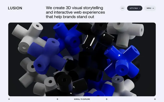
The site uses a max-width contained layout, not full-bleed, with ample horizontal padding visible through the main content area. The hero section features 3D abstract graphics centrally aligned, framed by a card-like container with rounded corners. The overall section rhythm appears to alternate between bright white backgrounds for textual content and darker backgrounds for visual elements. Content arrangement leans towards centered stacks for headlines and calls to action, with text and potentially visuals arranged in a balanced, open manner. Navigation is a top bar with clear 'LET'S TALK' and 'MENU' buttons, maintaining ample space.
The site uses hero section imagery dominated by 3D abstract renders: interlocking shapes in white, black, and 'Deep Space Blue' against a dark background. These are contained within a main content area, with rounded corners (15px radius) rather than full-bleed. The role of these visuals is primarily decorative atmosphere and brand showcase, indicating expertise in 3D and interactive storytelling, rather than explanatory content. Image density is high in the hero, but otherwise the site appears to be text-dominant.
Reminiscent of Framer, Superlist, Linear, Vercel, Stripe.
# Lusion — Style Reference
> Computational Laboratory Blueprint — high-contrast text on bright surfaces, accented by vivid blue and lime green.

**Theme:** light

**Site:** https://lusion.co

This design system conjures a computational laboratory aesthetic, balancing stark functionality with precise, vivid accents. The dominant bright off-white surfaces provide a clean canvas for sharp black typography, creating a high-contrast, information-focused layout. Carefully placed vivid blue and lime green appear in interactive elements, like focused indicators or calls to action, injecting focused energy against the predominantly neutral backdrop. Subtle elevation and generous border radii on active components soften the underlying hard-edged forms, implying a blend of digital precision and user-friendly interaction.

## Tokens — Colors

| Name | Value | Token | Role |
|------|------|------|------|
| Deep Space Blue | `#1a2ffb` | `--color-deep-space-blue` | Interactive elements, active states, borders around focused components. This vivid blue serves as the primary accent, signaling interaction. |
| Electric Lime | `#c1ff00` | `--color-electric-lime` | Highlights, specific attention-grabbing elements. Its lower prominence suggests a secondary accent, used sparingly. |
| Absolute Black | `#000000` | `--color-absolute-black` | Primary text, critical UI elements, button text on light-colored buttons. |
| Canvas White | `#ffffff` | `--color-canvas-white` | Page backgrounds, card surfaces, button text on dark buttons. |
| Whisper Off-White | `#f0f1fa` | `--color-whisper-off-white` | Input fields, secondary backgrounds, subtle background differentiation. |
| Storm Gray | `#2b2e3a` | `--color-storm-gray` | Background for primary interactive elements, like the 'Let's Talk' button. |
| Button White | `#e4e6ef` | `--color-button-white` | Secondary button backgrounds, offering a slightly muted white option. |
| Dark Surface | `#121416` | `--color-dark-surface` | Base background for sections where a dark context is required, likely for visuals. |

## Tokens — Typography

### Aeonik
- **Substitute:** system-ui (sans-serif)
- **Weights:** 400, 500
- **Sizes:** 12px, 13px, 14px, 16px, 18px, 20px, 22px, 26px, 36px, 38px, 43px, 49px, 50px, 108px, 115px, 144px
- **Line height:** 0.9, 1, 1.1, 1.15, 1.2, 1.4, 1.5
- **Letter spacing:** -0.02
- **Role:** All textual content: headings, body text, buttons, links, and inputs. The consistent application of Aeonik across all roles contributes to the system's coherent, slightly technical feel, with negative letter spacing adding to the precise aesthetic.

## Tokens — Type Scale

Perfect Fifth (1.5) from 16px base.

| Role | Size | Line height | Letter spacing |
|------|------|------|------|
| caption | 12px | 1.5 | -0.48px |
| body-sm | 14px | 1.5 | -0.48px |
| body | 16px | 1.5 | -0.48px |
| subheading | 22px | 1.4 | -0.48px |
| heading | 50px | 1 | -0.48px |
| heading-lg | 108px | 0.9 | -0.48px |
| display | 144px | 0.9 | -0.48px |

## Tokens — Spacing

- **Card padding:** 25px
- **Element gap:** 13px

## Tokens — Radius

- **Buttons:** 87.5px
- **Inputs:** 18px
- **Cards:** 15px
- **pillForms:** 100px

## Tokens — Elevation

- **Interactive Button/Card:** `rgba(0, 0, 0, 0.04) 0px 6px 10px 0px, rgba(0, 0, 0, 0.04) 0px 2px 4px 0px`

## Layout

The site uses a max-width contained layout, not full-bleed, with ample horizontal padding visible through the main content area. The hero section features 3D abstract graphics centrally aligned, framed by a card-like container with rounded corners. The overall section rhythm appears to alternate between bright white backgrounds for textual content and darker backgrounds for visual elements. Content arrangement leans towards centered stacks for headlines and calls to action, with text and potentially visuals arranged in a balanced, open manner. Navigation is a top bar with clear 'LET'S TALK' and 'MENU' buttons, maintaining ample space.

## Imagery

The site uses hero section imagery dominated by 3D abstract renders: interlocking shapes in white, black, and 'Deep Space Blue' against a dark background. These are contained within a main content area, with rounded corners (15px radius) rather than full-bleed. The role of these visuals is primarily decorative atmosphere and brand showcase, indicating expertise in 3D and interactive storytelling, rather than explanatory content. Image density is high in the hero, but otherwise the site appears to be text-dominant.

## Components

### CTA Button Group

### Hero Tagline with Scroll Bar

### Contact Form Input Card

### Primary Action Button
*Primary Call to Action*

Rounded pill-shaped button with 'Storm Gray' background (#2b2e3a), 'Canvas White' text (#ffffff). Uses 87.5px border-radius, with 22.75px left padding and 15.75px right padding for specific visual balance, and no vertical padding.

### Secondary Action Button
*Secondary Call to Action*

Rounded pill-shaped button with 'Button White' background (#e4e6ef), 'Absolute Black' text (#000000). Uses 87.5px border-radius, with 22.75px left padding and 15.75px right padding for specific visual balance, and no vertical padding.

### Tertiary Button
*Further Actions / Navigation*

Rounded pill-shaped button with 'Canvas White' background (#ffffff), 'Absolute Black' text (#000000). Uses 76.5px border-radius, with 21.6px horizontal padding and 14.4px vertical padding.

### Text Input Active
*User input fields*

Input field with 'Whisper Off-White' background (#f0f1fa), 'Absolute Black' text (#000000). Features an 18px border-radius and 25px uniform padding. Border color is #000000 at 0px width.

### Interactive Card Container
*Content grouping*

Container with a 15px border-radius, likely on a 'Canvas White' background or 'Storm Gray'. Features a subtle shadow: rgba(0, 0, 0, 0.04) 0px 6px 10px 0px, rgba(0, 0, 0, 0.04) 0px 2px 4px 0px, suggesting an interactive or elevated state.

## Guidelines

### Do

- Prioritize 'Absolute Black' (#000000) for all primary body text, headings, and critical UI labels.
- Use 'Canvas White' (#ffffff) as the default background for main content areas and cards, creating a bright, spacious canvas.
- Apply 'Deep Space Blue' (#1a2ffb) as the primary accent color, specifically for interactive elements, links, and focused states.
- Ensure all buttons use an 87.5px border-radius unless specified, maintaining a soft, pill-like form.
- Utilize Aeonik at `weight: 500` for headings and important UI labels, combined with a negative letter-spacing for a modern, compact feel.
- Enforce a base padding unit of 16px around interactive elements like buttons and 25px for inputs to ensure ample breathing room.
- Introduce 'Whisper Off-White' (#f0f1fa) specifically for less prominent interactive elements or background differentiation in forms.

### Don't

- Avoid using multiple accent colors in close proximity; 'Deep Space Blue' and 'Electric Lime' should be used sparingly and distinctly.
- Do not deviate from the specified negative letter-spacing for Aeonik, as it is a core characteristic of the typographic identity.
- Do not use sharp corners for interactive elements; maintain the consistent application of generous border radii for buttons and inputs.
- Avoid generic or default shadow values; use the specified shadow `rgba(0, 0, 0, 0.04) 0px 6px 10px 0px, rgba(0, 0, 0, 0.04) 0px 2px 4px 0px` for subtle elevation.
- Do not introduce highly saturated primary colors beyond 'Deep Space Blue' and 'Electric Lime' without specific justification.
- Avoid dense information blocks; maintain generous inter-element and inter-section spacing, aligning with the spacious density.

## Agent Prompt Guide

Quick Color Reference:
- Text: #000000
- Background: #ffffff
- CTA: #2b2e3a
- Border: #1a2ffb (for active/focus)
- Accent: #1a2ffb

Example Component Prompts:
1. Create a hero section with a "Canvas White" (#ffffff) background. Include a headline using Aeonik weight 500, size 144px, line-height 0.9, letter-spacing -0.02em, color "Absolute Black" (#000000). Below it, place a "Primary Action Button".
2. Build a card with a 'Canvas White' background, 15px border-radius, and the standard button/card shadow. Inside, include descriptive text using Aeonik weight 400, size 16px, line-height 1.5, color 'Absolute Black' (#000000).
3. Design a form input field using the 'Text Input Active' component specifications: 'Whisper Off-White' (#f0f1fa) background, 18px border-radius, 25px uniform padding. The placeholder text should be Aeonik weight 400, size 16px, color 'Absolute Black' (#000000) with 50% opacity.
4. Generate a navigation bar item: Text 'Home' with Aeonik weight 500, size 16px, color 'Absolute Black' (#000000), letter spacing -0.02em. On hover, apply 'Deep Space Blue' (#1a2ffb) as the text color.
More like this





Keep what you find
A free account saves references to boards and can send you a weekly email of picks based on what you save.
To see every result, go Pro.