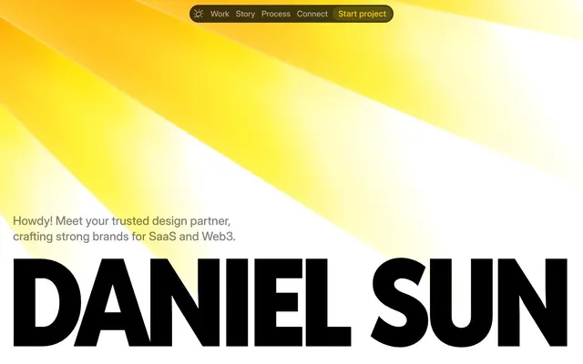
Preview image. Unlock full-res
Solar Flare Canvas. A radiant yellow burst on a clean, stark white backdrop defines the visual energy.
Color palette
Decorative elements, subtle highlights, active button indicators — a burst of vivid energy in an otherwise neutral palette.
Most prominent text color for headings and body, providing stark contrast against white backgrounds.
Primary page background, card surfaces, and text color on dark elements.
Secondary background color for sections and cards, providing a subtle differentiation from pure white.
Secondary text, descriptive elements. Offers softer contrast than Pitch Black, maintaining legibility.
Subtle text and borders, creating visual texture without distraction.
Background for subtle elevation or depth, usually found in larger UI sections or shadowed elements.
Typography
- Weights
- 900
- Sizes
- 36px, 88px, 246px
- Line height
- 0.9, 0.96, 1
- Letter spacing
- -0.0730em, -0.0340em, -0.0280em
- Fallback
- Bebas Neue
Dominant display font for headlines and impactful statements. Its condensed, ultra-bold presence with tight letter-spacing is a signature visual identity marker, creating strong, almost architectural text blocks.
- Weights
- 500
- Sizes
- 18px, 20px, 26px, 30px
- Line height
- 1.1, 1.3, 1.35
- Fallback
- Inter
Primary font for body text, subheadings, and medium-sized informational content. Its clarity and moderate weight provide a clean balance to the condensed headlines.
- Weights
- 500
- Sizes
- 14px, 20px, 128px
- Line height
- 1.2
- Letter spacing
- -0.0360em, -0.0160em
- Fallback
- Inter
Used for smaller body text, captions, and occasionally for very large, specific type treatments. The tighter letter-spacing subtly adds to its readability in dense contexts.
- Weights
- 400
- Sizes
- 12px
- Line height
- 1.2
- Fallback
- system-ui, sans-serif
Utility font for the smallest text elements like tags, metadata, and default browser text. Its neutrality ensures it doesn't compete with brand fonts.
- Weights
- 700
- Sizes
- 18px, 28px
- Line height
- 0.96, 1.2
- Letter spacing
- -0.0360em
- Fallback
- Dancing Script
Accent font for playful, humanistic touches, often used for dates or call-outs like 'from 2020 'til today'. Its handwritten feel provides a stark, warm contrast to the geometric sans-serifs.
Spacing & shape
Components
Rounded button with rgba(255, 213, 0, 0.15) background, rgb(0, 0, 238) text color and border. Uses 32px border-radius, 6px vertical padding, 14px horizontal padding. The transparent yellow background with a blue border creates a subtle, interactive state contrasting a vivid yellow accent.
Background is Pale Gray (#f5f5f5) or Canvas White (#ffffff). Features a drop shadow: rgba(0, 0, 0, 0.12) -2px 3px 3px 0px. Rounded corners at 14px. Inner content has padding of 16px. Imagery within may have 14px radius.
Uses Reddit Sans Condensed, weight 900, size 36px, lineHeight 0.90, letterSpacing -2.628px. Color Pitch Black (#000000). Establishes major section titles with high impact.
Uses Caveat, weight 700, size 18px, lineHeight 0.96, letterSpacing -0.648px. Color Ash Gray (#808080). Provides a warm, casual tone to introduce sections or add emphasis.
Uses Reddit Sans Condensed, weight 900, size 246px, lineHeight 1.00, letterSpacing -6.888px for 'Daniel Sun'. Pitch Black (#000000) text on Canvas White (#ffffff) background. The immense scale creates an immediate, unforgettable brand presence.
Guidelines
- Use Reddit Sans Condensed (weight 900) for all main headlines and significant display text to maintain the strong, condensed visual identity.
- Pair the bold Reddit Sans Condensed with Inter Display (weight 500) for body text to ensure readability and balance.
- Introduce playful, handwritten elements using Caveat (weight 700) for dates, sub-headers like 'from 2020 'til today', or subtle accent text.
- Apply Sunbeam Yellow (#ffd500) sparingly as a vivid accent color, primarily for interactive elements or to draw attention to specific keywords.
- Maintain a predominantly Canvas White (#ffffff) and Pale Gray (#f5f5f5) background with Pitch Black (#000000) text for high contrast and readability.
- Use 32px border-radius for all primary buttons and interactive elements, giving them a distinct pill-like shape.
- Apply 14px border-radius consistently to all image containers and content cards (like Work Showcase Cards).
- Do not use generic sans-serif fonts for headlines; always default to Reddit Sans Condensed for brand consistency.
- Avoid overusing Sunbeam Yellow (#ffd500); its impact comes from its scarcity and specific application.
- Do not introduce additional bold, condensed typefaces or calligraphic scripts; maintain the established font hierarchy.
- Avoid complex gradients beyond the subtle linear-gradient(rgb(230, 230, 230) 0%, rgb(166, 166, 166) 100%) for backgrounds.
- Do not use box-shadows other than rgba(0, 0, 0, 0.12) -2px 3px 3px 0px for element elevation.
- Do not introduce new border radii values; stick to 14px for cards/images and 32px for buttons.
- Avoid heavily stylized backgrounds or textures that detract from the clean canvas aesthetic.
About this system
ShowHide
This design system feels like a bold, sunny declaration. It pairs extreme typographic scale with a soft, limited color palette focused on vivid yellow and stark black and white. The visual identity hinges on the tension between playful handwritten accents and massive, condensed sans-serif headlines, creating a brand that feels both approachable and impactful.
The page primarily uses a full-bleed design, allowing the striking yellow sunbeam graphic to dominate the initial viewport. Content sections generally appear centered but without a strict max-width, allowing for large-scale typography and images to stretch. The rhythm is characterized by distinct, vertically stacked sections, often alternating between stark white backgrounds and subtle Pale Gray (#f5f5f5). Content is arranged in prominent stacks of headline-level text, followed by descriptive copy and product showcases. There's a strong emphasis on spaciousness, with ample vertical padding between sections (implied by 'sectionGap' and general visual breaks).
The site uses a mix of photographic hero elements (the sunbeam graphic) and product screenshots within a clean UI. Photography is treated as a full-bleed background for the hero, creating an atmospheric backdrop. Product screenshots are contained within rounded (14px radius) card components, presented clearly with minimal embellishment, serving an explanatory and showcasing role. Icons are minimal, monochromatic, and likely part of a utility set, primarily functional rather than decorative. The overall density is balanced, with imagery serving as clear illustrative content contrasted against large type.
Reminiscent of AIGA, Superside, Frank Digital.
# Daniel Sun — Style Reference
> Solar Flare Canvas. A radiant yellow burst on a clean, stark white backdrop defines the visual energy.

**Theme:** light

**Site:** https://danielsun.space

This design system feels like a bold, sunny declaration. It pairs extreme typographic scale with a soft, limited color palette focused on vivid yellow and stark black and white. The visual identity hinges on the tension between playful handwritten accents and massive, condensed sans-serif headlines, creating a brand that feels both approachable and impactful.

## Tokens — Colors

| Name | Value | Token | Role |
|------|------|------|------|
| Sunbeam Yellow | `#ffd500` | `--color-sunbeam-yellow` | Decorative elements, subtle highlights, active button indicators — a burst of vivid energy in an otherwise neutral palette. |
| Pitch Black | `#000000` | `--color-pitch-black` | Most prominent text color for headings and body, providing stark contrast against white backgrounds. |
| Canvas White | `#ffffff` | `--color-canvas-white` | Primary page background, card surfaces, and text color on dark elements. |
| Pale Gray | `#f5f5f5` | `--color-pale-gray` | Secondary background color for sections and cards, providing a subtle differentiation from pure white. |
| Ash Gray | `#808080` | `--color-ash-gray` | Secondary text, descriptive elements. Offers softer contrast than Pitch Black, maintaining legibility. |
| Silver Mist | `#a6a6a6` | `--color-silver-mist` | Subtle text and borders, creating visual texture without distraction. |
| Shadow Gradient | `#e6e6e6` | `--color-shadow-gradient` | Background for subtle elevation or depth, usually found in larger UI sections or shadowed elements. |

## Tokens — Typography

### Reddit Sans Condensed
- **Substitute:** Bebas Neue
- **Weights:** 900
- **Sizes:** 36px, 88px, 246px
- **Line height:** 0.9, 0.96, 1
- **Letter spacing:** -0.0730em, -0.0340em, -0.0280em
- **Role:** Dominant display font for headlines and impactful statements. Its condensed, ultra-bold presence with tight letter-spacing is a signature visual identity marker, creating strong, almost architectural text blocks.

### Inter Display
- **Substitute:** Inter
- **Weights:** 500
- **Sizes:** 18px, 20px, 26px, 30px
- **Line height:** 1.1, 1.3, 1.35
- **Role:** Primary font for body text, subheadings, and medium-sized informational content. Its clarity and moderate weight provide a clean balance to the condensed headlines.

### Inter
- **Substitute:** Inter
- **Weights:** 500
- **Sizes:** 14px, 20px, 128px
- **Line height:** 1.2
- **Letter spacing:** -0.0360em, -0.0160em
- **Role:** Used for smaller body text, captions, and occasionally for very large, specific type treatments. The tighter letter-spacing subtly adds to its readability in dense contexts.

### sans-serif
- **Substitute:** system-ui, sans-serif
- **Weights:** 400
- **Sizes:** 12px
- **Line height:** 1.2
- **Role:** Utility font for the smallest text elements like tags, metadata, and default browser text. Its neutrality ensures it doesn't compete with brand fonts.

### Caveat
- **Substitute:** Dancing Script
- **Weights:** 700
- **Sizes:** 18px, 28px
- **Line height:** 0.96, 1.2
- **Letter spacing:** -0.0360em
- **Role:** Accent font for playful, humanistic touches, often used for dates or call-outs like 'from 2020 'til today'. Its handwritten feel provides a stark, warm contrast to the geometric sans-serifs.

## Tokens — Type Scale

| Role | Size | Line height | Letter spacing |
|------|------|------|------|
| caption | 12px | 1.2 | — |
| body-sm | 14px | 1.2 | -0.48px |
| body | 18px | 1.1 | -0.648px |
| subheading | 20px | 1.2 | -0.72px |
| heading | 30px | 1.35 | — |
| heading-lg | 36px | 0.9 | -2.628px |
| display | 88px | 0.96 | -2.992px |
| display-xl | 246px | 1 | -6.888px |

## Tokens — Spacing

- **Section gap:** 64px

## Tokens — Radius

- **Default:** 14px
- **Buttons:** 32px
- **heroElement:** 110px
- **largeImages:** 24px

## Layout

The page primarily uses a full-bleed design, allowing the striking yellow sunbeam graphic to dominate the initial viewport. Content sections generally appear centered but without a strict max-width, allowing for large-scale typography and images to stretch. The rhythm is characterized by distinct, vertically stacked sections, often alternating between stark white backgrounds and subtle Pale Gray (#f5f5f5). Content is arranged in prominent stacks of headline-level text, followed by descriptive copy and product showcases. There's a strong emphasis on spaciousness, with ample vertical padding between sections (implied by 'sectionGap' and general visual breaks).

## Imagery

The site uses a mix of photographic hero elements (the sunbeam graphic) and product screenshots within a clean UI. Photography is treated as a full-bleed background for the hero, creating an atmospheric backdrop. Product screenshots are contained within rounded (14px radius) card components, presented clearly with minimal embellishment, serving an explanatory and showcasing role. Icons are minimal, monochromatic, and likely part of a utility set, primarily functional rather than decorative. The overall density is balanced, with imagery serving as clear illustrative content contrasted against large type.

## Components

### Navigation Bar

### Work Showcase Card

### Button Group & CTA Strip

### Navigation Button
*Interactive element*

Rounded button with rgba(255, 213, 0, 0.15) background, rgb(0, 0, 238) text color and border. Uses 32px border-radius, 6px vertical padding, 14px horizontal padding. The transparent yellow background with a blue border creates a subtle, interactive state contrasting a vivid yellow accent.

### Work Showcase Card
*Content display*

Background is Pale Gray (#f5f5f5) or Canvas White (#ffffff). Features a drop shadow: rgba(0, 0, 0, 0.12) -2px 3px 3px 0px. Rounded corners at 14px. Inner content has padding of 16px. Imagery within may have 14px radius.

### Primary Heading (Sectional)
*Information hierarchy*

Uses Reddit Sans Condensed, weight 900, size 36px, lineHeight 0.90, letterSpacing -2.628px. Color Pitch Black (#000000). Establishes major section titles with high impact.

### Sub-heading / Descriptor
*Contextual information*

Uses Caveat, weight 700, size 18px, lineHeight 0.96, letterSpacing -0.648px. Color Ash Gray (#808080). Provides a warm, casual tone to introduce sections or add emphasis.

### Hero Display Text
*Brand statement*

Uses Reddit Sans Condensed, weight 900, size 246px, lineHeight 1.00, letterSpacing -6.888px for 'Daniel Sun'. Pitch Black (#000000) text on Canvas White (#ffffff) background. The immense scale creates an immediate, unforgettable brand presence.

## Guidelines

### Do

- Use Reddit Sans Condensed (weight 900) for all main headlines and significant display text to maintain the strong, condensed visual identity.
- Pair the bold Reddit Sans Condensed with Inter Display (weight 500) for body text to ensure readability and balance.
- Introduce playful, handwritten elements using Caveat (weight 700) for dates, sub-headers like 'from 2020 'til today', or subtle accent text.
- Apply Sunbeam Yellow (#ffd500) sparingly as a vivid accent color, primarily for interactive elements or to draw attention to specific keywords.
- Maintain a predominantly Canvas White (#ffffff) and Pale Gray (#f5f5f5) background with Pitch Black (#000000) text for high contrast and readability.
- Use 32px border-radius for all primary buttons and interactive elements, giving them a distinct pill-like shape.
- Apply 14px border-radius consistently to all image containers and content cards (like Work Showcase Cards).

### Don't

- Do not use generic sans-serif fonts for headlines; always default to Reddit Sans Condensed for brand consistency.
- Avoid overusing Sunbeam Yellow (#ffd500); its impact comes from its scarcity and specific application.
- Do not introduce additional bold, condensed typefaces or calligraphic scripts; maintain the established font hierarchy.
- Avoid complex gradients beyond the subtle linear-gradient(rgb(230, 230, 230) 0%, rgb(166, 166, 166) 100%) for backgrounds.
- Do not use box-shadows other than rgba(0, 0, 0, 0.12) -2px 3px 3px 0px for element elevation.
- Do not introduce new border radii values; stick to 14px for cards/images and 32px for buttons.
- Avoid heavily stylized backgrounds or textures that detract from the clean canvas aesthetic.

## Agent Prompt Guide

### Quick Color Reference
- Text: #000000 (Pitch Black)
- Background: #ffffff (Canvas White)
- Accent: #ffd500 (Sunbeam Yellow)
- Secondary Text: #808080 (Ash Gray)
- Button Background: rgba(255, 213, 0, 0.15)

### Example Component Prompts
1. Create a hero section: full-width, with a radial gradient from transparent to vivid yellow (representing 'Sunbeam Yellow') from the top-left corner as a background, fading to white on the right. Overlay this with a headline 'DANIEL SUN' (Reddit Sans Condensed, 246px, 900, #000000, letter-spacing -6.888px) centered vertically. Below it, add a sub-headline 'Howdy! Meet your trusted design partner,' (Inter Display, 30px, 500, #000000, 1.35 lineHeight) left-aligned.
2. Design a primary navigation button: 'Start project' text (Inter Display, 18px, 500, #0000ee - this blue is a browser default for links, so for brand consistency assume a dark neutral like #000000 unless specified). The button should have a background of rgba(255, 213, 0, 0.15), a 32px border-radius, and padding of 6px top/bottom, 14px left/right. The border should also be #0000ee (again, assume black as default unless clearly primary color).
3. Generate a 'work showcase' card: use Pale Gray (#f5f5f5) as the background with a 14px border-radius. Apply a box-shadow of rgba(0, 0, 0, 0.12) -2px 3px 3px 0px. Inside, add an image (14px border-radius) at the top, then 16px padding. Below the image, include a title 'Ruby' (Inter Display, 26px, 500, #000000), and a descriptor 'Branding, Web design, Development' (Inter Display, 18px, 500, #808080).
4. Create a section title: Start with a hand-written accent 'from 2020 'til today' (Caveat, 28px, 700, #808080, letter-spacing -1.008px). Below it, add a main heading 'MY LATEST WORK' (Reddit Sans Condensed, 36px, 900, #000000, letter-spacing -2.628px). Center both elements.
More like this









Keep what you find
A free account saves references to boards and can send you a weekly email of picks based on what you save.
To see every result, go Pro.