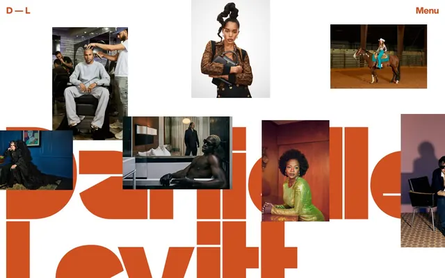
Preview image. Unlock full-res
Vivid editorial canvas
Color palette
Brand accent for interactive elements, headlines, and key text highlighting. Its vividness provides a striking contrast against both the White Canvas and Mint Canvas
Dominant background color for sections, creating a distinctive and energetic brand presence. Also used for text backgrounds to visually separate content
Decorative color, likely for specific branding elements or accents, derived from `--logo-color`
Dark borders and separators for elevated surfaces and inverted UI. Do not promote it to the primary CTA color
Typography
- Weights
- 800
- Sizes
- 10px, 18px, 29px
- Line height
- 0.95, 1, 1.6
- Letter spacing
- -0.01
- Fallback
- system-ui
Used for all primary text elements, including body text, navigation, and smaller headings. The consistent extra-bold weight (800) and tight letter-spacing create a compact, impactful, and modern tone, even at smaller sizes.
- Weights
- 800
- Sizes
- 72px
- Line height
- 0.95
- Letter spacing
- -0.01
- Fallback
- system-ui
The signature display font for large headlines. Its condensed nature and heavy weight, combined with exceptionally tight line-height and letter-spacing, create a bold, art-driven statement. It's often used at an oversized scale, allowing it to interact graphically with the canvas.
Spacing & shape
Components
Text uses 'Orange Peel' (`#d15022`) with no underline by default. On hover, it maintains the color, often appearing within contexts like the main navigation or content references. Some links also use 'Midnight Ink' (`#000000`) for text.
Text is 'Orange Peel' (`#d15022`), size `10px`, weight `800`, letter-spacing `-0.01em` from 'Helvetica Now Display'. It has `0px` radius, `0px` padding, and a transparent background. A thin 'Orange Peel' border appears on interaction or for emphasis, providing definition without heavy styling.
Text is 'Orange Peel' (`#d15022`) for active items or 'Midnight Ink' (`#000000`) for other menu items, using 'Helvetica Now Display' at `10px` and `800` weight, with `20px` right and left padding. These links often function graphically as part of the overall page layout.
Images are often framed with a 'Midnight Ink' (`#000000`) border and `0px` radius, creating clear visual separation from the background. No explicit padding is applied to the image itself, allowing it to sit flush with its container.
A full-width block with a 'Mint Canvas' (`#75dfb5`) background. Text within these blocks typically uses 'Orange Peel' (`#d15022`) for contrast, often with large 'Helvetica Now Display Condensed' headlines.
Guidelines
- Use 'Orange Peel' (`#d15022`) for all interactive text elements and primary calls to action, maintaining its vividness.
- Set the main canvas background either to pure white or 'Mint Canvas' (`#75dfb5`), alternating between sections to create visual rhythm.
- Apply 'Helvetica Now Display' (weight 800) for all body copy and standard navigation at `10px` and `18px`, ensuring a consistent energetic textual presence.
- Employ oversized 'Helvetica Now Display Condensed' (weight 800, `72px`) for headlines, allowing it to stretch and often break out of standard text flow.
- Frame images and content blocks with a `0px` radius and a 'Midnight Ink' (`#000000`) border to give structure without softening the visual edge.
- Use `20px` as the standard `elementGap` between diverse content elements and `50px` for `sectionGap` to manage vertical rhythm.
- Maintain a `0px` border-radius for all components and elements, aligning with the sharp, unyielding aesthetic.
- Avoid soft shadows or subtle elevation; the design system relies on flat planes and strong color contrast for depth.
- Do not use generic system fonts; always prioritize 'Helvetica Now Display' and 'Helvetica Now Display Condensed' to maintain brand identity.
- Refrain from using subdued or desaturated colors for primary elements; the system thrives on bold, high-chroma statements.
- Do not introduce padding or rounded corners on buttons or cards; maintain a crisp, minimalist interaction style.
- Avoid complex layouts that obscure the photography or dominant typography; prioritize clear, often dramatic, presentation of visual assets.
About this system
ShowHide
Daniellelevitt embraces an expressive, art-forward visual system pairing bold, high-contrast typography with a vibrant, playful color palette. The primary canvas shifts dramatically between an intense, almost acidic green and stark white, serving as a dynamic backdrop for overlaid photography and minimalist text. Typography is a dominant visual element, oversized and often cropped, creating a sense of dramatic scale and artistic edge. Components are lightweight and almost invisible, letting the visual content and distinctive typography define the aesthetic.
The layout is flexible and dynamic, with sections that often shift between a full-bleed white canvas and an equally full-bleed 'Mint Canvas' background. The hero section displays a collage of irregularly placed, framed images over a white background, with oversized, dynamically rendered brand typography ('Danielle Levitt') serving as a central graphic element. Subsequent sections can feature a full-bleed 'Mint Canvas' background with centered headlines and descriptive text and then return to an image-focused or text-over-image layout. There's no fixed max-width, allowing content to stretch across the viewport. Navigation is minimal, consisting of 'D-L' (logo) and 'Menu' aligned to the top corners.
The visual language is dominated by high-impact photography, primarily portraits and fashion/editorial shots, used in a full-bleed or contained, square/rectangular, unmasked format. Graphics are minimal, often manifested as oversized, cropped typography that functions as a graphic element itself. Images are treated realistically, with natural color palettes and varied lighting, from studio shots to outdoor scenes, emphasizing the subject. Iconography is text-based ('D-L', 'Menu') or omitted. Images are the primary content, with text playing a supporting or complementary graphic role, resulting in an image-heavy, visually dense experience.
Reminiscent of A24 (website), Other photography/portfolio sites using Readymag, Independent art gallery websites.
# Daniellelevitt — Style Reference
> Vivid editorial canvas

**Theme:** mixed

**Site:** https://www.daniellelevitt.com

Daniellelevitt embraces an expressive, art-forward visual system pairing bold, high-contrast typography with a vibrant, playful color palette. The primary canvas shifts dramatically between an intense, almost acidic green and stark white, serving as a dynamic backdrop for overlaid photography and minimalist text. Typography is a dominant visual element, oversized and often cropped, creating a sense of dramatic scale and artistic edge. Components are lightweight and almost invisible, letting the visual content and distinctive typography define the aesthetic.

## Tokens — Colors

| Name | Value | Token | Role |
|------|------|------|------|
| Orange Peel | `#d15022` | `--color-orange-peel` | Brand accent for interactive elements, headlines, and key text highlighting. Its vividness provides a striking contrast against both the White Canvas and Mint Canvas |
| Mint Canvas | `#75dfb5` | `--color-mint-canvas` | Dominant background color for sections, creating a distinctive and energetic brand presence. Also used for text backgrounds to visually separate content |
| Purple Haze | `#E676B6` | `--color-purple-haze` | Decorative color, likely for specific branding elements or accents, derived from `--logo-color` |
| Midnight Ink | `#000000` | `--color-midnight-ink` | Dark borders and separators for elevated surfaces and inverted UI. Do not promote it to the primary CTA color |

## Tokens — Typography

### Helvetica Now Display
- **Substitute:** system-ui
- **Weights:** 800
- **Sizes:** 10px, 18px, 29px
- **Line height:** 0.95, 1, 1.6
- **Letter spacing:** -0.01
- **Role:** Used for all primary text elements, including body text, navigation, and smaller headings. The consistent extra-bold weight (800) and tight letter-spacing create a compact, impactful, and modern tone, even at smaller sizes.

### Helvetica Now Display Condensed
- **Substitute:** system-ui
- **Weights:** 800
- **Sizes:** 72px
- **Line height:** 0.95
- **Letter spacing:** -0.01
- **Role:** The signature display font for large headlines. Its condensed nature and heavy weight, combined with exceptionally tight line-height and letter-spacing, create a bold, art-driven statement. It's often used at an oversized scale, allowing it to interact graphically with the canvas.

## Tokens — Type Scale

| Role | Size | Line height | Letter spacing |
|------|------|------|------|
| caption | 10px | 0.95 | -0.1px |
| body | 18px | 1 | -0.18px |
| subheading | 29px | 1.6 | -0.29px |
| display | 72px | 0.95 | -0.72px |

## Tokens — Spacing

- **Section gap:** 50px
- **Card padding:** 0px
- **Element gap:** 20px

## Tokens — Radius

- **none:** 0px

## Layout

The layout is flexible and dynamic, with sections that often shift between a full-bleed white canvas and an equally full-bleed 'Mint Canvas' background. The hero section displays a collage of irregularly placed, framed images over a white background, with oversized, dynamically rendered brand typography ('Danielle Levitt') serving as a central graphic element. Subsequent sections can feature a full-bleed 'Mint Canvas' background with centered headlines and descriptive text and then return to an image-focused or text-over-image layout. There's no fixed max-width, allowing content to stretch across the viewport. Navigation is minimal, consisting of 'D-L' (logo) and 'Menu' aligned to the top corners.

## Imagery

The visual language is dominated by high-impact photography, primarily portraits and fashion/editorial shots, used in a full-bleed or contained, square/rectangular, unmasked format. Graphics are minimal, often manifested as oversized, cropped typography that functions as a graphic element itself. Images are treated realistically, with natural color palettes and varied lighting, from studio shots to outdoor scenes, emphasizing the subject. Iconography is text-based ('D-L', 'Menu') or omitted. Images are the primary content, with text playing a supporting or complementary graphic role, resulting in an image-heavy, visually dense experience.

## Components

### Text Link
*Standard interactive link for navigation and inline references.*

Text uses 'Orange Peel' (`#d15022`) with no underline by default. On hover, it maintains the color, often appearing within contexts like the main navigation or content references. Some links also use 'Midnight Ink' (`#000000`) for text.

### Ghost Button
*Minimalist button with text acting as the primary visual. Used for navigation and calls to action.*

Text is 'Orange Peel' (`#d15022`), size `10px`, weight `800`, letter-spacing `-0.01em` from 'Helvetica Now Display'. It has `0px` radius, `0px` padding, and a transparent background. A thin 'Orange Peel' border appears on interaction or for emphasis, providing definition without heavy styling.

### Minimal Navigation Link
*Top-level navigation items.*

Text is 'Orange Peel' (`#d15022`) for active items or 'Midnight Ink' (`#000000`) for other menu items, using 'Helvetica Now Display' at `10px` and `800` weight, with `20px` right and left padding. These links often function graphically as part of the overall page layout.

### Content Card (Image)
*Displays visual content within dynamic layouts.*

Images are often framed with a 'Midnight Ink' (`#000000`) border and `0px` radius, creating clear visual separation from the background. No explicit padding is applied to the image itself, allowing it to sit flush with its container.

### Background Block (Mint)
*Large, distinct sections of content.*

A full-width block with a 'Mint Canvas' (`#75dfb5`) background. Text within these blocks typically uses 'Orange Peel' (`#d15022`) for contrast, often with large 'Helvetica Now Display Condensed' headlines.

## Guidelines

### Do

- Use 'Orange Peel' (`#d15022`) for all interactive text elements and primary calls to action, maintaining its vividness.
- Set the main canvas background either to pure white or 'Mint Canvas' (`#75dfb5`), alternating between sections to create visual rhythm.
- Apply 'Helvetica Now Display' (weight 800) for all body copy and standard navigation at `10px` and `18px`, ensuring a consistent energetic textual presence.
- Employ oversized 'Helvetica Now Display Condensed' (weight 800, `72px`) for headlines, allowing it to stretch and often break out of standard text flow.
- Frame images and content blocks with a `0px` radius and a 'Midnight Ink' (`#000000`) border to give structure without softening the visual edge.
- Use `20px` as the standard `elementGap` between diverse content elements and `50px` for `sectionGap` to manage vertical rhythm.
- Maintain a `0px` border-radius for all components and elements, aligning with the sharp, unyielding aesthetic.

### Don't

- Avoid soft shadows or subtle elevation; the design system relies on flat planes and strong color contrast for depth.
- Do not use generic system fonts; always prioritize 'Helvetica Now Display' and 'Helvetica Now Display Condensed' to maintain brand identity.
- Refrain from using subdued or desaturated colors for primary elements; the system thrives on bold, high-chroma statements.
- Do not introduce padding or rounded corners on buttons or cards; maintain a crisp, minimalist interaction style.
- Avoid complex layouts that obscure the photography or dominant typography; prioritize clear, often dramatic, presentation of visual assets.

## Agent Prompt Guide

Quick Color Reference:
text: #000000
background: #75dfb5
border: #000000
accent: #d15022
primary action: #d15022 (outlined action border)

Example Component Prompts:
Create a hero section with 'Danielle Levitt' as the main graphic headline: Use Helvetica Now Display Condensed at 72px, weight 800, letter-spacing -0.01em, Orange Peel #d15022. Position it centrally as an oversized graphic. Place a 'Midnight Ink' #000000 text link 'Menu' in the top right. Overlay various images with 'Midnight Ink' colored borders.

Create a descriptive text block on a 'Mint Canvas' background: Set background to #75dfb5. The main descriptive text should be 'Orange Peel' #d15022, Helvetica Now Display, 18px, weight 800, line-height 1.0, letter-spacing -0.01em. Provide `50px` of vertical `sectionGap` before and after.

Generate an interactive navigation element: Use 'Midnight Ink' #000000 text, Helvetica Now Display, 10px, weight 800, letter-spacing -0.01em. Add `20px` of padding on the right and left, and no border-radius. For active state, use 'Orange Peel' #d15022 as text color.
More like this






Keep what you find
A free account saves references to boards and can send you a weekly email of picks based on what you save.
To see every result, go Pro.