Preview image. Unlock full-res
Crisp Utility on White Canvas
Color palette
Decorative icons, interactive elements, button background for a primary action
Primary action background, focus state indication
Green text accent for links, tags, and emphasized short phrases. Use as a supporting accent, not as a status color
Highlight text, specific icon accents, informative badges
Link highlights, decorative icons, secondary brand accents
Background for specific callouts or positive elements
Background for specific callouts or visual accents
Background for specific callouts or visual accents
Page backgrounds, card surfaces, form fills, primary button text for dark buttons
Icon fills, outlines for ghost buttons, decorative strokes to establish boundaries
Primary text color for headings, body text, and prominent links
Secondary text for informational blocks, subtle accents
Tertiary text, less prominent details, active ghost button text
Muted text, less emphasis on secondary elements
Subtle background for UI elements, hover states, secondary card surfaces
Hairline borders, dividers, subtle outlines for cards and inputs
Default input borders, inactive states
Secondary body text, navigation labels, and subdued headings
Darker shade for linear gradients, often in backgrounds or decorative elements
Lighter shade for linear gradients, often in backgrounds or decorative elements
Typography
- Weights
- 500
- Sizes
- 36px, 40px, 48px
- Line height
- 1, 1.11, 1.15
- Letter spacing
- normal
- Fallback
- Montserrat
Display headlines and prominent marketing text. The semi-bold weight and clean, geometric forms provide a modern, confident voice.
- Weights
- 400, 500, 600
- Sizes
- 8px, 10px, 11px, 12px, 13px, 14px, 16px, 18px, 20px, 24px, 30px
- Line height
- 1, 1.33, 1.38, 1.4, 1.43, 1.5, 1.56, 2.15, 2.8
- Letter spacing
- normal
- Fallback
- Inter
The primary typeface for all UI elements, body text, navigation, and detailed information. Its legibility across various sizes ensures clarity in product contexts.
- Weights
- 400, 500
- Sizes
- 12px, 14px, 24px
- Line height
- 1, 1.33, 1.43
- Letter spacing
- normal
- Fallback
- Roboto Mono
Used for code snippets, data displays, and elements requiring a fixed-width, precise appearance, such as tracking IDs or numeric metrics.
Spacing & shape
Elevation
Components
Background: Accent Blue (#3b82f6) or Focus Ring Blue (#1e40af), Text: Canvas White (#ffffff), Border Radius: 8px, Padding: 6px 12px.
Background: transparent (rgba(0,0,0,0)), Text: Ink Black (#0a0a0a) or Thunder Gray (#171717), Border: none, Border Radius: 9999px, Padding: 0px 16px.
Background: Canvas White (#ffffff), Border: 1px solid Border Light (#e5e5e5), Border Radius: 12px, Padding: 8px.
Background: Canvas White (#ffffff), Border Radius: 16px, Shadow: rgba(0, 0, 0, 0.1) 0px 0px 0px 4px, Padding: 0px.
Background: Subtle Ash (#f5f5f5) or #dcfce7, Border Radius: 16px, Padding: 16px.
Background: Canvas White (#ffffff), Text: System Info (#111827), Border: 1px solid Border Muted (#d4d4d4) on top with clear bottom/sides, Border Radius: 0px 6px 6px 0px (asymmetric). Focus state uses a blue ring.
Background: #dcfce7, Text: Fresh Green (#16a34a), Border Radius: 9999px, Padding: 6px 12px.
Text: Ink Black (#0a0a0a), Hover: Underlined with Ink Black (#0a0a0a), Padding: 0px 24px.
Background: #fb923c, #c084fc, or #4ade80. Text: Ink Black (#0a0a0a) or similar dark neutral. Border radius: 9999px. Padding: dynamic based on content.
Guidelines
- Use Satoshi (or Montserrat) at 48px, weight 500, line-height 1.15 for primary page headings.
- Apply Canvas White (#ffffff) for all main page and card backgrounds to maintain a bright, open feel.
- Employ Ink Black (#0a0a0a) for all primary body text, headings, and crucial interactive text for maximum readability.
- Utilize Border Light (#e5e5e5) for all hairline borders and subtle dividers to define content areas without adding visual weight.
- Apply a 9999px (full pill shape) border-radius to all ghost buttons and tags for a distinctive soft, approachable quality.
- Use Element Gap of 16px to separate most inline elements and Card Padding of 16px for content within containers.
- Employ Accent Blue (#3b82f6) or Focus Ring Blue (#1e40af) as the background for primary call-to-action buttons, with Canvas White (#ffffff) text.
- Avoid using heavy drop shadows; prefer diffused, subtle shadows like rgba(0, 0, 0, 0.05) 0px 1px 2px 0px.
- Do not deviate from Inter for body text, links, and most UI elements; consistency is key for readability and brand recognition.
- Refrain from using saturated colors as large background blocks; reserve them for small accents, highlights, or semantic indicators.
- Avoid tight line spacing for larger text; ensure line-heights are generous, especially for headings, to enhance scannability.
- Do not overcrowd sections; maintain a Section Gap of at least 64px to provide clear visual separation and breathing room.
- Do not use arbitrary border radii; adhere strictly to the defined scales: 9999px for pills, 8px for small components, 12px for cards, and 16px for larger containers.
- Do not introduce new typefaces; the combination of Satoshi (display), Inter (UI), and Geist Mono (monospace) is comprehensive.
About this system
ShowHide
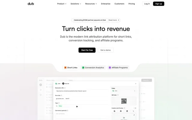
Dub presents a high-contrast, functionally transparent productivity aesthetic. Surfaces range from pure white to subtle light grays, often paired with crisp dark text. Typography is precise and clear, with a prominent serif display font for impact and a neutral sans-serif for content. Accent colors appear as small functional highlights rather than large blocks, creating a dynamic yet understated feel. Components are lightweight, featuring soft border radii and minimal, diffused shadows, emphasizing content over heavy ornamentation.
The page typically follows a max-width contained model, centered at around 1200px, creating a structured and professional feel. The hero section often presents a centered headline and subtext, followed by primary call-to-action buttons. Sections alternate between full-width content blocks and contained content, maintaining a rhythm of visual interest. Content arrangement leans towards alternating text-left/image-right compositions, or feature grids. There's a consistent vertical spacing between sections, primarily using a large section gap, creating a sense of spaciousness. Navigation is a sticky top bar with logo, main links, and distinct login/signup buttons.
The visual language for imagery is primarily product-focused, featuring clean, cropped screenshots of the Dub UI. These screenshots often appear against a slightly muted background, sometimes with a soft blur or slight elevation. Icons are minimal, featuring outline styles with thin strokes in black or occasionally brand accent colors (green, orange, violet), serving as decorative or explanatory elements. There is a general absence of lifestyle photography or complex illustrations, keeping the focus squarely on the product's interface and functionality. Density is moderate, with images used to break up text blocks and demonstrate product features rather than purely decorative purposes.
Reminiscent of Vercel, Linear, Framer, Notion.
# Dub — Style Reference
> Crisp Utility on White Canvas

**Theme:** light

**Site:** https://dub.co

Dub presents a high-contrast, functionally transparent productivity aesthetic. Surfaces range from pure white to subtle light grays, often paired with crisp dark text. Typography is precise and clear, with a prominent serif display font for impact and a neutral sans-serif for content. Accent colors appear as small functional highlights rather than large blocks, creating a dynamic yet understated feel. Components are lightweight, featuring soft border radii and minimal, diffused shadows, emphasizing content over heavy ornamentation.

## Tokens — Colors

| Name | Value | Token | Role |
|------|------|------|------|
| Accent Blue | `#3b82f6` | `--color-accent-blue` | Decorative icons, interactive elements, button background for a primary action |
| Focus Ring Blue | `#1e40af` | `--color-focus-ring-blue` | Primary action background, focus state indication |
| Fresh Green | `#16a34a` | `--color-fresh-green` | Green text accent for links, tags, and emphasized short phrases. Use as a supporting accent, not as a status color |
| Warm Orange | `#ea580c` | `--color-warm-orange` | Highlight text, specific icon accents, informative badges |
| Deep Violet | `#7c3aed` | `--color-deep-violet` | Link highlights, decorative icons, secondary brand accents |
| Highlight Green | `#4ade80` | `--color-highlight-green` | Background for specific callouts or positive elements |
| Highlight Violet | `#c084fc` | `--color-highlight-violet` | Background for specific callouts or visual accents |
| Highlight Orange | `#fb923c` | `--color-highlight-orange` | Background for specific callouts or visual accents |
| Canvas White | `#ffffff` | `--color-canvas-white` | Page backgrounds, card surfaces, form fills, primary button text for dark buttons |
| Jet Black | `#000000` | `--color-jet-black` | Icon fills, outlines for ghost buttons, decorative strokes to establish boundaries |
| Ink Black | `#0a0a0a` | `--color-ink-black` | Primary text color for headings, body text, and prominent links |
| Thunder Gray | `#171717` | `--color-thunder-gray` | Secondary text for informational blocks, subtle accents |
| Shadow Gray | `#262626` | `--color-shadow-gray` | Tertiary text, less prominent details, active ghost button text |
| Steel Gray | `#404040` | `--color-steel-gray` | Muted text, less emphasis on secondary elements |
| Subtle Ash | `#f5f5f5` | `--color-subtle-ash` | Subtle background for UI elements, hover states, secondary card surfaces |
| Border Light | `#e5e5e5` | `--color-border-light` | Hairline borders, dividers, subtle outlines for cards and inputs |
| Border Muted | `#d4d4d4` | `--color-border-muted` | Default input borders, inactive states |
| System Info | `#111827` | `--color-system-info` | Secondary body text, navigation labels, and subdued headings |
| Linear Gray Dark | `#525252` | `--color-linear-gray-dark` | Darker shade for linear gradients, often in backgrounds or decorative elements |
| Linear Gray Light | `#737373` | `--color-linear-gray-light` | Lighter shade for linear gradients, often in backgrounds or decorative elements |

## Tokens — Typography

### Satoshi
- **Substitute:** Montserrat
- **Weights:** 500
- **Sizes:** 36px, 40px, 48px
- **Line height:** 1, 1.11, 1.15
- **Letter spacing:** normal
- **Role:** Display headlines and prominent marketing text. The semi-bold weight and clean, geometric forms provide a modern, confident voice.

### Inter
- **Substitute:** Inter
- **Weights:** 400, 500, 600
- **Sizes:** 8px, 10px, 11px, 12px, 13px, 14px, 16px, 18px, 20px, 24px, 30px
- **Line height:** 1, 1.33, 1.38, 1.4, 1.43, 1.5, 1.56, 2.15, 2.8
- **Letter spacing:** normal
- **Role:** The primary typeface for all UI elements, body text, navigation, and detailed information. Its legibility across various sizes ensures clarity in product contexts.

### GeistMono
- **Substitute:** Roboto Mono
- **Weights:** 400, 500
- **Sizes:** 12px, 14px, 24px
- **Line height:** 1, 1.33, 1.43
- **Letter spacing:** normal
- **Role:** Used for code snippets, data displays, and elements requiring a fixed-width, precise appearance, such as tracking IDs or numeric metrics.

## Tokens — Type Scale

| Role | Size | Line height | Letter spacing |
|------|------|------|------|
| caption | 10px | 1.4 | — |
| body | 14px | 1.43 | — |
| subheading | 18px | 1.56 | — |
| heading-sm | 24px | 1.33 | — |
| heading | 30px | 1.33 | — |
| heading-lg | 36px | 1.11 | — |
| display | 48px | 1.15 | — |

## Tokens — Spacing

- **Max width:** 1200px
- **Section gap:** 64px
- **Card padding:** 16px
- **Element gap:** 16px

## Tokens — Radius

- **full:** 9999px
- **lg:** 12px
- **md:** 8px
- **xl:** 16px
- **xxl:** 20px

## Tokens — Elevation

- **Button:** `rgba(0, 0, 0, 0.05) 0px 1px 2px 0px`
- **Card (General):** `rgba(0, 0, 0, 0.1) 0px 0px 0px 4px`
- **Dropdown/Menu:** `rgba(0, 0, 0, 0.1) 0px 4px 6px -1px, rgba(0, 0, 0, 0.1) 0px 2px 4px -2px`

## Layout

The page typically follows a max-width contained model, centered at around 1200px, creating a structured and professional feel. The hero section often presents a centered headline and subtext, followed by primary call-to-action buttons. Sections alternate between full-width content blocks and contained content, maintaining a rhythm of visual interest. Content arrangement leans towards alternating text-left/image-right compositions, or feature grids. There's a consistent vertical spacing between sections, primarily using a large section gap, creating a sense of spaciousness. Navigation is a sticky top bar with logo, main links, and distinct login/signup buttons.

## Imagery

The visual language for imagery is primarily product-focused, featuring clean, cropped screenshots of the Dub UI. These screenshots often appear against a slightly muted background, sometimes with a soft blur or slight elevation. Icons are minimal, featuring outline styles with thin strokes in black or occasionally brand accent colors (green, orange, violet), serving as decorative or explanatory elements. There is a general absence of lifestyle photography or complex illustrations, keeping the focus squarely on the product's interface and functionality. Density is moderate, with images used to break up text blocks and demonstrate product features rather than purely decorative purposes.

## Components

### Primary Action Button
*Filled button for primary calls to action.*

Background: Accent Blue (#3b82f6) or Focus Ring Blue (#1e40af), Text: Canvas White (#ffffff), Border Radius: 8px, Padding: 6px 12px.

### Ghost Button
*Interactive elements that blend into the background, typically for secondary actions.*

Background: transparent (rgba(0,0,0,0)), Text: Ink Black (#0a0a0a) or Thunder Gray (#171717), Border: none, Border Radius: 9999px, Padding: 0px 16px.

### Outlined Card
*Informational containers with a subtle visual boundary.*

Background: Canvas White (#ffffff), Border: 1px solid Border Light (#e5e5e5), Border Radius: 12px, Padding: 8px.

### Raised Card
*Elevated cards for prominent content or interactive sections.*

Background: Canvas White (#ffffff), Border Radius: 16px, Shadow: rgba(0, 0, 0, 0.1) 0px 0px 0px 4px, Padding: 0px.

### Subtle Background Card
*Cards with a slightly off-white background, often used for grouped information or light contrast.*

Background: Subtle Ash (#f5f5f5) or #dcfce7, Border Radius: 16px, Padding: 16px.

### Text Input
*Standard input fields for user data.*

Background: Canvas White (#ffffff), Text: System Info (#111827), Border: 1px solid Border Muted (#d4d4d4) on top with clear bottom/sides, Border Radius: 0px 6px 6px 0px (asymmetric). Focus state uses a blue ring.

### Pill Tag
*Informative labels or categories.*

Background: #dcfce7, Text: Fresh Green (#16a34a), Border Radius: 9999px, Padding: 6px 12px.

### Navigation Link
*Top-level navigation items.*

Text: Ink Black (#0a0a0a), Hover: Underlined with Ink Black (#0a0a0a), Padding: 0px 24px.

### Featured Badge
*Small, colorful highlights for features or status.*

Background: #fb923c, #c084fc, or #4ade80. Text: Ink Black (#0a0a0a) or similar dark neutral. Border radius: 9999px. Padding: dynamic based on content.

## Guidelines

### Do

- Use Satoshi (or Montserrat) at 48px, weight 500, line-height 1.15 for primary page headings.
- Apply Canvas White (#ffffff) for all main page and card backgrounds to maintain a bright, open feel.
- Employ Ink Black (#0a0a0a) for all primary body text, headings, and crucial interactive text for maximum readability.
- Utilize Border Light (#e5e5e5) for all hairline borders and subtle dividers to define content areas without adding visual weight.
- Apply a 9999px (full pill shape) border-radius to all ghost buttons and tags for a distinctive soft, approachable quality.
- Use Element Gap of 16px to separate most inline elements and Card Padding of 16px for content within containers.
- Employ Accent Blue (#3b82f6) or Focus Ring Blue (#1e40af) as the background for primary call-to-action buttons, with Canvas White (#ffffff) text.

### Don't

- Avoid using heavy drop shadows; prefer diffused, subtle shadows like rgba(0, 0, 0, 0.05) 0px 1px 2px 0px.
- Do not deviate from Inter for body text, links, and most UI elements; consistency is key for readability and brand recognition.
- Refrain from using saturated colors as large background blocks; reserve them for small accents, highlights, or semantic indicators.
- Avoid tight line spacing for larger text; ensure line-heights are generous, especially for headings, to enhance scannability.
- Do not overcrowd sections; maintain a Section Gap of at least 64px to provide clear visual separation and breathing room.
- Do not use arbitrary border radii; adhere strictly to the defined scales: 9999px for pills, 8px for small components, 12px for cards, and 16px for larger containers.
- Do not introduce new typefaces; the combination of Satoshi (display), Inter (UI), and Geist Mono (monospace) is comprehensive.

## Agent Prompt Guide

Quick Color Reference:
- text: #0a0a0a
- background: #ffffff
- border: #e5e5e5
- accent: #3b82f6
- primary action: #000000 (filled action)

Example Component Prompts:
- Create a Primary Action Button: #000000 background, #ffffff text, 9999px radius, compact pill padding. Use this filled treatment for the main CTA.
- Create a feature card: Background Canvas White (#ffffff), 12px radius, 1px solid Border Light (#e5e5e5). Title 'Advanced Analytics' at 20px Inter 600, Ink Black (#0a0a0a). Body text 'Gain deep insights into your link performance with real-time data.' at 14px Inter 400, Ink Black (#0a0a0a).
More like this









Keep what you find
A free account saves references to boards and can send you a weekly email of picks based on what you save.
To see every result, go Pro.